Simple Implementation !
The "Fast UI Kit" is a Flutter package that aims to simplify application development by providing a collection of ready-to-use components. Similar to Quasar, it offers a set of components that can be used to quickly and efficiently create user interfaces while maintaining a consistent and elegant design.
The main goal of the "Fast UI Kit" is to expedite the development process by allowing developers to utilize pre-defined components instead of building each element from scratch. This saves time and effort while helping to maintain a cohesive visual appearance throughout the application.

✅ Dark Mode suporte
✅ Color scheme suporte
The components screenshots with colors scheme green selected
example of button



example of form field
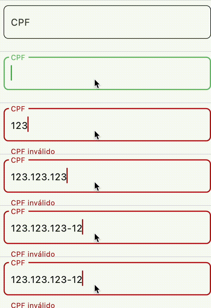
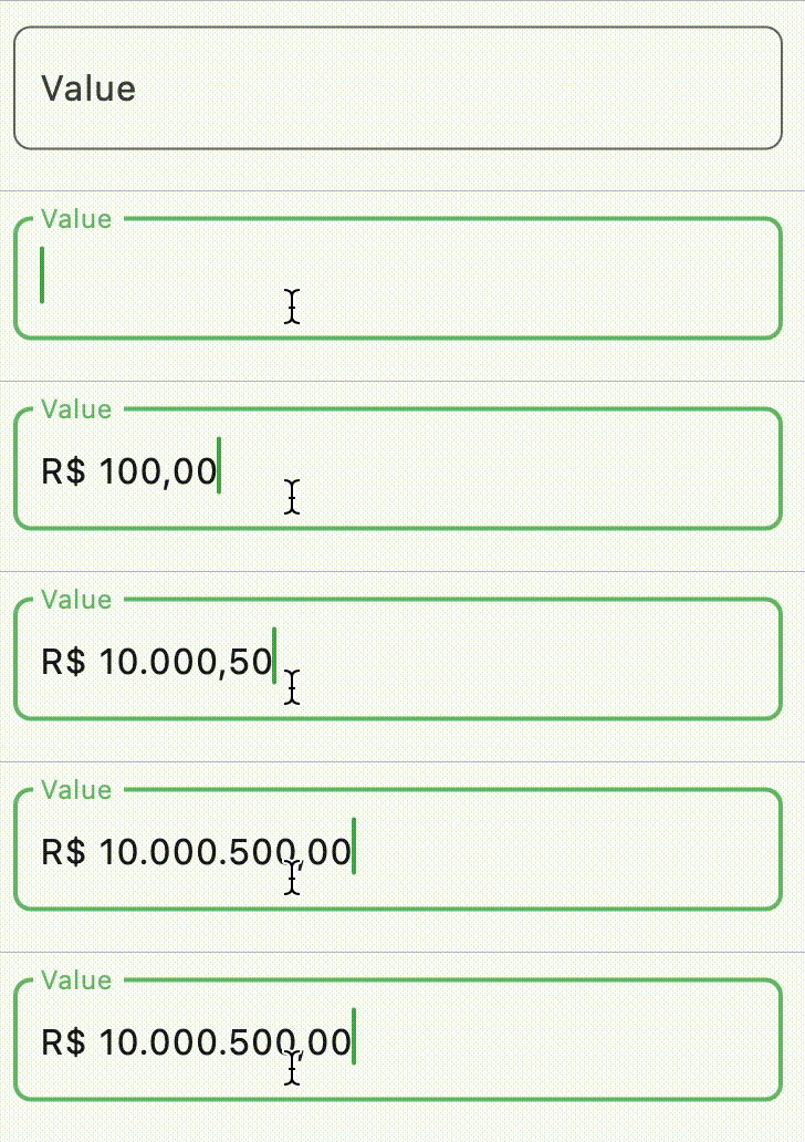
example of form field
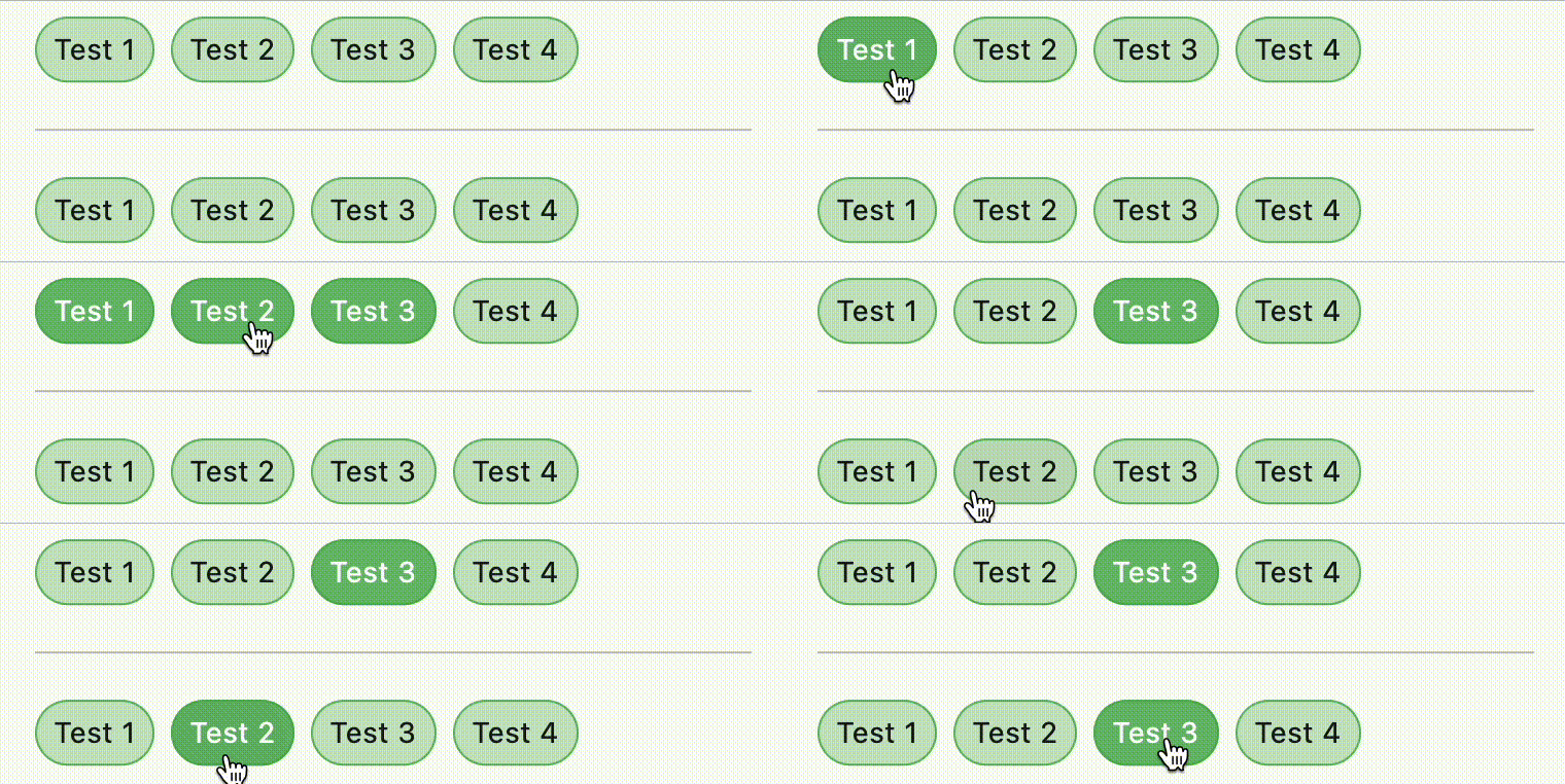
example of button group
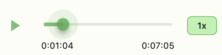
example of audio player
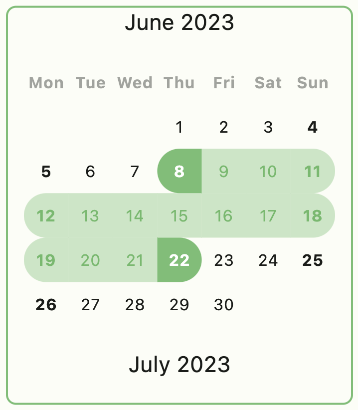
example of calendar
example of carousel

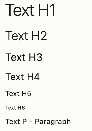
example of typographic
example of LinkFy

example of input picker
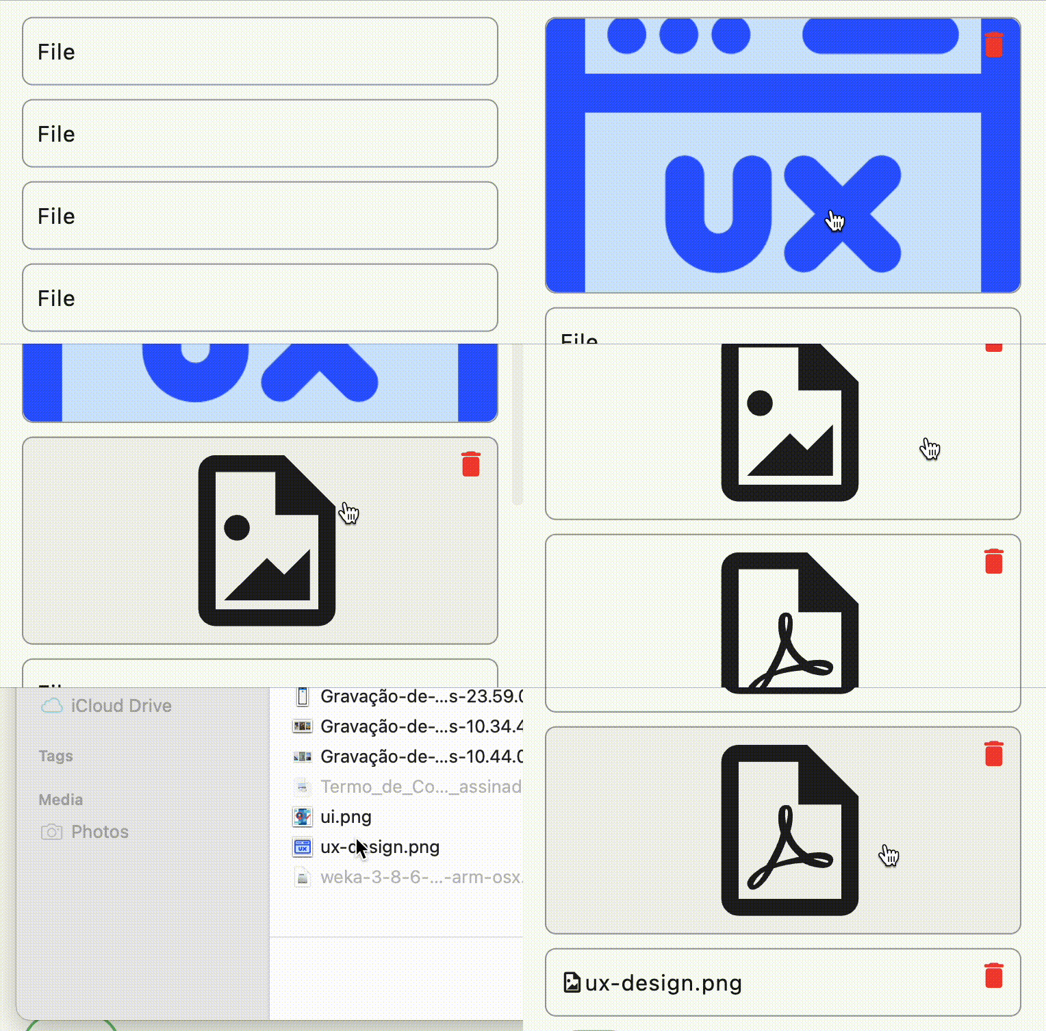
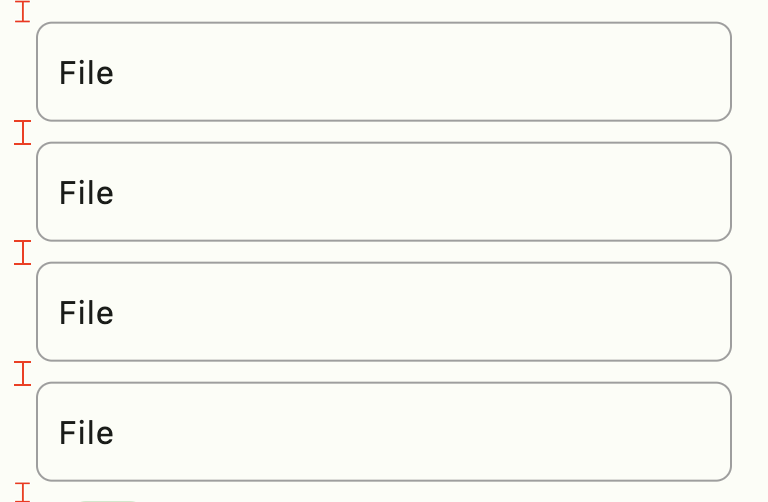
example of column
Use FastColumn to have a vertical gap between components
Define your theme
class MyApp extends StatelessWidget {
  MyApp({super.key});

  final theme = FastTheme(seed: Colors.green);

  @override
  Widget build(BuildContext context) {
    return MaterialApp(
      darkTheme: theme.dark,
      theme: theme.light,
      home: const HomePage(),
    );
  }
}
Components
- FastColum
- FastRow
- FastImg
- FastAvatar
- FastAnimate
- FastCalendar
- FastTable
- FastSkeleton
- FastSearchAppBar
- FastFormField
- FastFormFieldFile
- FastFormAvatarFile
- FastDropDown
- FastSearchSelect
- FastDialog
- FastContent
- FastCarousel
- FastButton
- FastButtonIcon
- FastButtonGroup
- FastAudio
- FastLinkFy
- FastIcon ->
Icon(FastIcons.library.icon)
Extension
Typographic
- context.H1
- context.H2
- context.H3
- context.H4
- context.H5
- context.H6
- context.P
Size
- context.height
- context.width
Navigation
- context.dialog
- context.push
- context.pushNamed
- context.pushReplacement
- context.pushReplacementNamed
- context.pushAndRemoveUntil
- context.pushAndRemoveUntilNamed
- pop
- popUntil
- popUntilNamed
Style
- context.colors
color scheme
- context.theme
current theme
- context.button
button scheme of colors
- context.brightness
brightness of application
Message
example:
context.showMessage(
'Update user successful',
title: 'Sucesso',
type: MessageVariant.success,
position: MessagePosition.top,
style: Style.flat,
);
Utils
- FastDebounce
- FastUUID
- FastClipboard
- FastLinkFyHelper
Services
- FastAudioService
- FastPickerService
📄 Access the example file
Feito com ❤️ by Weliton Sousa

