パッケージ、リポジトリ、アプリカテゴリを検索

figma_layout_grid のカバー
パッケージ詳細v0.3.2

figma_layout_grid

Figmaのレイアウトグリッド機能をサポートする視覚的補助グリッドシステム

AndroidiOSWebmacOSWindowsLinux
30日間ダウンロード
108
いいね数
32
Pub ポイント
160

パッケージをインストール

flutter pub add figma_layout_grid

パッケージ概要

公開情報に基づく選定ガイドです。参考としてご利用ください。

Figmaのレイアウトグリッドシステムを視覚的な補助として実装するFlutterパッケージで、開発者がUI要素をデザイン仕様と一貫して整列させるのを助けます。Figmaのグリッド機能(列数、ギャップサイズ、オフセットなど)をサポートしており、デザインと実装の間でのレイアウトの正確な一致を可能にします。グリッドは画面にオーバーレイとして描画されるため、プロトタイピングや開発に最適です。すべての主要プラットフォームで互換性があり、FigmaのデザインとライブのFlutterアプリとのギャップを埋めることで、デザイナーと開発者の連携を強化します。

用途

  • FlutterアプリでFigmaデザインに一致させる
  • 視覚的グリッド整合によるプロトタイピング
  • デザイナーと開発者との連携
  • UIレイアウトにおける一貫した余白の確保
  • レイアウト制約のビジュアルデバッグ

主な機能

  • Figma風のグリッドシステム
  • リアルタイムのビジュアルグリッドオーバーレイ
  • カラム、ギャップ、オフセットをサポート
  • クロスプラットフォーム互換性
  • pub add を通じた簡単な統合
  • カスタマイズ可能なグリッドの外観

適している対象

  • Flutterを使用して作業するデザイナー
  • Figmaのデザインに従うFlutter開発者
  • UI/UXワークフローにFigmaを使用するチーム
  • ピクセル単位のレイアウト整合を必要とするプロジェクト
  • デザインの一貫性に注力するフロントエンドチーム

注意事項

  • グリッドは視覚的補助のみを目的としており、レイアウト論理には使用されません
  • 本番UIレンダリングには適していません
  • 過度に使用するとパフォーマンスに影響する可能性があります
  • リリースビルドでは無効にする必要があります
  • 異なる画面用に手動で設定が必要です

元の README

関連するソースリポジトリの README 原文のスナップショットです。最新の内容はリポジトリをご覧ください。

Figma layout grid

pub package  

figma_layout_grid is a Flutter package which imitates Figma's layout grid and all its functionalities. It helps you determine whether your UI components match the design file and align properly.

Basic usage

Wrap a widget with LayoutGrid in order to render a layout grid on top of it.

LayoutGrid(
    ...
    builder: (context) => Scaffold(),
)

Available layouts

This package supports three types of layout overlays - rows, columns and pixel grid.

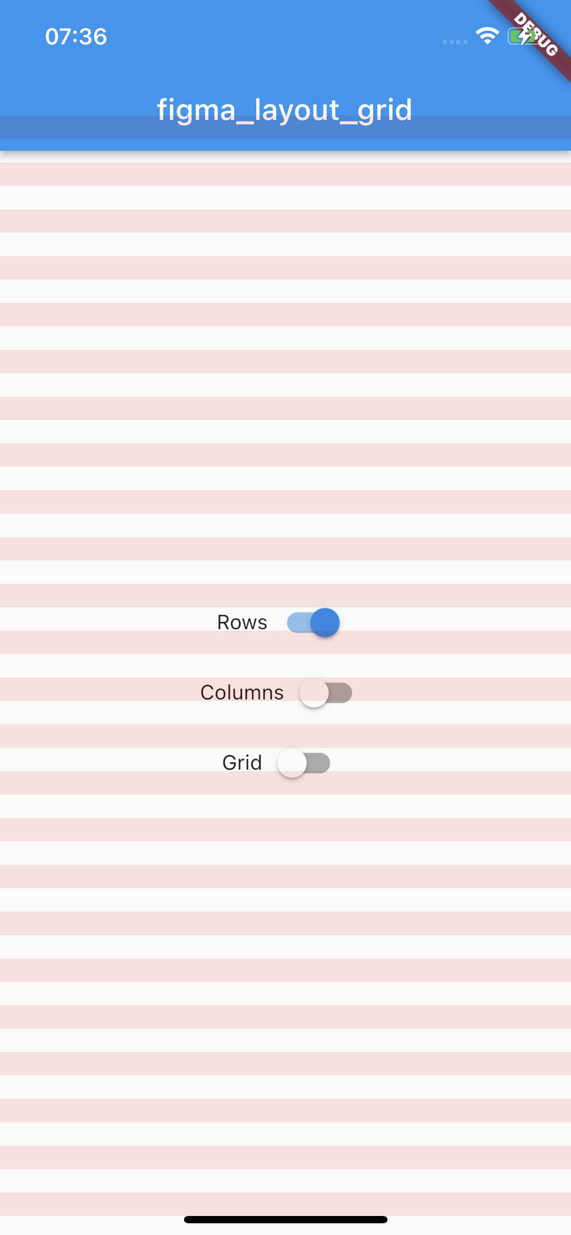
Rows

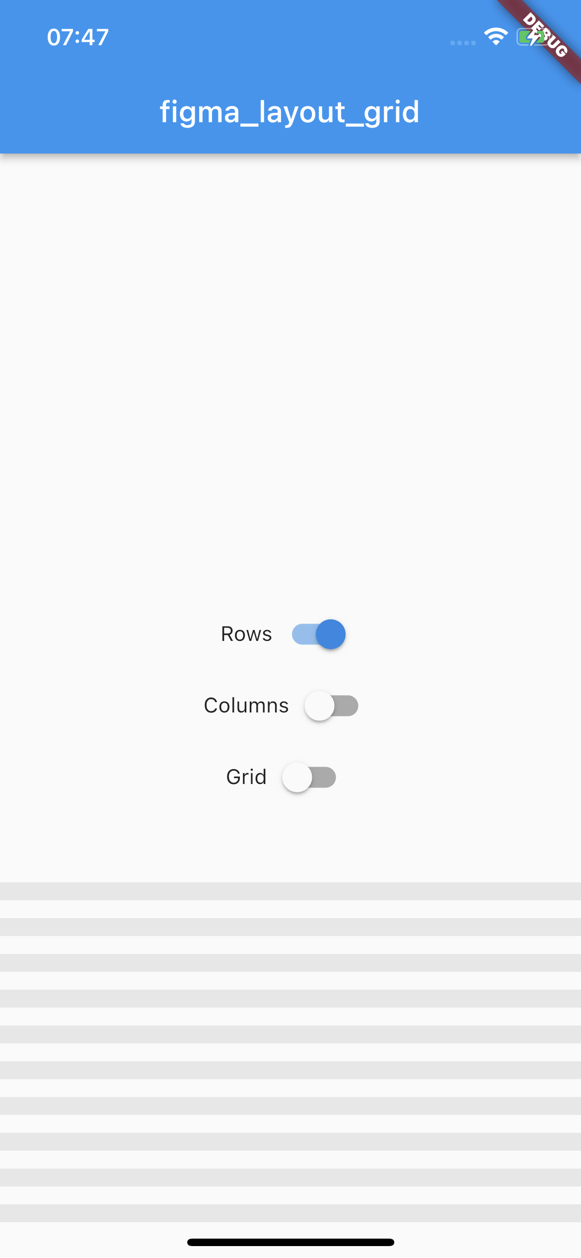
Horizontal stripes with specified height, gutter, margin, offset, arrangement and color. There is a possibility for fixed rows count with passing desired number in a count parameter, otherwise rows are rendered dynamically due to the screen limits.

Example usage

LayoutGrid(
  ...
  rowsParams: const RowsParams(
    offset: 32.0,
    height: 16.0,
    gutter: 16.0,
  ),
  builder: (context) => Scaffold(),
),
rows example image
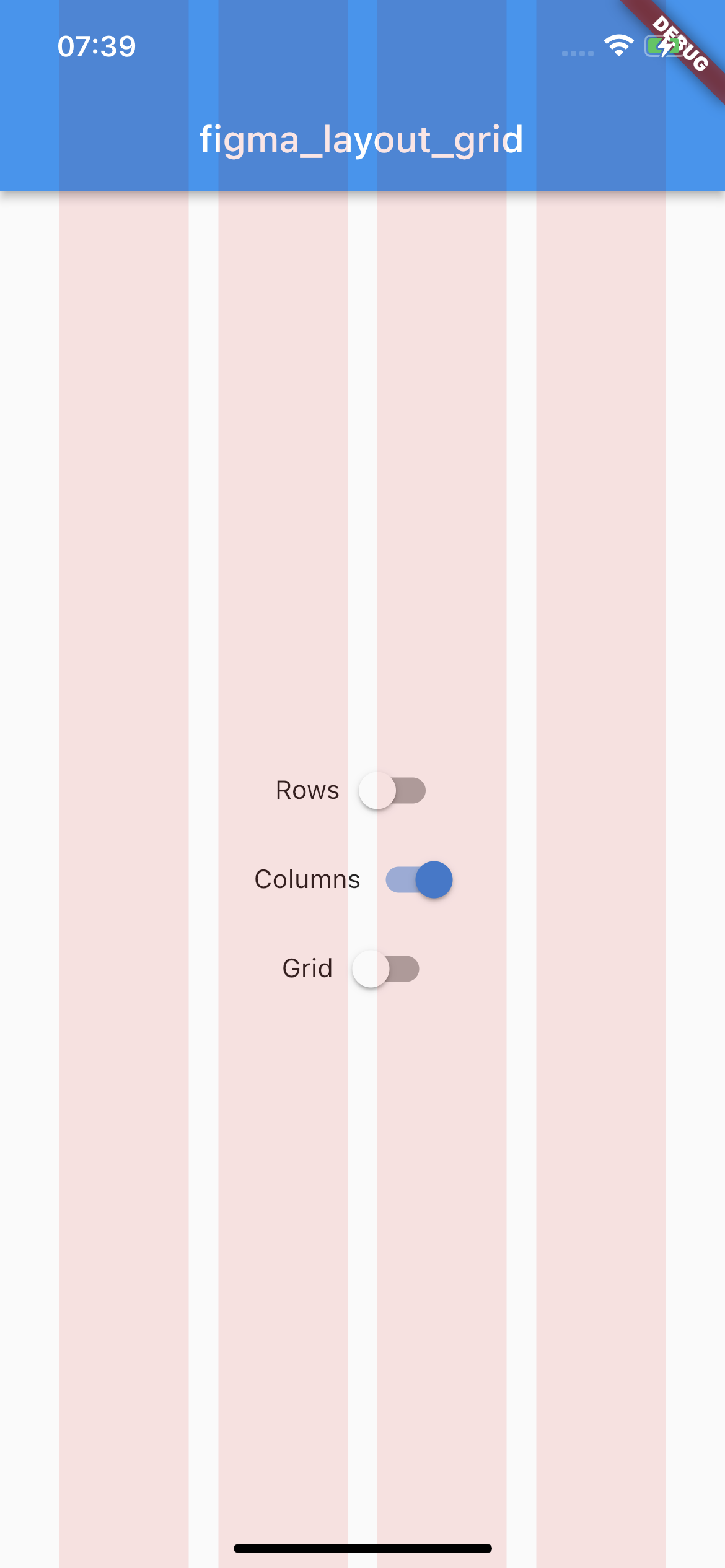
Columns

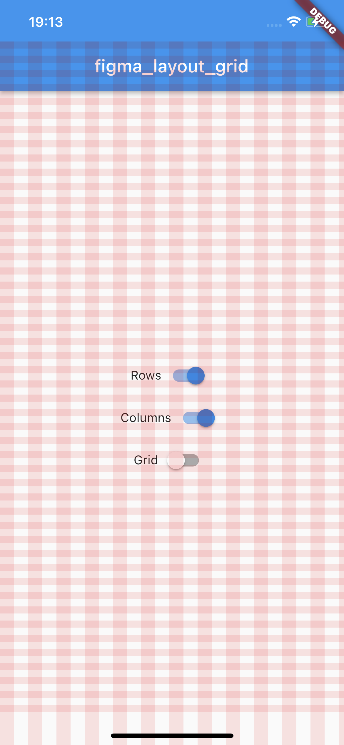
Vertical stripes with specified height, gutter, margin, offset, arrangement and color. There is a possibility for fixed columns count with passing desired number in a count parameter, otherwise columns are rendered dynamically due to the screen limits.

Example usage

LayoutGrid(
  ...
  columnsParams: const ColumnsParams(
    count: 4,
    width: 64.0,
    margin: 32.0,
  ),
  builder: (context) => Scaffold(),
),
columns example image
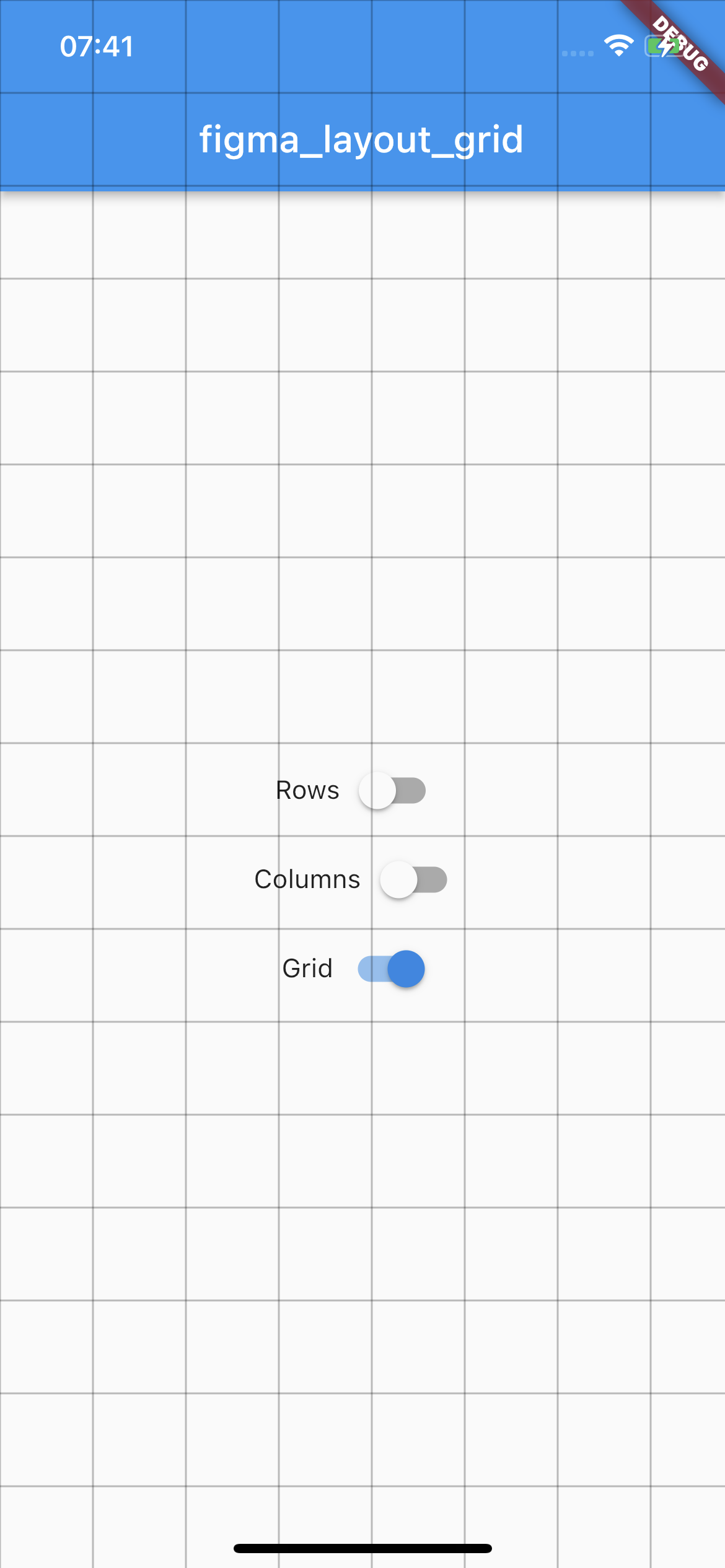
Grid

Square pixel grid with fixed spacing and color. The thickness of a grid is set to 1.

Example usage

LayoutGrid(
  ...
  gridParams: const GridParams(
    size: 50.0,
    color: Colors.black26,
  ),
  builder: (context) => Scaffold(),
),
grid example image

State management

By default all of the layouts are disabled. In order to manage layout grid state you may use LayoutGrid methods which are accessible via builder context.

Rows

void LayoutGrid.of(context).showRows() - shows row layout

void LayoutGrid.of(context).hideRows() - hides row layout

void LayoutGrid.of(context).toggleRows() - toggles row layout visibility

bool LayoutGrid.of(context).visibleRows - returns current row layout visibility state

Columns

void LayoutGrid.of(context).showColumns() - shows column layout

void LayoutGrid.of(context).hideColumns() - hides column layout

void LayoutGrid.of(context).toggleColumns() - toggles column layout visibility

bool LayoutGrid.of(context).visibleColumns - returns current column layout visibility state

Grid

void LayoutGrid.of(context).showGrid() - shows grid layout

void LayoutGrid.of(context).hideGrid() - hides grid layout

void LayoutGrid.of(context).toggleGrid() - toggles grid layout visibility

bool LayoutGrid.of(context).visibleGrid - returns current grid layout visibility state

Parametrization

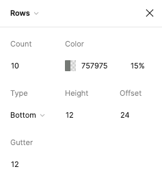
As this package mimics Figma's layout grid features you can directly transfer desired outcome into corresponding parameters. The following example shows columns grid set with count = 10, height = 12, gutter = 12, offset = 24, bottom alignment and some custom color.

figma layout configuration

Which translates to this piece of code

LayoutGrid(
  ...
  rowsParams: RowsParams(
    count: 10,
    height: 12.0,
    gutter: 12.0,
    offset: 24.0,
    arrangement: RowsArragement.bottom,
    color: const Color(0xFF757975).withOpacity(0.15),
  ),
  builder: (context) => Scaffold(),
),

And finally to the following UI.

custom config

There is also a possibility to enable SafeArea for a specific layout.

Each of the three layers has optional SafeAreaParams within you can pass what SafeArea parts should be handled. The available options are top, bottom, left and right which correspond to SafeArea's parameters with the same names.

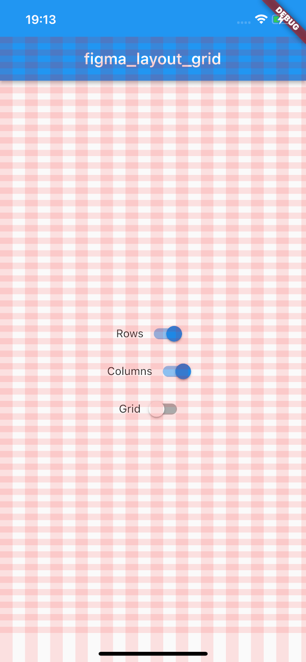
By default SafeArea feature is disabled.

LayoutGrid(
    ...
    rowsParams: const RowsParams(
      safeAreaParams: SafeAreaParams(
        bottom: true,
        top: true,
      ),
    ),
    columnsParams: const ColumnsParams(
      safeAreaParams: SafeAreaParams(
        right: true,
        left: true,
        top: true,
      ),
    ),
    builder: (context) => Scaffold(),
)

The above snippet will make the grid overlays avoid the device's intrusions.

safe area config

Demo

Try out the example app.

カテゴリー

ソースリポジトリ

このパッケージを使用しているプロジェクト

データはまだありません。