パッケージ、リポジトリ、アプリカテゴリを検索

fl_animated_linechart のカバー
パッケージ詳細v1.2.0

fl_animated_linechart

アニメーション付きのFlutterラインチャートおよびエリアチャート。大規模なデータセットに対応し、複数のY軸と日時X軸をサポートします。

AndroidiOSWebmacOSWindowsLinux
30日間ダウンロード
175
いいね数
73
Pub ポイント
130

パッケージをインストール

flutter pub add fl_animated_linechart

パッケージ概要

公開情報に基づく選定ガイドです。参考としてご利用ください。

fl_animated_linechart は、大規模なデータセットでも滑らかなパフォーマンスを実現するアニメーションラインチャートおよびエリアチャートを作成するためのFlutterパッケージです。異なるデータスケールを比較するために複数のY軸をサポートし、時系列可視化に最適な日時ベースのX軸を備えています。クロスプラットフォームでの応答性を最適化しており、リアルタイムまたは動的なデータ表示に適しています。Flutterのレンダリングエンジンで構築されており、視覚的品質を損なうことなく、滑らかなアニメーションと効率的な更新を実現します。

用途

  • リアルタイムデータモニタリング
  • 時系列解析
  • マルチメトリクスダッシュボード
  • 財務チャート
  • インタラクティブなデータ探索

主な機能

  • アニメーション付きの遷移
  • 複数の Y 軸のサポート
  • 日時X軸
  • 大規模データでの高性能
  • クロスプラットフォーム互換性

適している対象

  • データ可視化アプリ
  • ダッシュボード開発者
  • 分析ツール
  • モバイルおよびウェブ分析
  • リアルタイム追跡インターフェース

注意事項

  • フレームレートを維持するために、大規模なデータセットの取り扱いに注意が必要です
  • コアのチャートタイプ以外のカスタマイズは限定的
  • 複雑なUIには追加のスタイリングが必要になる場合があります
  • 線形または時間ベースのデータパターンに最適
  • 高度な機能には外部の依存関係に依存しています

元の README

関連するソースリポジトリの README 原文のスナップショットです。最新の内容はリポジトリをご覧ください。

fl_animated_linechart

Codemagic build status

Animations

An animated chart library for flutter.

  • Support for datetime axis
  • Multiple y axis, supporting different units
  • Highlight selection
  • Animation of the chart
  • Possibility of adding legends
  • Support for both horizontal and vertical markerlines
  • Tested with more than 3000 points and still performing

There are currently two different charts:

  • line chart
  • area chart

Getting Started

Try the sample project or include in your project.

Highlight for the line chart:

Chart example with highlight

Linechart with markerlines, icons, legends and "heat-map" shaded zones:

Chart example with markerlines and legends

Chart example with horizontal and vertical markerlines along with icons on the chart and legends

Chart example with shaded area between markerlines

Area chart:

Area Chart example

Area Chart example

Example code:

    LineChart lineChart = LineChart.fromDateTimeMaps([line1, line2], [Colors.green, Colors.blue]);

    return Scaffold(
      appBar: AppBar(
        title: Text(widget.title),
      ),
      body: Container(
        child: Column(
            mainAxisSize: MainAxisSize.max,
            mainAxisAlignment: MainAxisAlignment.spaceBetween,
            crossAxisAlignment: CrossAxisAlignment.stretch,
            children: [
              Expanded(child: AnimatedLineChart(lineChart)),
            ]
        ),
      ),
    );

Example code with horizontal markerlines and legends:
LineChart lineChart = LineChart.fromDateTimeMaps([
    line1,
    line2,
    line3,
    line4,
    line5
  ], [
    Colors.blue,
    Colors.red,
    Colors.yellow,
    Colors.yellow,
    Colors.red
  ], [
    'C',
    'C',
    'C',
    'C',
    'C',
  ], tapTextFontWeight: FontWeight.w400);

To define a line as a horizontal dashed markerline, first define the line as any other regular line, then set isMarkerLine to true:

lineChart.lines[1].isMarkerLine = true;
lineChart.lines[2].isMarkerLine = true;
lineChart.lines[3].isMarkerLine = true;
lineChart.lines[4].isMarkerLine = true;

Or:

  lineChart.lines.skip(1).forEach((line) {
      line.isMarkerLine = true;
    });

Legends:
A Legend has the following constructor:

    const Legend({this.title, this.color, this.icon, this.style, this.showLeadingLine = false,});

You can choose to either have a short line or an Icon as the first part of the legend before the title. It is possible set showLeadingLine to true, then a short line will be shown in the color you have defined.
You can change the Color of the line and Icon, and the TextStyle of the String title.
The length of the Legends list must to equal to the length of chartlines which have isMakerLine = true.

When orientation of the screen is in landscape mode, it is possible to have the legends drawn on the right hand side instead of below the graph. Simply set legendsRightLandscapeMode: true

      return Scaffold(
      appBar: AppBar(
        title: Text(widget.title),
      ),
      body: Container(
        child: Column(
          mainAxisSize: MainAxisSize.max,
          mainAxisAlignment: MainAxisAlignment.spaceBetween,
          crossAxisAlignment: CrossAxisAlignment.stretch,
          children: [
            Expanded(
              child: AnimatedLineChart(
                lineChart,
                toolTipColor: Colors.white,
                gridColor: Colors.black54,
                textStyle: TextStyle(fontSize: 10, color: Colors.black54),
                showMarkerLines:
                    true, // If this value is not set to true, all defines lines will be filled lines and not dashed
                legends: [
                  Legend(title: 'Critical', color: Colors.red, showLeadingLine: true),
                  Legend(title: 'Warning', color: Colors.yellow, Icon(Icons.report_problem_rounded, size: 17, color: Colors.yellow)),
                ],
                legendsRightLandscapeMode: true,
              ),
            ),
          ],
        ),
      ),
    ); 

Example code with horizontal and vertical markerlines along with icons on the chart and legends:

It is possible to define a maximum of two vertical markerlines.
The verticalMarker variable is a List<DateTime> and the length can be >= 2.
If two vertical markerlines are defined, the area between the two lines will be filled with a color that can be defined with verticalMarkerColor.

It is possible to add an Icon on the point where the vertical markerline crosses the y-axis value by defining the verticalMarkerIcon.
The verticalMarkerIcon variable takes a List<Icon> and the lenght must be equal to the length of the verticalMarker variable.
The possibility of adding a colored background to the icons have been added and can be defined with iconBackgroundColor which takes a Color.

      return Scaffold(
      appBar: AppBar(
        title: Text(widget.title),
      ),
      body: Container(
        child: Column(
          mainAxisSize: MainAxisSize.max,
          mainAxisAlignment: MainAxisAlignment.spaceBetween,
          crossAxisAlignment: CrossAxisAlignment.stretch,
          children: [
            Expanded(
              child: AnimatedLineChart(
                lineChart,
                toolTipColor: Colors.white,
                gridColor: Colors.black54,
                textStyle: TextStyle(fontSize: 10, color: Colors.black54),
                showMarkerLines:
                    true, // If this value is not set to true, all defines lines will be filled lines and not dashed
                legends: [
                  Legend(title: 'Critical', color: Colors.red),
                  Legend(title: 'Warning', color: Colors.yellow),
                ],
                verticalMarker:[
                    DateTime.parse('2012-02-27 12:54:00'),
                    DateTime.parse('2012-02-27 13:16:00')
                        ],
                  verticalMarkerColor: Colors.yellow,
                  verticalMarkerIcon: [
                    Icon(
                      Icons.report_problem_rounded,
                      color: Colors.yellow,
                    ),
                    Icon(
                      Icons.check_circle_rounded,
                      color: Colors.green,
                    ),
                  ],
                  iconBackgroundColor: Colors.white,
              ),
            ),
          ],
        ),
      ),
    );

Example code with shaded area between markerlines: It is possible to have shaded areas between the defined markerlines.
The shaded area will be in the same color as the markerline.
It is important that the order of enums in the List<MaxMin> filledMarkerLinesValues matches the order of defined markerlines to be shown in the graph.
Enums with the value MaxMin.MAX will draw to the top if there is only one markerline defined as MAX, otherwise it will draw from i - 1 where enum values are MAX.
If enum value is MaxMin.MIN the shaded area will draw downwards to i + 1, unless the index is the last in the list, then the shaded area will draw all the way to the bottom of the graph.

      return Scaffold(
      appBar: AppBar(
        title: Text(widget.title),
      ),
      body: Container(
        child: Column(
          mainAxisSize: MainAxisSize.max,
          mainAxisAlignment: MainAxisAlignment.spaceBetween,
          crossAxisAlignment: CrossAxisAlignment.stretch,
          children: [
            Expanded(
              child: AnimatedLineChart(
                  chart,
                  key: UniqueKey(),
                  gridColor: Colors.black54,
                  textStyle: TextStyle(fontSize: 10, color: Colors.black54),
                  toolTipColor: Colors.white,
                  showMarkerLines: true,
                  fillMarkerLines: true,
                  filledMarkerLinesValues:[
                          MaxMin.MAX,
                          MaxMin.MAX,
                          MaxMin.MIN,
                          MaxMin.MIN,
                        ],
              ),
            ),
          ],
        ),
      ),
    );

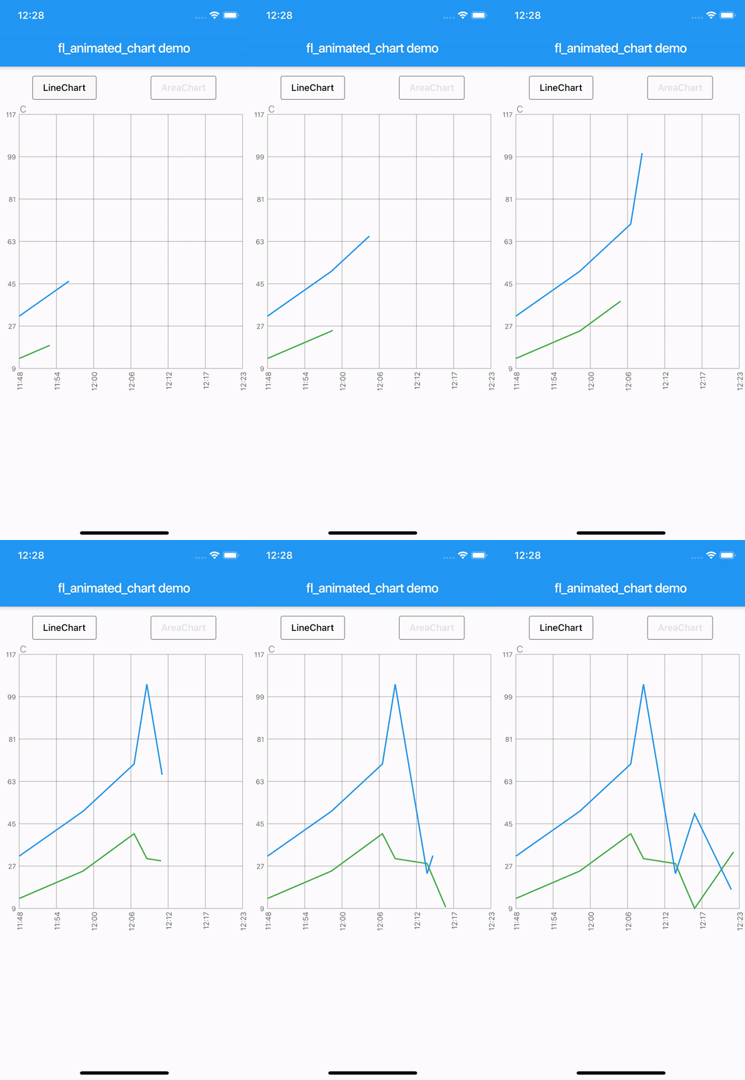
The example app, can toggle between line chart and area chart. Example app

カテゴリー

依存関係

依存関係一覧 2 件

ソースリポジトリ

このパッケージを使用しているプロジェクト

データはまだありません。