パッケージ、リポジトリ、アプリカテゴリを検索

flip_board のカバー
パッケージ詳細v1.0.0

flip_board

FlipBoards は、コンテンツの変更を裏返しアニメーションでアニメートする FlipWidgets のコンポジションです。FlipFraseBoard、FlipMatrix、FlipClock なども含まれます。

AndroidiOSWebmacOSWindowsLinux
30日間ダウンロード
1360
いいね数
115
Pub ポイント
150

パッケージをインストール

flutter pub add flip_board

パッケージ概要

公開情報に基づく選定ガイドです。参考としてご利用ください。

FlipBoard は、フリッピングアニメーションを使用してアニメートされたコンテンツ遷移を可能にするFlutterパッケージです。FlipFraseBoard、FlipMatrix、FlipClockなどの再利用可能なウィジェットを提供しており、それぞれが表示されるコンテンツの変更をスムーズにアニメーション化するように設計されています。Flutterのアニメーションシステムに基づいて構築されており、Android、iOS、Web、macOS、Windows、Linuxなど複数のプラットフォームをサポートしています。状態変更時の視覚フィードバックがユーザー体験を向上させるため、魅力的なUIを作成するのに最適です。

用途

  • アニメーションデジタル時計
  • 動的テキスト表示
  • インタラクティブなデータグリッド
  • ユーザーインターフェースの遷移
  • ゲームスコアカウンター
  • フォーム内の視覚フィードバック

主な機能

  • スムーズなフリップアニメーション
  • 事前構築された専用ボード
  • クロスプラットフォーム互換性
  • Flutter との簡単な統合
  • カスタマイズ可能なフリップ方向と速度
  • リアクティブなコンテンツの更新

適している対象

  • インタラクティブなダッシュボードを開発する開発者
  • 動的なUI要素を求めるデザイナー
  • 視覚的な状態遷移を必要とするアプリ
  • 教育またはゲームアプリケーション
  • リアルタイムデータ可視化ツール

注意事項

  • 低性能デバイスでのパフォーマンスに影響を与える可能性があります
  • フリップ効果を超えるカスタマイズは限られている
  • Flutter のウィジェットライフサイクルの理解が必要です
  • 単純な静的コンテンツには適していません
  • アニメーションはミニマリスティックなデザインで気を散らす可能性があります
  • Flutterのアニメーションフレームワークの安定性に依存しています

元の README

関連するソースリポジトリの README 原文のスナップショットです。最新の内容はリポジトリをご覧ください。

Flip Board

pub package license

Widgets to build displays that resemble Mechanical Flip Boards.

The basic component is a stateful FlipWidget that renders flip transitions for a stream of items and an itemBuilder.

The package also includes other widgets that compose this basic component in useful Flip Boards:

Flip Widget

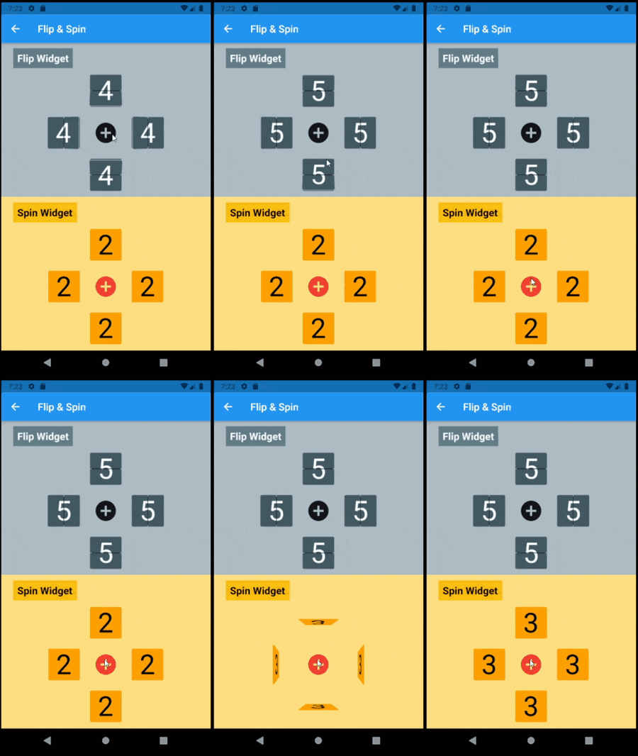
The most distinctive characteristic of a FlipWidget is its flip type to define the type of movement that will animate items rendering, either FlipType.middleFlip or FlipType.spinFlip.

This widget renders flip animations in a configured Axis and AxisDirection, animating the transition to each new item received in the given item stream. It is commonly used to display digits and letters but can actually render any widget you build through the given itemBuilder.

It is constructed with four required parameters (besides many optional parameters):

  • flipType: either FlipType.middleFlip or FlipType.spinFlip
  • itemStream: stream of items to be flipped as they are received
  • itemBuilder: builder to create a widget out of each item
  • flipDirection: AxisDirection to animate new items flip

Please check the class documentation to see all options.

Middle Flip

When we think of Mechanical Flip Boards as we used to see in airports and sport score boards we think on a Vertical MiddleFlip Widget or, most likely, on a composition (row) of them.

Its construction could look like:

FlipWidget({
  flipType: FlipType.middleFlip,
  itemStream: _stream,
  itemBuilder: _itemBuilder,
  flipDirection: AxisDirection.down,
});
Spin Flip

With FlipType.spinFlip this widget will render a Flip Card animation when new items arrive in the stream.

It has a similiar constructor, something like:

FlipWidget({
  flipType: FlipType.spinFlip,
  itemStream: _stream,
  itemBuilder: _itemBuilder,
  flipDirection: AxisDirection.right,
});

Example page that shows both types and all flipping directions (full code in examples folder):

  @override
  Widget build(BuildContext context) =>
    Center(
      child: Column(
        mainAxisAlignment: MainAxisAlignment.center,
        children: [
          _flipWheel,
          _spinWheel,
        ],
      ),
    );

  Widget get _flipWheel =>
    Center(
      child: Column(
        mainAxisSize: MainAxisSize.min,
        children: [
          _wheelTitle('Flip Widget'),
          _flipWidget(AxisDirection.up),
          Row(
            mainAxisSize: MainAxisSize.min,
            children: [
              _flipWidget(AxisDirection.left),
              _button,
              _flipWidget(AxisDirection.right),
            ],
          ),
          _flipWidget(AxisDirection.down),
        ],
      ),
    );

  Widget _flipWidget(AxisDirection direction) =>
    FlipWidget(
      flipType: FlipType.middleFlip,
      itemStream: _flipController.stream,
      itemBuilder: _itemBuilder,
      initialValue: _nextFlipValue,
      flipDirection: direction,
      hingeWidth: 1.0,
      hingeLength: 56.0,
      hingeColor: Colors.black,
    );

  Widget _itemBuilder(BuildContext context, int? value) =>
    Container(
      width: 64.0,
      height: 64.0,
      alignment: Alignment.center,
      decoration: BoxDecoration(
        borderRadius: const BorderRadius.all(Radius.circular(4.0)),
        border: Border.all(),
      ),
      child: Text(
        (value ?? 0).toString(),
        style: TextStyle(fontSize: 54.0),
      ),
    );

  void _flip() => _flipController.add(++_nextFlipValue % 10);

Flip Boards

Basic FlipWidgets are usually composed in a layout, this package provides a few configurable compositions of FlipWidgets of the same type and orientation, sometimes varying some elements direction within that axis orientation.

All these composed widgets are described below and explored in the examples folder.

Flip Matrix Board

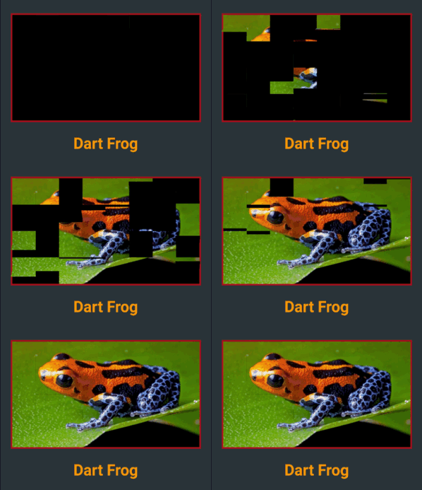
There two classes of FlipMatrixBoard that animate the display in a matrix of FlipWidgets. The first class displays a single child, an image in the given example. The second class animates the display of a stream of items, also given as a stream of images in the example below.

The board is configured with the number of rows and columns, flipping orientation and animation speed and delays parameters.

  • FlipMatrixBoardSingleChild

    Widget get _flipImage =>
      Container(
        decoration: BoxDecoration(
          border: Border.all(width: 3.0, color: Colors.red[900]!),
        ),
        child: FlipMatrixBoardSingleChild.assetImage(
          imageName: 'assets/horizontal/dart-frog.jpg',
          backgroundColor: Colors.black,
          axis: Axis.vertical,
          width: 364.0,
          height: 205.0,
          columnCount: 8,
          rowCount: 4,
        ),
      );
  • FlipMatrixBoardStream

    Widget get _flipWidget =>
      Container(
        decoration: BoxDecoration(border: Border.all(color: Colors.blue)),
        child: FlipMatrixBoardStream<String>(
          itemStream: _controller.stream,
          itemBuilder: _itemBuilder,
          axis: Axis.vertical,
          width: 375.0,
          height: 200.0,
          columnCount: 8,
          rowCount: 4,
        ),
      );

Flip Clock

FlipClock will default to Theme colors but can be further customized through constructor parameters.

The default flip direction is AxisDirection.down and the default animation curve is a custom curve that acceletares like gravity and bounces back at the end (like a mechanical bang).

In the example below some colors are inherited by a parent ThemeData from the amber color scheme. While some colors are defined in the constructor invocation:

  Widget _flipClock(ColorScheme colors) =>
    Container(
      decoration: BoxDecoration(
        color: colors.onPrimary,
        borderRadius: const BorderRadius.all(Radius.circular(8.0)),
      ),
      padding: const EdgeInsets.all(16.0),
      child: FlipClock(
        digitSize: 54.0,
        width: 46.0,
        height: 62.0,
        separatorColor: colors.primary,
        hingeColor: Colors.black,
        showBorder: true,
      ),
    );

Flip Countdown Clock

FlipCountdownClock is similar, it requires a duration parameter and may be configured with an onDone callback function.

Countdown default flip direction is AxisDirection.up, the opposite of FlipClock, with no panel bang animation.

In the following example most colors are configured with constructor parameters:

  Widget _flipCountdown(ColorScheme colors) => 
    Container(
      decoration: BoxDecoration(
        color: colors.secondary,
        borderRadius: BorderRadius.circular(8.0),
      ),
      padding: const EdgeInsets.all(24.0),
      child: FlipCountdownClock(
        duration: const Duration(minutes: 1),
        digitSize: 54.0,
        width: 46.0,
        height: 62.0,
        digitColor: colors.surface,
        backgroundColor: colors.onSurface,
        separatorColor: colors.onSurface,
        borderColor: colors.primary,
        hingeColor: colors.surface,
        borderRadius: const BorderRadius.all(Radius.circular(8.0)),
        onDone: () => print('Buzzzz!'),
      ),
    );

Flip Frase Board

This composed widget displays a Frase Board that will animate each letter up to the the given frase letters.

Flip type, initial and end colors, delays and more are all customized at constructor level. Check the class documentation for a run over all configurations.

The provided example looks like this:

This page displays a variety of frase boards, one of them would be constructed like this:

  Widget _flipFraseBoard(FlipType type, Axis axis, String frase) =>
    FlipFraseBoard(
      flipType: type,
      axis: axis,
      startLetter: 'A',
      endFrase: frase,
      fontSize: 30.0,
      hingeWidth: 0.6,
      hingeColor: Colors.black,
      borderColor: Colors.black,
      endColors: _flipEndColors,
      letterSpacing: 2.0,
    );

Game

We created a simple game to use a FlipWidget in a more complex context. Check the code in the example folder to see the complete implementation.

Uhaaa! Flip Game

Flip cards untill you make all three cards match the same painting.

There are two valid actions:

  • a first tap on a card: will flip that card
  • a second consecutive tap on a card: wil flip the other two cards
Can you win? Good luck!

カテゴリー

依存関係

依存関係一覧 1 件

ソースリポジトリ

このパッケージを使用しているプロジェクト