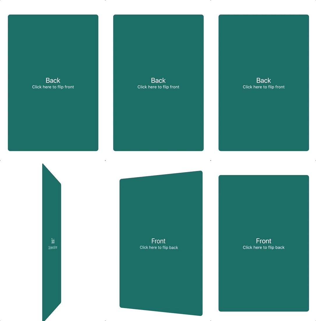
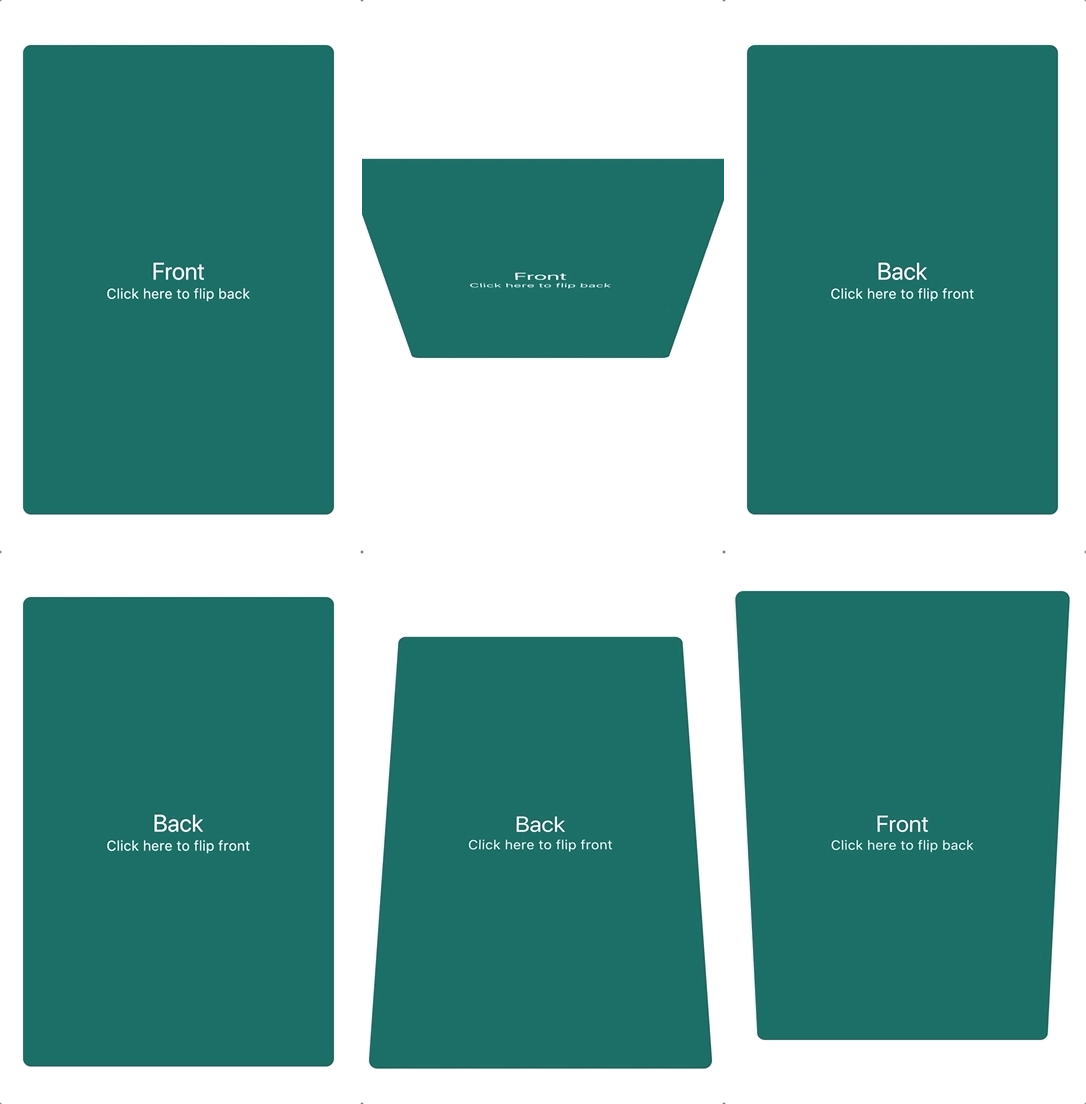
A component that provides a flip card animation. It could be used for hiding and showing details of a product.
How to use
Import the package
import'package:flip_card/flip_card.dart';
Default
Create a flip card as shown below. By default the card is touch controlled.
You can turn off touch control by setting flipOnTouch to false.
FlipCard(
  fill: Fill.fillBack, // Fill the back side of the card to make in the same size as the front.
  direction: Axis.horizontal, // default
  initialSide: CardSide.front, // The side to initially display.
  front: Container(
    child: Text('Front'),
  ),
  back: Container(
    child: Text('Back'),
  ),
)
Programmatically
Controller (Recommended)
To control the card programmatically, you can pass a controller
when creating the card.
lateFlipCardController _controller = FlipCardController();
@overrideWidgetbuild(BuildContext context) {
returnFlipCard(
controller: _controller,
front: ...,
back: ...,
);
}
voiddoStuff() {
// Flip the card a bit and back to indicate that it can be flipped (for example on page load)
_controller.hint(
duration: constDuration(milliseconds: 400),
);
// Tilt the card a bit (for example when hovering)
_controller.skew(0.2);
// Flip the card programmatically
_controller.flip();
// Flip the card to front specifically
_controller.flip(CardSide.front);
// Flip the card without animation
_controller.flipWithoutAnimation();
}
Global Key
You can also control the card via a global key as shown below.
You can auto-flip the widget after a certain delay without any external triggering.
FlipCard(
fill: Fill.back, // Fill the back side of the card to make in the same size as the front.
direction: Axis.horizontal, // default
initialSide: CardSide.front, // The side to initially display.
front: Container(
child: Text('Front'),
),
back: Container(
child: Text('Back'),
),
autoFlipDuration: constDuration(seconds: 2), // The flip effect will work automatically after the 2 seconds
)