パッケージ、リポジトリ、アプリカテゴリを検索

flutter_advanced_switch のカバー
パッケージ詳細v3.2.2

flutter_advanced_switch

高度なスイッチコントロールは、ウィジェットカスタマイズのための豊富なAPIを提供し、アプリに新しい見た目と感触をもたらします。

AndroidiOSWebmacOSWindowsLinux
30日間ダウンロード
2.4万
いいね数
166
Pub ポイント
160

パッケージをインストール

flutter pub add flutter_advanced_switch

パッケージ概要

公開情報に基づく選定ガイドです。参考としてご利用ください。

Flutter Advanced Switch は、広範なスタイルおよび動作のカスタマイズを可能にする豊富な API を提供するカスタマイズ可能なスイッチウィジェットです。開発者は滑らかなアニメーション、カスタムトラックおよびサムデザイン、すべての主要プラットフォームでの応答性のあるインタラクションを備えた視覚的に異なるスイッチを作成できます。独自のトグルコントロールが必要な現代的なUIに最適で、洗練されたインタラクティブ要素によりユーザー体験を向上させます。このパッケージは Android、iOS、Web、macOS、Windows、Linux をサポートしており、クロスプラットフォームの一貫性を確保しています。

用途

  • カスタムトグルインターフェース
  • フォーム内のユーザーのフィードバックの向上
  • モダンなアプリUIデザイン
  • インタラクティブな設定パネル
  • クロスプラットフォームスイッチコンポーネント
  • ダッシュボードにおける視覚的差別化

主な機能

  • 高度カスタマイズ可能なトラックとサム
  • スムーズなアニメーション遷移
  • クロスプラットフォーム互換性
  • 豊富なスタイルオプション
  • 応答性のあるタッチフィードバック
  • 設定可能な状態と動作

適している対象

  • 視覚的な柔軟性を求めるUIデザイナー
  • 現代アプリを開発する開発者
  • 一貫したトグルUXを必要とするチーム
  • 複雑なフォームインタラクションを持つアプリ
  • 複数のプラットフォームをターゲットにするプロジェクト

注意事項

  • Flutter Widget のカスタマイズについて理解が必要
  • バンドルサイズがわずかに増加する可能性があります
  • スタイルの複雑さは開発速度に影響を与える可能性があります
  • 制限された組み込みテーマ
  • カスタマイズなしでシンプルなオン/オフ切り替えには適していない

元の README

関連するソースリポジトリの README 原文のスナップショットです。最新の内容はリポジトリをご覧ください。

flutter_advanced_switch

A highly customizable switch widget for Flutter with support for custom colors, text, icons, images, and more.

APP_ICON

Switch Light Switch Dark
Flutter Advanced Switch Off State Flutter Advanced Switch On State

Features

  • ✅ Fully customizable colors, sizes, and shapes
  • ✅ Support for text labels and icons
  • ✅ Background images for active/inactive states
  • ✅ Custom thumb widget support
  • ✅ Smooth animations
  • ✅ Enabled/disabled states
  • ✅ Controller-based or callback-based state management
  • ✅ Customizable thumb padding
  • ✅ Null-safe

Getting Started

In the pubspec.yaml of your flutter project, add the following dependency:

dependencies:
  flutter_advanced_switch: ^3.2.0

Import in your project:

import 'package:flutter_advanced_switch/flutter_advanced_switch.dart';

Usage

Basic Switch
class MyWidget extends StatefulWidget {
  @override
  State<MyWidget> createState() => _MyWidgetState();
}

class _MyWidgetState extends State<MyWidget> {
  final _controller = ValueNotifier<bool>(false);

  @override
  void dispose() {
    _controller.dispose();
    super.dispose();
  }

  @override
  Widget build(BuildContext context) {
    return AdvancedSwitch(
      controller: _controller,
    );
  }
}
Using Callback Instead of Controller
AdvancedSwitch(
  initialValue: false,
  onChanged: (value) {
    print('Switch value: $value');
  },
)
Customized Switch
final _controller = ValueNotifier<bool>(false);

AdvancedSwitch(
  controller: _controller,
  activeColor: Colors.green,
  inactiveColor: Colors.red,
  activeChild: const Text('ON'),
  inactiveChild: const Text('OFF'),
  width: 70.0,
  height: 35.0,
  decoration: BoxDecoration(
    borderRadius: BorderRadius.circular(20),
  ),
)
With Custom Thumb
final _controller = ValueNotifier<bool>(false);

AdvancedSwitch(
  controller: _controller,
  thumb: ValueListenableBuilder<bool>(
    valueListenable: _controller,
    builder: (_, value, __) {
      return Icon(
        value ? Icons.check : Icons.close,
        size: 16,
      );
    },
  ),
)
With Background Images
final _controller = ValueNotifier<bool>(false);

AdvancedSwitch(
  controller: _controller,
  activeImage: const AssetImage('assets/images/day.png'),
  inactiveImage: const AssetImage('assets/images/night.png'),
  activeChild: const Text('DAY'),
  inactiveChild: const Text('NIGHT'),
  width: 80,
)
With Icons
final _controller = ValueNotifier<bool>(false);

AdvancedSwitch(
  controller: _controller,
  activeChild: const Icon(Icons.wb_sunny, size: 16),
  inactiveChild: const Icon(Icons.nightlight_round, size: 16),
  activeColor: Colors.orange,
  inactiveColor: Colors.indigo,
  width: 60,
)
Listening to State Changes
class _MyWidgetState extends State<MyWidget> {
  final _controller = ValueNotifier<bool>(false);

  @override
  void initState() {
    super.initState();
    _controller.addListener(() {
      setState(() {
        // React to state changes
        print('Switch is now: ${_controller.value}');
      });
    });
  }

  @override
  void dispose() {
    _controller.dispose();
    super.dispose();
  }

  @override
  Widget build(BuildContext context) {
    return Column(
      children: [
        AdvancedSwitch(controller: _controller),
        Text('Switch is ${_controller.value ? "ON" : "OFF"}'),
      ],
    );
  }
}

Parameters

Parameter Description Type Default
controller Controls the state of the switch. If provided, the switch will use this controller to manage its state. ValueNotifier<bool>? null
activeColor The background color when the switch is in the active (on) state. Color Color(0xFF4CAF50)
inactiveColor The background color when the switch is in the inactive (off) state. Color Color(0xFF9E9E9E)
activeChild A widget to display on the left side when the switch is active. Widget? null
inactiveChild A widget to display on the right side when the switch is inactive. Widget? null
activeImage An optional background image to display when the switch is active. ImageProvider? null
inactiveImage An optional background image to display when the switch is inactive. ImageProvider? null
decoration The decoration to apply to the switch container. Typically used to set the border radius and shape. BoxDecoration BorderRadius.circular(15)
width The width of the switch. double 50.0
height The height of the switch. The thumb size is automatically calculated based on this value. double 30.0
enabled Whether the switch is enabled. If false, the switch will be displayed with reduced opacity and will not respond to user interactions. bool true
disabledOpacity The opacity to apply when the switch is disabled. double 0.5
thumb A custom widget to use as the thumb (the sliding part of the switch). If null, a default white rounded rectangle with a shadow will be used. Widget? null
thumbPadding The padding around the thumb. This creates space between the thumb and the switch edges. double 1.0
initialValue The initial state of the switch when controller is not provided. This value is only used when controller is null. bool false
onChanged Called when the user toggles the switch. The switch will call this callback with the new value. If null and no controller is provided, the switch will be disabled. ValueChanged<bool>? null

Demo

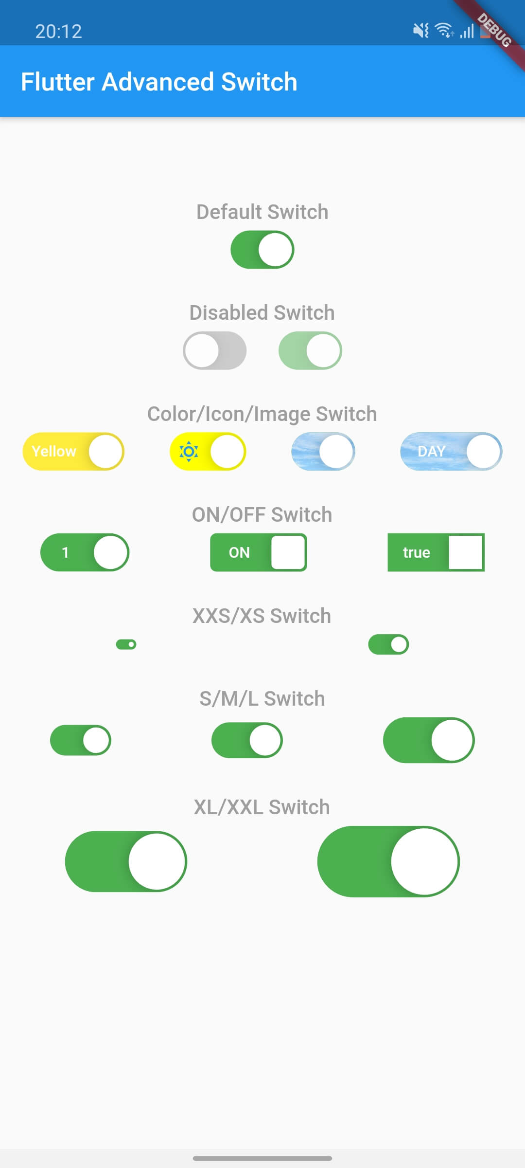
Flutter Advanced Switch Preview

カテゴリー

ソースリポジトリ

このパッケージを使用しているプロジェクト

データはまだありません。