パッケージ、リポジトリ、アプリカテゴリを検索

flutter_bootstrap のカバー
パッケージ詳細v2.0.0

flutter_bootstrap

Flutter におけるレスポンシブレイアウト用のBootstrapグリッドシステムの部分実装。

AndroidiOSWebmacOSWindowsLinux
30日間ダウンロード
888
いいね数
185
Pub ポイント
150

パッケージをインストール

flutter pub add flutter_bootstrap

パッケージ概要

公開情報に基づく選定ガイドです。参考としてご利用ください。

Flutter Bootstrap は、Flutter 内で Bootstrap グリッドシステムの部分的な実装を提供し、開発者が簡単に応答性のあるレイアウトを作成できるようにします。Bootstrap をインスパイアした馴染みやすいグリッド構造を提供し、さまざまな画面サイズでの柔軟な列と行の配置をサポートしています。カスタムレイアウトロジックを必要とせず、レスポンシブデザインを簡素化しており、一貫性があり拡張可能なUIが必要なプロジェクトに最適です。Flutterのウィジェットシステムに基づいて構築されており、Android、iOS、Web、macOS、Windows、Linux の既存アプリにスムーズに統合できます。

用途

  • 応答性のあるダッシュボードの構築
  • モバイルファーストのレイアウトを作成する
  • クロスプラットフォームWebインターフェースの設計
  • グリッドベースのフォームの実装
  • レスポンシブなナビゲーションバーの簡素化

主な機能

  • Bootstrapを参考にしたグリッドシステム
  • 柔軟な列と行の配置
  • レスポンシブブレイクポイント
  • クロスプラットフォーム互換性
  • Flutterウィジェットとの簡単な統合

適している対象

  • Bootstrapに精通した開発者
  • レスポンシブレイアウトを必要とするプロジェクト
  • クロスプラットフォームアプリ開発
  • 迅速なUIプロトタイピング
  • 複数デバイス間での一貫性を重視するチーム

注意事項

  • 部分的な実装(完全なBootstrapではない)
  • グリッドシステムのみに制限
  • 複雑なデザインには追加のスタイリングが必要になる場合があります
  • グリッド以外に組み込みコンポーネントはありません
  • グリッド外の要素の手動処理に依存する

元の README

関連するソースリポジトリの README 原文のスナップショットです。最新の内容はリポジトリをご覧ください。

flutter_bootstrap

A partial implementation of Bootstrap Grid system in Flutter for Responsive Layout.


Getting Started

You should ensure that you add the following dependency in your Flutter project.

dependencies:
 flutter_bootstrap: "^2.0.0"

You should then run flutter packages upgrade or update your packages in IntelliJ.

In your Dart code, to use it:

import 'package:flutter_bootstrap/flutter_bootstrap.dart';

Documentation

This package exposes 4 new Widgets:

  • BootstrapContainer
  • BootstrapRow
  • BootstrapCol
  • BootstrapVisibility

...and a series of helper methods:

  • bootstrapGridParameters
  • bootstrapPrefixBasedOnWidth
  • bootstrapMaxWidthNonFluid
  • bootStrapValueBasedOnSize

It implements the following Bootstrap4 features:

  • .container
  • .container-fluid
  • .row
  • .col-*, .col-sm-*, .col-md-*, .col-lg-*, .col-xl-*
  • .offset-*, .offset-sm-*, .offset-md-*, .offset-lg-*, .offset-xl-*
  • .order-*, .order-sm-*, .order-md-*, .order-lg-*, .order-xl-*
  • conditional visibility based on device width and column definition

Full documentation and examples can be found on my website.


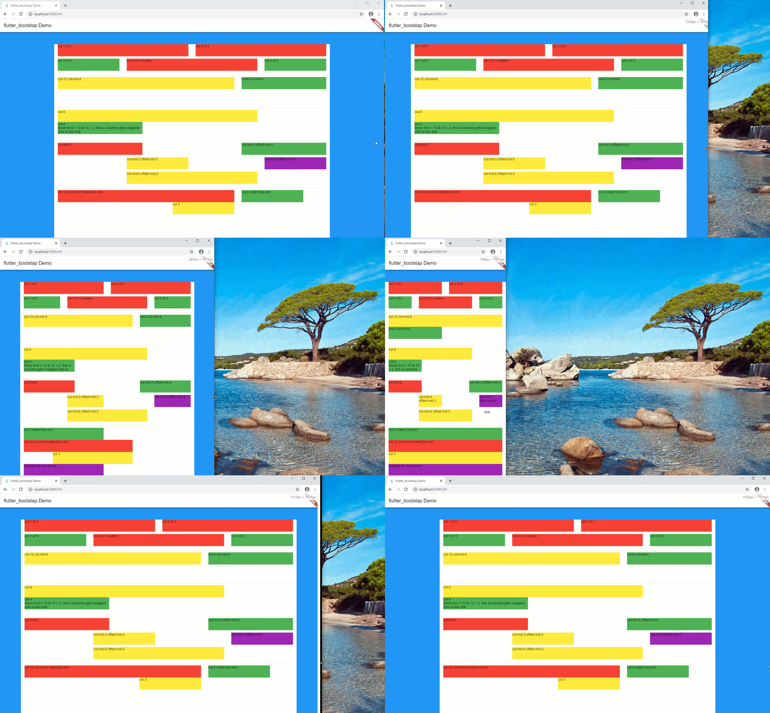
Example

An example can be found in the example folder. Check it out.

カテゴリー

ソースリポジトリ

このパッケージを使用しているプロジェクト

データはまだありません。