パッケージ、リポジトリ、アプリカテゴリを検索

パッケージ詳細v1.1.1+1

flutter_bootstrap5

多くのBootstrap 5の機能をFlutterで実装したものです。

AndroidiOSWebmacOSWindowsLinux
30日間ダウンロード
16
いいね数
28
Pub ポイント
150

パッケージをインストール

flutter pub add flutter_bootstrap5

パッケージ概要

公開情報に基づく選定ガイドです。参考としてご利用ください。

Flutter Bootstrap5 は、Flutter アプリケーションに多数の Bootstrap 5 コンポーネントとユーティリティをもたらす Flutter パッケージです。開発者は、馴染みのある Bootstrap 5 の構文とクラスを使用して、レスポンシブでモバイルファーストなデザインを実装できます。このパッケージは Android、iOS、Web、macOS、Windows、Linux といったすべての主要プラットフォームをサポートしており、クロスプラットフォームプロジェクトに最適です。Bootstrap のグリッドシステム、タイポグラフィ、ボタン、フォームなどを活用することで、開発者はUI開発を加速させ、デバイス間で一貫したスタイルを維持できます。

用途

  • 応答性のあるウェブおよびモバイルアプリの構築
  • Bootstrap パターンを活用した迅速な UI プロトタイピング
  • クロスプラットフォームアプリ開発
  • 一貫したデザインシステムの構築
  • FlutterでBootstrapベースのレイアウトを実装する

主な機能

  • Bootstrap 5 コンポーネントの互換性
  • レスポンシブグリッドシステム
  • すべてのターゲットにおけるプラットフォームサポート
  • CSS風のクラスベースのスタイリング
  • 既存のFlutterプロジェクトとの簡単な統合

適している対象

  • Bootstrapに精通した開発者
  • デザインの一貫性を重視するチーム
  • 迅速なUI開発を必要とするプロジェクト
  • クロスプラットフォームアプリケーションビルダー
  • フロントエンド中心のFlutter開発者

注意事項

  • バンドルサイズを増加させる可能性があります
  • Bootstrap クラスを超えるカスタマイズは限られている
  • 外部のCSSロジックに依存しています
  • 完全なBootstrapの置き換えではない
  • Bootstrapの概念を理解する必要があります

元の README

関連するソースリポジトリの README 原文のスナップショットです。最新の内容はリポジトリをご覧ください。

FlutterBootstrap5 🚀

This package is used to support the creation of responsive web applications with Flutter. It is based on the well-known CSS framework Bootstrap 5 and offers many features that can also be found in Bootstrap.

If you like this package it would be nice if you would give a Like ❤️ and a Star ⭐ to support the project!


If you want to have a quick overview of the most important functions and test them directly, you can do so here

FLUTTER BOOTSTRAP 5 EXAMPLE WEBSITE

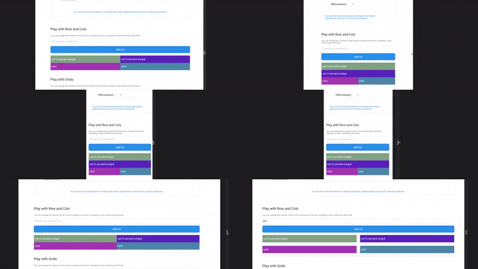
Small Example

Small Example

Getting Started

Configure Flutter Bootstrap5

To use Flutter Bootstrap5 anywhere in your app, you don't have to do anything but wrap your MaterialApp with the [FlutterBootstrap5] widget.

        FlutterBootstrap5(
            builder: (ctx) => MaterialApp(...),
        );
App Theming

You have various possibilities to customize Flutter Bootstrap5 for your needs. You can also leave it at the default values to get the default behavior of a Bootstrap5 app.

Currently the following customization options are supported:

BreakPoints

To set your own BreakPoints, you can simply pass the BreakPoints class to the [FlutterBootstrap5] widget. By default the current BreakPoints of Bootstrap5 CSS are used

        class _BootstrapBreakPoints {
          static const BreakPoint xs = BreakPoint(minWidth: 0, maxWidth: 576);
          static const BreakPoint sm = BreakPoint(minWidth: 576, maxWidth: 768);
          static const BreakPoint md = BreakPoint(minWidth: 768, maxWidth: 992);
          static const BreakPoint lg = BreakPoint(minWidth: 992, maxWidth: 1200);
          static const BreakPoint xl = BreakPoint(minWidth: 1200, maxWidth: 1400);
          static const BreakPoint xxl =
          BreakPoint(minWidth: 1400, maxWidth: double.infinity);
        }
Container BreakPoints

Beside the normal BreakPoints you can also define your own BreakPoints for the [FB5Container]. These determine which width a [FB5Container] should have at a certain BreakPoint.

By default the current Container BreakPoints of Bootstrap5 CSS are used

      class _BootstrapContainerBreakPoints {
        static const double xs = double.infinity;
        static const double sm = 540;
        static const double md = 720;
        static const double lg = 960;
        static const double xl = 1140;
        static const double xxl = 1320;
      }
Default Fontsize

With the parameter defaultFontSize you can specify the default font size to be used for the calculation of "rem" values. Bootstrap CSS uses rem to calculate margins, paddings and also font size. Similarly, these values are also calculated in Flutter Bootstrap5 depending on the defaultFontSize.

The default value is 16.0

Typography

Flutter Bootstrap5 uses a font size calculation mechanism based on Bootstrap CSS. So font sizes change dynamically depending on the screen size.

To customize this behavior you can pass the [FB5Typography] class to FlutterBootstrap5.

Use the theme in your MaterialApp

After configuring [FlutterBootstrap5] to your liking, you can now pass the theme to your MaterialApp to take full advantage of Flutter Bootstrap 5.

        MaterialApp(
            title: 'Flutter Bootstrap5 Demo',
            theme: BootstrapTheme.of(ctx).toTheme( [PASS YOUR THEME TO OVERRIDE BOOTSTRAP THEME IF YOU WANT TO] ),
            home: const Home(),
        ),

So now let's talk about the features

Currently supported Bootstrap classes

NOTE! Responsive support indicates whether the use of -xs, -sm, -md, -lg, -xl, and-xxl is supported
Description Base class Variations Responsive Support
Width of a column col col-{1-12}, ✓
Columns per row row-cols row-cols-{1-*}, ✓
Padding p p-{1-5},p{t,b,s,e,x,y}-{1-5},p{t,b,s,e,x,y}-custom-{0.0-*} ✓
Margin m m-{1-5},p{t,b,s,e,x,y}-{1-5},m{t,b,s,e,x,y}-custom-{0.0-*} ✓
Gutter g g-{1-5},g{x,y}-{1-5},g{x,y}-custom-{0.0-*} ✓
Order order order-{0-*} ✓
Display d d-none, d-block, ✓
Align Items align-items align-items-{start, center, end} ✓
Align Self align-self align-self-{start, center, end} ✓
Justify Content justify-content justify-content-{start, around, between, evenly, center, end} ✓

Widgets

FB5Container

FB5 containers are the Flutter implementation of Bootstrap Container. You can test the resize behavior of the containers on the FLUTTER BOOTSTRAP 5 EXAMPLE WEBSITE.

The following container types are supported:

    FB5Container(child: child);
    FB5Container.sm(child: child);
    FB5Container.md(child: child);
    FB5Container.lg(child: child);
    FB5Container.xl(child: child);
    FB5Container.xxl(child: child);
    FB5Container.fluid(child: child);
FB5Row

FB5Row are the Flutter implementation of Bootstrap Row. They get a list of FB5Col which are then arranged and displayed according to the classNames.

    FB5Row(
        classNames: 'mt-5 px-xs-3 px-lg-0 gx-4',
        children: [
            FB5Col(
                classNames: 'col-12',
                child: const GettingStarted(),
            ),
            FB5Col(
                classNames: 'col-12 mt-5',
                child: const Containers(),
            ),
            FB5Col(
                classNames: 'mt-5',
                child: const TestingArea(),
            ),
            FB5Col(
                classNames: 'my-5',
                child: const GridArea(),
            ),
       ],
  ),
FB5Col

FB5Col are the flutter implementation of the Bootstrap Col. They should be used inside a FB5Row and change their representation according to the classNames.

        FB5Col(
            classNames: 'col-12 col-lg-6 col-xl-4 m-3 m-xl-2 d-none d-sm-block',
            child: child,
        ),
FB5Grid

FB5Grid are used to represent a grid system of your children. They should not contain FB5Cols. FB5Grid automatically adjusts the size of the children so that a row of children always has the same height.

    FB5Grid(
      classNames: 'row-cols-3',
      children: [
          ...
      ],
    ),

Helper

BootstrapTheme

Information about the current screen size and breakpoint is returned by the BootstrapTheme. For this, nothing more is necessary than to execute the following function.

    final screenData = BootstrapTheme.of(context);

It also offers useful functions. For example, the query whether the current breakpoint is larger or smaller than a certain breakpoint.

    final screenData = BootstrapTheme.of(context);
    screenData.currentBreakPoint.isBreakPointOrSmaller(screenData.breakPoints.xl);

    screenData.currentBreakPoint.isBreakPointOrLarger(screenData.breakPoints.xl);
Functions

There are some helper functions to add bootstrap functionality to Flutter widgets:

    // e.g. add a 4rem margin-top to a Container
    Container(
      margin: margin(context, 'mt-4'),
    );

    // e.g. add a 2rem padding to a Container
    Container(
      margin: padding(context, 'p-2'),
    );
    
    // add a borderRadius to a Container
    Container(
      decoration: BoxDecoration(
        borderRadius: rounded(context), // rounded1 rounded2 rounded3 rounded4 rounded5 roundedPill
      ),
    );

    // add a border to a Container
    Container(
      decoration: BoxDecoration(
        border: borderPrimary(context), // borderSecondary, borderSuccess, borderDanger, etc...
      ),
    );


    // responsiveValue & responsiveValueOrNull
    // if you need different values for different breakPoints
    final width = responsiveValue<double>(context, defaultValue: 300.0, md: 350.0, xl: 400.0);

カテゴリー

依存関係

依存関係一覧 2 件

ソースリポジトリ

このパッケージを使用しているプロジェクト

データはまだありません。