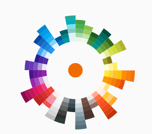
パッケージ、リポジトリ、アプリカテゴリを検索

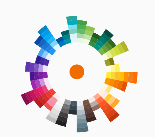
flutter_color_picker_wheel のカバー
パッケージ詳細v0.0.1

flutter_color_picker_wheel

完全にDartで書かれたホイール形状のカラーピッカー

AndroidiOSWebmacOSWindowsLinux
30日間ダウンロード
127
いいね数
40
Pub ポイント
120

パッケージをインストール

flutter pub add flutter_color_picker_wheel

パッケージ概要

公開情報に基づく選定ガイドです。参考としてご利用ください。

Flutterアプリケーション向けに完全にDartで書かれた、ホイール型のカラーピッカーです。直感的な円形インターフェースにより、色を選択しやすく、デザインツールやテーマカスタマイザー、クリエイティブアプリに最適です。スムーズな色の遷移をサポートしており、Android、iOS、Web、macOS、Windows、Linuxなどすべての主要プラットフォームと互換性があります。洗練されたカスタマイズ可能なUIにより、開発者は最小限の設定で視覚的に魅力的な色選択体験を簡単に統合できます。

用途

  • デザインツールの統合
  • テーマカスタマイズインターフェース
  • クリエイティブアプリのカラーセレクション
  • モバイルおよびデスクトップアプリのUI
  • Webベースのカラーピッカー

主な機能

  • 円形ホイールカラー選択
  • 完全にDartで書かれた
  • クロスプラットフォーム互換性
  • スムーズな色のトランジション
  • カスタマイズ可能なUI
  • Flutterとの簡単な統合

適している対象

  • UI/UXデザイナー
  • クリエイティブツールを構築するアプリ開発者
  • テーマ対応アプリケーション
  • マルチプラットフォーム Flutter プロジェクト

注意事項

  • ホイールベースの選択に制限
  • ブランディング用に追加のスタイリングが必要になる場合があります
  • HSL や HSV のような複雑な色モデルには適していません

元の README

関連するソースリポジトリの README 原文のスナップショットです。最新の内容はリポジトリをご覧ください。

Flutter Color Picker Wheel

dashbook

Flutter Color Picker Wheel is an easy-to-use widget that can be heavily customized.

  • You can use the WheelColorPicker directly by providing list of colors you want to include and animation configs.
  • You can use the WheelColorPickerEntryContent and manage OverlayEntry yourself.
  • This library provides some presets which make it even easier to use this component.

How to use

Add the dependency to your pubspec.yaml

flutter_color_picker_wheel: ^0.0.1

Try it out

Currently this Storybook only works well on Web

TODO: [ ] Use another storybook to provide better preview for both web and phone

https://flutter-color-picker-wheel.kexinlu.com

Showcase

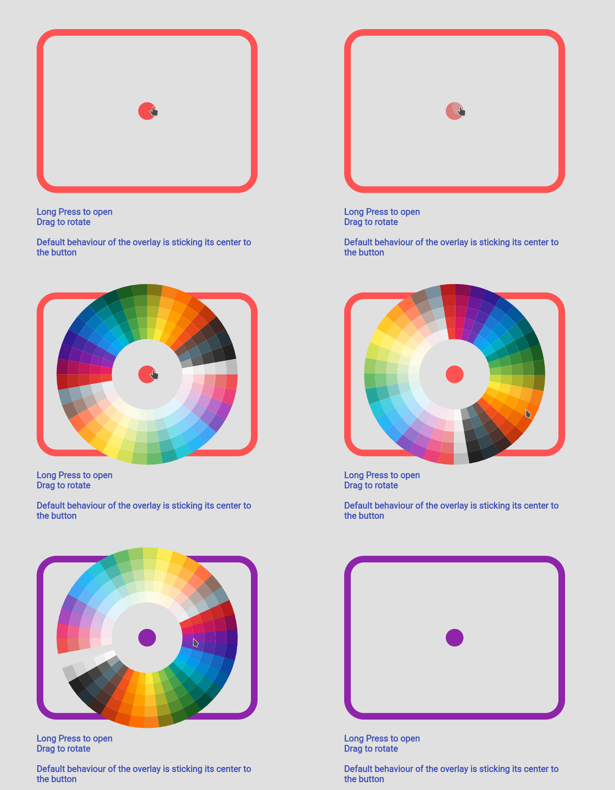
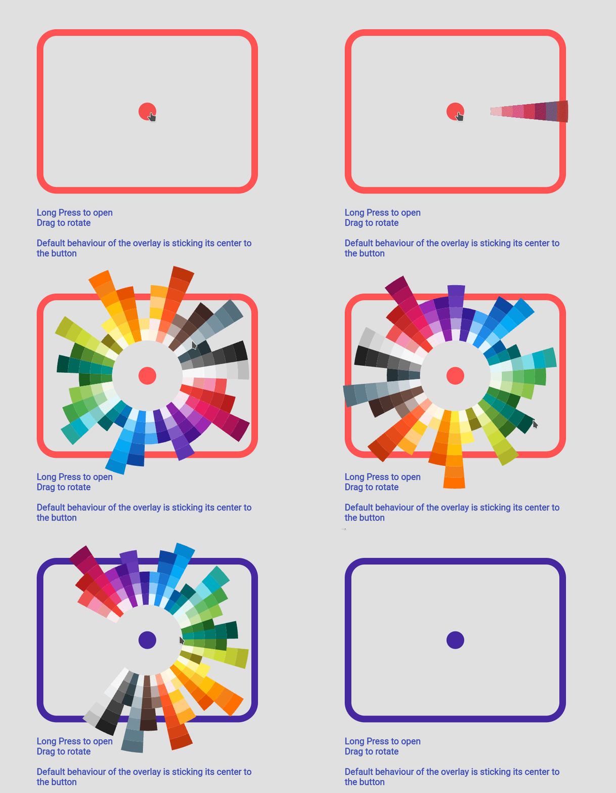
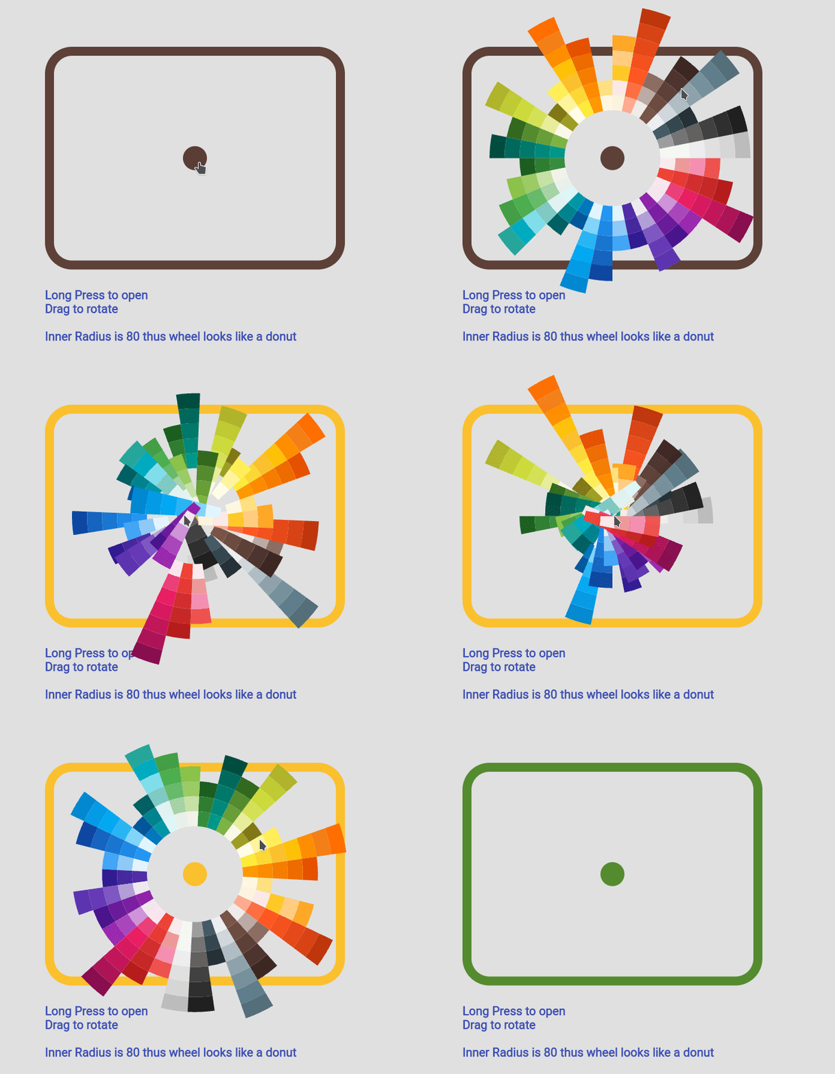
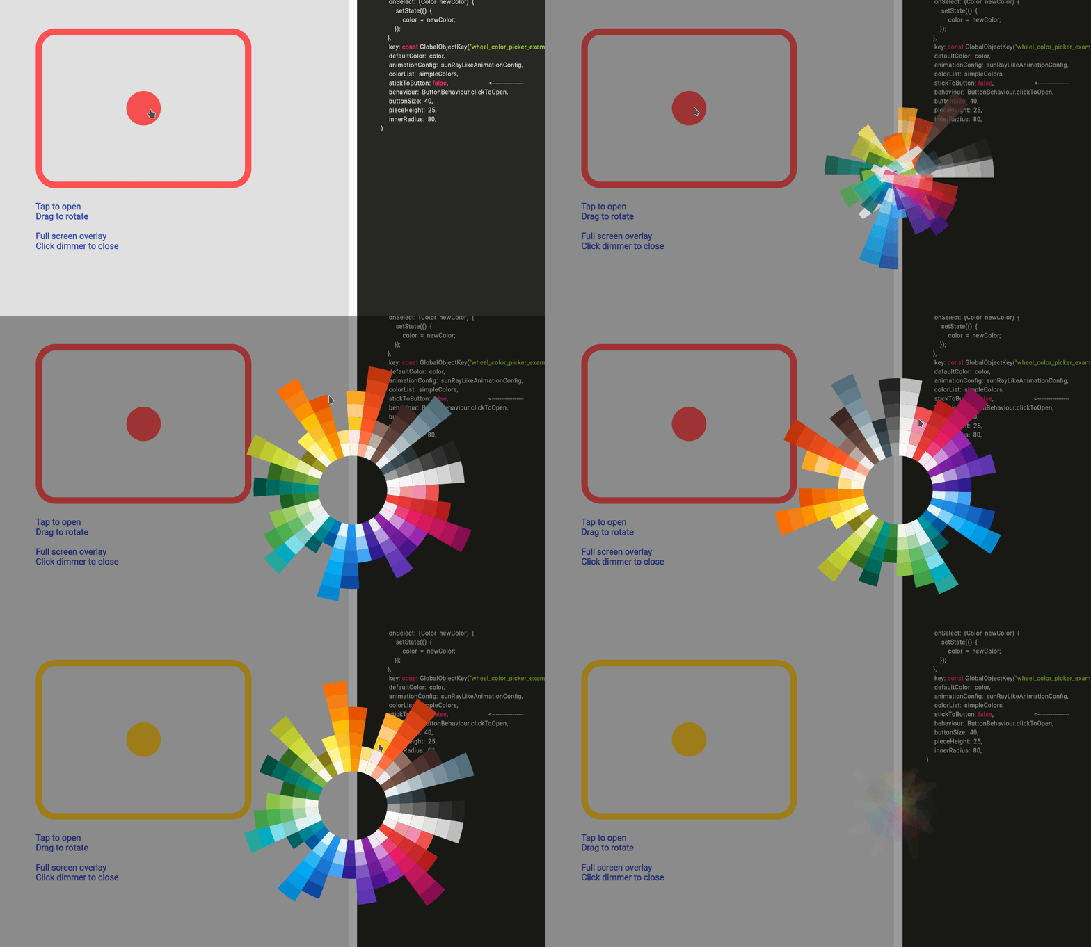
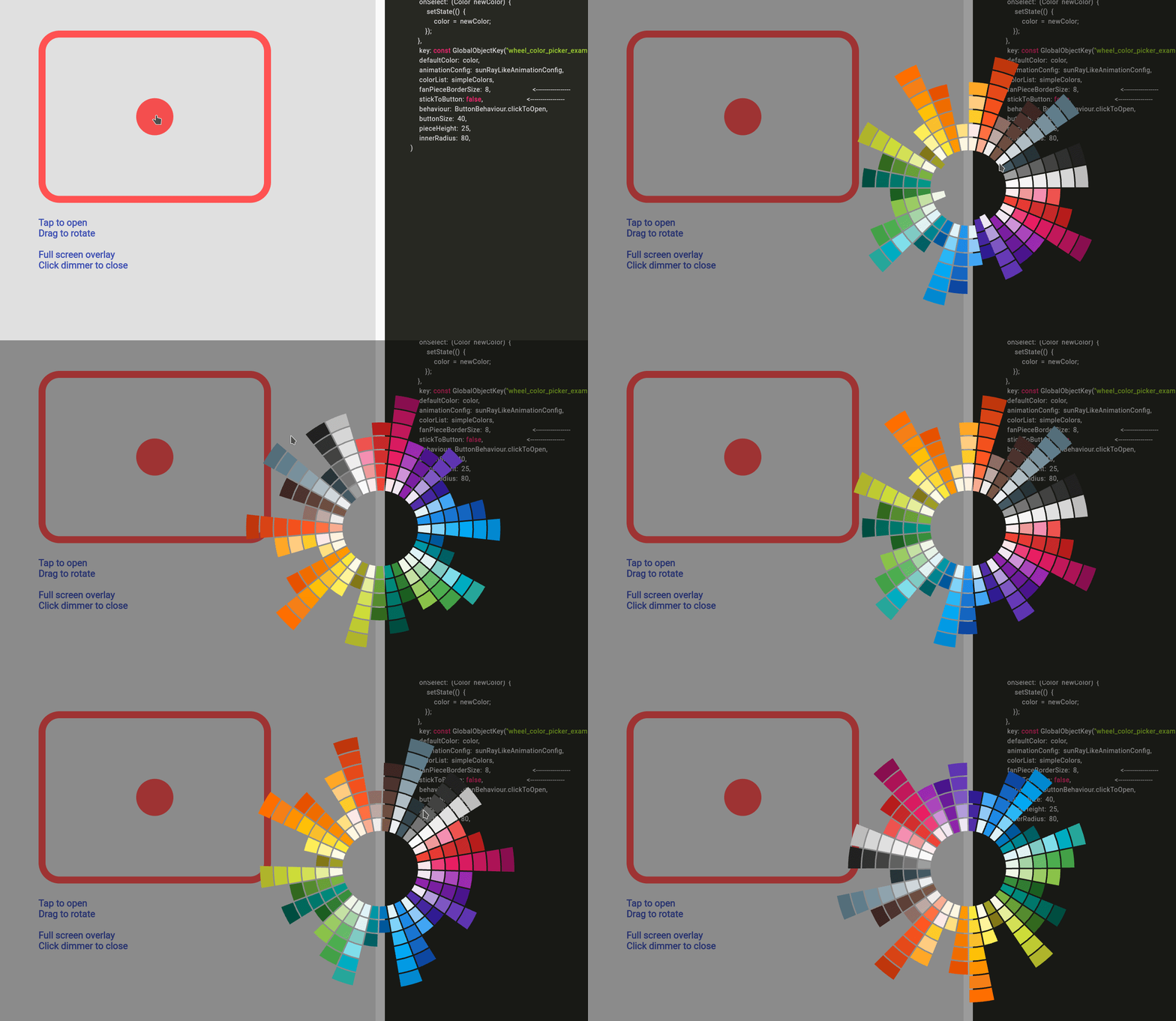
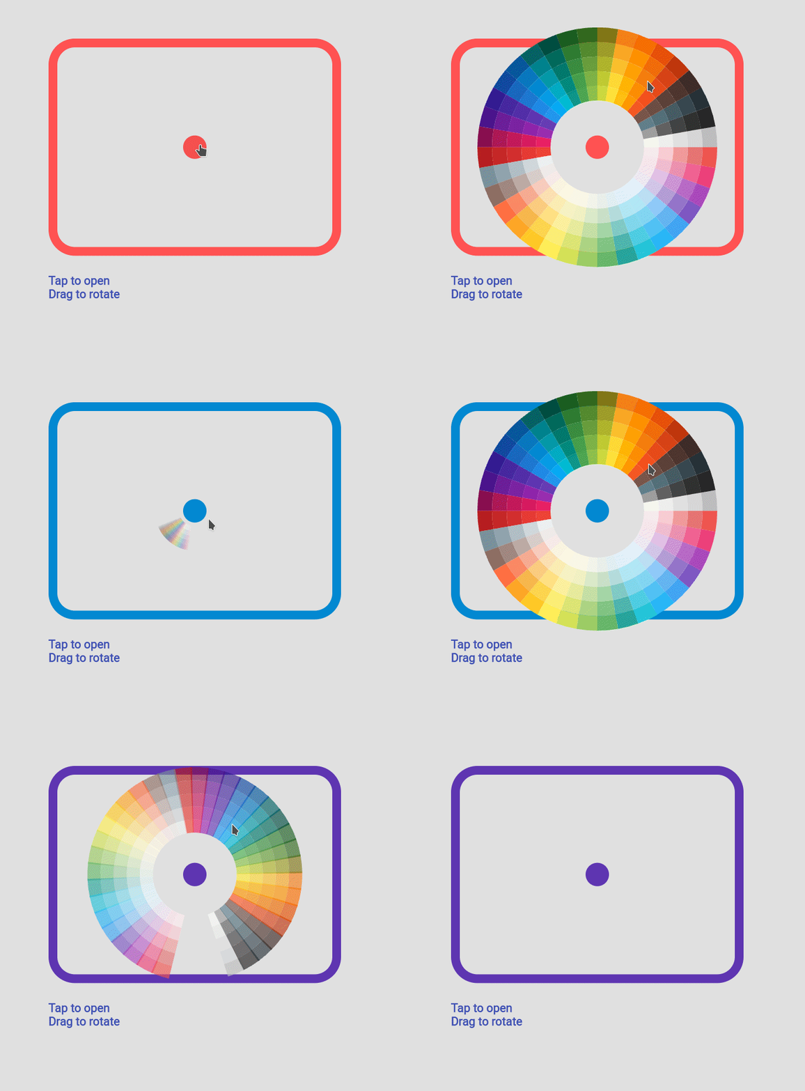
Fan default Fan Default Preset Fan simpleFan Simple Preset Ray Default Sun Ray Default
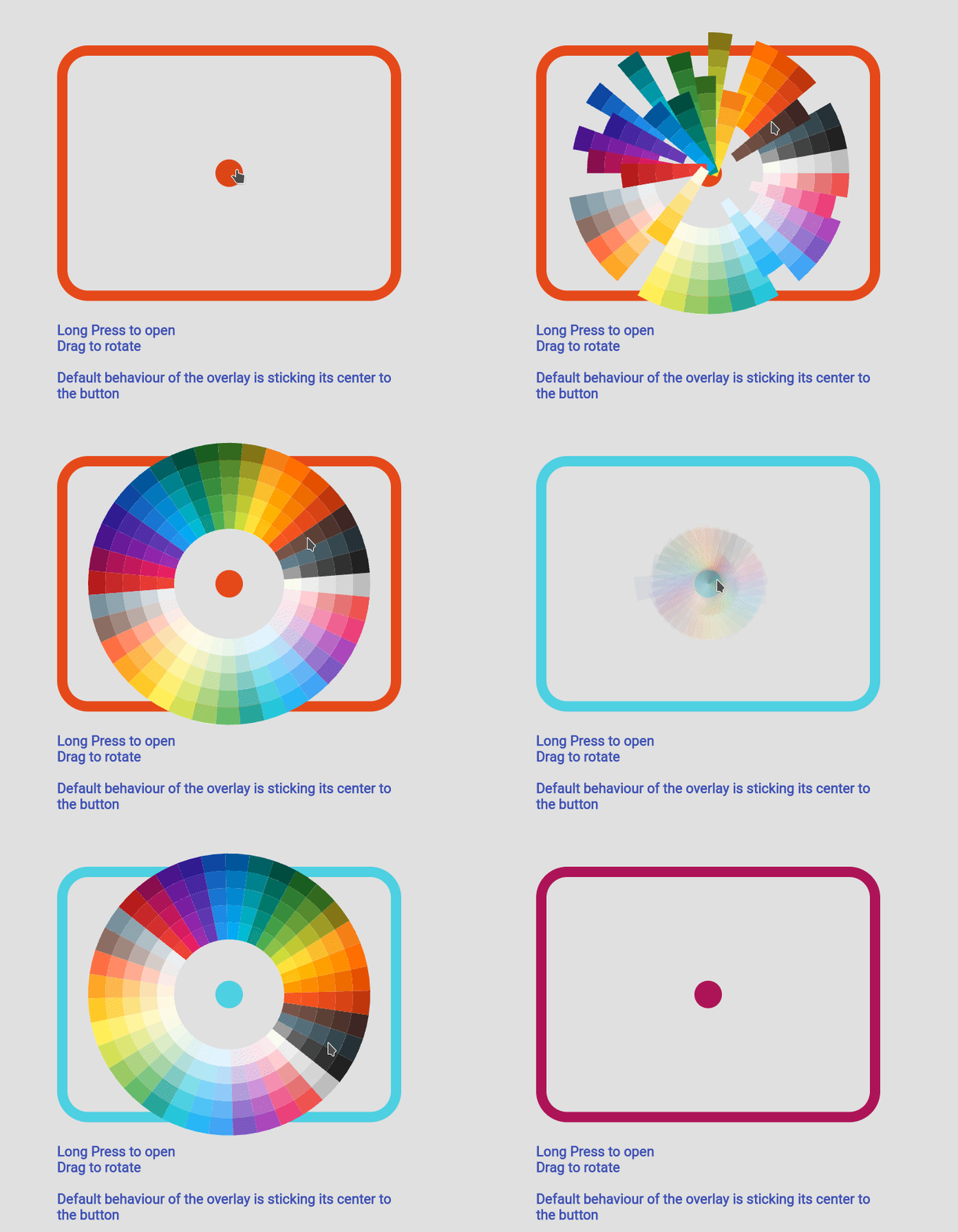
Sun Ray Simple Sun Ray Simple Detached Overlay default Detached Full Screen without Gap Detached Full Screen with gap Detached Full Screen with Gap
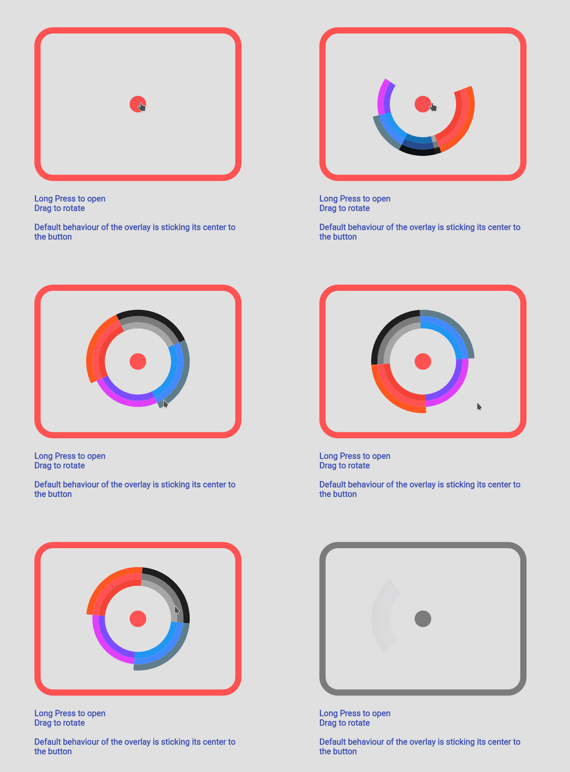
Custom Color Custom Color Set Custom Animation Custom Animation Manage your own OverlayEntry Manage Your Own OverlayEntry

Example Code

you can find more examples in the example path of this repository

Simple Usecase
Sun Ray Simple
import 'package:flutter_color_picker_wheel/flutter_color_picker_wheel.dart';

Color color; /// you want to initialize this color in the initState method

Widget myButton = WheelColorPicker(
  onSelect: (Color newColor) {
    setState(() {
       color = newColor;
    });
  },
  /// long press to open, another behaviour is clickToOpen to open
  behaviour: ButtonBehaviour.longPressToOpen,
  /// inital color
  defaultColor: color,
  /// fanLikeAnimationConfig is a preset, you can import this from the package
  animationConfig: fanLikeAnimationConfig,
  /// simpleColors is a preset, you can import this from the package
  colorList: simpleColors,
  /// size of the clickable button in the middle
  buttonSize: 40,
  /// height of each piece (outerRadius - innerRadius of a piece)
  pieceHeight: 25,
  /// starting radius of the donut shaped wheel
  innerRadius: 80,
);

Custom Color Set
Sun Ray Simple
WheelColorPicker(
  onSelect: (Color newColor) {
    setState(() {
      color = newColor;
    });
  },
  defaultColor: color,
  animationConfig: fanLikeAnimationConfig,
  colorList: const [
    [Colors.red, Colors.redAccent, Colors.deepOrange],
    [Colors.black26, Colors.black45, Colors.black87],
    [Colors.blue, Colors.blueAccent, Colors.blueGrey],
    [Colors.deepPurpleAccent, Colors.purpleAccent],
  ],
  buttonSize: 40,
  pieceHeight: 15,
  innerRadius: 80,
);

Custom Animation
Sun Ray Simple
WheelColorPicker(
  onSelect: (Color newColor) {
    setState(() {
      color = newColor;
    });
  },
  behaviour: ButtonBehaviour.clickToOpen,
  defaultColor: color,
  animationConfig: const FanAnimationConfig(
    animationDurationInMillisecond: 1000,
    rayAnimationConfig: RayAnimationConfig(
      curve: Curves.easeInQuad,
      enabled: false,
    ),
    scaleAnimationConfig: ScaleAnimationConfig(
      curve: Curves.easeInOutCubic,
      enabled: true,
      animationStartDelay: 0,
      animationFinishDelay: 0.2,
    ),
    opacityAnimationConfig: OpacityAnimationConfig(
      curve: Curves.linear,
      enabled: true,
      animationStartDelay: 0.2,
      animationFinishDelay: 0,
    ),
    rotationAnimationConfig: RotationAnimationConfig(
      curve: Curves.easeInQuad,
      enabled: true,
      animationFinishDelay: 0.4
    )
  ),
  colorList: defaultAvailableColors,
  buttonSize: 40,
  pieceHeight: 25,
  innerRadius: 80,
)

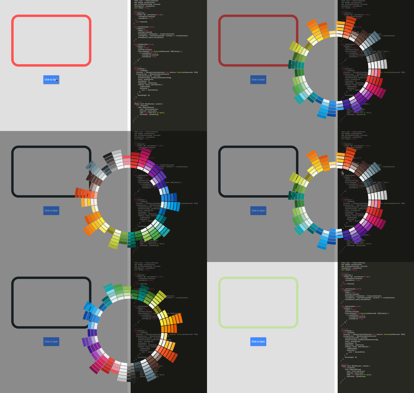
Using WheelColorPickerEntryContent
Sun Ray Simple

Note: This use case is a bit complicated.

If you decided to go this route there are several core ideas that you need to wrap your head around.

  • WheelOverlayEntryContent should be generated only ONCE but not generated each build. You can have a new OverlayEntry, but you only need one WheelOverlayEntryContent. This helps us to have a decent performance.
  • To stick the WheelOverlayEntryContent to some component, you want to use LayerLink. See WheelColorPicker as an example
  • You need to provide AnimationController to the Widget, thus you want to extend some ticker provider, eg. SingleTickerProviderStateMixin

Example:

class ExampleUseOverlayOnlyState extends State<ExampleUseOverlayOnly> with SingleTickerProviderStateMixin {
  Color color = Colors.redAccent;
  late Widget overlayContent;
  late AnimationController controller;
  OverlayEntry? _overlayEntry;
  bool isOpen = false;

  @override
  void dispose() {
    if (_overlayEntry != null) {
      _overlayEntry!.remove();
      _overlayEntry = null;
    }
    controller.dispose();
    super.dispose();
  }

  void _showOverlay() async {
    if (!isOpen) {
      isOpen = true;
      controller.forward();
      OverlayState? overlayState = Overlay.of(context);
      _overlayEntry = OverlayEntry(builder: (context) => overlayContent);
      overlayState?.insert(_overlayEntry!);
    }
  }

  void _hideOverlay() async {
    if (isOpen) {
      isOpen = false;
      controller.reverse();
      Future.delayed(const Duration(milliseconds: 500)).then((_) {
        if (_overlayEntry != null) {
          _overlayEntry!.remove();
          _overlayEntry = null;
        }
      });
  }
  }

  @override
  void initState() {
    super.initState();
    controller = AnimationController(vsync: this, duration:Duration(milliseconds: 500));
    overlayContent = WheelOverlayEntryContent(
      animationController: controller,
      animationConfig: sunRayLikeAnimationConfig,
      colors: simpleColors,
      innerRadius: 200,
      pieceHeight: 20,
      pieceBorderSize: 5,
      hideOverlay: _hideOverlay,
      onSelect: (Color selectedColor) {
        _hideOverlay();
        setState(() {
          color = selectedColor;
        });
      },
    );
  }

  @override
  Widget build(BuildContext context) {
    return Container(
      padding: const EdgeInsets.all(150),
      child: Column(
        children:[
          Expanded(
            flex:12,
            child: Container(
              height: 500,
              width: 500,
              decoration: BoxDecoration(
                borderRadius: BorderRadius.circular(45),
                border: Border.all(
                  width: 15,
                  color: color
                )
              ),
            )
          ),
          const Expanded(flex:2, child: SizedBox()),
          Expanded(
            flex:2,
            child: MaterialButton(
              color: Colors.blueAccent,
              textColor: Colors.white,
              child: const Text("Click to Open"),
              onPressed: _showOverlay,
            ),
          ),
        ],
      )
    );
  }
}

カテゴリー

依存関係

依存関係一覧 1 件

ソースリポジトリ

このパッケージを使用しているプロジェクト

データはまだありません。