パッケージ、リポジトリ、アプリカテゴリを検索

flutter_date_picker_timeline のカバー
パッケージ詳細v0.3.3

flutter_date_picker_timeline

水平タイムラインとしてのカスタマイズ可能なグレゴリオ暦およびジャラリ暦の日付ピッカー

AndroidiOSWebmacOSWindowsLinux
30日間ダウンロード
103
いいね数
86
Pub ポイント
130

パッケージをインストール

flutter pub add flutter_date_picker_timeline

パッケージ概要

公開情報に基づく選定ガイドです。参考としてご利用ください。

Flutter用のカスタマイズ可能な日付ピッカーで、日付を水平なタイムラインとして表示し、グレゴリオ暦とジャラーリー(ペルシャ)暦の両方をサポートしています。滑らかなスクロールと視覚フィードバックにより、ユーザーが直感的に日付を選択できるようにします。スケジューリング、計画、カレンダーに基づくワークフローなど、長期にわたる日付ナビゲーションが必要なアプリ向けに設計されています。Android、iOS、Web、macOS、Windows、Linuxなどの主要プラットフォームすべてで動作します。

用途

  • スケジューリングアプリケーション
  • カレンダーに基づくタスクプランナー
  • イベント予約インターフェース
  • 旅行スケジュール管理
  • 長期プロジェクトのスケジュール

主な機能

  • グレゴリオ暦およびジャラーリ暦をサポートしています
  • 水平スクロール可能なタイムラインインターフェース
  • カスタマイズ可能な外観とスタイル
  • クロスプラットフォーム互換性
  • スムーズな日付ナビゲーション
  • 日付範囲および選択モードのカスタマイズ

適している対象

  • 長期にわたり日付選択が必要なアプリ
  • ペルシャ語を話すユーザーをターゲットにする開発者
  • 二重カレンダー対応を必要とするプロジェクト
  • UI重視のカレンダ実装
  • マルチプラットフォームのFlutterアプリケーション

注意事項

  • 最適なUXを実現するには、追加のスタイリングが必要になる場合があります
  • 非常に大きな日付範囲でのパフォーマンス
  • 日付選択以外の組み込み検証は限定的
  • 英語以外のロケールでは外部ローカリゼーションに依存しています

元の README

関連するソースリポジトリの README 原文のスナップショットです。最新の内容はリポジトリをご覧ください。

Flutter Date Picker Timeline

Flutter Date Picker Timeline Banner pub package

💥 Gregorian and Jalali customizable date picker as a horizontal timeline 💥

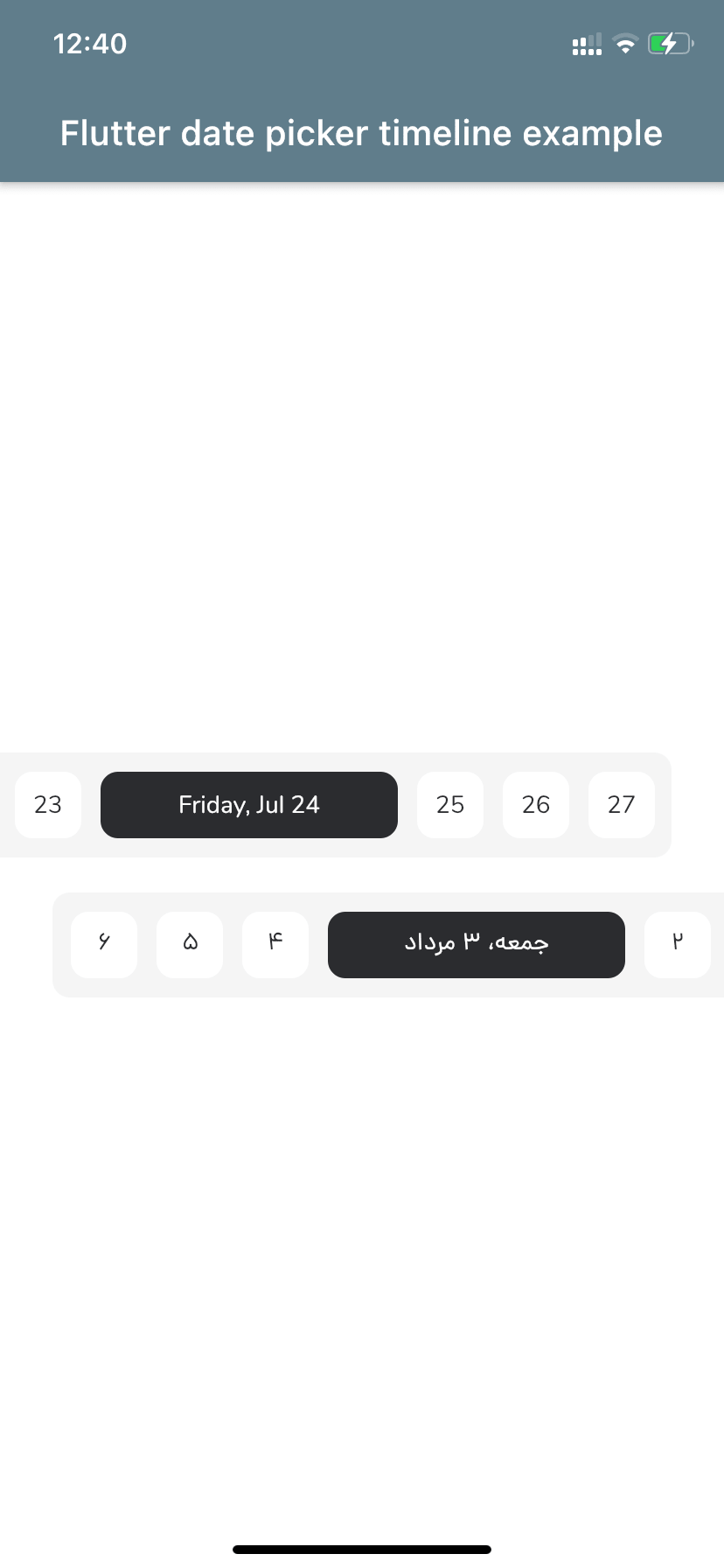
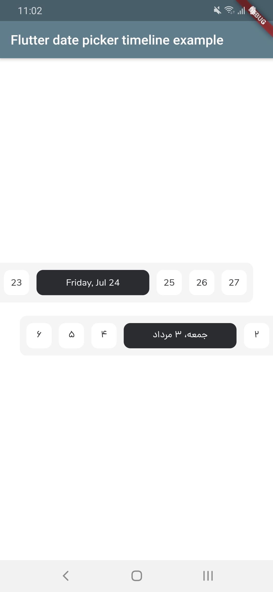
Screenshot iOS      Screenshot android


Let's get started

1 - Depend on it
Add it to your package's pubspec.yaml file
dependencies:
  flutter_date_picker_timeline: ^0.3.3
2 - Install it
Install packages from the command line
flutter pub get
3 - Import it
Import it to your project
import 'package:flutter_date_picker_timeline/flutter_date_picker_timeline.dart';

How to use?

Use the FlutterDatePickerTimeline Widget
FlutterDatePickerTimeline(
    startDate: DateTime(2020, 07, 01),
    endDate: DateTime(2020, 12, 30),
    initialSelectedDate: DateTime(2020, 07, 24),
    onSelectedDateChange: (DateTime dateTime) {
        print(dateTime);
      },
    )
Constructor:
FlutterDatePickerTimeline({
    Key key,
    // Determines the [FlutterDatePickerTimeline] mode.
    this.calendarMode = CalendarMode.gregorian,
    // The first date of [FlutterDatePickerTimeline].
    @required this.startDate,
    // The last date of [FlutterDatePickerTimeline].
    @required this.endDate,
    // Initially selected date.
    this.initialSelectedDate,
    // Initially focused date(If nothing is provided, a [initialSelectedDate] will be used).
    this.initialFocusedDate,
    // Used for setting the textDirection of [FlutterDatePickerTimeline].
    this.textDirection,
    // Used for setting the width of selected items.
    this.selectedItemWidth = 170,
    // Used for setting the width of unselected items.
    this.unselectedItemWidth = 38,
    // Used for setting the height of selected and unselected items.
    this.itemHeight = 38,
    // Used for setting the radius of selected and unselected items background.
    this.itemRadius = 10,
    // Used for setting the padding of [ListView].
    this.listViewPadding = const EdgeInsets.only(right: 5.5, left: 5.5),
    // Used for setting the margin of selected items.
    this.selectedItemMargin = const EdgeInsets.only(right: 5.5, left: 5.5),
    // Used for setting the margin of unselected items.
    this.unselectedItemMargin = const EdgeInsets.only(right: 5.5, left: 5.5),
    // Used for setting the color of selected items background.
    this.selectedItemBackgroundColor = const Color(0xFF2B2C30),
    // Used for setting the color of unselected items background.
    this.unselectedItemBackgroundColor = Colors.white,
    // Used for setting the style of selected items [Text].
    this.selectedItemTextStyle,
    // Used for setting the style of unselected items [Text].
    this.unselectedItemTextStyle,
    // Called whenever any date gets selected.
    @required this.onSelectedDateChange,
  }) : super(key: key);

Props

props types defaultValues
calendarMode CalendarMode CalendarMode.gregorian
startDate DateTime
endDate DateTime
initialSelectedDate DateTime?
initialFocusedDate DateTime? If nothing is provided, a [initialSelectedDate] will be used
textDirection TextDirection? If nothing is provided, a [calendarMode] will be used. (CalendarMode.gregorian -> TextDirection.ltr , CalendarMode.jalali -> TextDirection.rtl)
selectedItemWidth double 170
unselectedItemWidth double 38
itemHeight double 38
itemRadius double 10
listViewPadding EdgeInsets const EdgeInsets.only(right: 5.5, left: 5.5)
selectedItemMargin EdgeInsets const EdgeInsets.only(right: 5.5, left: 5.5)
unselectedItemMargin EdgeInsets const EdgeInsets.only(right: 5.5, left: 5.5)
selectedItemBackgroundColor Color const Color(0xFF2B2C30)
unselectedItemBackgroundColor Color Colors.white
selectedItemTextStyle TextStyle? TextStyle(fontFamily: widget.calendarMode == CalendarMode.gregorian ? 'nunito' : 'dana', package: 'flutter_date_picker_timeline', color: widget.unselectedItemBackgroundColor)
unselectedItemTextStyle TextStyle? TextStyle(fontFamily: widget.calendarMode == CalendarMode.gregorian ? 'nunito' : 'dana', package: 'flutter_date_picker_timeline', color: widget.selectedItemBackgroundColor)
onSelectedDateChange DateChangeListener

カテゴリー

依存関係

依存関係一覧 3 件

ソースリポジトリ

このパッケージを使用しているプロジェクト

データはまだありません。