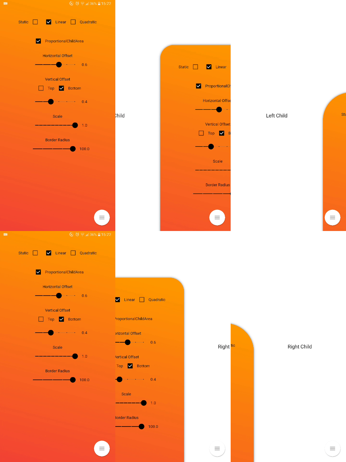
Inner Drawer is an easy way to create an internal side section (left/right) where you can insert a list menu or other.
Installing
Add this to your package's pubspec.yaml file:
dependencies:
  flutter_inner_drawer: "^1.0.0+1"
Demo
Simple usage
import'package:flutter_inner_drawer/inner_drawer.dart';
.
.
.
@overrideWidgetbuild(BuildContext context)
{
returnInnerDrawer(
key: _innerDrawerKey,
onTapClose: true, // default false
swipe: true, // default true
colorTransitionChild: Color.red, // default Color.black54
colorTransitionScaffold: Color.black54, // default Color.black54//When setting the vertical offset, be sure to use only top or bottom
offset: IDOffset.only(bottom: 0.05, right: 0.0, left: 0.0),
scale: IDOffset.horizontal( 0.8 ), // set the offset in both directions
proportionalChildArea : true, // default true
borderRadius: 50, // default 0
leftAnimationType: InnerDrawerAnimation.static, // default static
rightAnimationType: InnerDrawerAnimation.quadratic,
backgroundDecoration: BoxDecoration(color: Colors.red ), // default Theme.of(context).backgroundColor//when a pointer that is in contact with the screen and moves to the right or left
onDragUpdate: (double val, InnerDrawerDirection direction) {
// return values between 1 and 0print(val);
// check if the swipe is to the right or to the leftprint(direction==InnerDrawerDirection.start);
},
innerDrawerCallback: (a) => print(a), // return true (open) or false (close)
leftChild: Container(), // required if rightChild is not set
rightChild: Container(), // required if leftChild is not set// A Scaffold is generally used but you are free to use other widgets// Note: use "automaticallyImplyLeading: false" if you do not personalize "leading" of Bar
scaffold: Scaffold(
appBar: AppBar(
automaticallyImplyLeading: false
),
)
/* OR
CupertinoPageScaffold(
navigationBar: CupertinoNavigationBar(
automaticallyImplyLeading: false
),
),
*/
)
}
// Current State of InnerDrawerStatefinalGlobalKey<InnerDrawerState> _innerDrawerKey = GlobalKey<InnerDrawerState>();
void_toggle()
{
_innerDrawerKey.currentState.toggle(
// direction is optional // if not set, the last direction will be used//InnerDrawerDirection.start OR InnerDrawerDirection.end
direction: InnerDrawerDirection.end
);
}
InnerDrawer Parameters
PropName
Description
default value
scaffold
A Scaffold is generally used but you are free to use other widgets
required
leftChild
Inner Widget
required if rightChild is not set
rightChild
Inner Widget
required if leftChild is not set
leftOffset(deprecated)
Offset drawer width
0.4
rightOffset(deprecated)
Offset drawer width
0.4
leftScale(deprecated)
Left scaffold scaling
1
rightScale(deprecated)
Right scaffold scaling
1
offset
Offset InnerDrawer width
IDOffset.horizontal(0.4)
scale
Scaffold scaling
IDOffset.horizontal(1)
proportionalChildArea
If true, dynamically sets the width based on the selected offset, otherwise it leaves the width at 100% of the screen.
true
borderRadius
For scaffold border
0
onTapClose
Tap on the Scaffold closes it
false
swipe
activate or deactivate the swipe
true
swipeChild
activate or deactivate the swipeChild
false
duration
Animation Controller duration
Duration(milliseconds: 246)
velocity
Allows you to set the opening and closing velocity when using the open/close methods
Optional callback that is called when a InnerDrawer is opened or closed
onDragUpdate
When a pointer that is in contact with the screen and moves to the right or left
_innerDrawerKey.currentState.open
Current State of GlobalKey(check example) - OPEN
_innerDrawerKey.currentState.close
Current State of GlobalKey(check example) - CLOSE
_innerDrawerKey.currentState.toggle
Current State of GlobalKey(check example) - OPEN or CLOSE
Donate
It takes time to carry on this project. If you found it useful or learned something from the source code please consider the idea of donating 5, 20, 50 € or whatever you can to support the project.
Issues
If you encounter problems, open an issue. Pull request are also welcome.