パッケージ、リポジトリ、アプリカテゴリを検索

flutter_pannable_rating_bar のカバー
パッケージ詳細v2.7.2+1

flutter_pannable_rating_bar

Flutter用の汎用的でカスタマイズ可能なレーティングバーです。このバーは、任意の分数値を選択できる点で他と異なります。ドラッグ、タップ、ホバーイベントすべてに対応しています。

AndroidiOSWebmacOSWindowsLinux
30日間ダウンロード
50
いいね数
35
Pub ポイント
150

パッケージをインストール

flutter pub add flutter_pannable_rating_bar

パッケージ概要

公開情報に基づく選定ガイドです。参考としてご利用ください。

Flutter用の高度にカスタマイズ可能なレーティングバーで、任意の分数値を選択できます。従来のレーティングバーとは異なり、ドラッグ、タップ、ホバーイベントを通じてスムーズなインタラクションを実現し、デバイス間で応答性があり直感的なユーザー体験を提供します。レビューまたはアンケートなど、正確なフィードバック入力が必要なアプリケーションに最適です。このパッケージは、Android、iOS、Web、macOS、Windows、Linuxを含むすべての主要プラットフォームと互換性があります。

用途

  • ユーザーのレビューと細かい評価
  • インタラクティブなアンケートインターフェース
  • アプリにおけるフィードバック収集
  • リアルタイムでの評価調整
  • タッチ対応のUIコンポーネント

主な機能

  • 小数点付きの評価をサポート
  • ドラッグ、タップ、ホバー操作
  • 非常にカスタマイズ可能なデザイン
  • クロスプラットフォーム互換性
  • スムーズなアニメーションのトランジション
  • 設定可能なステップサイズ

適している対象

  • インタラクティブなフィードバックシステムを構築する開発者
  • 正確なレーティング入力が必要なアプリ
  • タッチ最適化UIを望むデザイナー
  • 複数のプラットフォームをターゲットにするプロジェクト
  • 動的レーティングコントロールを必要とするプロトタイプ

注意事項

  • 複雑なテーマには追加のスタイリングが必要になる場合があります
  • 大規模なレーティングバーのリストにおけるパフォーマンスへの影響
  • ジェスチャーの衝突を慎重に処理する必要がある
  • 基本的な使用法を超えるドキュメントは限られている
  • 非常に高い頻度の更新には最適化されていません

元の README

関連するソースリポジトリの README 原文のスナップショットです。最新の内容はリポジトリをご覧ください。

pub package

PannableRatingBar

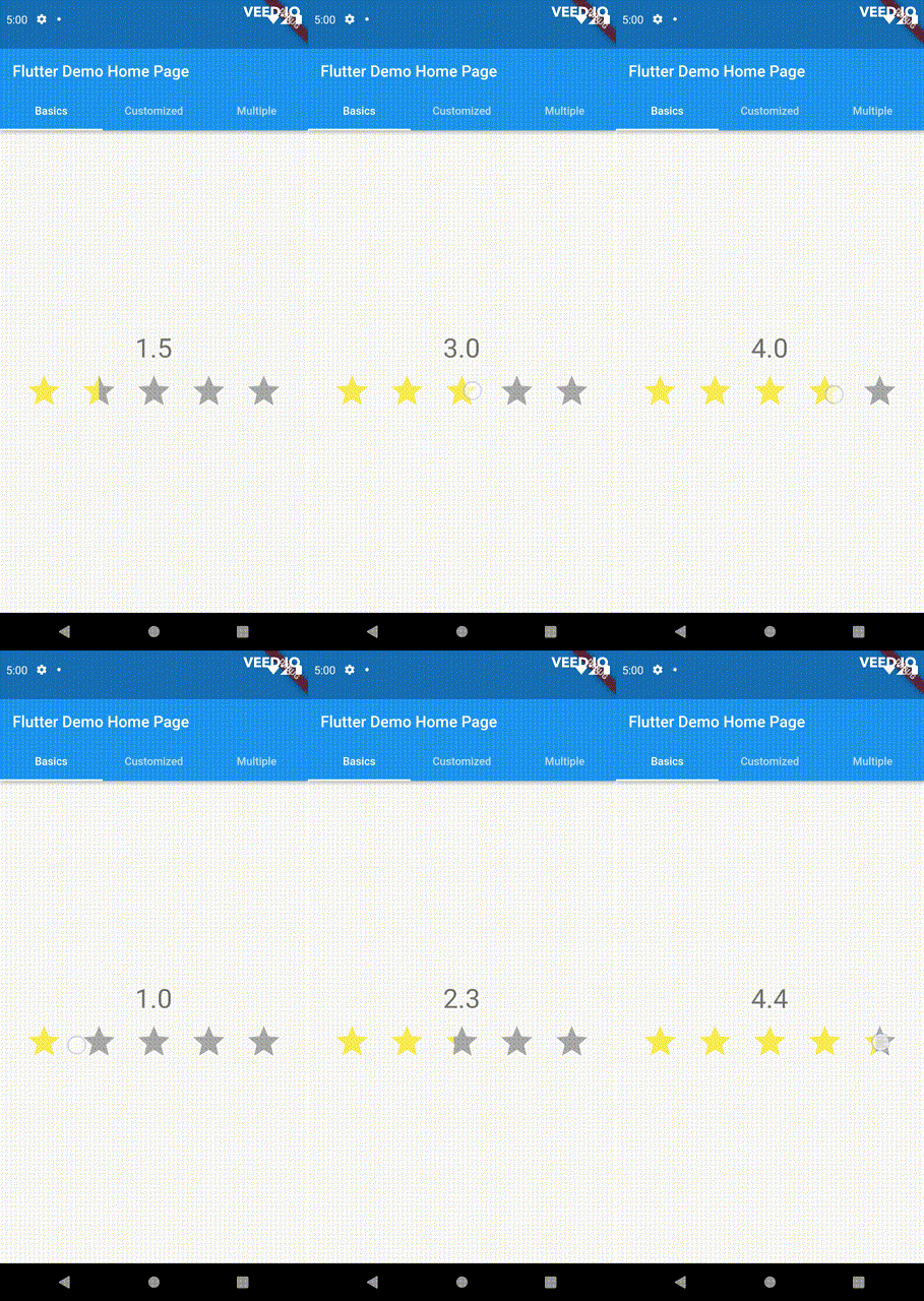
Introducing a new and improved rating bar for Flutter, offering versatility and full customization. Unlike other rating bars, this one allows for any value to be selected, not just full or half ratings when interacted. Tap, drag and hover gestures are seamlessly supported, providing a smooth user experience.

Features

  • Offers fractional values for rating
  • High degree of customization for the rating widgets, which can be of different sizes, shapes, and colors.
  • Precise hit testing, as the child widget's render object is utilized to determine the results.
  • Allows for filtering gestures with either tapOnly, dragOnly or tapAndDrag options.
  • Rating reports on cursor hovering supported.
  • Built on Flutter's Wrap widget, offering a variety of supported layouts, including consideration of Wrap properties such as textDirection and verticalDirection when painting the indicators.

Getting started

First import the widget

import 'package:flutter_pannable_rating_bar/flutter_pannable_rating_bar.dart';

Usage

This widget is stateless and highly flexible, allowing you to easily manipulate values and customize the display of the PannableRatingBar. Simply rebuild the widget with the value provided in the onChanged callback or onHover callback and the widget will automatically adjust the rating distribution across each rating widget.

double rating = 0.0;

PannableRatingBar(
  rate: rating,
  items: List.generate(5, (index) =>
    const RatingWidget(
      selectedColor: Colors.yellow,
      unSelectedColor: Colors.grey,
      child: Icon(
        Icons.star,
        size: 48,
      ),
    )),
  onChanged: (value) { // the rating value is updated on tap or drag.
    setState(() {
      rating = value;
    });
  },
)

The widget also supports getting the rate value by hovering with the onHover callback. It works best on devices that support a mouse cursor, including desktop web browsers.

double rating = 0.0;

PannableRatingBar(
  rate: rating,
  items: List.generate(5, (index) =>
    const RatingWidget(
      selectedColor: Colors.yellow,
      unSelectedColor: Colors.grey,
      child: Icon(
        Icons.star,
        size: 48,
      ),
    )),
  onHover: (value) { // the rating value is updated every time the cursor moves over a new item.
    setState(() {
      rating = value;
    });
  },
)

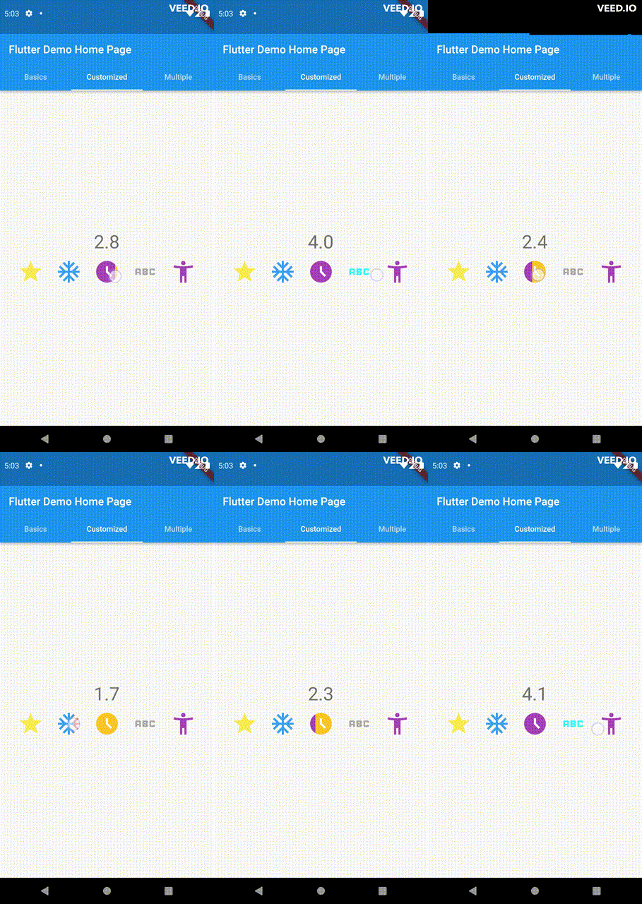
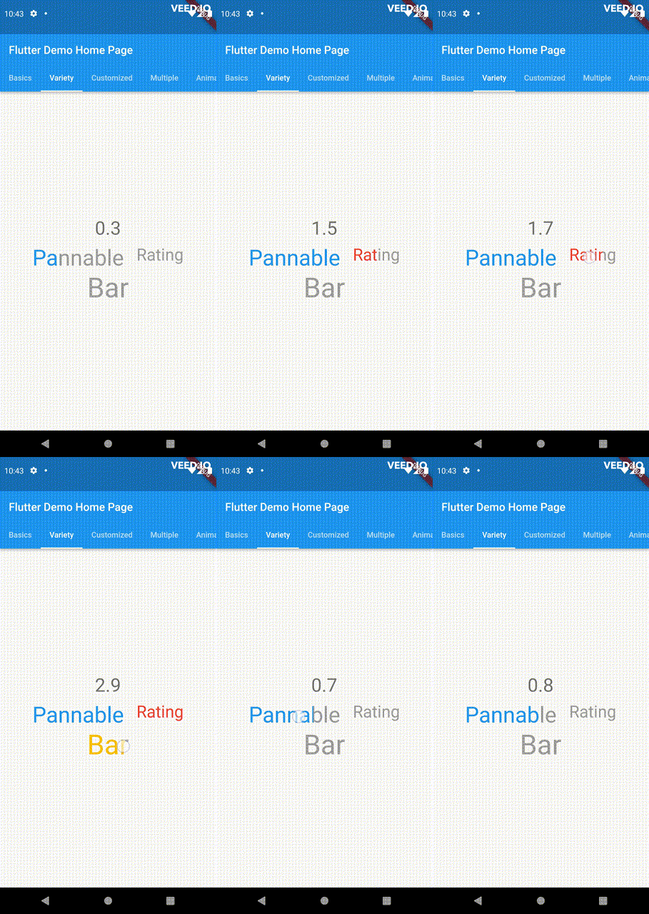
Utilize your own custom widgets as the rating indicators. With complete customization freedom, they don't have to be uniform in size, color, or any other aspect.

double rating = 0.0;

PannableRatingBar(
  rate: rating,
  onChanged: (value) {
    setState(() {
      rating = value;
    });
  },
  items: const [
    RatingWidget(
      selectedColor: Colors.yellow,
      unSelectedColor: Colors.grey,
      child: Icon(
        Icons.star,
        size: 48,
      ),
    ),
    RatingWidget(
      selectedColor: Colors.blue,
      unSelectedColor: Colors.red,
      child: Icon(
        Icons.ac_unit,
        size: 48,
      ),
    ),
    RatingWidget(
      selectedColor: Colors.purple,
      unSelectedColor: Colors.amber,
      child: Icon(
        Icons.access_time_filled,
        size: 48,
      ),
    ),
    RatingWidget(
      selectedColor: Colors.cyanAccent,
      unSelectedColor: Colors.grey,
      child: Icon(
        Icons.abc,
        size: 48,
      ),
    ),
    RatingWidget(
      selectedColor: Colors.tealAccent,
      unSelectedColor: Colors.purple,
      child: Icon(
        Icons.accessibility_new_sharp,
        size: 48,
      ),
    ),
  ],
)
double rating = 0;
PannableRatingBar(
  rate: rating,
  onChanged: (value){
    setState((){
      rating = value;
    });
  },
  spacing: 20,
  items: const [
    RatingWidget(
      selectedColor: Colors.blue,
      child: Text(
        "Pannable",
        style: TextStyle(color: Colors.grey, fontSize: 40),
      ),
    ),
    RatingWidget(
      selectedColor: Colors.red,
      child: Text(
        "Rating",
        style: TextStyle(color: Colors.grey, fontSize: 30),
      ),
    ),
    RatingWidget(
      selectedColor: Colors.amber,
      child: Text(
        "Bar",
        style: TextStyle(color: Colors.grey, fontSize: 50),
      ),
    ),
  ],
),

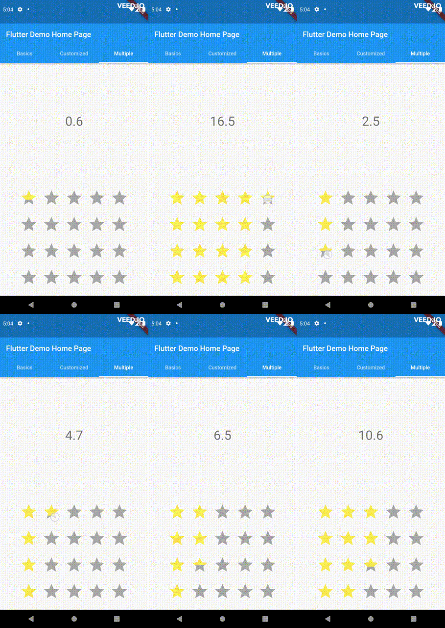
This widget utilizes the layout capabilities of Flutter's built-in Wrap widget, allowing for a wide range of possible layouts to be achieved. The properties of the Wrap widget, such as textDirection and verticalDirection, are also considered when painting the indicators, giving you even greater control over the final look and feel of the rating bar.

double rating = 0.0;

PannableRatingBar.builder(
  rate: rating,
  alignment: WrapAlignment.center,
  spacing: 20,
  runSpacing: 10,
  itemCount: 20,
  direction: Axis.vertical,
  itemBuilder: (context, index) {
    return const RatingWidget(
      selectedColor: Colors.yellow,
      unSelectedColor: Colors.grey,
      child: Icon(
        Icons.star,
        size: 48,
      ),
    );
  },
  onChanged: (value) {
    setState(() {
      rating = value;
    });
  },
)

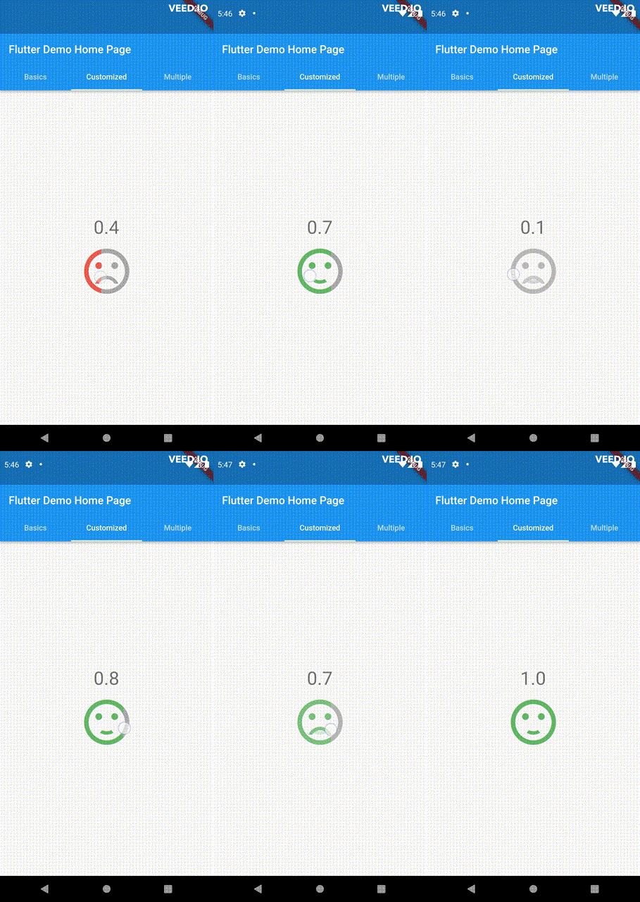
Customize the appearance of the rating indicators based on their values.

double rating = 0;

PannableRatingBar(
    rate: rating,
    spacing: 20,
    onChanged: (value){
      setState((){
        rating = value;
      });
    },
    items: [
      RatingWidget(
        selectedColor: rating <= 0.5 ? Colors.red : Colors.green,
        unSelectedColor: Colors.grey,
        child: AnimatedSwitcher(
          duration: const Duration(milliseconds: 300),
          child: rating <= 0.5
              ? const Icon(
                  Icons.sentiment_very_dissatisfied,
                  key: ValueKey("sad"),
                  size: 100,
                )
              : const Icon(
                  Icons.sentiment_satisfied,
                  key: ValueKey("happy"),
                  size: 100,
                ),
        ),
      ),
    ],
),

For ease of transforming / mutating rating values, the library support using functions to do as such, used as a parameter in PannableRatingBar.

Return null from this will cause the current rating value skipped in all callbacks.

typedef RatingValueTransformer = double? Function(double value);

Some of the pre-built RatingValueTransformers available are:

// Rounding to nearest single fractional digit. This is also the default one that 
// `PannableRatingBar` used.
double singleFractionalValueTransformer(double value);
// Rounding to nearest .5.
double halfFractionalValueTransformer(double value);
// Leave the rating as is.
double rawValueTransformer(double value);

Additional information

For more, checkout and play with the example file. If you have any suggestions for improvement, simply create an issue in the repository!

カテゴリー

ソースリポジトリ

このパッケージを使用しているプロジェクト

データはまだありません。