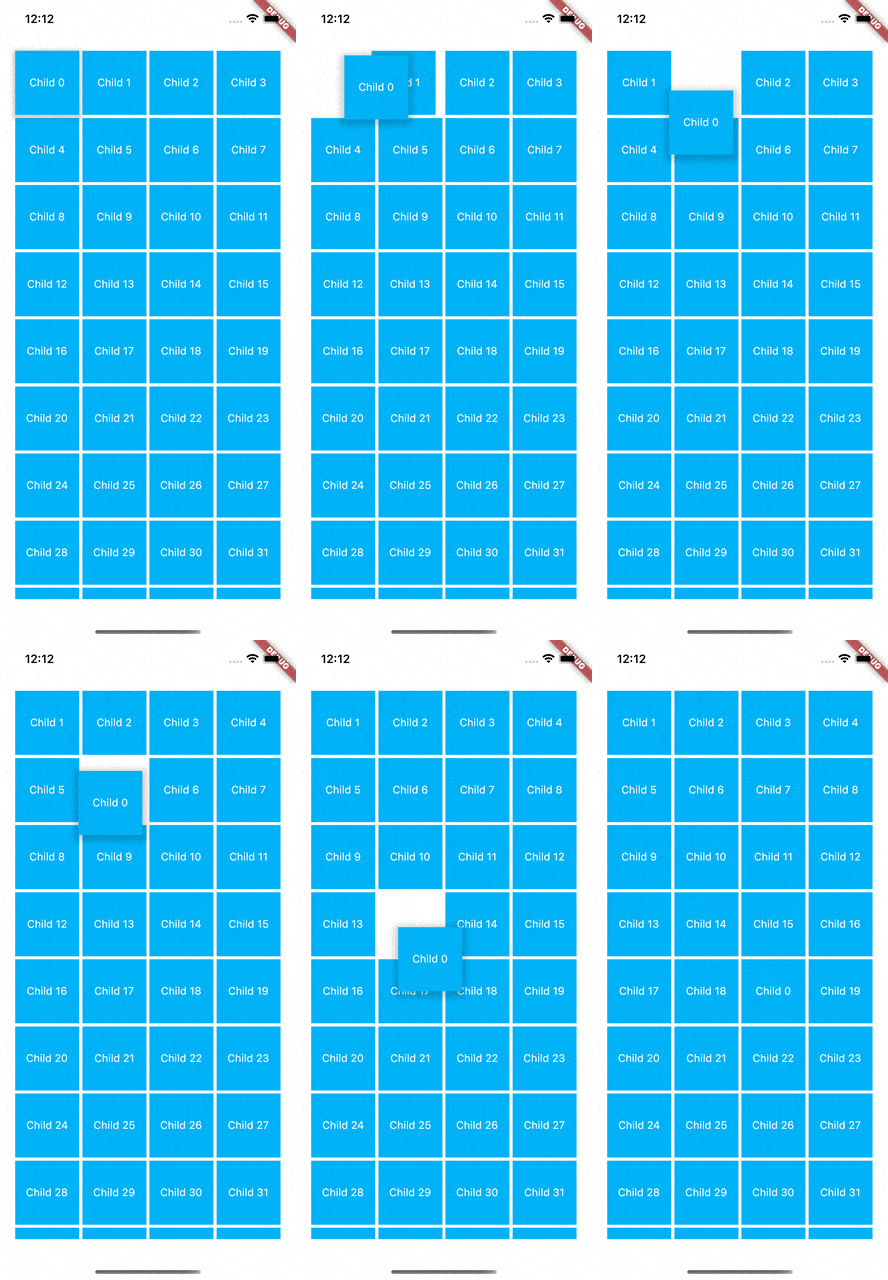
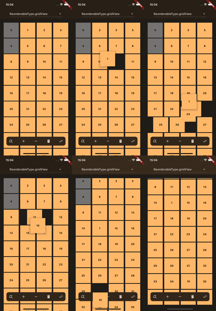
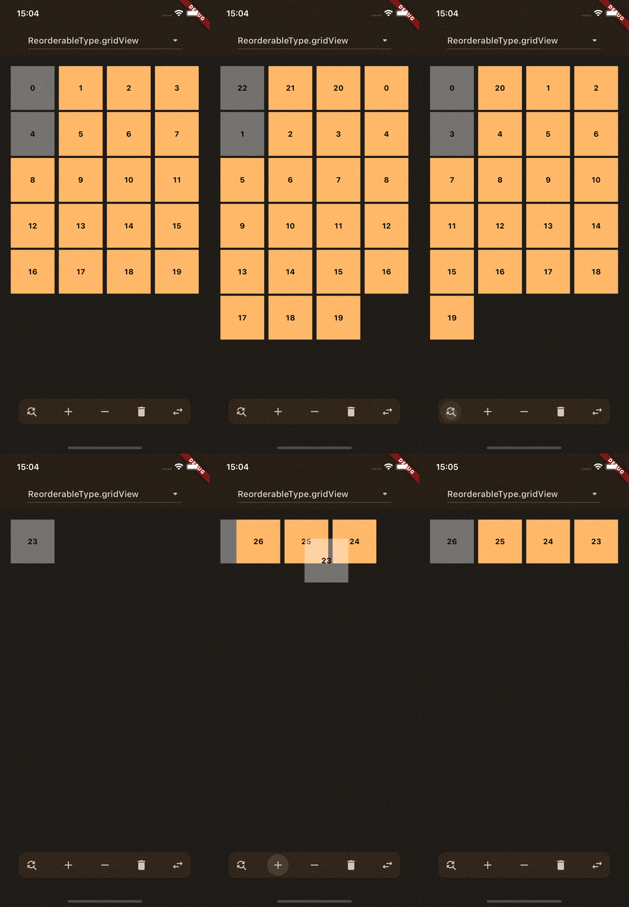
Package for having animated Drag and Drop functionality for every type of GridView and to have animations when changing the size of children inside your GridView.
ReorderableBuilder provides two main functionalities: Drag and Drop and Animations.
To use this widget, wrap ReorderableBuilder around your GridView. For more details, refer to the Getting Started section.
Important: Ensure each child within the GridView has a unique key.
ScrollController
When using a scrollable GridView, ReorderableBuilder requires a ScrollController.
This means you must assign the ScrollController to both the scrollable widget and ReorderableBuilder.
For more details, check out the example in inner_scrollable_example.dart.
If the parent is a scrollable widget, you should not assign a ScrollController.
In this case, the widget automatically looks up the ScrollController.
Assigning one manually can cause issues with drag-and-drop functionality.
For more details, check out the example in outer_scrollable_example.dart.
If no ScrollController is assigned and no ScrollController is found within the context, it indicates that the GridView is not scrollable.
For more details, check out the example in no_scrollable_example.dart.
Drag and Drop
The drag-and-drop functionality is enabled by default.
To ensure proper reordering, you must implement the onReorder callback to update your list of children.
Without this, the reorder operation will not work and may cause issues.
Scroll while dragging
While dragging a child, moving it to the top or bottom of your GridView will trigger automatic scrolling.
You can disable this behavior by setting enableScrollingWhileDragging to false.
Animations
Types of Animations
There are two types of animations:
Drag and Drop:
This animation ensures smooth positioning of the dragged child to any position (unless the position is locked).
While dragging, the movement of the other children is also animated.
List Updates:
These animations occur when updating your list of children by adding, removing, or modifying items.
For example, adding or removing a child at the beginning of the list affects the positions of all subsequent children (See the GIFs at the top of the page for examples).
Supported Widgets
Using ReorderableBuilder supports
GridView
GridView.count
GridView.extent
Using ReorderableBuilder.builder supports
GridView.builder
Parameters
Parameter
Description
Default Value
children
Displays all given children that are build inside a Wrap or GridView. Don't forget a unique key for every child.
-
childBuilder
Enable support for [GridView.builder] using this function. Don't forget a unique key for every child.
-
lockedIndices
Define all children that can't be moved while dragging. You need to add the index of this child in a list.
[]
nonDraggableIndices
Specify indices for [children] that are not draggable.
[]
animationConfig
Configuration for all child animations (fade in, position changes, drag feedback, release animation).
const ReorderableAnimationConfig()
enableLongPress
Deprecated. Use longPressDelay; for immediate drag set Duration.zero.
true
longPressDelay
Specify the duration before dragging starts after long-pressing the widget.
500 ms
enableDraggable
Enables the drag and drop functionality.
true
enableScrollingWhileDragging
Enables the functionality to scroll while dragging a child to the top or bottom.
true
automaticScrollExtent
Defines the height of the top or bottom before the dragged child indicates a scrolling.
150.0
dragChildBoxDecoration
When a child is dragged, you can override the default BoxDecoration of the dragged child.
-
reverse
Handles the reversed order of your children. Ensure to add this flag to your scrollable and this widget.
false
builder
It's required to use [ReorderableBuilder] to obtain updated [children].
-
onReorder
After releasing the dragged child, [onReorder] is called which contains a function as parameter to reorder all items.
-
onDragStarted
Callback when dragging starts with the index where it started.
-
onDragEnd
Callback when the dragged child was released with the index.
-
onUpdatedDraggedChild
Called when the dragged child has updated his position while dragging.
-
scrollController
ScrollController which should be also assigned to the scrollable widget. Don't forget this to prevent animation issues.
-
AnimationConfig Parameters
Use animationConfig to configure all animation durations and curves in one place.
Parameter
Description
Default Value
positionChangeDuration
Duration for item position changes outside active dragging.
200 ms
draggingPositionChangeDuration
Duration for item position changes while dragging.
200 ms
releasedItemDuration
Duration for the released dragged item to animate to its final position.
150 ms
fadeInDuration
Duration for fade-in when a new child is added.
500 ms
dragFeedbackDuration
Duration for scaling the drag feedback widget.
150 ms
positionChangeCurve
Curve for positionChangeDuration. Falls back to defaultAnimationCurve when null.
-
draggingPositionChangeCurve
Curve for draggingPositionChangeDuration. Falls back to defaultAnimationCurve when null.
-
releasedItemCurve
Curve for releasedItemDuration. Falls back to defaultAnimationCurve when null.
-
fadeInCurve
Curve for fadeInDuration. Falls back to defaultAnimationCurve when null.
-
dragFeedbackCurve
Curve for dragFeedbackDuration. Falls back to defaultAnimationCurve, then to Curves.linear if still null.
Curves.linear
defaultAnimationCurve
Global fallback curve for animation curve parameters when a specific curve is not provided.
-
enableAnimations
Enables or disables animations globally. If false, durations become Duration.zero and nullable curves resolve to null.
true
CustomDraggable
The CustomDraggable widget is a helper that can contain optional information to be added to Draggable or LongPressDraggable.
Ensure this widget wraps the child you intend to add to your GridView, as it should receive the unique key.
  CustomDraggable(
    // add your unique key here
    key: Key('unique'),
    // will be passed to `Draggable` or `LongPressDraggable`
    data: 'data',
    child: Placeholder(),
  ),
If you have feature requests or have found any issues, please feel free to open an issue on the GitHub project repository.
Contributions are also highly appreciated! If you'd like to contribute a new feature or bug fix,
opening a pull request is the way to go. This helps in getting updates and fixes out faster.