パッケージ、リポジトリ、アプリカテゴリを検索

flutter_responsive のカバー
パッケージ詳細v1.1.0

flutter_responsive

Flutter用のレスポンシブレイアウトウィジェット。このプラグインはBootstrapウェブプロジェクトにインスパイアされています。

AndroidiOSWebmacOSWindowsLinux
30日間ダウンロード
2060
いいね数
30
Pub ポイント
140

パッケージをインストール

flutter pub add flutter_responsive

パッケージ概要

公開情報に基づく選定ガイドです。参考としてご利用ください。

Flutter Responsive は、Bootstrap のアダプティブデザインのアプローチを参考にした、Flutterでレスポンシブなユーザーインターフェースを作成するためのレイアウトウィジェットのセットを提供しています。開発者は、さまざまな画面サイズや向きに対応して自動的に調整されるレイアウトを構築でき、複数のプラットフォームで動作します。複雑なカスタムロジックを必要とせずに、柔軟なグリッド、ブレークポイント、およびレスポンシブコンポーネントの実装を簡素化します。モバイル、タブレット、Web、デスクトップデバイスで一貫したUIが必要なアプリに最適です。

用途

  • クロスプラットフォーム対応のレスポンシブダッシュボードの構築
  • モバイルおよびウェブ用の適応型レイアウトを作成する
  • タブレットおよびデスクトップ向けのスケーラブルなUIの設計
  • グリッドベースのレスポンシブデザインの実装
  • デバイスの種類にかかわらず一貫したUXを確保する

主な機能

  • ブレイクポイントに基づくレイアウトの調整
  • 柔軟なグリッドシステム
  • クロスプラットフォーム互換性
  • Bootstrapを参考にしたデザインパターン
  • 既存のFlutterプロジェクトとの簡単な統合

適している対象

  • 複数のプラットフォームをターゲットにする開発者
  • レスポンシブな管理パネルを構築するチーム
  • アダプティブUIを必要とするプロジェクト
  • フロントエンド中心のFlutterアプリケーション
  • さまざまな画面サイズ要件を持つアプリ

注意事項

  • 新しいウィジェットの規則を学ぶ必要がある可能性があります
  • 手動レイアウトコーディングと比較してカスタマイズの選択肢が限られている
  • プラットフォーム固有のレンダリング動作に依存します
  • 通常のグリッドレイアウトに最適
  • 非常に動的なまたはグリッドでないUIには適していない

元の README

関連するソースリポジトリの README 原文のスナップショットです。最新の内容はリポジトリをご覧ください。

About flutter_responsive plugin

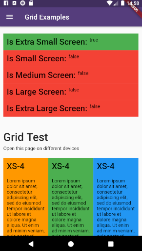
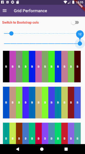
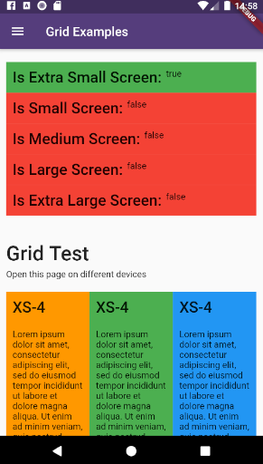
example_6 example_7

This plugin provides a easy and productive way to work with responsive layouts for Flutter Applications in mobile, desktop and web, allowing your layout to adapt and wrap widgets ( Container, Rows, Columns and RichText ) referent to the size of his parent element.

Made by Rafael Setragni to all Flutter's Community.

Licensing

This project follows the GNU General Public License V3, wich means you can change the entire project the way as you want to, but you need to share your improvements back to the community.

To share your improvements, please first do a Fork of this project, change what you need to and finally do a pull request. And don´t let to share your ideas and needs on "Issues" page, even before to start your changes.

IMPORTANT NOTES:

  • This plugin was based on Bootstrap Web Project, but do not implement all its features (not yet).
  • The column's layer responsiveness is based on the size of the global screen, such as Bootstrap does.
  • All the widgets contains margin, padding, width, height (maximum and minimum edges), such as div Html element.
  • Fell free to improve and change this project.

How to Use

Add the dependency bellow into your pubspec.yaml file.

dependencies:
  flutter_responsive: ^0.0.6 #Please, ensure to use the most updated version

Add the reference into your .dart files

import 'package:flutter_responsive/flutter_responsive.dart';

Use the Widgets ResponsiveContainer, ResponsiveRow, ResponsiveCol and JSX as the way you want to.

Screen Sizes

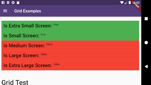
This plugin was based on Bootstrap web project and split the screen in 12 columns, considering 7 screen sizes:

  • US - Ultra Small Screens - 0px to 309px
  • XS - Extra Small Screens - 310px to 575px
  • SM - Small Screens - 576px to 767px
  • MD - Medium Screens - 768px to 991px
  • LG - Large Small Screens - 992px to 1199px
  • XL - Extra Large Screens - 1200px to 1999px
  • UL - Ultra Large Screens - 2000px and beyond

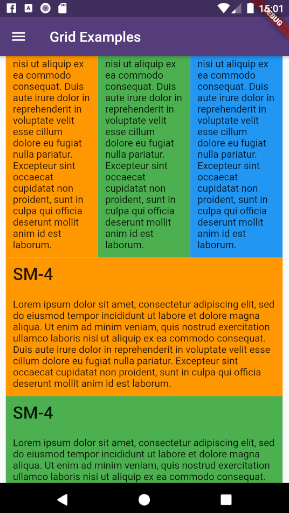
example_1 example_2 example_3 example_4

Personalizing limits (Optional)

All the limits could be personalized as you need, changing the limit Hashmap into ResponsiveScreen class.

/* Map<String, double> */
ResponsiveScreen.limits = {
    ScreenSize.us: 0.00,
    // Smart watches
    ScreenSize.xs: 310.00,
    // Small phones (5c)
    ScreenSize.sm: 576.00,
    // Medium phones
    ScreenSize.md: 768.00,
    // Large phones (iPhone X)
    ScreenSize.lg: 992.00,
    // Tablets
    ScreenSize.xl: 1200.00,
    // Laptops
    ScreenSize.ul: 2000.00,
    // Desktops and TVs 4K
  };

Grid Usage

This plugin have 3 major grid elements:

  • ResponsiveContainer: Container to all page elements, such as Rows and Columns, centralizing the content and beeing limited to a maximum width size
ResponsiveContainer(

  // Determines the container's limit size
  widthLimit: ResponsiveScreen.limits[ScreenSize.lg],
  margin: EdgeInsets.symmetric(horizontal: 10),
  
  children: <Widget>[
  
    ResponsiveRow(),
    ResponsiveRow(),
    ResponsiveRow(),
    
  ]
)
  • ResponsiveRow: Container wich contains many columns or even other widget. OBS: Its not necessary to wrap inner widgets into a ResponsiveCol object.
ResponsiveRow(

  margin: EdgeInsets.only(top: 20, bottom: 5),
  
  children: <Widget>[
  
    ResponsiveCol(),
    ResponsiveCol(),
    ResponsiveCol(),
    
    Text('It´s fine to use another widget directly inside a ResponsiveRow')
  ]
),
  • ResponsiveCol:
ResponsiveCol(
  margin: EdgeInsets.all(10),
  padding: EdgeInsets.all(10),
  backgroundColor: Colors.blue,
  gridSizes: {
      ScreenSize.xs : 4,
      ScreenSize.sm : 3,
      ScreenSize.lg : 2,
      ScreenSize.xl : 1,
  },
  children: [
      Text('Lorem ipsum dolor sit amet, consectetur adipiscing elit')
  ]
)

Full Example

import 'package:flutter/material.dart';
import 'package:flutter_responsive/flutter_responsive.dart';

class HomePage extends StatefulWidget {
  @override
  _HomePage createState() => _HomePage();
}

class _HomePage extends State<HomePage> {

  @override
  void initState() {
    super.initState();
  }

  @override
  Widget build(BuildContext context) {

    /*create 12 columns*/
    List<Widget> responsiveGridExample =

      /*repeat 12 times*/
      List<int>.generate(12, (index) => index).map((colIndex) =>
          ResponsiveCol(
              padding: EdgeInsets.all(10),
              backgroundColor: Colors.blue,
              gridSizes: {
                ScreenSize.xs : 4,
                ScreenSize.sm : 3,
                ScreenSize.lg : 2,
                ScreenSize.xl : 1,
              },
              children: [
                Text('Lorem ipsum dolor sit amet, consectetur adipiscing elit')
              ]
          )
      ).toList();

    MediaQueryData mediaQuery = MediaQuery.of(context);

    return Scaffold(
        appBar: AppBar(
          title: const Text('Home', overflow: TextOverflow.ellipsis),
        ),
        body: Container(
          color: Color(0xFFCCCCCC),
          child: ListView(
            children: <Widget>[
              ResponsiveContainer(
                margin: EdgeInsets.symmetric(vertical: 10),
                padding: EdgeInsets.symmetric(horizontal: 10),
                backgroundColor: Colors.white,
                widthLimit: mediaQuery.size.width * 0.95,
                children: <Widget>[
                  ResponsiveRow(
                    margin: EdgeInsets.symmetric(vertical: 10),
                    children: <Widget>[

                      ResponsiveCol(
                          padding: EdgeInsets.all(10),
                          margin: EdgeInsets.only(bottom: 20),
                          backgroundColor: Colors.blueGrey,
                          children: [
                            Text('Flutter Responsive Layout', style: JSXTypography.h4.merge(TextStyle(color: Colors.white)))
                          ]
                      ),
                    ]
                  ),
                  ResponsiveRow(
                    margin: EdgeInsets.symmetric(vertical: 10),
                    children: <Widget>[

                      // By default, the column occupies the entire row, always
                      ResponsiveCol(
                        children: [
                          JSX(
                            shrinkToFit: true,
                            padding: EdgeInsets.only(bottom: 20),
                            stylesheet: {
                              'h3': JSXStylesheet(
                                  textStyle: TextStyle(color: Theme.of(context).primaryColor),
                                  displayLine: DisplayLine.block
                              ),
                              'h6': JSXStylesheet(
                                  textStyle: TextStyle(color: Theme.of(context).primaryColor),
                                  displayLine: DisplayLine.block
                              )
                            },
                            margin: EdgeInsets.symmetric(horizontal: 10, vertical: 20),
                            text:
                            '<div>'
                                '<h3>Responsive Layouts</h3><h6>for <i>Flutter</i></h6>'
                                '<br><br>'
                                '<p>This <b>RichText</b> was easily produced and personalized using pure HTML</p>'
                                '<p>Bellow there is an example of 12 columns, wich changes the amount of each line depending of his father´s widget size.</p>'
                            '</div>',
                          )
                        ]
                      )

                    ]..addAll(
                        responsiveGridExample
                    )
                  )
                ],
              )
            ],
          ),
        )
    );
  }
}
Final result:

example_9

How to run the plugin example

This project is a starting point for a Flutter plug-in package, a specialized package that includes platform-specific implementation code for Android and/or iOS.

For help getting started with Flutter, view our online documentation, which offers tutorials, samples, guidance on mobile development, and a full API reference.

To run the full example App, wich contains performance and case tests, do the steps bellow:

  • Clone this project into your local machine using Github Desktop or any other git program of your preference.
  • Download Android Studio and the last Flutter SDK into your local machine. Configure they to works properly such as this article here
  • Run flutter pub get to update all the dependencies
  • Debug the file example/lib/main.dart or any of the unity case tests located on test folder on emulator or real device.
  • To run properly the performance tests, please run the app using flutter run --release

カテゴリー

ソースリポジトリ

このパッケージを使用しているプロジェクト

データはまだありません。