パッケージ、リポジトリ、アプリカテゴリを検索

パッケージ詳細v1.0.5

flutter_sizer

Flutter Sizer は、ヘルパーワジェットと拡張機能を提供することで、応答性のあるレイアウトの実装を支援します。

AndroidiOSWebmacOSWindowsLinux
30日間ダウンロード
942
いいね数
24
Pub ポイント
150

パッケージをインストール

flutter pub add flutter_sizer

パッケージ概要

公開情報に基づく選定ガイドです。参考としてご利用ください。

Flutter Sizerは、さまざまな画面サイズおよび向きに応じて適応するレイアウトを可能にするレスポンシブUIパッケージです。デバイスの画面寸法に基づいてフォント、サイズ、マージンを簡単にスケーリングできるヘルパー小道具と拡張機能を提供します。画面の幅と高さを活用することで、手動での計算なしにさまざまなデバイスで一貫したデザイン表示を実現します。最小限のボイラープレートコードで流動的かつスケーラブルなインターフェースを構築したい開発者に最適です。

用途

  • 複数の画面サイズ用のレスポンシブレイアウトを作成する
  • デバイス間でUI要素を比例的にスケーリングする
  • モバイルおよびWebアプリにおけるレスポンシブデザインの簡素化
  • 一貫した間隔とタイポグラフィを維持する
  • 一貫した外観でクロスプラットフォームアプリを構築する
  • UI コード内の手動サイズ計算の削減

主な機能

  • 画面サイズに応じたウィジェットの自動スケーリング
  • 簡単な単位変換のためのヘルパー拡張
  • 縦表示と横表示の両方をサポート
  • 数行のコードでの最小設定
  • クロスプラットフォーム互換性
  • Android、iOS、Web、macOS、Windows、Linux に対応する内蔵サポート

適している対象

  • 応答性のあるFlutterアプリケーションを開発する開発者
  • デバイス間で一貫したUIを重視するチーム
  • 迅速なレスポンシブレイアウトの実装を必要とするプロジェクト
  • さまざまな画面サイズを持つ複数のプラットフォーム向けのアプリ
  • デザイナーが開発者と密接に協力してピクセル単位の正確なレイアウトを実現
  • 初心者が応答性のあるFlutterパターンを学ぶ

注意事項

  • カスタムレイアウト制約を使用する場合、調整が必要になる可能性があります
  • 非常に複雑または非一様なレイアウトには適していません
  • 過剰なウィジェットのネストによるパフォーマンスへの影響
  • さまざまな画面サイズでの慎重なテストが必要です
  • 一貫したデザインシステムと併用するのが最適です
  • 高度なスケーリング論理のカスタマイズが限られている

元の README

関連するソースリポジトリの README 原文のスナップショットです。最新の内容はリポジトリをご覧ください。

Flutter Sizer

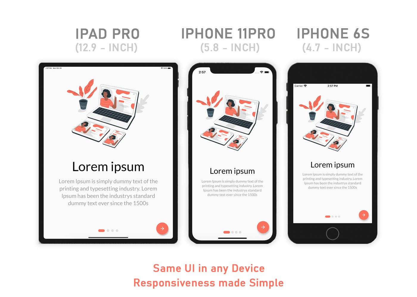
Flutter Sizer helps implement a responsive layout by providing helper widgets and extensions

Responsive Image

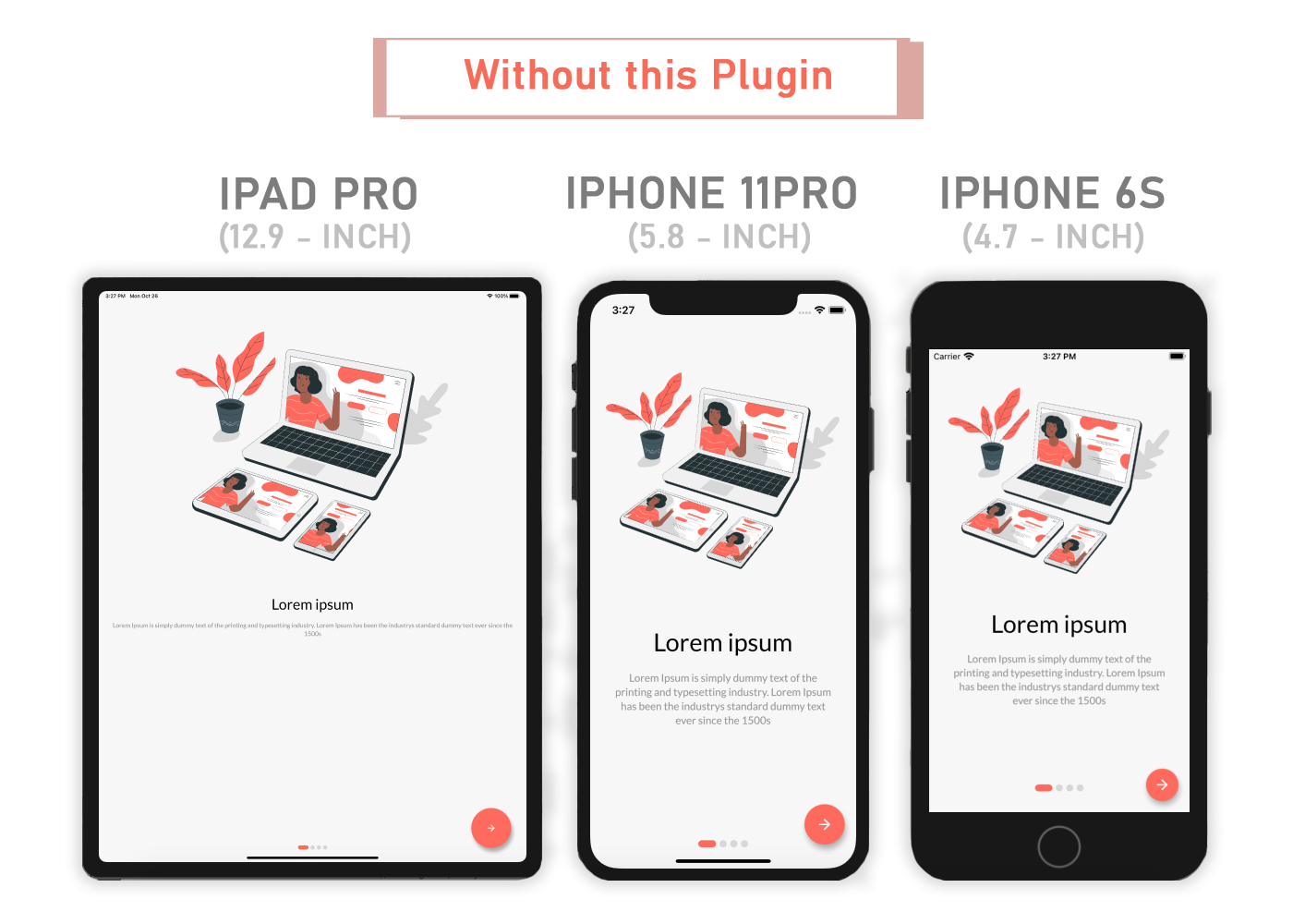
Responsive Image

Content

Installation

Add flutter_sizer to pubspec.yaml

dependencies:
  flutter_sizer: ^1.0.4

Parameters

  • Adaptive.h() - Returns a calculated height based on the device
  • Adaptive.w() - Returns a calculated width based on the device
  • Adaptive.sp() - Returns a calculated sp based on the device (deprecated)
  • Adaptive.dp() - Returns a calculated dp based on the device
  • .h - Returns a calculated height based on the device
  • .w - Returns a calculated width based on the device
  • .sp - Returns a calculated sp based on the device (deprecated)
  • .dp - Returns a calculated dp based on the device
  • Device.boxConstraints - Returns the Device's BoxConstraints
  • Device.orientation - Returns the Screen Orientation (portrait or landscape)
  • Device.screenType - Returns the Screen Type (mobile or tablet)
  • Device.devicePixelRatio - Returns the devicePixel Ratio or (1.0)

Usage

Import the Package

import 'package:flutter_sizer/flutter_sizer.dart';

Wrap MaterialApp with FlutterSizer widget

 FlutterSizer(
      builder: (context, orientation, screenType) {
        return MaterialApp();
      }
 )

Widget Size

Container(
  width: Adaptive.w(20),    // This will take 20% of the screen's width
  height: 30.5.h     // This will take 30.5% of the screen's height
)

Font size

Text(
  'Flutter Sizer', 
  style: TextStyle(fontSize: 15.dp),
)

Orientation

If you want to support both portrait and landscape orientations

Device.orientation == Orientation.portrait
  ? Container(   // Widget for Portrait
      width: 100.w,
      height: 20.5.h,
   )
  : Container(   // Widget for Landscape
      width: 100.w,
      height: 12.5.h,
   )

DeviceType

If you want the same layout to look different in tablet and mobile, use the Device.screenType method:

Device.screenType == ScreenType.tablet
  ? Container(   // Widget for Tablet
      width: 100.w,
      height: 20.5.h,
   )
  : Container(   // Widget for Mobile
      width: 100.w,
      height: 12.5.h,
   )

Take Note

You need to import flutter_sizer package in order to access number.h, number.w, and number.dp

Auto import in VSCode and Android Studio doesn't work for dart extension methods. Typing 10.h would not bring up auto import suggestion for this package

One workaround is to type Device so that the auto import suggestion would show up:

import 'package:flutter_sizer/flutter_sizer.dart';

Community Support

If you have any suggestions or issues, feel free to open an issue

If you would like to contribute, feel free to create a PR

カテゴリー

ソースリポジトリ

このパッケージを使用しているプロジェクト

データはまだありません。