パッケージ、リポジトリ、アプリカテゴリを検索

パッケージ詳細v0.0.3

flutter_sticky_widgets

CSS の position sticky と同様に動作する Flutter ウィジェットを実装します。

AndroidiOSWebmacOSWindowsLinux
30日間ダウンロード
1600
いいね数
91
Pub ポイント
160

パッケージをインストール

flutter pub add flutter_sticky_widgets

パッケージ概要

公開情報に基づく選定ガイドです。参考としてご利用ください。

Flutterパッケージで、ウィジェットをCSSの'position: sticky'のように動作させます。スクロール中に指定された境界に達するまで表示されたままになります。ヘッダー、ナビゲーションバー、またはコンテンツがスクロールされる際に画面に残る必要のあるUI要素に最適です。このパッケージはAndroid、iOS、Web、macOS、Windows、Linuxなどすべての主要プラットフォームで動作し、ネイティブのプラットフォーム固有コードなしで一貫したスタック動作を提供します。既存のFlutterレイアウトへの統合も最小限のセットアップでスムーズに行えます。

用途

  • リスト内のスクロールヘッダー
  • スタックナビゲーションバー
  • 永続的なアクションボタン
  • スクロール可能なビュー内の固定サイドパネル
  • ユーザーのスクロールに従うダイナミックレイアウト要素
  • フォーム内のフローティングツールバー

主な機能

  • CSSに似たスタティック位置指定
  • クロスプラットフォーム互換性
  • 最小構成
  • 自動境界検出
  • ネストされたスクロールビューをサポートしています
  • スクロール中のスムーズな遷移

適している対象

  • スクロール可能なインターフェースを構築する開発者
  • スタックされたUI要素が必要なデザイナー
  • 長いリストやフォームを含むアプリ
  • レスポンシブレイアウトを必要とするウェブおよびモバイルアプリ
  • 複数のプラットフォーム間で一貫したスタック動作を求めるチーム

注意事項

  • 大きなリストではパフォーマンスに影響する可能性があります
  • 慎重なレイアウトのネストが必要です
  • 複雑なオーバーラップシーンには適していません
  • 基本的なスタック動作を超えるカスタマイズは限られている
  • 単一スクロールコンテキストと併用するのが最適です
  • 適切に管理されていない場合、他のスクロールコントローラーと競合する可能性があります

元の README

関連するソースリポジトリの README 原文のスナップショットです。最新の内容はリポジトリをご覧ください。

Build Status

With flutter_sticky_widgets you can use a widget as if it is position: sticky; in CSS.

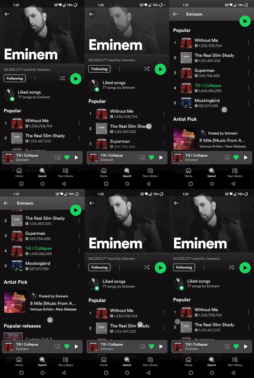
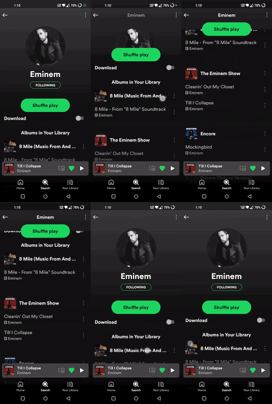
Sticky widgets is an UI pattern where we want widgets to scroll along with the UI upto a certain point, and then stick to the screen instead of scrolling off the screen.

(Green play button in first image, and shuffle play button in second image are examples for position: sticky)

Getting started

import 'package:flutter_sticky_widgets/flutter_sticky_widgets.dart';
StickyContainer(
    stickyChildren: [
        StickyWidget(
            initialPosition: StickyPosition(bottom: 20, right: 20),
            finalPosition: StickyPosition(
                bottom: MediaQuery.of(context).size.height - 80, right: 20),
            controller: _controller,
            child: Container(
            width: 40,
            height: 40,
            decoration: const BoxDecoration(
                shape: BoxShape.circle,
                color: Colors.green,
            ),
            child: const Center(child: Icon(Icons.pause)),
            ),
        ),
    ],
    child: ListView.builder(
    controller: _controller,
    itemCount: 50,
    itemBuilder: (context, index) {
        return ListTile(
            title: Text("Tile $index"),
        );
    }),
);
StickyWidget

Widget used to implement the sticky pattern.

  • initialPosition (StickyPosition): indicates the position of the widget before the scrolling has started. Position is represented by a custom class StickyPosition.

  • finalPosition (StickyPosition): indicates the position of the widget where it will remain sticky after sufficient amount of scrolling. Widget will return to its initial position if scrolled in reverse direction.

  • controller (ScrollController): used by StickyWidget to detect scrolling. Same ScrollController must be attached to your Scrollable (ListView, SingleChildScrollView, CustomScrollView, ...) for StickyWidgets to work. It is also used to determine if the scroll axis is vertical or horizontal.

  • callback (Function(double)?) (optional): An optional callback function, which gets called on every scroll. It receives scrolloffset as parameter which can be used to animate the StickyWidget.

StickyContainer

It must be the parent element of the Scrollable widget used. StickyContainer's size is used as reference size by StickWidgets to position themselves. So make sure StickyContainer's size is same as the size of the Scrollable widget.

  • child (Widget): ideally Scrollable widget should be supplied for this parameter, if not you have to make sure StickyContainer's size is same as Scrollable's size.

  • stickyChildren (List<StickyWidget>): you can supply one or more StickyWidgets.

  • displayOverFlowContent (bool) (optional): true if you want to display the StickyWidgets overflowing outside of the StickyContainer's bounds.

StickyPosition

A Custom class used to represent initial and final positions of StickyWidget. It takes 4 parameters (top, bottom, left, right). But you should supply only 2 of them (top / bottom, right / left)

Note: Make sure to pass same set of parameters for StickyPosition used in initialPosition and finalPosition

Eg:

Correct ✅
initialPosition: StickyPosition(top: .., left: ..)
finalPosition: StickyPosition(top: .., left: ..)

Wrong ❌
(should supply top instead of bottom for finalPosition also)

initialPosition: StickyPosition(top: .., left: ..)
finalPosition: StickyPosition(bottom: .., left: ..)

カテゴリー

ソースリポジトリ

このパッケージを使用しているプロジェクト

データはまだありません。