パッケージ、リポジトリ、アプリカテゴリを検索

flutter_tags のカバー
パッケージ詳細v0.4.9+1

flutter_tags

選択可能で入力可能なタグ(TextField)を作成するのは、これまでになく簡単です。

30日間ダウンロード
1070
いいね数
297
Pub ポイント
40

パッケージをインストール

flutter pub add flutter_tags

パッケージ概要

公開情報に基づく選定ガイドです。参考としてご利用ください。

flutter_tags は、選択可能で入力ベースのタグを作成するのを簡単にするFlutterパッケージであり、事前に定義されたタグとユーザー入力によるタグの両方の機能を組み合わせています。追加、削除、選択といったタグ操作を内蔵サポートする直感的なインターフェースを提供し、フォームやフィルター、タグシステムに最適です。TextFieldとのシームレスな統合により、動的な入力をサポートし、スタイルやコールバックを通じてカスタマイズが可能です。軽量で、複雑な設定なしに使いやすく設計されています。

用途

  • タグ選択付きのフォーム入力
  • ユーザー生成コンテンツのタグ付け
  • 動的タグを使用したインターフェースのフィルタリング
  • タグベースの検索機能
  • リアルタイムフィードバック付きのインタラクティブなフォーム要素

主な機能

  • 選択可能で編集可能なタグ
  • 組み込みの TextField インテグレーション
  • カスタマイズ可能な外観と動作
  • タグの追加/削除操作が簡単
  • 事前定義されたタグと動的タグの両方をサポートしています

適している対象

  • インタラクティブなフォームを構築する開発者
  • タグベースのフィルタリングを必要とするアプリ
  • 動的タグ管理を必要とするUIコンポーネント
  • 洗練された、ミニマルなタグインターフェースに焦点を当てるプロジェクト
  • タグが多く含まれる機能の迅速なプロトタイピング

注意事項

  • 制限されたプラットフォーム固有のカスタマイズ
  • 入力タグに組み込みの検証機能はありません
  • 複雑なレイアウトには追加のスタイル設定が必要になる場合があります
  • 非常に大きなタグリストには最適化されていません
  • 高度な機能には外部の依存関係に依存しています

元の README

関連するソースリポジトリの README 原文のスナップショットです。最新の内容はリポジトリをご覧ください。

flutter_tags

pub package Awesome Flutter Donate

Create beautiful tags quickly and easily.

Installing

Add this to your package's pubspec.yaml file:

dependencies:
  flutter_tags: "^0.4.9+1"

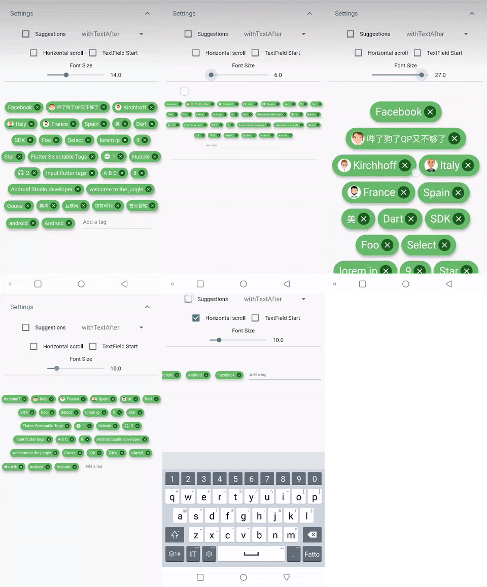
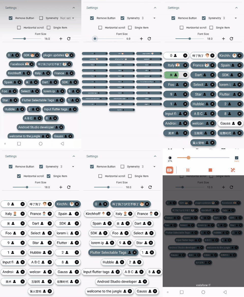
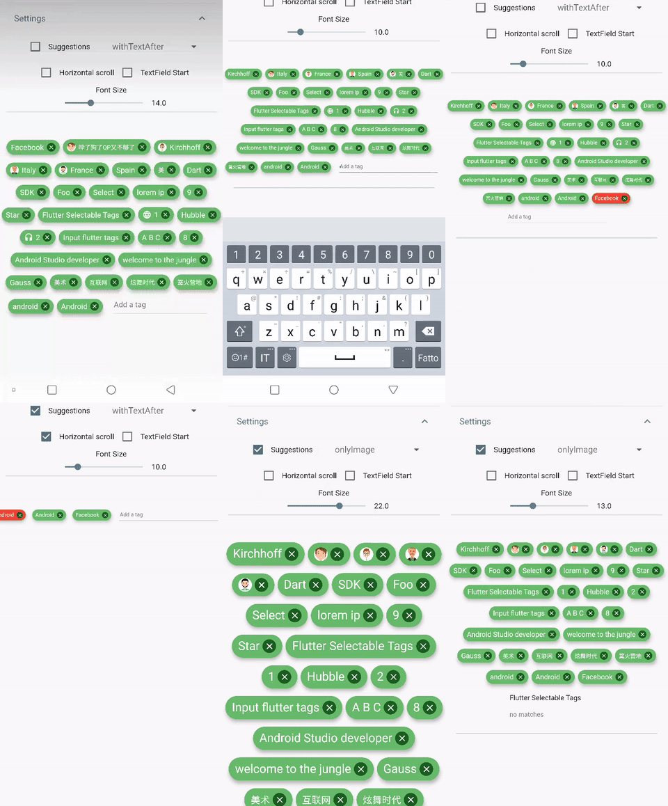
DEMO

Simple usage


import 'package:flutter_tags/flutter_tags.dart';
.
.
.
List _items;
double _fontSize = 14;

@override
void initState(){
    super.initState();
    // if you store data on a local database (sqflite), then you could do something like this
    Model().getItems().then((items){
            _items = items;
        });
}

@override
Widget build(BuildContext context) {
    return Tags(
      key:_tagStateKey,
      textField: TagsTextField(
        textStyle: TextStyle(fontSize: _fontSize),
        constraintSuggestion: true, suggestions: [],
        //width: double.infinity, padding: EdgeInsets.symmetric(horizontal: 10),
        onSubmitted: (String str) {
          // Add item to the data source.
          setState(() {
              // required
            _items.add(str);
          });
        },
      ),
      itemCount: _items.length, // required
      itemBuilder: (int index){          
            final item = _items[index];
    
            return ItemTags(
                  // Each ItemTags must contain a Key. Keys allow Flutter to
                  // uniquely identify widgets.
                  key: Key(index.toString()),
                  index: index, // required
                  title: item.title,
                  active: item.active,
                  customData: item.customData,
                  textStyle: TextStyle( fontSize: _fontSize, ),
                  combine: ItemTagsCombine.withTextBefore,
                  image: ItemTagsImage(
                    image: AssetImage("img.jpg") // OR NetworkImage("https://...image.png")
                  ), // OR null,
                  icon: ItemTagsIcon(
                    icon: Icons.add,
                  ), // OR null,
                  removeButton: ItemTagsRemoveButton(
                    onRemoved: (){
                        // Remove the item from the data source.
                        setState(() {
                            // required
                            _items.removeAt(index);
                        });
                        //required
                        return true;
                    },
                  ), // OR null,
                  onPressed: (item) => print(item),
                  onLongPressed: (item) => print(item),
            );
    
      },
    );    
}

final GlobalKey<TagsState> _tagStateKey = GlobalKey<TagsState>();
// Allows you to get a list of all the ItemTags
_getAllItem(){
    List<Item> lst = _tagStateKey.currentState?.getAllItem;
    if(lst!=null)
        lst.where((a) => a.active==true).forEach( ( a) => print(a.title));        
}

Wrapped widget example

You are free to wrap ItemTags () inside another widget

Tags(  
      itemCount: items.length, 
      itemBuilder: (int index){ 
          return Tooltip(
          message: item.title,
          child:ItemTags(
            title:item.title,
          )
          );
      },
    );    
Tags() parameters
PropName Description default value
columns Possibility to set number of columns when necessary null
itemCount Tag number to display required
symmetry Ability to view and scroll tags horizontally false
horizontalScroll Offset drawer width 0.4
heightHorizontalScroll height for HorizontalScroll to set to display tags correctly 60
spacing Horizontal space between the tags 6
runSpacing Vertical space between the tags 14
alignment Horizontal WrapAlignment WrapAlignment.center
runAlignment Vertical WrapAlignment WrapAlignment.center
direction Direction of the ItemTags Axis.horizontal
verticalDirection Iterate Item from the lower to the upper direction or vice versa VerticalDirection.down
textDirection Text direction of the ItemTags TextDirection.ltr
itemBuilder tag generator
textField add textField TagsTextFiled()
ItemTags() parameters
  • index - required
  • title - required
  • textScaleFactor - custom textScaleFactor
  • active - bool value (default true)
  • pressEnabled - active onPress tag ( default true)
  • customData - Possibility to add any custom value in customData field, you can retrieve this later. A good example: store an id from Firestore document.
  • textStyle - textStyle()
  • alignment - MainAxisAlignment ( default MainAxisAlignment.center)
  • combine - * ability to combine text, icons, images in different ways ( default ItemTagsCombine.imageOrIconOrText)*
  • icon - ItemTagsIcon()
  • image - ItemTagsImage()
  • removeButton - ItemTagsRemoveButton()
  • borderRadius - BorderRadius
  • border - custom border-side
  • padding - default EdgeInsets.symmetric(horizontal: 7, vertical: 5)
  • elevation - default 5
  • singleItem - default false
  • textOverflow - default TextOverflow.fade
  • textColor - default Colors.black
  • textActiveColor - default Colors.white
  • color - default Colors.white
  • activeColor - default Colors.blueGrey
  • highlightColor -
  • splashColor -
  • colorShowDuplicate - default Colors.red
  • onPressed - callback
  • onLongPressed - callback
  • onRemoved - callback

Donate

It takes time to carry on this project. If you found it useful or learned something from the source code please consider the idea of donating 5, 20, 50 € or whatever you can to support the project.

  • Donate

Issues

If you encounter problems, open an issue. Pull request are also welcome.

カテゴリー

ソースリポジトリ

このパッケージを使用しているプロジェクト