パッケージ、リポジトリ、アプリカテゴリを検索

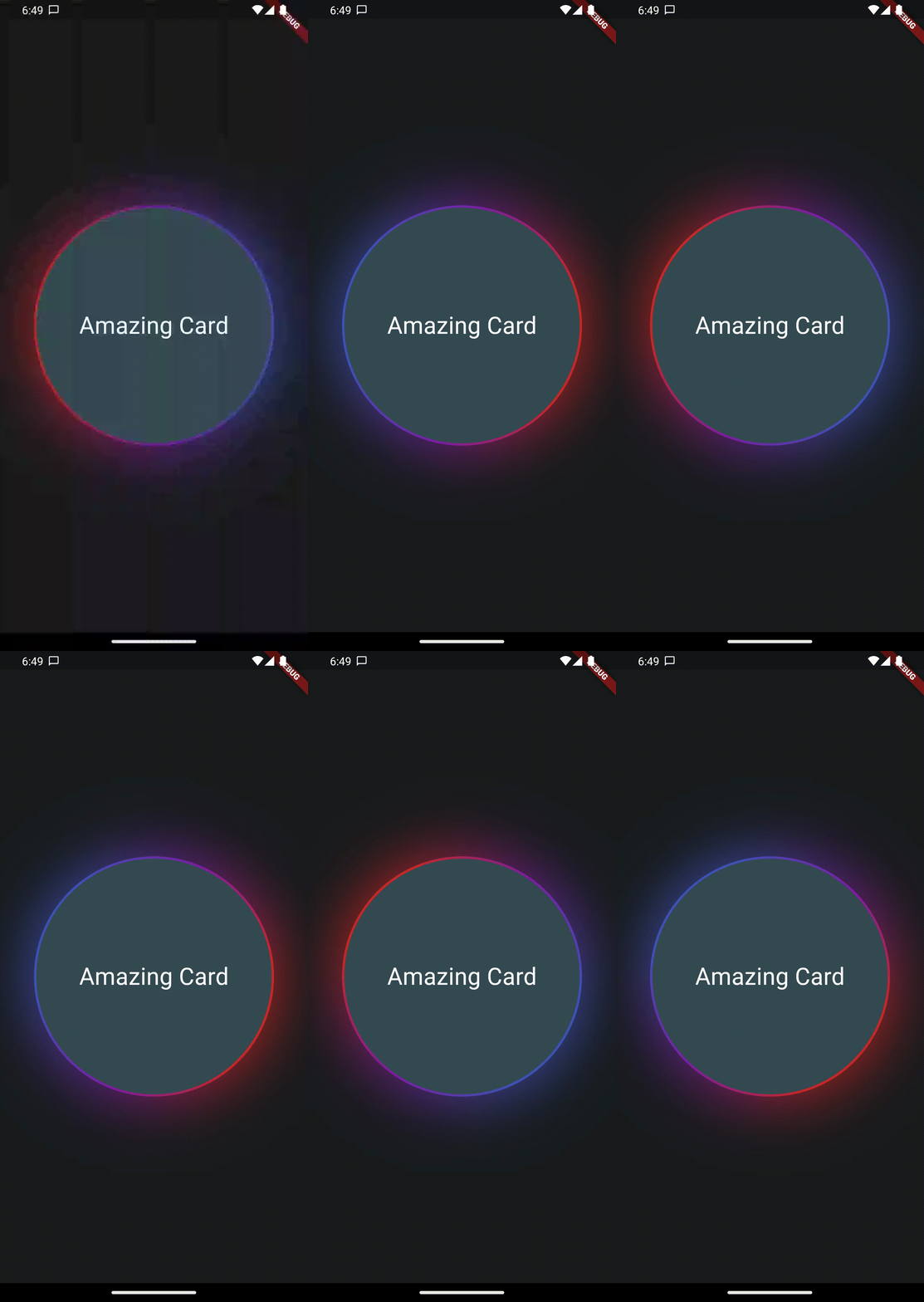
glowy_borders のカバー
パッケージ詳細v1.0.2

glowy_borders

ボーダーを輝かせるためのパッケージ

AndroidiOSWebmacOSWindowsLinux
30日間ダウンロード
7250
いいね数
84
Pub ポイント
130

パッケージをインストール

flutter pub add glowy_borders

パッケージ概要

公開情報に基づく選定ガイドです。参考としてご利用ください。

Glowy Borders は、ウィジェットの境界に鮮やかでアニメーション付きの光沢効果を追加することで、UIデザインを強化するFlutterパッケージです。最小限のコードで、任意のウィジェットの周りに滑らかでカスタマイズ可能な光沢を簡単に適用できます。モダンなアプリインターフェースに最適で、Android、iOS、Web、macOS、Windows、Linuxなど複数のプラットフォームをサポートしています。Flutterのレンダリング機能を活用して、滑らかなアニメーションと視覚的な奥行きを実現します。ボタン、カード、インタラクティブ要素など、ダイナミックな仕上がりが必要な場面にぴったりです。

用途

  • アニメーションボタンの境界を作成する
  • 発光エフェクトによるカードUIの強化
  • インタラクティブなUIコンポーネントの設計
  • ユーザー操作に視覚フィードバックを追加する
  • モダンで洗練されたアプリインターフェースの構築

主な機能

  • カスタマイズ可能な発光色と強度
  • スムーズなアニメーション遷移
  • 複数プラットフォームのサポート
  • 既存のウィジェットとの簡単な統合
  • 調整可能な発光半径とブラー

適している対象

  • 視覚的な魅力を求めるUIデザイナー
  • 現代のFlutterアプリを開発する開発者
  • アニメーションされたボーダー効果を必要とするプロジェクト
  • クロスプラットフォームの整合性を重視するアプリ
  • クリエイティブまたはゲームスタイルのインターフェース

注意事項

  • 低性能デバイスでのパフォーマンスに影響を与える可能性があります
  • 最適な視覚的バランスを得るためには注意深い調整が必要です
  • 発光プロパティ以外のカスタマイズは限られている
  • ミニマリズムデザインスタイルには適していません
  • 視覚的な混雑を避けるために控えめに使用することをお勧めします

元の README

関連するソースリポジトリの README 原文のスナップショットです。最新の内容はリポジトリをご覧ください。

This package provides a wrapper widget to animate borders around your widgets. You can choose to provide current Animation Progress externally or use an indefinitely animation.

| |

Features

AnimatedGradientBorder Widget
  • Wrapper to Animate widgets border with gradients and glow
  • Set animation progress manually or loop indefinitely
  • control size of glow, border and colors to achieve stunning effects

Getting started

Create your flutter app, import this package and use AnimatedGradientBorder to wrap some element.

Usage

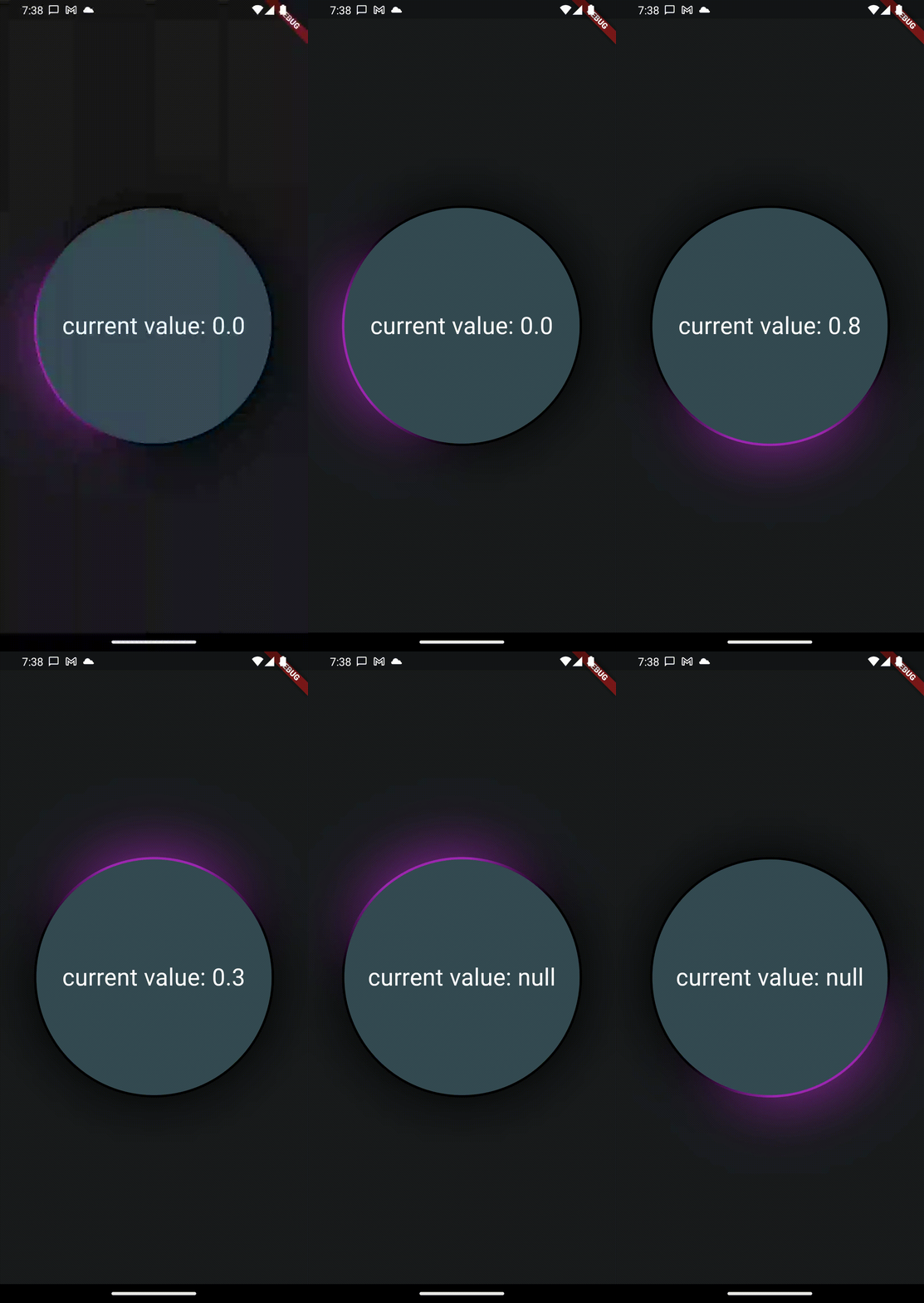
In this example you only need to wrap the widget with a full size Column in your app to see the results. Also note the currentProgress variable which is used to set animation state. If you remove it or set it to null, the animation will play indefinitely.

Please Note that you will need to set the same border radius for the wrapper as well as the child to make it look like a true border.

Also note, that this widget will not work in stretched alignments if you don't provide the parameter stretchAlongAxis and specify which axis you want to stretch along


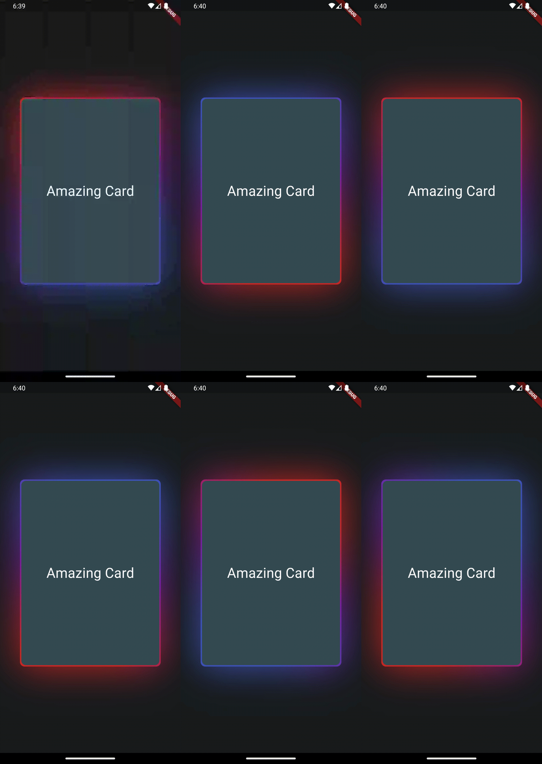
final widget = Scaffold(
  extendBody: true,
  body: SafeArea(
    child: Center(
      child: Column(
        mainAxisAlignment: MainAxisAlignment.center,
        crossAxisAlignment: CrossAxisAlignment.center,
        children: [
          const Column(
            children: [Text('Hallo Welt')],
          ),
          AnimatedGradientBorder(
            borderSize: 2,
            glowSize: 10,
            gradientColors: [
              Colors.transparent,
              Colors.transparent,
              Colors.transparent,
              Colors.purple.shade50
            ],
            animationProgress: currentProgress,
            borderRadius: BorderRadius.all(Radius.circular(999)),
            child: SizedBox(
              width: 300,
              height: 300,
              child: Container(
                decoration: BoxDecoration(
                    borderRadius: BorderRadius.all(Radius.circular(999)),
                    color: Theme
                        .of(context)
                        .colorScheme
                        .secondaryContainer),
                child: Column(
                  mainAxisAlignment: MainAxisAlignment.center,
                  children: [
                    Text("current value: $currentProgress",
                        style: TextStyle(color: Colors.white, fontSize: 30.0)),
                  ],
                ),
              ),
            ),
          ),
        ],
      ),
    ),
  ),
);

Additional information

This feature uses Backdrop Filter under the hood which can cause performance issues if used extensively. Keep that in mind.

カテゴリー

ソースリポジトリ

このパッケージを使用しているプロジェクト

データはまだありません。