パッケージ、リポジトリ、アプリカテゴリを検索

google_nav_bar のカバー
パッケージ詳細v5.0.7

google_nav_bar

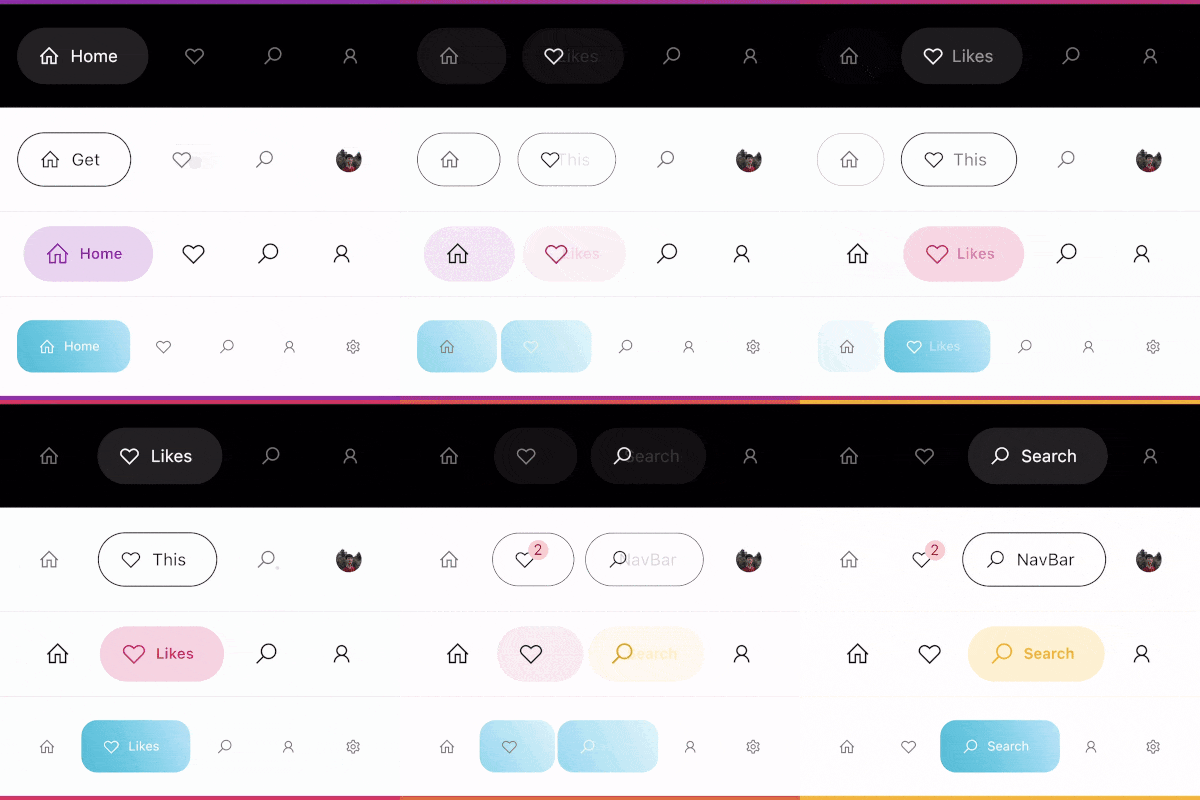
モダンなGoogleスタイルのナビゲーションバーで、ボトムナビゲーションバーまたはタブバーとして利用可能。デザインはDribbble上のCubertoのUI/UXを厳密に再現しています。

AndroidiOSWebmacOSWindowsLinux
30日間ダウンロード
3.4万
いいね数
1690
Pub ポイント
140

パッケージをインストール

flutter pub add google_nav_bar

パッケージ概要

公開情報に基づく選定ガイドです。参考としてご利用ください。

Googleのデザイン言語とDribbbleのCuberto UI/UXコンセプトをインスパイアした、現代的で視覚的に魅力的なナビゲーションバーです。滑らかなアニメーション、カスタマイズ可能な色、応答性のあるレイアウトを備えた、ボトムナビゲーションバーまたはタブバーとして機能します。Flutter専用に構築されており、Android、iOS、Web、macOS、Windows、Linuxなど複数のプラットフォームをサポートしています。洗練されたナビゲーション体験を必要とするアプリケーションに最適な、クリーンな美学と直感的なユーザーインタラクションを重視しています。

用途

  • モバイルアプリの下部ナビゲーション
  • Webアプリケーションのタブインターフェース
  • クロスプラットフォームのFlutterアプリ
  • モダンなUIデザインの実装
  • カスタマイズ可能なナビゲーションバー

主な機能

  • Googleにインスパイアされたデザイン
  • スムーズなアニメーション
  • マルチプラットフォーム対応
  • カスタマイズ可能な色とアイコン
  • レスポンシブレイアウト
  • Flutter との簡単な統合

適している対象

  • マテリアルデザインの美学を求める開発者
  • エレガントなボトムナビゲーションを必要とするアプリ
  • デザインに注力したFlutterプロジェクト
  • UI/UX ファン
  • 迅速なプロトタイピング

注意事項

  • ナビゲーション用途に限定
  • 手動でのアイコン管理が必要です
  • 複雑なレイアウトには追加のスタイリングが必要になる場合があります
  • トップレベルのナビゲーションバーには適していません
  • 外部デザインの整合性に依存する

元の README

関連するソースリポジトリの README 原文のスナップショットです。最新の内容はリポジトリをご覧ください。

google_nav_bar


A modern google style nav bar for flutter.

google_nav_bar

GoogleNavBar is a Flutter widget designed by Aurelien Salomon and developed by sooxt98.

Getting Started

Add this to your package's pubspec.yaml file:

...
dependencies:
  google_nav_bar: ^5.0.7
  

Now in your Dart code, you can use:

import 'package:google_nav_bar/google_nav_bar.dart';

Usage

Style your tab globally with GNav's attribute, if you wish to style tab separately, use GButton's attribute

GNav(
  rippleColor: Colors.grey[800], // tab button ripple color when pressed
  hoverColor: Colors.grey[700], // tab button hover color
  haptic: true, // haptic feedback
  tabBorderRadius: 15, 
  tabActiveBorder: Border.all(color: Colors.black, width: 1), // tab button border
  tabBorder: Border.all(color: Colors.grey, width: 1), // tab button border
  tabShadow: [BoxShadow(color: Colors.grey.withOpacity(0.5), blurRadius: 8)], // tab button shadow
  curve: Curves.easeOutExpo, // tab animation curves
  duration: Duration(milliseconds: 900), // tab animation duration
  gap: 8, // the tab button gap between icon and text 
  color: Colors.grey[800], // unselected icon color
  activeColor: Colors.purple, // selected icon and text color
  iconSize: 24, // tab button icon size
  tabBackgroundColor: Colors.purple.withOpacity(0.1), // selected tab background color
  padding: EdgeInsets.symmetric(horizontal: 20, vertical: 5), // navigation bar padding
  tabs: [
    GButton(
      icon: LineIcons.home,
      text: 'Home',
    ),
    GButton(
      icon: LineIcons.heart_o,
      text: 'Likes',
    ),
    GButton(
      icon: LineIcons.search,
      text: 'Search',
    ),
    GButton(
      icon: LineIcons.user,
      text: 'Profile',
    )
  ]
)

View the example folder

There are 4 different use case included in the /example directory, go try it out!

カテゴリー

ソースリポジトリ

このパッケージを使用しているプロジェクト