パッケージ、リポジトリ、アプリカテゴリを検索

パッケージ詳細v1.0.4

grouped_buttons

チェックボックスとラジオボタンをグループ化するのをはるかに簡単にするシンプルなパッケージです。

30日間ダウンロード
302
いいね数
82
Pub ポイント
30

パッケージをインストール

flutter pub add grouped_buttons

パッケージ概要

公開情報に基づく選定ガイドです。参考としてご利用ください。

グループ化されたチェックボックスおよびラジオボタンの作成と管理を簡素化する軽量なFlutterパッケージです。一貫したスタイルと状態管理で複数選択オプションを扱うためのクリーンで再利用可能な方法を提供します。ユーザーが事前に定義されたセットから1つ以上を選択する必要があるフォームや設定に最適です。このパッケージは共通パターンを抽象化することでボイラープレートコードを削減し、開発者の生産性を高めます。

用途

  • 複数の選択肢を持つフォーム入力
  • ユーザーの好み設定
  • アンケートまたはクイズインターフェース
  • 動的オプション選択
  • グループ向けの状態処理の簡素化
  • 切り替え可能なオプションの一貫したUI

主な機能

  • チェックボックスとラジオボタンのグループ化を簡単に
  • 組み込みの状態管理
  • カスタマイズ可能な外観
  • 最小限のボイラープレート
  • 単一選択と複数選択の両方をサポートしています
  • 洗練された、読みやすい API

適している対象

  • オプショングループを使用してフォームを構築する開発者
  • 一貫したトグルコンポーネントを求めるUIデザイナー
  • シンプルながらスケーラブルな選択ウィジェットを必要とするプロジェクト
  • コードの保守性を優先するチーム
  • Flutterの初心者がフォーム処理を学ぶ

注意事項

  • チェックボックスおよびラジオボタンタイプに限定
  • 組み込みの検証なし
  • ネストされたグループをサポートしていません
  • 複雑なデザインには手動でのスタイリングが必要です
  • 選択を超える高度なフォーム論理には適していません

元の README

関連するソースリポジトリの README 原文のスナップショットです。最新の内容はリポジトリをご覧ください。

grouped_buttons

pub package

A set of Flutter widgets that makes grouping Checkboxes and Radio Buttons much easier!

Installing

Add the following to your pubspec.yaml file:

dependencies:
  grouped_buttons: ^1.0.4

Simple Usage

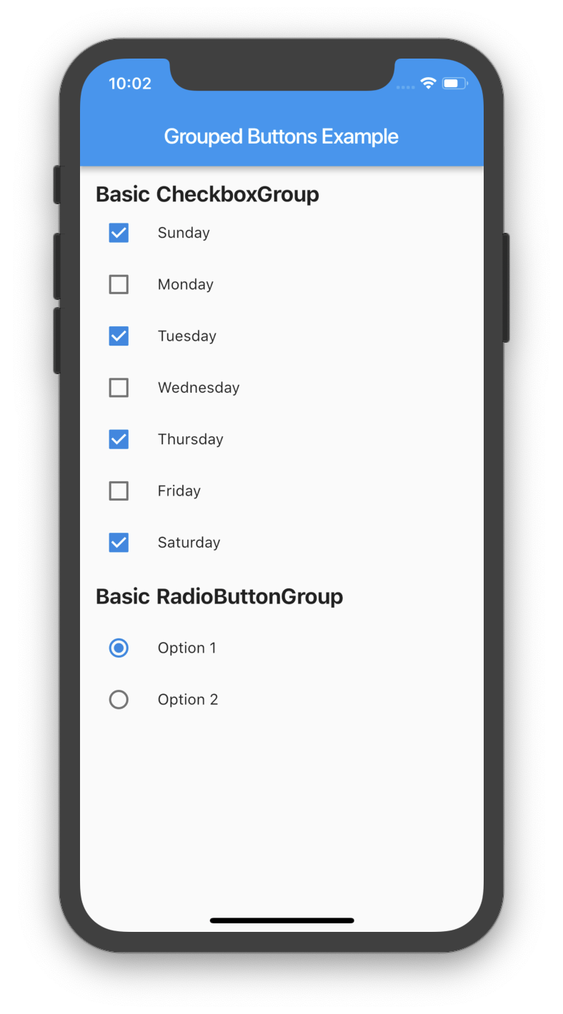
Creating a basic CheckboxGroup
CheckboxGroup(
  labels: <String>[
    "Sunday",
    "Monday",
    "Tuesday",
    "Wednesday",
    "Thursday",
    "Friday",
    "Saturday",
    "Sunday",
  ],
  onSelected: (List<String> checked) => print(checked.toString())
);
Creating a basic RadioButtonGroup
RadioButtonGroup(
  labels: <String>[
    "Option 1",
    "Option 2",
  ],
  onSelected: (String selected) => print(selected)
);
Screenshot
Basic Usage

Custom Usage

There are several options that allow for more control.

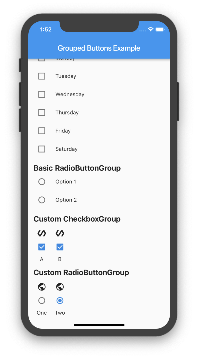
Custom CheckboxGroup
Properties Description
activeColor The color to use when a Checkbox is checked.
checkColor The color to use for the check icon when a Checkbox is checked.
checked Specifies which boxes to be automatically checked. Every element must match a label. This is useful for clearing all selections (set it to []). If this is non-null, then the user must handle updating this list; otherwise, the state of the CheckboxGroup won't change.
disabled Specifies which boxes should be disabled. If this is non-null, no boxes will be disabled. The strings passed to this must match the labels.
itemBuilder Called when needed to build a CheckboxGroup element.
labels (required) A list of strings that describes each Checkbox. Each label must be distinct.
labelStyle The style to use for the labels.
margin Empty space surrounding the CheckboxGroup.
onChange Called when the value of the CheckboxGroup changes.
onSelected Called when the user makes a selection.
orientation Specifies the orientation to display elements. Either GroupedButtonsOrientation.HORIZONTAL or GroupedButtonsOrientation.VERTICAL.
padding Empty space in which to inset the CheckboxGroup.
tristate If true the checkbox's value can be true, false, or null.
List<String> _checked = ["A", "B"];

CheckboxGroup(
  orientation: GroupedButtonsOrientation.HORIZONTAL,
  margin: const EdgeInsets.only(left: 12.0),
  onSelected: (List selected) => setState((){
    _checked = selected;
  }),
  labels: <String>[
    "A",
    "B",
  ],
  checked: _checked,
  itemBuilder: (Checkbox cb, Text txt, int i){
    return Column(
      children: <Widget>[
        Icon(Icons.polymer),
        cb,
        txt,
      ],
    );
  },
);
Custom RadioButtonGroup
Properties Description
activeColor The color to use when a Radio button is checked.
disabled Specifies which buttons should be disabled. If this is non-null, no buttons will be disabled. The strings passed to this must match the labels.
itemBuilder Called when needed to build a RadioButtonGroup element.
labels (required) A list of strings that describes each Radio button. Each label must be distinct.
labelStyle The style to use for the labels.
margin Empty space surrounding the RadioButtonGroup.
onChange Called when the value of the RadioButtonGroup changes.
onSelected Called when the user makes a selection.
orientation Specifies the orientation to display elements. Either GroupedButtonsOrientation.HORIZONTAL or GroupedButtonsOrientation.VERTICAL.
padding Empty space in which to inset the RadioButtonGroup.
picked Specifies which Radio button to automatically pick. Every element must match a label. This is useful for clearing what is picked (set it to ""). If this is non-null, then the user must handle updating this; otherwise, the state of the RadioButtonGroup won't change.
String _picked = "Two";

RadioButtonGroup(
  orientation: GroupedButtonsOrientation.HORIZONTAL,
  margin: const EdgeInsets.only(left: 12.0),
  onSelected: (String selected) => setState((){
    _picked = selected;
  }),
  labels: <String>[
    "One",
    "Two",
  ],
  picked: _picked,
  itemBuilder: (Radio rb, Text txt, int i){
    return Column(
      children: <Widget>[
        Icon(Icons.public),
        rb,
        txt,
      ],
    );
  },
);
Screenshot
Basic Usage

カテゴリー

ソースリポジトリ

このパッケージを使用しているプロジェクト

データはまだありません。