パッケージ、リポジトリ、アプリカテゴリを検索

info_popup のカバー
パッケージ詳細v4.3.2

info_popup

選択したウィジェットにユーザーに情報を表示する簡単な方法。

AndroidiOSWebmacOSWindowsLinux
30日間ダウンロード
4.6万
いいね数
165
Pub ポイント
150

パッケージをインストール

flutter pub add info_popup

パッケージ概要

公開情報に基づく選定ガイドです。参考としてご利用ください。

InfoPopup は、最小限のセットアップで任意のウィジェットに情報を表示するための軽量な Flutter パッケージです。ユーザーにコンテキスト情報を明確かつカスタマイズ可能な方法で提示し、UI 要素上でツールチップやガイドを直接提供することで、UX を向上させます。Android、iOS、Web、macOS、Windows、Linux など複数のプラットフォームをサポートしており、デバイス間で一貫した動作を保証します。単一のコマンドで簡単に統合できるため、繊細ながらも効果的なユーザーフィードバック機構を追加するのに最適です。

用途

  • ボタンにツールチップを表示する
  • コンテキストに応じたヘルプを提供する
  • フォームフィールドのガイドラインの強化
  • オンボーディング体験の改善
  • インタラクティブなヒントを追加
  • ステータスの説明を表示

主な機能

  • シンプルな1行統合
  • カスタマイズ可能なポップアップコンテンツ
  • クロスプラットフォーム互換性
  • さまざまなウィジェットターゲットをサポートしています
  • 設定可能な位置決め
  • 軽量で高速

適している対象

  • 迅速なフィードバックツールを探しているUI/UXデザイナー
  • 教育アプリを開発する開発者
  • アクセシビリティに注力するチーム
  • 直感的なユーザー案内を必要とするアプリ
  • 開発期間がタイトなプロジェクト

注意事項

  • 基本的なポップアップスタイルに限定
  • 組み込みのアニメーションカスタマイズなし
  • 小さなテキストコンテンツに最適
  • 手動での位置調整が必要になる場合があります
  • 複雑なモーダルインタラクションには向いていない

元の README

関連するソースリポジトリの README 原文のスナップショットです。最新の内容はリポジトリをご覧ください。

Introduction

The info_popup package allows you to easily show a simple, customizable popup on your wrapped widget. The highlight feature, which can be activated at will, helps draw the user's attention to the desired location.

You can test it now on the Info Popup preview page. Note that the website experience may be different.

Features

  • Display a customizable popup on your wrapped widget
  • Activate the highlight feature to draw the user's attention to the desired location
  • Fully customize the content of the popup
  • Add margins to the popup from any side

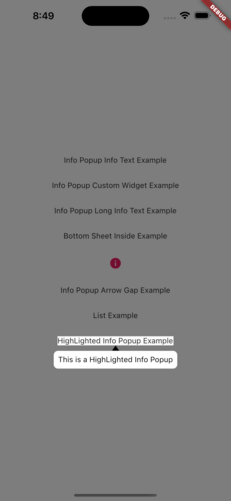
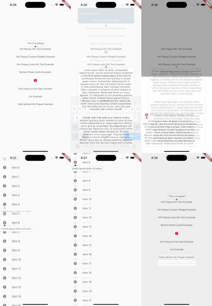
MainPresentation HighlightExample

Getting Started

To use this package, add info_popup as a dependency in your pubspec.yaml file.

dependencies:
  info_popup: ^3.0.0

Alternatively, you can add it to your project by running the following commands in your terminal:

with Dart:

$ dart pub add info_popup

with Flutter:

$ flutter pub add info_popup

Usage

To show a popup, wrap the widget that you want to display the popup on with the InfoPopupWidget widget. All you have to do is wrap it in the widget you want to show information with the InfoPopupWidget widget. With the InfoPopupController, you can customize it as you wish, and turn it on and off.

import 'package:info_popup/info_popup.dart';
	InfoPopupWidget(
		contentTitle: 'Info Popup Details',
		child: Icon(
			Icons.info,
			color: Colors.pink,
		),
	),

Example

This is a normal info text displayed using the InfoPopupWidget widget with several optional parameters.

              InfoPopupWidget(
                contentTitle: 'Info Popup Details',
                arrowTheme: InfoPopupArrowTheme(
                  color: Colors.pink,
                  arrowDirection: ArrowDirection.up,
                ),
                contentTheme: InfoPopupContentTheme(
                  infoContainerBackgroundColor: Colors.black,
                  infoTextStyle: TextStyle(color: Colors.white),
                  contentPadding: const EdgeInsets.all(8),
                  contentBorderRadius: BorderRadius.all(Radius.circular(10)),
                  infoTextAlign: TextAlign.center,
                ),
                dismissTriggerBehavior: PopupDismissTriggerBehavior.onTapArea,
                areaBackgroundColor: Colors.transparent,
                indicatorOffset: Offset.zero,
                contentOffset: Offset.zero,
                onControllerCreated: (controller) {
                  print('Info Popup Controller Created');
                },
                onAreaPressed: (InfoPopupController controller) {
                  print('Area Pressed');
                },
                infoPopupDismissed: () {
                  print('Info Popup Dismissed');
                },
                onLayoutMounted: (Size size) {
                  print('Info Popup Layout Mounted');
                },
                child: Icon(
                  Icons.info,
                  color: Colors.pink,
                ),
              ),

"This is a custom popup example created using the InfoPopupWidget widget.

Custom Popup Widget
              InfoPopupWidget(
                customContent: Container(
                  decoration: BoxDecoration(
                    color: Colors.blueGrey,
                    borderRadius: BorderRadius.circular(10),
                  ),
                  padding: const EdgeInsets.all(10),
                  child: Column(
                    children: const <Widget>[
                      TextField(
                        decoration: InputDecoration(
                          hintText: 'Enter your name',
                          hintStyle: TextStyle(color: Colors.white),
                          enabledBorder: OutlineInputBorder(
                            borderSide: BorderSide(color: Colors.white),
                          ),
                        ),
                      ),
                      SizedBox(height: 10),
                      Center(
                        child: Text(
                          'Example of Info Popup inside a Bottom Sheet',
                          style: TextStyle(
                            color: Colors.white,
                          ),
                        ),
                      ),
                    ],
                  ),
                ),
                arrowTheme: const InfoPopupArrowTheme(
                  color: Colors.pink,
                  arrowDirection: ArrowDirection.up,
                ),
                dismissTriggerBehavior: PopupDismissTriggerBehavior.onTapArea,
                areaBackgroundColor: Colors.transparent,
                indicatorOffset: Offset.zero,
                contentOffset: Offset.zero,
                onControllerCreated: (controller) {
                  print('Info Popup Controller Created');
                },
                onAreaPressed: (InfoPopupController controller) {
                  print('Area Pressed');
                },
                infoPopupDismissed: () {
                  print('Info Popup Dismissed');
                },
                onLayoutMounted: (Size size) {
                  print('Info Popup Layout Mounted');
                },
                child: Icon(
                  Icons.info,
                  color: Colors.pink,
                ),
              ),

Conclusion

The info_popup package provides a simple and effective way to show a customizable popup on your wrapped widget. With the highlight feature, you can draw the user's attention to the desired location.

License

This project is licensed under the MIT License - see the LICENSE file for details.

カテゴリー

ソースリポジトリ

このパッケージを使用しているプロジェクト

データはまだありません。