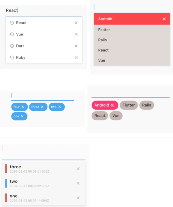
input_history_text_field
A input_history_text_field widget is automatically saved and suggest as you type.
Overview
List
Badge
Customize
Getting Started
Usage
The only key in the your widget of application set to historyKey, supports like a text_field.
InputHistoryTextField(
    historyKey: "01",
),
a saved automatically as you type.( save up to limit, default to 5 )

a input history is suggested.

input history can be deleted.

Example
simple
All you need is a historyKey.
InputHistoryTextField(
    historyKey: "01",
),
badge style
Change style to badge is listStyle = ListStyle.Badge
InputHistoryTextField(
    historyKey: "01",
    listStyle: ListStyle.Badge,
),
Default items
If there is an item you want to display from the beginning or an item you want the user to selected.
InputHistoryTextField(
    historyKey: "01",
    lockItems: ['Flutter', 'Rails', 'React', 'Vue'],
),
| List |
 |
change icon
Can hide or change the icon.
InputHistoryTextField(
    historyKey: "01",
    showHistoryIcon: true,
    showDeleteIcon: true,
    historyIcon: Icons.add,
    deleteIcon: Icons.delete,
),
gradually transmitted
enableOpacityGradient is input history list is gradually transmitted.
InputHistoryTextField(
    historyKey: "01",
    enableOpacityGradient: true,
),
lines decoration
listRowDecoration is input history lines as a decoration.
InputHistoryTextField(
    historyKey: "01",
    listRowDecoration: BoxDecoration(
        border: Border(
        left: BorderSide(color: Colors.blue, width: 8),
        ),
    ),
),
list decoration
listDecoration is input history list as a decoration.
InputHistoryTextField(
    historyKey: "01",
    listDecoration: BoxDecoration(
        color: Colors.cyan,
        borderRadius: BorderRadius.only(
            bottomLeft: Radius.circular(20),
            bottomRight: Radius.circular(20)),
        boxShadow: [
        BoxShadow(
            color: Colors.grey.withOpacity(0.2),
            spreadRadius: 8,
            blurRadius: 8,
            offset: Offset(0, 3)),
        ],
    ),
),
list layout builder
If you want to customize everything, to use historyListItemLayoutBuilder.
InputHistoryTextField(
    historyKey: "01",
    historyListItemLayoutBuilder: (controller, value, index) {
        return InkWell(
        onTap: () => controller.select(value.text),
        child: Row(
            children: [
            Expanded(
                flex: 1,
                child: Container(
                    margin: const EdgeInsets.only(left: 10.0),
                    padding: const EdgeInsets.only(left: 10.0),
                    decoration: BoxDecoration(
                    border: Border(
                        left: BorderSide(
                        width: 5.0,
                        color: index % 2 == 0
                            ? Colors.red
                            : Colors.blue,
                        ),
                    ),
                    ),
                    child: Column(
                    crossAxisAlignment: CrossAxisAlignment.start,
                    children: [
                        Text(
                        value.textToSingleLine,
                        overflow: TextOverflow.ellipsis,
                        style:
                            TextStyle(fontWeight: FontWeight.bold),
                        ),
                        Text(
                        DateTime.fromMillisecondsSinceEpoch(
                                value.createdTime)
                            .toUtc()
                            .toString(),
                        overflow: TextOverflow.ellipsis,
                        style: TextStyle(
                            fontSize: 10,
                            color: Theme.of(context).disabledColor),
                        ),
                    ],
                    )),
            ),
            IconButton(
                icon: Icon(
                Icons.close,
                size: 16,
                color: Theme.of(context).disabledColor,
                ),
                onPressed: () {
                controller.remove(value);
                },
            ),
            ],
        ),
    );}
)
API
| name |
ex |
|
note |
| historyKey |
key-01 |
String |
a only key in the your application,saved with this key. |
| limit |
5 |
int |
max limit of input history |
| hasFocusExpand |
true |
bool |
show input history of edit text focused |
| showHistoryIcon |
true |
bool |
icon of input history at left positioned |
| showDeleteIcon |
true |
bool |
icon of delete at right positioned |
| enableHistory |
true |
bool |
enabled/disabled of input history |
| enableSave |
true |
bool |
enabled/disabled saved history |
| enableOpacityGradient |
true |
bool |
make the input history list gradually transparent |
| enableFilterHistory |
true |
bool |
suggest filters when input text |
| showHistoryList |
true |
bool |
show/hide of input history list |
| historyIcon |
Icons.add |
IconData |
IconData for history icon. |
| historyIconTheme |
IconTheme |
IconTheme |
IconTheme for history icon. |
| deleteIcon |
Icons.delete |
IconData |
IconData for delete icon. |
| deleteIconTheme |
IconTheme |
IconTheme |
IconTheme for delete icon. |
| listOffset |
Offset(0, 5) |
Offset |
set a position for list. |
| listTextStyle |
TextStyle(fontSize: 30) |
TextStyle |
sets a text style for list. |
| listRowDecoration |
BoxDecoration |
Decoration |
a row of input history for decoration |
| listDecoration |
BoxDecoration |
Decoration |
a list of input history for decoration |
| listStyle |
ListStyle.List |
ListStyle |
change style List or Badge |
| textColor |
Colors.black |
Color |
a text color |
| backGroundColor |
Colors.grey |
Color |
a background color |
| historyIconColor |
Colors.white |
Color |
a history icon color |
| deleteIconColor |
Colors.white |
Color |
a delete icon color |
| lockItems |
['Flutter', 'Rails', 'React', 'Vue'] |
List |
|
| fixed shown, cannot be delete items |
|
|
|
| lockTextColor |
Colors.black |
Color |
a lock items text color |
| lockBackgroundColor |
Colors.grey |
Color |
a lock items background color |
| historyListItemLayoutBuilder |
Widget |
Widget |
a customize full layout. |
| InputHistoryController |
InputHistoryController |
InputHistoryController |
Select or delete the input history list |