Interactive Bottom Sheet




A customizable interactive bottom sheet, which lets you interact with the screen behind it.
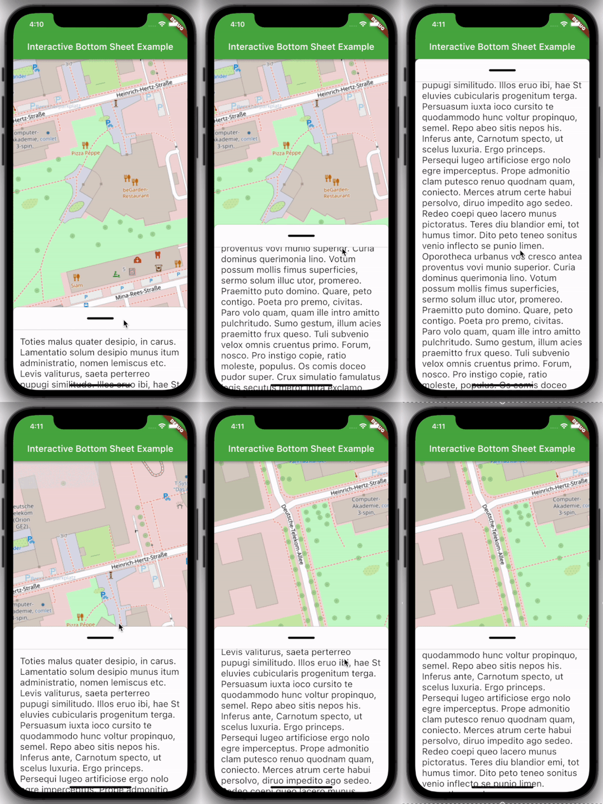
Features
- Easy to use
- Customizable colors
- Customizable DraggableArea
- Customizable heights and widths of different parts of the sheet
- Possibility to declare snap points
Usage
Depend on it:
dependencies:
  interactive_bottom_sheet: ^1.0.0
Import it:
import 'package:interactive_bottom_sheet/interactive_bottom_sheet.dart';
Example
Scaffold(
  bottomSheet: const InteractiveBottomSheet(
    options: InteractiveBottomSheetOptions(),
    child: Text(
       'Lorem ipsum dolor sit amet.'
    ),
  ),
);
Customization options
Scaffold(
  bottomSheet: const Scaffold(
  bottomSheet: InteractiveBottomSheet(
    options: InteractiveBottomSheetOptions(
      maxSize: 0.75,
      backgroundColor: Colors.green,
      snapList: [0.25, 0.5],
    ),
    draggableAreaOptions: DraggableAreaOptions(
      topBorderRadius: 10,
      height: 75,
      backgroundColor: Colors.grey,
      indicatorColor: Colors.grey,
      indicatorWidth: 50,
      indicatorHeight: 50,
      indicatorRadius: 10,
      ),
    ),
    child: Text('Lorem ipsum dolor sit amet.'),
  ),
);
Top Border Radius
To get rounded Borders at the top of the sheet (usual for iOS) on the top side of the widget, it is necessary to overwrite the bottomSheetTheme.
Theme(
  data: Theme.of(context).copyWith(
    bottomSheetTheme: const BottomSheetThemeData(
      backgroundColor: Colors.transparent
    ),
  ),
  child: const Scaffold(
    bottomSheet: InteractiveBottomSheet(
      child: Text('Lorem ipsum dolor sit amet.'),
    ),
  ),
);

