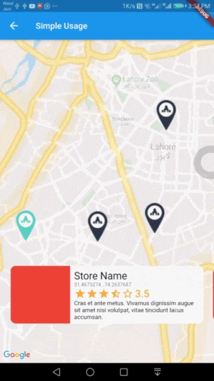
Use this widget inside a stateful widget and update the markers list state with new data. An example can be found in stateful_example.dart file in example project.
Customise with parameters
You can customise it by passing various parameter values. Details about all parameters is as follows.
Parameter
Type
Default Value
Description
items
List<MarkerItem>
none
List of Markers with type of MarkerItem. This parameter is required and cannot be null.
itemContent
IndexedWidgetBuilder
none
This is builder function which will receive context and index. You must return a Widget which will show on a pre designed container. This is exactly like you use ListView Builder. Not applicable when using itemBuilder
center
LatLng
LatLng(0.0, 0.0)
Center point for initial map display.
zoom
double
12.0
Default zoom value for initial map screen.
itemHeight
double
116.0
Height of your detail item. Not applicable when using itemBuilder
itemPadding
EdgeInsetsGeometry
EdgeInsets.only(bottom: 80.0)
Padding for item detail card. Mainly used for bottom padding.
itemPadding
Alignment
Alignment.bottomCenter
Alignment for content slider.
itemBuilder
IndexedWidgetBuilder
null
If you don't want default container and want to build the bottom widget yourself, you can use this builder instead of itemContent and have full control over UI. This is builder function which will receive context and index. You must return a Widget.
controller
InteractiveMapsController
null
A controller if you want to add the markers later and then call rebuild() or change the index of marker to animate with your action via setCurrentIndex(int index).