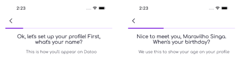
Linear Progress Bar


A powerful and customizable progress indicator library for Flutter. Supports linear progress bars, circular percent indicators, gauges, dots indicators, titled progress bars, gradient colors, and smooth animations.


Features
Progress Bars
- ✅ Linear Progress Bar - Traditional horizontal progress indicator
- ✅ Titled Progress Bar - Progress bar with customizable labels
- ✅ Dots Progress Indicator - Step-based dots indicator
Percent Indicators
- ✅ Circular Percent Indicator - Beautiful circular progress with percentage display
- ✅ Linear Percent Indicator - Linear progress with leading/trailing/center widgets
- ✅ Multi-segment Linear Indicator - Show multiple progress segments
Gauges
- ✅ Gauge Indicator - Modern speedometer-style gauge with needle and ranges
- ✅ Linear Gauge - Horizontal/vertical gauge with ruler, pointer, and ranges
- ✅ Radial Gauge - Advanced circular gauge with needle and shape pointers
Common Features
- ✅ Gradient Support - Apply beautiful gradients to all indicators
- ✅ Smooth Animations - Animated progress transitions with customizable curves
- ✅ Toggle Animation - Enable/disable animations on any indicator
- ✅ Custom Animation Duration - Control animation timing
- ✅ Interactivity - Drag/tap to change values on gauges
- ✅ Multiple Label Types - Text, percentage, step count, or custom widgets
- ✅ Flexible Child Positioning - Left/right/center for linear, top/bottom/center for circular
- ✅ Customizable Appearance - Colors, sizes, shapes, borders, and more
- ✅ Accessibility Support - Semantic labels and values
Installation
Add this to your pubspec.yaml:
dependencies:
  linear_progress_bar: ^3.0.0
Then run:
flutter pub get
Quick Start
Import the package:
import 'package:linear_progress_bar/linear_progress_bar.dart';
Basic Linear Progress Bar
LinearProgressBar(
  maxSteps: 6,
  progressType: ProgressType.linear,
  currentStep: 3,
  progressColor: Colors.blue,
  backgroundColor: Colors.grey,
  borderRadius: BorderRadius.circular(10),
  minHeight: 12,
)
Circular Percent Indicator
CircularPercentIndicator(
  percent: 0.75,
  radius: 60,
  lineWidth: 10,
  progressColor: Colors.blue,
  backgroundColor: Colors.grey.shade300,
  circularStrokeCap: CircularStrokeCap.round,
  center: Text(
    '75%',
    style: TextStyle(
      fontSize: 20,
      fontWeight: FontWeight.bold,
    ),
  ),
)
Gauge Indicator
GaugeIndicator(
  value: 0.65,
  size: 200,
  strokeWidth: 20,
  valueColor: Colors.blue,
  backgroundColor: Colors.grey.shade300,
  showValue: true,
  gaugeStyle: GaugeStyle.modern,
)
Dots Progress Indicator
LinearProgressBar(
  maxSteps: 5,
  progressType: ProgressType.dots,
  currentStep: 2,
  progressColor: Colors.blue,
  backgroundColor: Colors.grey,
  dotsActiveSize: 12,
  dotsInactiveSize: 8,
)
Titled Progress Bar with Percentage
TitledProgressBar(
  maxSteps: 100,
  currentStep: 75,
  progressColor: Colors.green,
  backgroundColor: Colors.grey.shade300,
  labelType: LabelType.percentage,
  labelColor: Colors.white,
  labelFontWeight: FontWeight.bold,
  minHeight: 24,
  borderRadius: BorderRadius.circular(12),
)
Usage Examples
Circular Percent Indicator
Basic Circle with Percentage
CircularPercentIndicator(
  percent: 0.75,
  radius: 60,
  lineWidth: 10,
  progressColor: Colors.blue,
  backgroundColor: Colors.grey.shade300,
  circularStrokeCap: CircularStrokeCap.round,
  center: Text('75%'),
)
With Gradient Colors
CircularPercentIndicator(
  percent: 0.75,
  radius: 70,
  lineWidth: 12,
  backgroundColor: Colors.grey.shade200,
  linearGradient: LinearGradient(
    colors: [Colors.purple, Colors.pink, Colors.orange],
  ),
  circularStrokeCap: CircularStrokeCap.round,
  center: Column(
    mainAxisSize: MainAxisSize.min,
    children: [
      Text('75%', style: TextStyle(fontSize: 24, fontWeight: FontWeight.bold)),
      Text('Complete', style: TextStyle(fontSize: 12, color: Colors.grey)),
    ],
  ),
)
With Header and Footer
CircularPercentIndicator(
  percent: 0.75,
  radius: 60,
  lineWidth: 8,
  progressColor: Colors.green,
  backgroundColor: Colors.grey.shade300,
  header: Text('Downloading...', style: TextStyle(fontWeight: FontWeight.bold)),
  center: Icon(Icons.download, size: 32, color: Colors.green),
  footer: Text('75%', style: TextStyle(fontSize: 16, fontWeight: FontWeight.bold)),
)
Animated Circular Progress
CircularPercentIndicator(
  percent: 0.75,
  radius: 60,
  lineWidth: 10,
  progressColor: Colors.purple,
  backgroundColor: Colors.grey.shade300,
  animation: true,
  animationDuration: Duration(milliseconds: 800),
  animationCurve: Curves.easeInOut,
)
Gauge Indicator
Simple Gauge
GaugeIndicator(
  value: 0.65,
  size: 200,
  strokeWidth: 15,
  valueColor: Colors.blue,
  backgroundColor: Colors.grey.shade300,
  showValue: true,
)
Speedometer Style with Needle
GaugeIndicator(
  value: 0.65,
  size: 200,
  strokeWidth: 20,
  valueColor: Colors.green,
  backgroundColor: Colors.grey.shade200,
  showNeedle: true,
  needleColor: Colors.red,
  gaugeStyle: GaugeStyle.ticked,
  tickCount: 10,
  showMinMax: true,
  minLabel: '0',
  maxLabel: '100',
)
Half Gauge (180°)
GaugeIndicator(
  value: 0.65,
  size: 200,
  strokeWidth: 20,
  valueColor: Colors.teal,
  backgroundColor: Colors.grey.shade300,
  startAngle: 180,
  sweepAngle: 180,
  showValue: true,
)
Gradient Gauge
GaugeIndicator(
  value: 0.65,
  size: 200,
  strokeWidth: 18,
  backgroundColor: Colors.grey.shade200,
  gradient: SweepGradient(
    startAngle: 2.35,
    endAngle: 7.07,
    colors: [Colors.green, Colors.yellow, Colors.orange, Colors.red],
  ),
  gaugeStyle: GaugeStyle.modern,
  tickCount: 8,
  showValue: true,
)
Range Colors Gauge
GaugeIndicator(
  value: 0.65,
  size: 200,
  strokeWidth: 20,
  backgroundColor: Colors.grey.shade200,
  ranges: [
    GaugeRange(start: 0.0, end: 0.33, color: Colors.green),
    GaugeRange(start: 0.33, end: 0.66, color: Colors.orange),
    GaugeRange(start: 0.66, end: 1.0, color: Colors.red),
  ],
  showNeedle: true,
  needleColor: Colors.black87,
  showMinMax: true,
  minLabel: 'Low',
  maxLabel: 'High',
  showValue: true,
  valueFormatter: (v) {
    if (v < 0.33) return 'Good';
    if (v < 0.66) return 'Normal';
    return 'Alert';
  },
)
With Title and Subtitle
GaugeIndicator(
  value: 0.65,
  size: 180,
  strokeWidth: 15,
  valueColor: Colors.deepPurple,
  backgroundColor: Colors.grey.shade300,
  showValue: true,
  valueFormatter: (v) => '${(v * 100).toInt()}°C',
  title: Text('Temperature', style: TextStyle(fontSize: 18, fontWeight: FontWeight.bold)),
  subtitle: Text('Current reading', style: TextStyle(fontSize: 12, color: Colors.grey)),
)
Linear Progress Bar
With Gradient
LinearProgressBar(
  maxSteps: 100,
  progressType: ProgressType.linear,
  currentStep: 65,
  progressGradient: LinearGradient(
    colors: [Colors.blue, Colors.purple, Colors.pink],
  ),
  backgroundColor: Colors.grey.shade300,
  borderRadius: BorderRadius.circular(10),
  minHeight: 16,
)
With Animation
LinearProgressBar(
  maxSteps: 100,
  progressType: ProgressType.linear,
  currentStep: currentStep,
  progressColor: Colors.blue,
  backgroundColor: Colors.grey.shade300,
  animateProgress: true,
  animationDuration: Duration(milliseconds: 500),
  animationCurve: Curves.easeInOut,
)
API Reference
CircularPercentIndicator
| Property |
Type |
Default |
Description |
percent |
double |
0.0 |
Progress value (0.0 to 1.0) |
radius |
double |
50.0 |
Radius of the circle |
lineWidth |
double |
5.0 |
Width of the progress line |
backgroundWidth |
double? |
lineWidth |
Width of background circle |
progressColor |
Color |
Colors.blue |
Progress indicator color |
backgroundColor |
Color |
grey |
Background color |
linearGradient |
Gradient? |
null |
Gradient for progress |
circularStrokeCap |
CircularStrokeCap |
round |
Line cap style |
startAngle |
CircularStartAngle |
top |
Starting position |
reverse |
bool |
false |
Reverse direction |
animation |
bool |
false |
Enable animation |
animationDuration |
Duration |
500ms |
Animation duration |
animationCurve |
Curve |
easeInOut |
Animation curve |
center |
Widget? |
null |
Widget in the center |
header |
Widget? |
null |
Widget above circle |
footer |
Widget? |
null |
Widget below circle |
fillColor |
bool |
false |
Fill background |
circleColor |
Color? |
null |
Fill color |
GaugeIndicator
| Property |
Type |
Default |
Description |
value |
double |
0.0 |
Current value (0.0 to 1.0) |
size |
double |
200.0 |
Size of the gauge |
strokeWidth |
double |
15.0 |
Width of the arc |
valueColor |
Color |
Colors.blue |
Value indicator color |
backgroundColor |
Color |
grey |
Background color |
gradient |
Gradient? |
null |
Gradient for value arc |
startAngle |
double |
135.0 |
Start angle in degrees |
sweepAngle |
double |
270.0 |
Sweep angle in degrees |
showValue |
bool |
true |
Show value label |
labelPosition |
GaugeLabelPosition |
center |
Label position |
valueFormatter |
Function? |
null |
Custom value formatter |
valueTextStyle |
TextStyle? |
null |
Value text style |
center |
Widget? |
null |
Custom center widget |
animation |
bool |
false |
Enable animation |
animationDuration |
Duration |
500ms |
Animation duration |
gaugeStyle |
GaugeStyle |
simple |
Gauge style |
tickCount |
int |
10 |
Number of tick marks |
tickLength |
double |
8.0 |
Length of tick marks |
ranges |
List<GaugeRange>? |
null |
Color ranges |
showNeedle |
bool |
false |
Show needle pointer |
needleColor |
Color |
Colors.red |
Needle color |
showMinMax |
bool |
false |
Show min/max labels |
title |
Widget? |
null |
Title widget |
subtitle |
Widget? |
null |
Subtitle widget |
LinearProgressBar
| Property |
Type |
Default |
Description |
maxSteps |
int |
1 |
Maximum number of steps |
currentStep |
int |
0 |
Current step (0 to maxSteps) |
progressType |
ProgressType |
linear |
Type of progress bar |
progressColor |
Color |
Colors.red |
Progress indicator color |
backgroundColor |
Color |
Colors.white |
Background color |
minHeight |
double |
10 |
Minimum height of the bar |
borderRadius |
BorderRadiusGeometry |
zero |
Border radius |
progressGradient |
Gradient? |
null |
Gradient for progress |
animateProgress |
bool |
false |
Enable animations |
animationDuration |
Duration |
300ms |
Animation duration |
animationCurve |
Curve |
easeInOut |
Animation curve |
dotsAxis |
Axis |
horizontal |
Dots orientation |
dotsActiveSize |
double |
8 |
Active dot size |
dotsInactiveSize |
double |
8 |
Inactive dot size |
dotsSpacing |
EdgeInsets |
zero |
Spacing around dots |
onDotTap |
OnTap? |
null |
Dot tap callback |
LinearGauge
| Property |
Type |
Default |
Description |
value |
double |
0.0 |
Current value (0.0 to 1.0) |
orientation |
LinearGaugeOrientation |
horizontal |
Gauge orientation |
thickness |
double |
20.0 |
Track thickness |
valueColor |
Color |
Colors.blue |
Value bar color |
backgroundColor |
Color |
grey |
Background color |
valueGradient |
Gradient? |
null |
Gradient for value bar |
rulerStyle |
RulerStyle |
none |
Ruler/tick style |
rulerPosition |
RulerPosition |
start |
Ruler position |
pointer |
PointerConfig? |
null |
Pointer configuration |
ranges |
List<LinearGaugeRange>? |
null |
Color ranges |
animation |
bool |
false |
Enable animation |
interactive |
bool |
false |
Enable drag interaction |
onValueChanged |
Function? |
null |
Value change callback |
RadialGauge
| Property |
Type |
Default |
Description |
value |
double |
0.0 |
Current value (0.0 to 1.0) |
size |
double |
200.0 |
Gauge size |
position |
RadialGaugePosition |
bottom |
Start position |
sweepAngle |
double |
270.0 |
Sweep angle in degrees |
trackWidth |
double |
20.0 |
Track width |
valueColor |
Color |
Colors.blue |
Value bar color |
needle |
NeedleConfig? |
null |
Needle configuration |
shapePointer |
ShapePointerConfig? |
null |
Shape pointer config |
ranges |
List<RadialGaugeRange>? |
null |
Color ranges |
showTicks |
bool |
false |
Show tick marks |
showTickLabels |
bool |
false |
Show tick labels |
interactive |
bool |
false |
Enable drag interaction |
LinearPercentIndicator
| Property |
Type |
Default |
Description |
percent |
double |
0.0 |
Progress value (0.0 to 1.0) |
width |
double? |
null |
Width (uses available space if null) |
lineHeight |
double |
10.0 |
Height of the progress bar |
progressColor |
Color |
Colors.blue |
Progress color |
linearGradient |
Gradient? |
null |
Gradient for progress |
leading |
Widget? |
null |
Widget on the left |
trailing |
Widget? |
null |
Widget on the right |
center |
Widget? |
null |
Widget in the center |
childPosition |
LinearChildPosition |
center |
Child positioning |
animation |
bool |
false |
Enable animation |
animationDuration |
int |
500 |
Animation duration (ms) |
showPercentage |
bool |
false |
Show percentage text |
segments |
List<LinearSegment>? |
null |
Multi-segment config |
isRTL |
bool |
false |
Right-to-left support |
Enums
GaugeStyle
GaugeStyle.simple - Simple arc gaugeGaugeStyle.ticked - Gauge with tick marksGaugeStyle.segmented - Gauge with segmentsGaugeStyle.modern - Modern gradient gauge
GaugeLabelPosition
GaugeLabelPosition.center - Label at centerGaugeLabelPosition.bottom - Label below gaugeGaugeLabelPosition.none - No label
CircularStrokeCap
CircularStrokeCap.round - Rounded capCircularStrokeCap.square - Square capCircularStrokeCap.butt - No cap
CircularStartAngle
CircularStartAngle.top - Start from top (12 o'clock)CircularStartAngle.right - Start from right (3 o'clock)CircularStartAngle.bottom - Start from bottom (6 o'clock)CircularStartAngle.left - Start from left (9 o'clock)
LinearGaugeOrientation
LinearGaugeOrientation.horizontal - Horizontal gaugeLinearGaugeOrientation.vertical - Vertical gauge
RulerStyle
RulerStyle.none - No ruler marksRulerStyle.simple - Simple tick marksRulerStyle.labeled - Tick marks with labelsRulerStyle.graduated - Major and minor tick marksRulerStyle.bothSides - Tick marks on both sides
PointerStyle
PointerStyle.none - No pointerPointerStyle.triangle - Triangle pointerPointerStyle.diamond - Diamond pointerPointerStyle.arrow - Arrow pointerPointerStyle.circle - Circle pointerPointerStyle.rectangle - Rectangle pointerPointerStyle.invertedTriangle - Inverted triangle
RadialGaugePosition
RadialGaugePosition.top - Start from topRadialGaugePosition.right - Start from rightRadialGaugePosition.bottom - Start from bottomRadialGaugePosition.left - Start from leftRadialGaugePosition.custom - Custom start angle
NeedleStyle
NeedleStyle.none - No needleNeedleStyle.simple - Simple line needleNeedleStyle.tapered - Tapered needleNeedleStyle.triangle - Triangle needleNeedleStyle.diamond - Diamond needleNeedleStyle.flat - Modern flat needleNeedleStyle.compass - Compass-style needle
ShapePointerStyle
ShapePointerStyle.none - No shape pointerShapePointerStyle.circle - Circle shapeShapePointerStyle.triangle - Triangle shapeShapePointerStyle.diamond - Diamond shapeShapePointerStyle.rectangle - Rectangle shapeShapePointerStyle.invertedTriangle - Inverted triangleShapePointerStyle.arrow - Arrow shape
LinearChildPosition
LinearChildPosition.left - Child on leftLinearChildPosition.right - Child on rightLinearChildPosition.center - Child in center
CircularChildPosition
CircularChildPosition.center - Child in centerCircularChildPosition.top - Child at topCircularChildPosition.bottom - Child at bottom
Helper Classes
GaugeRange
GaugeRange(
  start: 0.0,
  end: 0.33,
  color: Colors.green,
  label: 'Low',
)
GaugeSegment
GaugeSegment(
  start: 0.0,
  end: 0.33,
  color: Colors.red,
)
GaugeDecorator
Preset configurations for gauge styles:
final decorator = GaugeDecorator.speedometer();
final decorator = GaugeDecorator.minimal();
final decorator = GaugeDecorator.gradient();
final decorator = GaugeDecorator.health();
final decorator = GaugeDecorator.temperature();
CircularDecorator
Preset configurations for circular indicators:
final decorator = CircularDecorator.gradient();
final decorator = CircularDecorator.minimal();
final decorator = CircularDecorator.thick();
final decorator = CircularDecorator.thin();
Linear Gauge
A powerful linear gauge with orientation, ruler style, pointer, value bar, ranges, animation, and interactivity.
LinearGauge(
  value: 0.65,
  orientation: LinearGaugeOrientation.horizontal,
  thickness: 20,
  valueColor: Colors.blue,
  backgroundColor: Colors.grey.shade300,
  rulerStyle: RulerStyle.graduated,
  pointer: PointerConfig(
    style: PointerStyle.triangle,
    color: Colors.red,
    size: 20,
  ),
  ranges: [
    LinearGaugeRange(start: 0.0, end: 0.3, color: Colors.green),
    LinearGaugeRange(start: 0.3, end: 0.7, color: Colors.yellow),
    LinearGaugeRange(start: 0.7, end: 1.0, color: Colors.red),
  ],
  animation: true,
  interactive: true,
  onValueChanged: (value) => print('Value: $value'),
)
Radial Gauge
An advanced radial gauge with position, needle pointer, shape pointer, value bar, and interactivity.
RadialGauge(
  value: 0.75,
  size: 250,
  position: RadialGaugePosition.bottom,
  trackWidth: 20,
  valueColor: Colors.blue,
  needle: NeedleConfig(
    style: NeedleStyle.tapered,
    color: Colors.red,
    lengthRatio: 0.75,
    showKnob: true,
  ),
  shapePointer: ShapePointerConfig(
    style: ShapePointerStyle.triangle,
    color: Colors.orange,
    position: ShapePointerPosition.outer,
  ),
  ranges: [
    RadialGaugeRange(start: 0.0, end: 0.33, color: Colors.green),
    RadialGaugeRange(start: 0.33, end: 0.66, color: Colors.orange),
    RadialGaugeRange(start: 0.66, end: 1.0, color: Colors.red),
  ],
  showTicks: true,
  showTickLabels: true,
  interactive: true,
  onValueChanged: (value) => print('Value: $value'),
)
Linear Percent Indicator
A linear progress indicator with leading/trailing/center widgets, multi-segment support, and gradients.
LinearPercentIndicator(
  percent: 0.75,
  lineHeight: 25,
  progressColor: Colors.blue,
  backgroundColor: Colors.grey.shade300,
  leading: Icon(Icons.download),
  trailing: Text('75%'),
  center: Text('Loading...'),
  animation: true,
  animationDuration: 1000,
  linearGradient: LinearGradient(
    colors: [Colors.blue, Colors.purple],
  ),
  borderRadius: BorderRadius.circular(12),
)
Multi-Segment Linear Indicator
MultiSegmentLinearIndicator(
  segments: [
    LinearSegment(start: 0.0, end: 0.3, color: Colors.green, label: 'Done'),
    LinearSegment(start: 0.3, end: 0.6, color: Colors.yellow, label: 'Progress'),
    LinearSegment(start: 0.6, end: 0.9, color: Colors.orange, label: 'Pending'),
  ],
  lineHeight: 30,
  animation: true,
  showLabels: true,
)
Circular Percent Indicator with Child Positioning
CircularPercentIndicator(
percent: 0.75,
radius: 60,
child: Icon(Icons.check),
childPosition: CircularChildPosition.center,
)
CircularPercentIndicator(
percent: 0.75,
radius: 60,
child: Text('Title'),
childPosition: CircularChildPosition.top,
)
CircularPercentIndicator(
percent: 0.75,
radius: 60,
showPercentage: true,
percentageDecimals: 1,
)
Migration Guides
Migration from v1.x
If you're upgrading from version 1.x:
Breaking Changes
- ProgressType Enum: Replace integer constants with enum values:
progressType: LinearProgressBar.progressTypeLinear
progressType: ProgressType.linear
- TitledProgressBar: Now uses
const constructor and has additional features.
New Features in v2.0
animateProgress - Enable smooth progress animationsprogressGradient - Apply gradients to progress barsLabelType.percentage and LabelType.stepCount for TitledProgressBarLabelPosition for flexible label placementonDotTap callback for interactive dots- Improved null safety and assertions
Migration from v2.x
If you're upgrading from version 2.x:
New Features in v3.0
-
LinearGauge - Linear gauge with:
- Horizontal/vertical orientation
- Ruler styles (none, simple, labeled, graduated, bothSides)
- Pointer types (triangle, diamond, arrow, circle, rectangle)
- Value bar with gradient support
- Range coloring
- Animation and interactivity (drag to change value)
-
RadialGauge - Radial gauge with:
- Customizable start position (top, right, bottom, left, custom angle)
- Needle pointer styles (simple, tapered, triangle, diamond, flat, compass)
- Shape pointer types (circle, triangle, diamond, rectangle, arrow)
- Value bar with gradient support
- Range coloring
- Tick marks with labels
- Animation and interactivity
-
LinearPercentIndicator - Linear percent indicator with:
- Leading/trailing/center widgets
- Child positioning (left, right, center)
- Multi-segment support
- Gradient progress
- RTL support
- Animation controls
-
MultiSegmentLinearIndicator - Display multiple segments in a single bar
-
CircularPercentIndicator enhancements:
- Child positioning (top, bottom, center)
- Automatic percentage display
- Custom decimal places
-
GaugeIndicator - Modern speedometer-style gauges with:
- Multiple styles (simple, ticked, segmented, modern)
- Needle pointer support
- Range colors
- Custom value formatting
-
GaugeDecorator - Preset gauge configurations
-
CircularDecorator - Preset circular indicator configurations
-
Improved animations and customization options
Example Project
Check out the example folder for a complete demo app showcasing all features.
cd example
flutter run
Download APK
You can download and test the example app directly on your Android device:
📱 Download APK
Contributing
Contributions are welcome! Please feel free to submit a Pull Request.
License
This project is licensed under the MIT License - see the LICENSE file for details.
Author
Created by @maravilhosinga