パッケージ、リポジトリ、アプリカテゴリを検索

material_dialogs のカバー
パッケージ詳細v1.1.5

material_dialogs

Flutterパッケージは、アプリ内でアニメーション付きでシンプルかつスタイリッシュなMaterialダイアログを作成するのを支援することを目的としています。

AndroidiOSWebmacOSWindowsLinux
30日間ダウンロード
4080
いいね数
360
Pub ポイント
155

パッケージをインストール

flutter pub add material_dialogs

パッケージ概要

公開情報に基づく選定ガイドです。参考としてご利用ください。

Material Dialogs は、アニメーション付きでスタイリッシュかつカスタマイズ可能なマテリアルデザインのダイアログを作成するのを簡単にするための Flutter パッケージです。すべてのプラットフォームでマテリアルガイドラインに準拠したモダンなダイアログインターフェースを簡単に構築できる使いやすい API を提供します。アラート、確認、カスタムダイアログなど、さまざまなダイアログタイプをサポートし、滑らかなアニメーションと応答性のあるレイアウトを実現しています。Android、iOS、Web、macOS、Windows、Linux 向けのアプリで視覚的に魅力的なポップアップによりユーザー体験を向上させるのに最適です。

用途

  • アラートと確認の表示
  • カスタムモーダルダイアログの作成
  • アニメーションによるユーザーのフィードバックの向上
  • オンボーディングまたはチュートリアルプロンプトの実装
  • インタラクティブなボトムシートの追加
  • Material Design を活用した UI の一貫性の向上

主な機能

  • アニメーション付き遷移
  • カスタマイズ可能なテーマ
  • クロスプラットフォーム対応
  • シンプルな API
  • 組み込みダイアログタイプ
  • レスポンシブデザイン

適している対象

  • 迅速なダイアログ実装を求める開発者
  • 一貫した Material Design を必要とするアプリ
  • 複数プラットフォーム向けのプロジェクト
  • UI中心のアプリケーション
  • 開発者体験を最優先とするチーム
  • プロトタイピングと迅速な開発

注意事項

  • マテリアルデザインの美学に限定
  • 非マテリアルテーマ用に追加のスタイリングが必要になる場合があります
  • Flutter の Material ライブラリに依存しています
  • 複雑なカスタムモーダルには適していません
  • Flutter のデフォルトのテーマシステムと併用するのが最適です
  • Flutter のウィジェットツリーの理解が必要です

元の README

関連するソースリポジトリの README 原文のスナップショットです。最新の内容はリポジトリをご覧ください。

Flutter Material Dialogs

pub

Flutter Material Dialogs 📱

A Flutter library aims to help you create 💪🏻animated, 😃 simple, 😎 stylish Material Dialogs in your app.

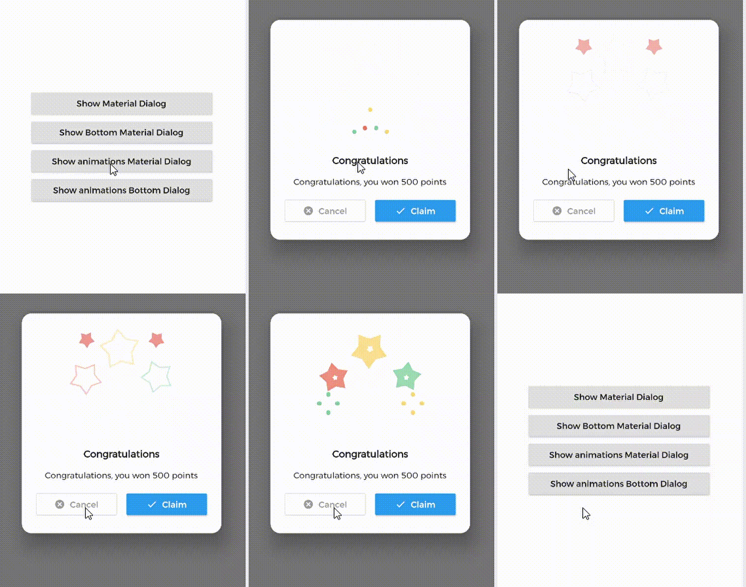
1. Material Dialog 2. Animations Material Dialog 3. Bottom Material Dialog 4. Animations Bottom Dialog

Table of Contents:

Introduction

MaterialDialog This Plugin will be useful to create simple, animated, and beautiful dialogs in your next Flutter app. This library implements Airbnb's Lottie library to render After Effects animation in app.

Types of Dialog

MaterialDialog library provides two types of dialog i.e.

1. Material Dialog 2. Bottom Sheet Material Dialog
A normal material dialog which can have one or two buttons. A Bottom Sheet material dialog which can have one or two buttons, is showed from bottom of device.

Implementation

Implementation of Material Dialog library is so easy. You can check /example directory for demo. Let's have look talk in details about it.

install
i. pubspec

In pubspec.yaml

dependencies:
  material_dialogs: _latest_version

Now in your Dart code, you can use:

import 'package:material_dialogs/material_dialogs.dart';

Details see pub.dev.

Create Dialog

As there are two types of dialogs in library. Material Dialogs are instantiated as follows.

i. Material Dialog

Dialogs class will be used to create your dialog, below is an example to show your dialog in the app.

Dialogs.materialDialog(
          msg: 'Are you sure ? you can\'t undo this',
          title: "Delete",
          color: Colors.white,
          context: context,
          actions: [
            IconsOutlineButton(
              onPressed: () {},
              text: 'Cancel',
              iconData: Icons.cancel_outlined,
              textStyle: TextStyle(color: Colors.grey),
              iconColor: Colors.grey,
            ),
            IconsButton(
              onPressed: () {},
              text: 'Delete',
              iconData: Icons.delete,
              color: Colors.red,
              textStyle: TextStyle(color: Colors.white),
              iconColor: Colors.white,
            ),
          ])

IconsOutlineButton and IconsButton are both buttons widgets provided by the plugin to make things easier for you read more, you can use any other buttons if you want.

ii. Bottom Sheet Material Dialog

Dialogs class will be used to create your dialog, use bottomMaterialDialog. Below is an example to show your dialog in the app.

Dialogs.bottomMaterialDialog(
          msg: 'Are you sure? you can\'t undo this action',
          title: 'Delete',
          context: context,
          actions: [
            IconsOutlineButton(
              onPressed: () {},
              text: 'Cancel',
              iconData: Icons.cancel_outlined,
              textStyle: TextStyle(color: Colors.grey),
              iconColor: Colors.grey,
            ),
            IconsButton(
              onPressed: () {},
              text: 'Delete',
              iconData: Icons.delete,
              color: Colors.red,
              textStyle: TextStyle(color: Colors.white),
              iconColor: Colors.white,
            ),
          ]),

Show Animations

Animations in this library are implemented using Lottie animation library. You can get free animations files here.

*.json file downloaded from LottieFiles should be placed in flutter project.

For example, here cong_example.json animation file is used in the assets folder to show congratulations animation in the example app.

In code, set lottieBuilder arg in Widget to set Animation to the dialog.

Dialogs.materialDialog(
          color: Colors.white,
          msg: 'Congratulations, you won 500 points',
          title: 'Congratulations',
          lottieBuilder: Lottie.asset(
          'assets/cong_example.json',
          fit: BoxFit.contain,
          ),
          context: context,
          actions: [
            IconsButton(
              onPressed: () {},
              text: 'Claim',
              iconData: Icons.done,
              color: Colors.blue,
              textStyle: TextStyle(color: Colors.white),
              iconColor: Colors.white,
            ),
          ]),

Icons buttons

The plugin provide you some out of the box customized buttons to help you creating your dialog.

IconsOutlineButton

This widget helps you create an outline button easily

    IconsOutlineButton(
      onPressed: () {},
      text: 'Cancel',
      iconData: Icons.cancel_outlined,
      textStyle: TextStyle(color: Colors.grey),
      iconColor: Colors.grey,
    ),
IconsButton

This widget helps you create a material button with icons in few lines of code

    IconsButton(
      onPressed: () {},
      text: 'Delete',
      iconData: Icons.delete,
      color: Colors.red,
      textStyle: TextStyle(color: Colors.white),
      iconColor: Colors.white,
    ),
CustomView

You can add your own Widget inside the dialog by using the customView attribute and CustomViewPosition to place it wherever you want.

Possible values
BEFORE_ANIMATION
BEFORE_TITLE (Default)
BEFORE_MESSAGE
BEFORE_ACTION
AFTER_ACTION
Dialogs.materialDialog(
          color: Colors.white,
          msg: 'Congratulations, you won 500 points',
          title: 'Congratulations',
          lottieBuilder: Lottie.asset(
          'assets/cong_example.json',
          fit: BoxFit.contain,
          ),
          customView: MySuperWidget(),
          customViewPosition: CustomViewPosition.BEFORE_ACTION,
          context: context,
          actions: [
            IconsButton(
              onPressed: () {},
              text: 'Claim',
              iconData: Icons.done,
              color: Colors.blue,
              textStyle: TextStyle(color: Colors.white),
              iconColor: Colors.white,
            ),
          ]),

Limitations

it's better to make your animation to have the same background color as your dialog's background color, please use lottie editor to remove the background layer of your animation or make it same as your dialog background color before using it in the plugin.

Contribute

Let's develop with collaborations. We would love to have contributions by raising issues and opening PRs. Filing an issue before PR is must.

Credits

This library is built using following open-source libraries.

License

Project is published under the Apache 2.0 license. Feel free to clone and modify repo as you want, but don't forget to add reference to authors :)

カテゴリー

依存関係

依存関係一覧 1 件

ソースリポジトリ

このパッケージを使用しているプロジェクト

データはまだありません。