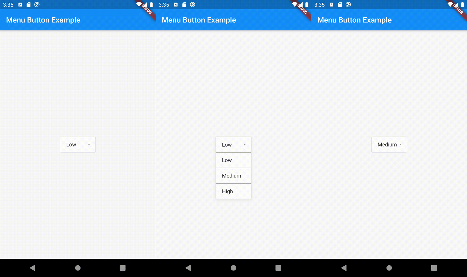
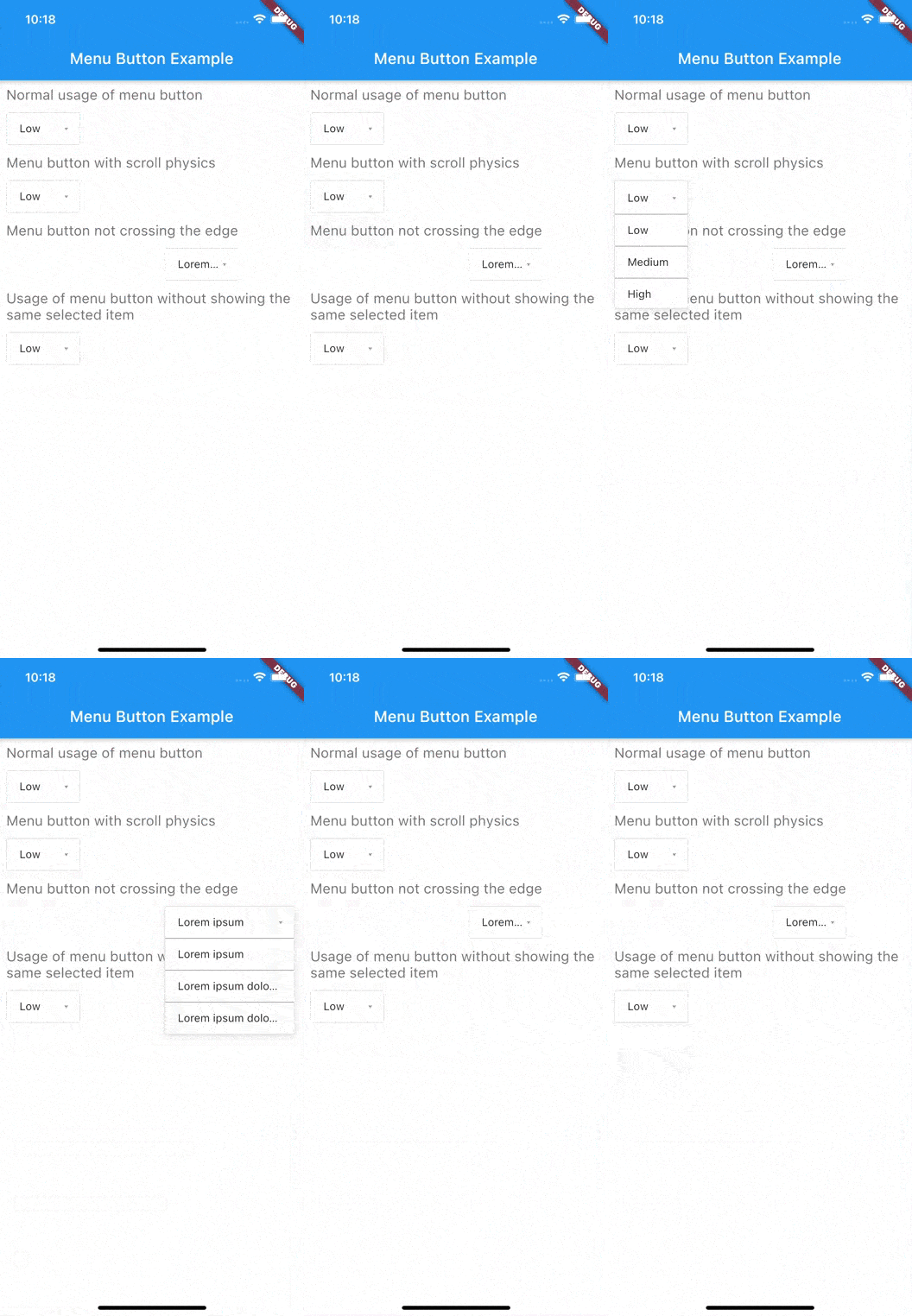
menu_button
Flutter widget to display a popup menu button very simply and easily customizable.
Resources
Installations
Add menu_button: ^1.4.2+1 in your pubspec.yaml dependencies. And import it:
import 'package:menu_button/menu_button.dart' ;
Usage
The widget has a lot of properties to customize it, we will see here the ones needed to get a "basic" menu button.
Firstly we have to declare a variable to keep the selected item (selectedKey) and a list that contains all the items we want to display in this menu button.
Here we will make a list of strings that we will call keys and that contains the values Low, Medium & High.
String selectedKey;
List <String > keys = <String >[
'Low' ,
'Medium' ,
'High' ,
];
Now that we have these two elements we can start using the MenuButton<T> widget.
MenuButton <String >(
child: normalChildButton,
items: keys,
itemBuilder: (String value) => Container (
height: 40 ,
alignment: Alignment .centerLeft,
padding: const EdgeInsets .symmetric (vertical: 0.0 , horizontal: 16 ),
child: Text (value),
),
toggledChild: Container (
child: normalChildButton,
),
onItemSelected: (String value) {
setState (() {
selectedKey = value;
});
},
onMenuButtonToggle: (bool isToggle) {
print (isToggle);
},
)
And finally here is an example of the child widget used for the MenuButton above:
final Widget normalChildButton = SizedBox (
width: 93 ,
height: 40 ,
child: Padding (
padding: const EdgeInsets .only (left: 16 , right: 11 ),
child: Row (
mainAxisAlignment: MainAxisAlignment .spaceBetween,
children: <Widget >[
Flexible (
child: Text (selectedKey, overflow: TextOverflow .ellipsis)
),
const SizedBox (
width: 12 ,
height: 17 ,
child: FittedBox (
fit: BoxFit .fill,
child: Icon (
Icons .arrow_drop_down,
color: Colors .grey,
),
),
),
],
),
),
);
Of course you can make your own according to your needs.
Basic Parameters
Parameter
Description
childA widget to display the default button to trigger the menu button
itemsThe list that contains all values that you want to display on the menu button
itemBuilderA widget to design each item of the menu button
onItemSelectedFunction triggered when an item is selected
onMenuButtonToggleFunction triggered when menu button is triggered (true if displayed, false if not)
toggledChildSame as child but when the menu button is opened
More Parameters
Parameter
Description
crossTheEdgeBy default false you can set it to true if you want the button to expand
dividerA custom divider between each items
decorationA custom decoration for menu button
edgeMarginBy default 0 add a custom value to prevent the button to not touch the edge, check the example edge_menu_button.dart for more information
itemBackgroundColorBy default Colors.white add custom Colors to customize the background of every items
labelAdd a widget to display a custom label as MaterialDesign on top of the button, check label_menu_button.dart for more information
labelDecorationIf you use a label you can set a custom LabelDecoration
menuButtonBackgroundColorBy default Colors.white add custom Colors to customize the background of the menu button
popupHeightBy default popupHeight is automatically calculated but if you need a custom height use this property
scrollPhysicsBy default items are not scrollable (NeverScrollableScrollPhysics), add a ScrollPhysics to enable it, for instance AlwaysScrollableScrollPhysics
showSelectedItemOnListBy default true, set it to false if you don't want the selected items in the list
For a more detail example please take a look at the example folder.
Example
Menu button with 3 items:
If something is missing, feel free to open a ticket or contribute!