month_picker_dialog


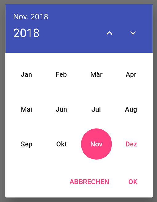
Internationalized material style dialog for picking a single month from an infinite list of years.
This package makes use of the intl package and flutter's i18n abilities to provide labels in all languages known to flutter.

Setting up an internationalized app: the flutter localization package
How to use it:
Just add:
showMonthPicker() to select a single month;
showMonthRangePicker() to select a range of months;
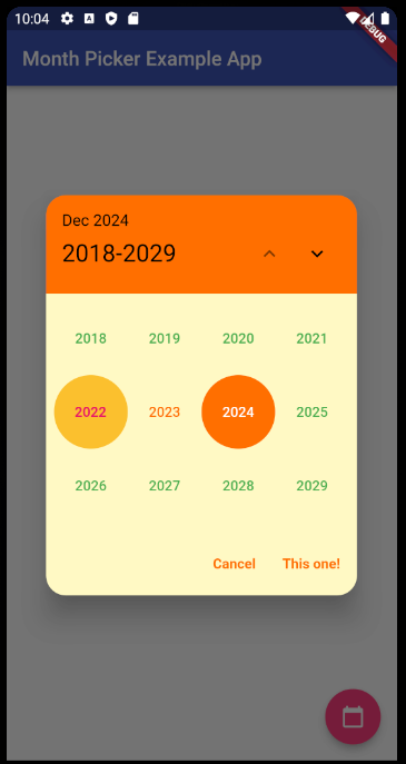
showYearPicker() to select only a year;
...inside your button function like a normal date picker dialog (context parameter is required):
Example:
FloatingActionButton(
    onPressed: () {
        showMonthPicker(
        context: context,
        initialDate: DateTime.now(),
        ).then((date) {
        if (date != null) {
            setState(() {
            selectedDate = date;
            });
        }
        });
    },
    child: Icon(Icons.calendar_today),
),

FloatingActionButton(
    onPressed: () {
        showMonthRangePicker(
        context: context,
        initialDate: DateTime.now(),
        rangeList: true,
        ).then((List<DateTime>? dates) {
        if (dates != null) {
            print(dates);
            print(dates.last.lastDayOfMonth());
        }
        });
    },
    child: Icon(Icons.calendar_today),
),

FloatingActionButton(
    onPressed: () {
        showYearPicker(
        context: context,
        initialDate: DateTime.now(),
        ).then((year) {
        if (year != null) {
            setState(() {
            selectedYear = year;
            });
        }
        });
    },
    child: Icon(Icons.calendar_today),
),
Migrating to 5.0:
Starting with version 5.0.0 of the package, everything related to the behavior/style of it that isn't a function, date parameter or custom widget is now under the new MonthPickerDialogSettings class.
It contains three subclasses:
PickerDialogSettings to customize the dialog part of the package;
PickerHeaderSettings to customize the header part of the package;
PickerButtonsSettings to customize the buttons part of the package;
And will be used like this:
FloatingActionButton(
    onPressed: () {
        showMonthPicker(
        context: context,
        initialDate: DateTime.now(),
        monthPickerDialogSettings: const MonthPickerDialogSettings(
            headerSettings: PickerHeaderSettings(
                headerCurrentPageTextStyle: TextStyle(fontSize: 14),
                headerSelectedIntervalTextStyle: TextStyle(fontSize: 16),
            ),
            dialogSettings: PickerDialogSettings(
                locale: const Locale('en'),
                dialogRoundedCornersRadius: 20,
                dialogBackgroundColor: Colors.blueGrey[50],
            ),
            buttonsSettings: PickerButtonsSettings(
                buttonBorder: const RoundedRectangleBorder(),
                selectedMonthBackgroundColor: Colors.amber[900],
                selectedMonthTextColor: Colors.white,
                unselectedMonthsTextColor: Colors.black,
                currentMonthTextColor: Colors.green,
                yearTextStyle: const TextStyle(
                    fontSize: 10,
                ),
                monthTextStyle: const TextStyle(
                    fontWeight: FontWeight.bold,
                    fontSize: 18,
                ),
            ),
        ),
        ).then((date) {
        if (date != null) {
            setState(() {
            selectedDate = date;
            });
        }
        });
    },
    child: Icon(Icons.calendar_today),
),
If you have any doubts on how to use this new settings class (that the sample app can't solve), please feel free to open an issue on the github project.
Contributors:
Gian Bettega
Dimitri Krivoj (the original creator of the package)
Fabio Henrique
Leon Colt
Wesley Gonzaga
Efrain Bastidas
Volodymyr Hyrka
Bern
just1982
Sagar Zala
Pong Loong Yeat
Masayuki Ono
Alecsplus
Lautaro Zanuttini
sinelser
sheldontuitt
nomoruyi
gabrielezereik
roth-arasys