パッケージ、リポジトリ、アプリカテゴリを検索

morphable_shape のカバー
パッケージ詳細v2.0.1

morphable_shape

さまざまな形状をレスポンシブに作成し、互いに変形できるFlutterパッケージ。

AndroidiOSWebmacOSWindowsLinux
30日間ダウンロード
6670
いいね数
202
Pub ポイント
160

パッケージをインストール

flutter pub add morphable_shape

パッケージ概要

公開情報に基づく選定ガイドです。参考としてご利用ください。

MorphableShape は、Flutter パッケージであり、さまざまな形態間をスムーズに遷移できる応答性があり、動的な形状の作成を可能にします。インタラクティブでアニメーション対応の UI を目的として設計されており、開発者がカスタムパスを定義し、複数のプラットフォーム上でリアルタイムでその変形をアニメーション化できます。視覚効果やローディングインジケーター、クリエイティブなインターフェースに最適で、直感的な API を使って複雑なパスアニメーションを簡略化します。このパッケージは、すべての主要な Flutter プラットフォームをサポートしており、モバイルからデスクトップおよびウェブまで一貫した動作を保証します。

用途

  • アニメーションUI要素
  • インタラクティブな形状の遷移
  • 読み込みアニメーション
  • クリエイティブなインターフェースデザイン
  • 応答性のある形状コンポーネント

主な機能

  • 形状間のスムーズな変化
  • レスポンシブデザインのサポート
  • クロスプラットフォーム互換性
  • カスタムパス定義
  • リアルタイムアニメーション制御

適している対象

  • ダイナミックなビジュアルを求めるUI/UXデザイナー
  • インタラクティブなアプリを開発する開発者
  • 流体の形状アニメーションを必要とするプロジェクト
  • 実験的インターフェースのプロトタイピング
  • ビジュアルストーリーテリングに重点を置いたアプリ

注意事項

  • 複雑なパスによるパフォーマンスへの影響
  • スムーズな遷移には、パスの定義に注意が必要です
  • 低性能デバイス向けの最適化が必要になる可能性があります
  • 基本的な例以外のドキュメントは限られている
  • 中程度の複雑さのアニメーションに最適

元の README

関連するソースリポジトリの README 原文のスナップショットです。最新の内容はリポジトリをご覧ください。

morphable_shape

A Flutter package for creating various shapes that are responsive and can morph between each other.

Notice: This class uses the dimension package but only the px and percent units are respected since ShapeBorder has no access to the build context and the screen size.

Getting Started

First, you need to create a ShapeBorder instance. The responsive feature means that you can have a single ShapeBorder instance that adapts to different sizes without you calculating the desired dimensions. For example, the following code will give you a rounded rectangle border with a 60 px circular radius at the top left corner and a (60 px, 10%) elliptical corner at the bottom right corner. (for more information of how to use the Length class, see dimension).

ShapeBorder rectangle=RectangleShapeBorder(
    borderRadius: DynamicBorderRadius.only(
    topLeft: DynamicRadius.circular(10.toPXLength),
    bottomRight: DynamicRadius.elliptical(60.0.toPXLength, 10.0.toPercentLength))
    );

You can create a ShapeBorder that gets used by the Material widget or the ClipPath widget which perform the shape clipping.

Widget widget=Material(
    shape: rectangle,
    clipBehavior: Clip.antiAlias,
    child: Container()
    );

Or you can use it in a ShapeDecoration and provide it to the Container/DecoratedBox widget:

Decoration decoration = ShapeDecoration(shape: rectangle);
Widget widget = Container(
decoration: decoration
);

This package also has the DecoratedShadowedShape widget which lets you define inset shadows which Flutter does not support right now:

Widget widget = DecoratedShadowedShape(
    shape: shape,
    shadows: shadows,
    insetShadows: insetShadows,
    decoration: decoration,
    child: child
    );

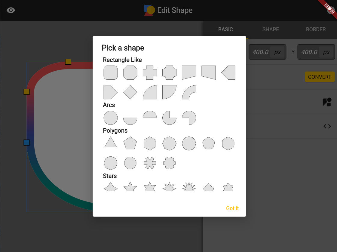
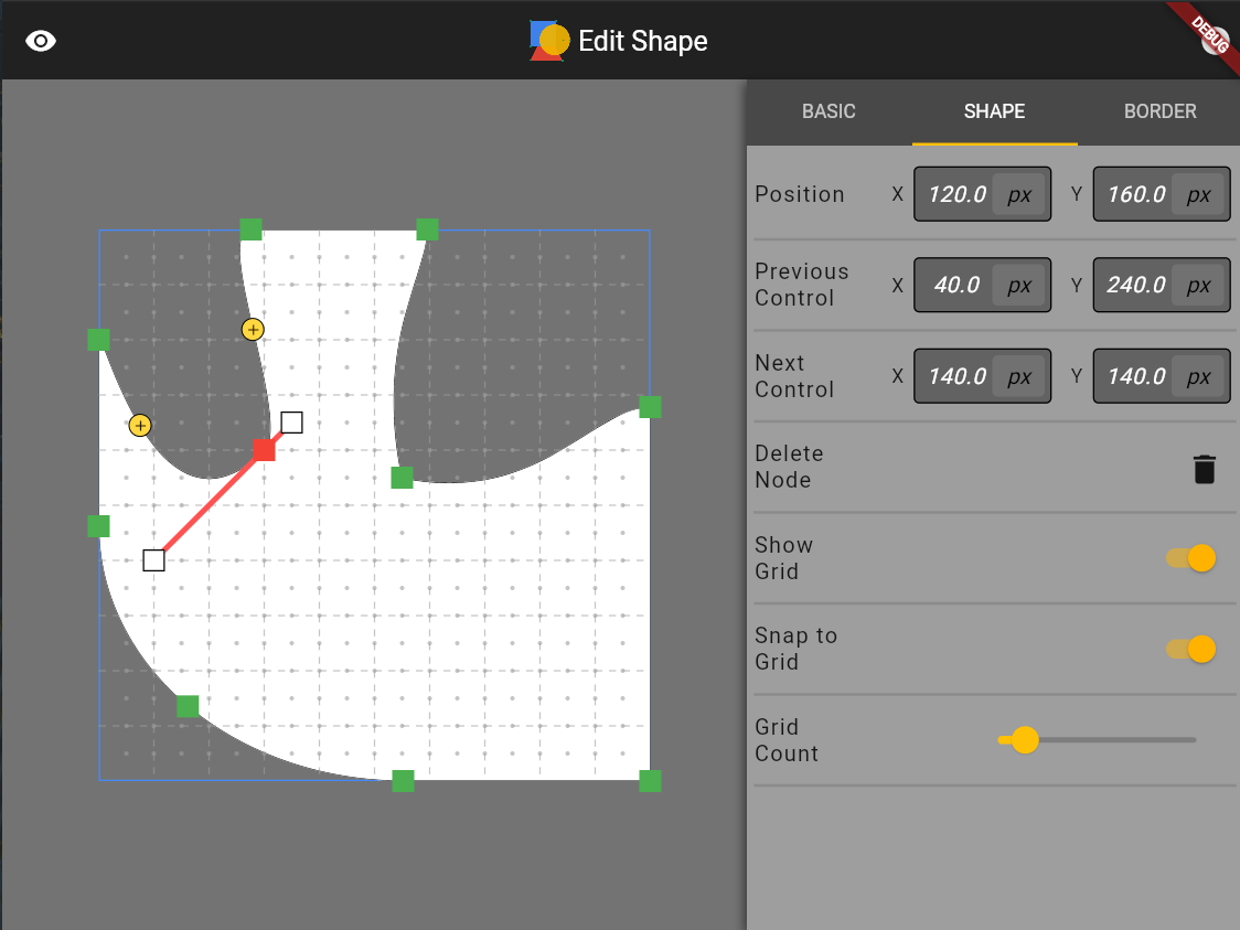
You can run the example app to create a local shape editing tool to see the various shapes supported by this package (also hosted online at https://fluttershape.com/).

DynamicBorderSide

The DynamicBorderSide is an extension to the built-in BorderSide class. It supports gradient filling in addtion to single color filling. It also supports painting partially by specifing the begin, end and offset parameters (e.g. paint only the first half of the border side). You can change the strokeJoin and strokeCap paramter as well.

This class is used to configure how the borders are painted with different shapes.

DynamicBorderSide(
    style: BorderStyle.solid,
    width: 1,
    color: Colors.red,
    gradient: LinearGradient(colors:[Colors.red, Colors.blue]),
    begin: 0.toPercentLength,
    end: 100.toPercentLength,
    offset: 0.toPercentLength,
    strokeJoin: StrokeJoin.miter,
    strokeCap: StrokeCap.round,
);

Supported Shapes

Currently supported shape borders are:

RectangleShapeBorder

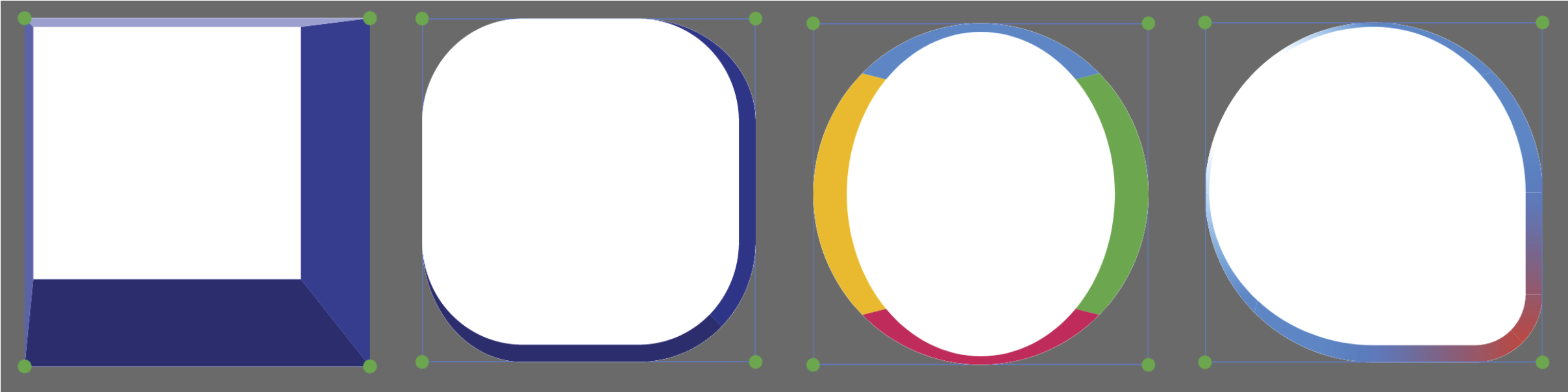
The most powerful and commonly used one should be the RectangleShapeBorder class. It allows to you configure each corner of the rectangle individually or at once. It also automatically scales all sides so that they don’t overlap (just like what CSS does). The RectangleShapeBorder supports four different corner styles:

enum CornerStyle{
  rounded,
  concave,
  straight,
  cutout,
}

You can configure the corner styles at once or individually:

var cornerStyles=RectangleCornerStyles.all(CornerStyle.rounded);
cornerStyles=RectangleCornerStyles.only(
topLeft: CornerStyle.rounded, 
bottomRight: CornerStyle.concave
);

You can also specify the border width, color (or gradient) using the DynamicBorderSide class:

var border=DynamicBorderSide(
width: 10,
gradient: LinearGradient(colors:[Colors.red, Colors.green]),
);

Now you get a fully fledged rectangle:

ShapeBorder rectangle=RectangleShapeBorder(
borderRadius:
        const DynamicBorderRadius.all(DynamicRadius.circular(Length(100))),
cornerStyles: cornerStyles,
border: border,
);

You can make a triangle, a diamond, a trapezoid, or even an arrow shape by just using the RectangleShapeBorder class and providing the right corner style and border radius.

rectangle

CircleShapeBorder

CircleShapeBorder gives you a circle. Simple as that.

RoundedRectangleShapeBorder

If you use the RoundedRectangleShapeBorder class, then the four border sides can be configured individually. The four border sides can be styled independently or at once, similar to what CSS offers:

var borders=RectangleBorderSides.all(DynamicBorderSide.none);
borders=RectangleBorderSides.symmetric(
horizontal: DynamicBorderSide(
width: 10,
color: Colors.blue,
));
borders=RectangleBorderSides.only(
top: DynamicBorderSide(
width: 10,
gradient: LinearGradient(colors:[Colors.red, Colors.green]),
));

Then you have:

ShapeBorder shapeBorder=RoundedRectangleShapeBorder(
    borderRadius: DynamicBorderRadius.all(DynamicRadius.circular(Length(100))),
    borderSides: borders,
  );

Below are some border designs using this class. This class is very similar to what CSS offers and is a combination of the BoxBorder and RoundedRectangleBorder class that Flutter offers.

round_rectangle

PolygonShapeBorder

PolygonShapeBorder supports changing the number of sides as well as corner radius and corner style:

PolygonShapeBorder(
sides:6,
cornerRadius: 10.toPercentLength,
cornerStyle: CornerStyle.rounded
)

polygon

StarShapeBorder

The StarShapeBorder allows you to change the number of corners, the inset, the border radius, the border style, the inset radius, and the inset style.

StarShapeBorder(
corners: 5,
inset: 50.toPercentLength,
cornerRadius: 0.toPXLength,
cornerStyle: CornerStyle.rounded,
insetRadius: 0.toPXLength,
insetStyle: CornerStyle.rounded
)

star

ArcShapeBorder, ArrowShapeBorder, BubbleShapeBorder, TrapezoidShapeBorder, TriangleShapeBorder

These shape borders are also supported and responsive. Check out their constructors to see how to make them.

various

PathShapeBorder

Accepts a DynamicPath instance to draw a custom path border. Right now only straight line and cubic Bezier curves are supported. Arcs need to be translated to cubic Beziers first. In the future I may let this class accept close SVG path as well.

Shape Morphing

Every shape in this package can be morphed into one another, including the border side(s). Hence the name of this package. To morph between two shapes you first need to create a ShapeBorderTween:

MorphableShapeBorderTween shapeBorderTween =
        MorphableShapeBorderTween(begin: beginShapeBorder, end: endShapeBorder);

Then you can get the intermediate shapes at progress t(from 0 to 1) by calling:

ShapeBorder intermediate=shapeBorderTween.lerp(t);

For an explanation and demonstration of the morphing algorithm, take a look at this Medium post.

Below are some showcases of the shape morphing process. Most shapes can be morphed in a natural fashion.

morph

morph2

There are three morph methods to choose when you create your tween.

MorphableShapeBorderTween shapeBorderTween =
        MorphableShapeBorderTween(begin: startBorder, end: endBorder, 
        method: MorphMethod.auto);

The MorphMethod.weighted tries to use as little control points as possible to do the morphing and takes into account the length of each side of a shape. The MorphMethod.unweighted uses more points
but do not utilize the length information. The MorphMethod.auto will choose either one of the two methods based on some geometric criteria to make the morphing process to look more natural. The auto method generally works well, but you can try other ones if the morphing looks weird.

Shapes with the same geometry can be morphed faster and in a more consistent way. For example, rectangles and rounded rectangles, or polygons with the same number of sides. For other shapes, the morphing takes more time and may not look great especially for two very distinct shapes.

Shape Serialization

Every shape in this package supports serialization. If you have designed some shape you like, just call toJson() on it. Then you can reuse it by writting.

Shape shape=RoundedRectangleShape();
String jsonStr=json.encode(shape.toJson());
MorphableShapeBorder shapeDecoded=parseMorphableShapeBorder(json.decode(jsonStr));

Decorated Shadowed Shape

You can use the DecoratedShadowedShape widget to add shadow and inset shadow to your widget.

DecoratedShadowedShape(
      shape: shape,
      shadows: shadows,
      insetShadows: insetShadows,
      decoration: decoration,
      child: child);

This will render the following component from bottom to top: shadows, decoration, inset shadows, child, shape border.

The ShapeShadow is very similar to the BoxShadow class but supports gradient filling:

const ShapeShadow({
    Color color = const Color(0xFF000000),
    Offset offset = Offset.zero,
    double blurRadius = 0.0,
    this.spreadRadius = 0.0,
    this.gradient,
  })

If you want implicit animation for this widget, use the AnimatedDecoratedShadowedShape.

The animated_styled_widget has many exmaples using the DecoratedShadowedShape widget.

A Shape Editing Tool

As I mentioned before, the example app in this package is a shape editing tool for you to quickly design the shape you want and generate the corresponding code. Below are some screenshots of the interfaces of this tool. I put about equal amount of effort into developing this tool compared to developing this package so I strongly recommend you to check it out. You can either build it locally or visit: https://fluttershape.com/.

interface interface2 interface3 interface4 interface5

カテゴリー

依存関係

依存関係一覧 3 件

  • animated_box_decoration>=0.0.7 <0.1.0
  • dimension^0.2.0
  • flutter_class_parser^0.2.5

ソースリポジトリ

このパッケージを使用しているプロジェクト