パッケージ、リポジトリ、アプリカテゴリを検索

neopop のカバー
パッケージ詳細v1.0.2

neopop

NeoPop は、アプリで NeoPop コンポーネントを使用するための CRED の組み込みライブラリです。

AndroidiOSWebmacOSWindowsLinux
30日間ダウンロード
864
いいね数
336
Pub ポイント
150

パッケージをインストール

flutter pub add neopop

パッケージ概要

公開情報に基づく選定ガイドです。参考としてご利用ください。

NeoPop は CRED.club が開発した Flutter パッケージで、モダンな UI を構築するためのカスタマイズ可能で視覚的に魅力的なコンポーネントを提供します。アニメーション付きでインタラクティブな要素(ボタンやプログレスインジケーターなど)を、洗練された現代的なデザイン言語で簡単に統合できるようにしています。このライブラリは、繊細なアニメーションと応答性のあるフィードバックを通じてユーザー体験を向上させるように設計されており、洗練され、ダイナミックなインターフェースを目指すアプリに最適です。NeoPop は Android、iOS、Web、macOS、Windows、Linux といった複数のプラットフォームをサポートしており、デバイス間で一貫したパフォーマンスを実現します。

用途

  • モバイルアプリでアニメーションボタンを作成する
  • インタラクティブな進行状況インジケーターの実装
  • 現代的なビジュアルエフェクトによるUIの向上
  • 魅力的なオンボーディング画面の構築
  • ハイファイデプロトタイプの設計
  • フォームにマイクロインタラクションを追加する

主な機能

  • 事前構築されたカスタマイズ可能な NeoPop コンポーネント
  • スムーズなアニメーションとハプティックフィードバック
  • クロスプラットフォーム互換性
  • pub add を通じた簡単な統合
  • 軽量でパフォーマンスに優れる
  • ダークモードのサポート

適している対象

  • 現代的なコンポーネントを探しているUIデザイナー
  • インタラクティブなFlutterアプリを開発する開発者
  • ユーザー参加度に注力するチーム
  • 洗練されたMVPを作成するスタートアップ
  • クロスプラットフォームプロジェクトに従事するフロントエンドエンジニア

注意事項

  • 複雑なテーマに対応するためには追加のスタイル設定が必要になる場合があります
  • 基本的な使用方法以外のドキュメントは限られている
  • モダンな美学的目標を持つアプリに最適
  • ミニマリズムまたは伝統的なUIデザインには適していない
  • アニメーションの過剰使用によるパフォーマンスへの影響

元の README

関連するソースリポジトリの README 原文のスナップショットです。最新の内容はリポジトリをご覧ください。

NeoPOP

NeoPOP is CRED's inbuilt library for using NeoPOP components in your app.

What really is NeoPOP?

NeoPOP was created with one simple goal; to create the next generation of a beautiful, affirmative design system. NeoPOP stays true to everything that design at CRED stands for.

NeoPOP is built for Android, iOS, Flutter and Web

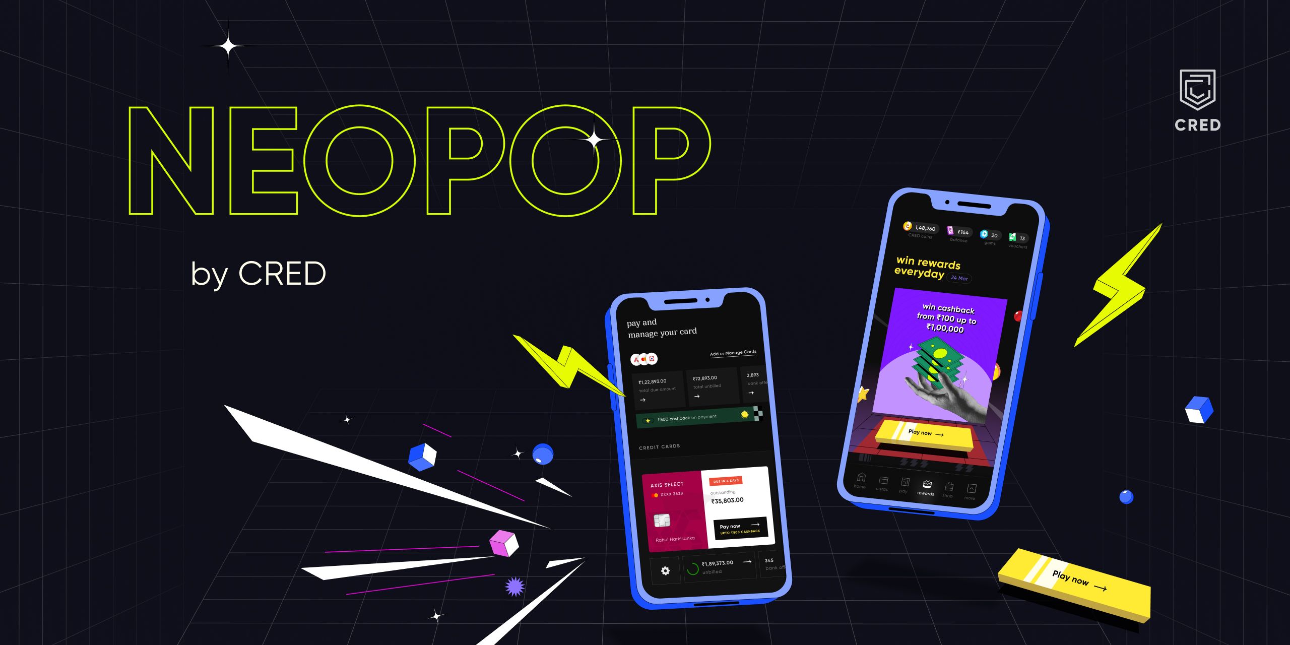
NeoPOP Banner

Installation

Add neopop as a dependency in your pubspec.yaml file.

dependencies:
    neopop: ^1.0.2

NeoPopButton

Configs NeoPopButton render 5 surfaces, top, left, right, bottom and center. NeoPopButton widget gives you mutliple configs that you can use for your widget.

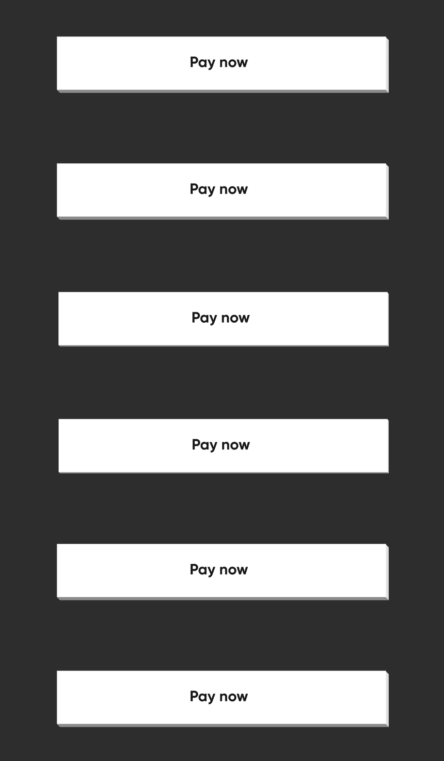
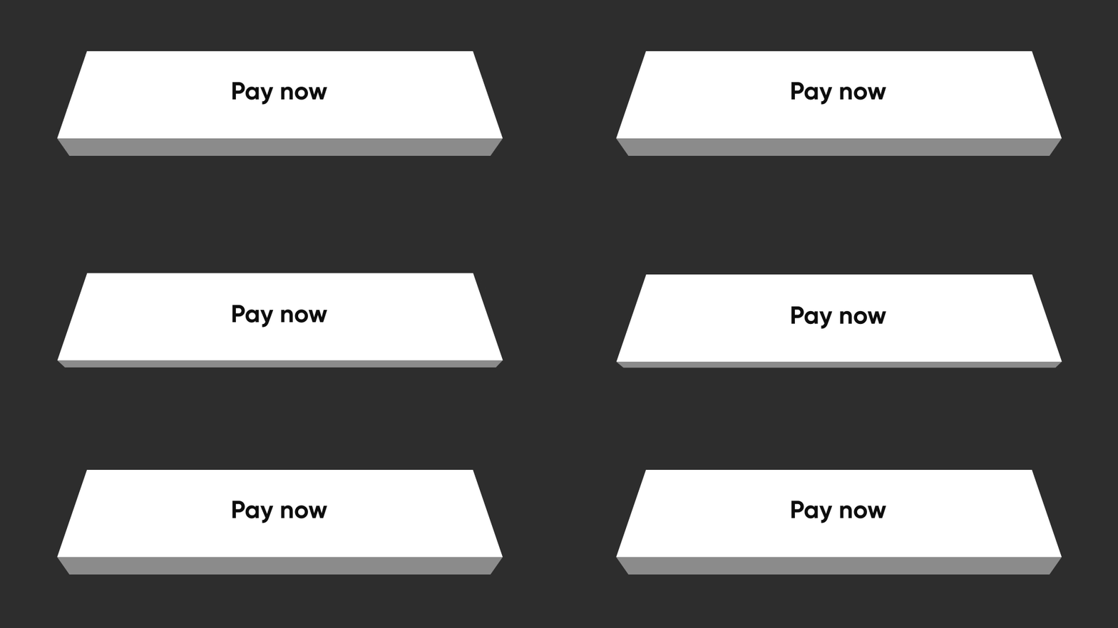
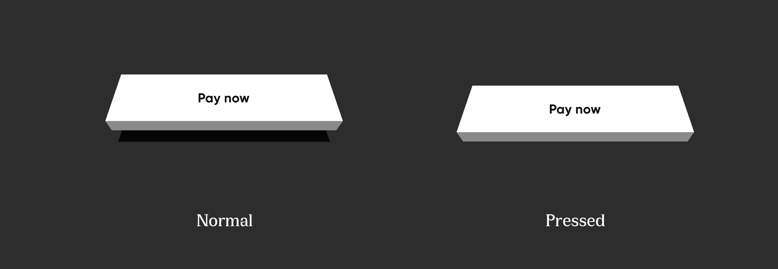
Elevated

Elevated elevated

NeoPopButton(
    color: Colors.white,
    onTapUp: () => HapticFeedback.vibrate(),
    onTapDown: () => HapticFeedback.vibrate(),
    child: Padding(
        padding: EdgeInsets.symmetric(horizontal: 20, vertical: 15),
        child: Row(
            mainAxisAlignment: MainAxisAlignment.center,
            children: [
                Text("Pay now"),
            ],
        ),
    ),
),

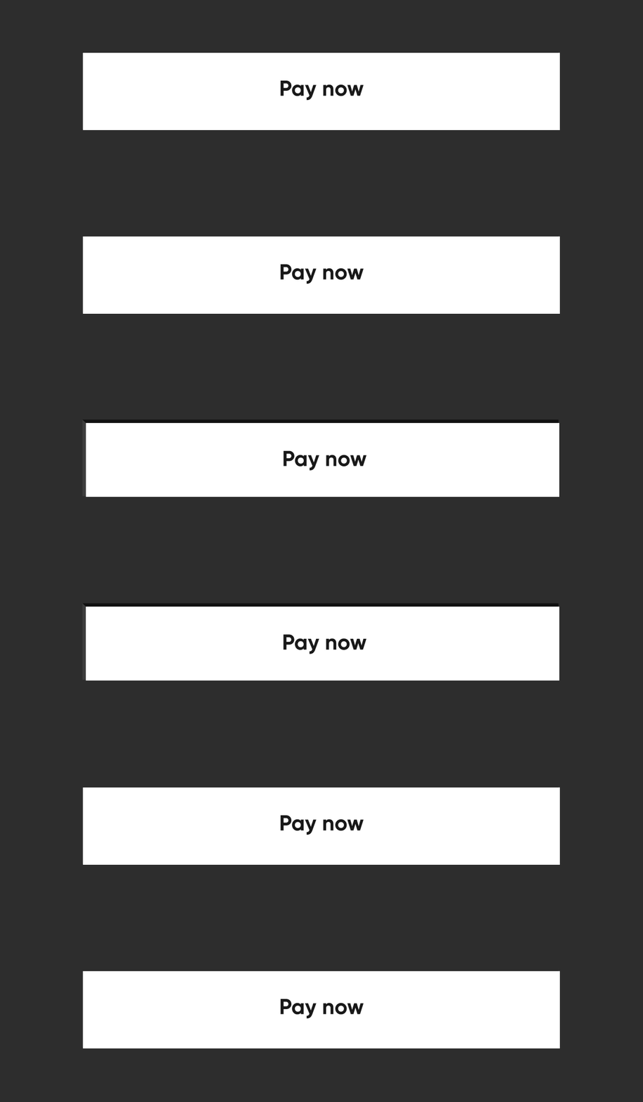
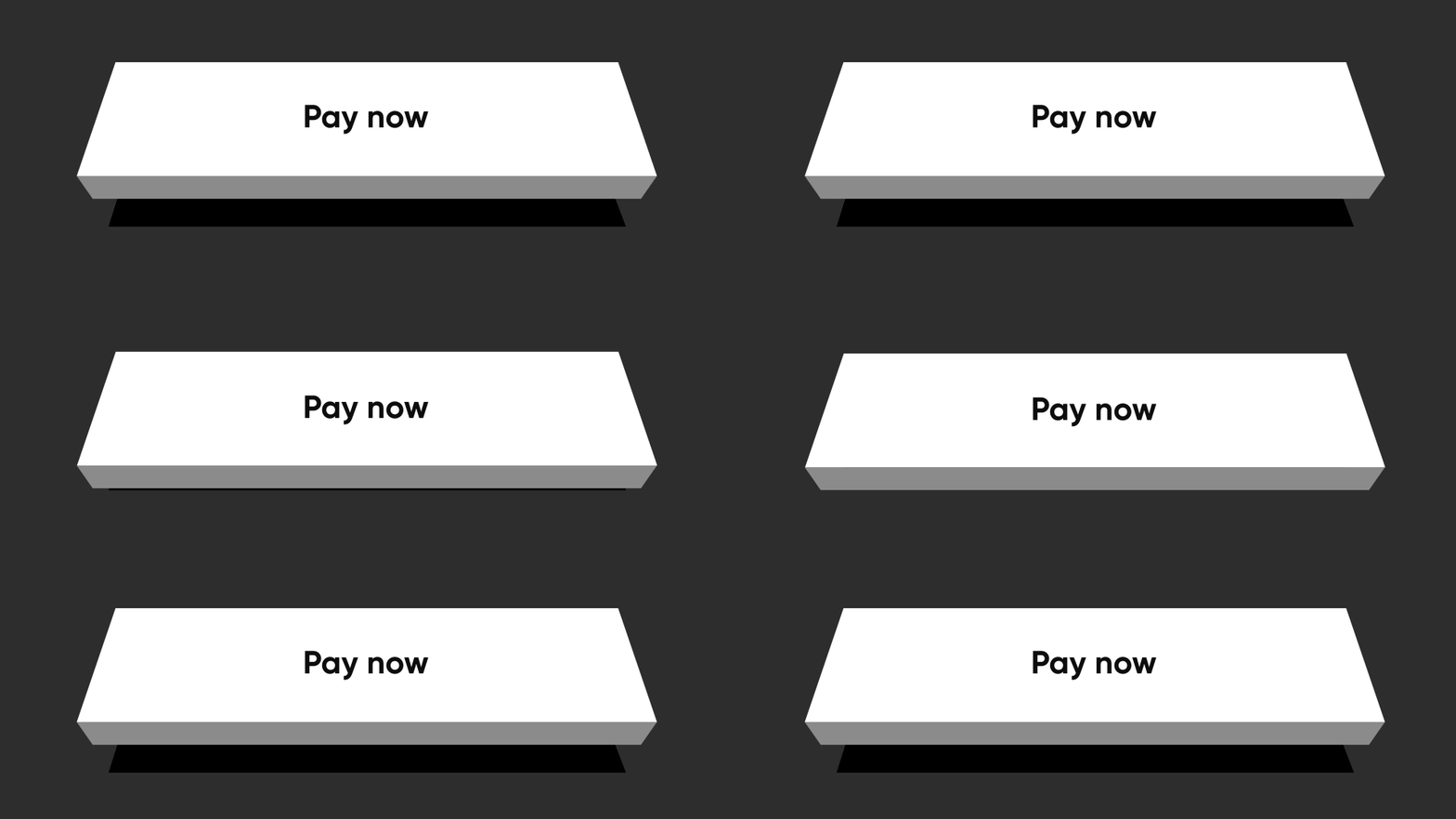
Flat

Flat flatButton

By specifying the buttonPosition as Position.center, NeoPOP will compute right and bottom surface's color according to color. Top and left surface's color is computed w.r.t parentColor and grandparentColor

NeoPopButton(
    color: Colors.white,
    onTapUp: () => HapticFeedback.vibrate(),
    onTapDown: () => HapticFeedback.vibrate(),
    parentColor: Colors.transparent,
    buttonPosition: Position.center,
    child: Padding(
        padding: const EdgeInsets.symmetric(horizontal: 20, vertical: 15),
        child: Row(
            mainAxisAlignment: MainAxisAlignment.center,
            children: const [
                Text("Pay Now"),
            ],
        ),
    ),
),

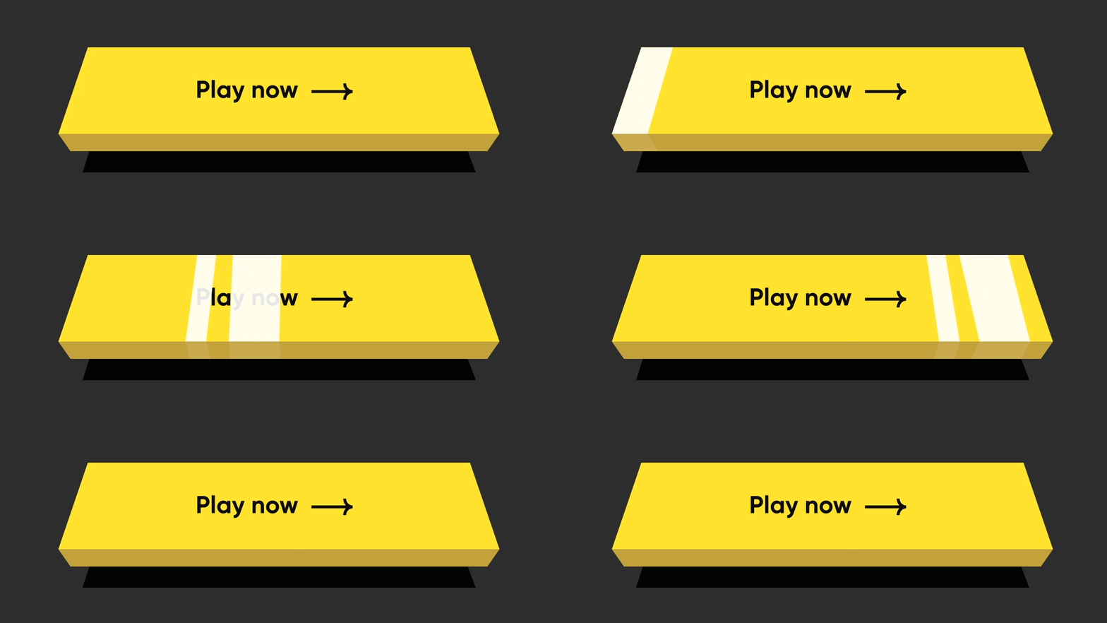
Shimmer

const NeoPopShimmer(
    shimmerColor: Colors.yellow,
    child: Padding(
        padding: const EdgeInsets.symmetric(horizontal: 100, vertical: 15),
        child: Text("Hello"),
    ),
),

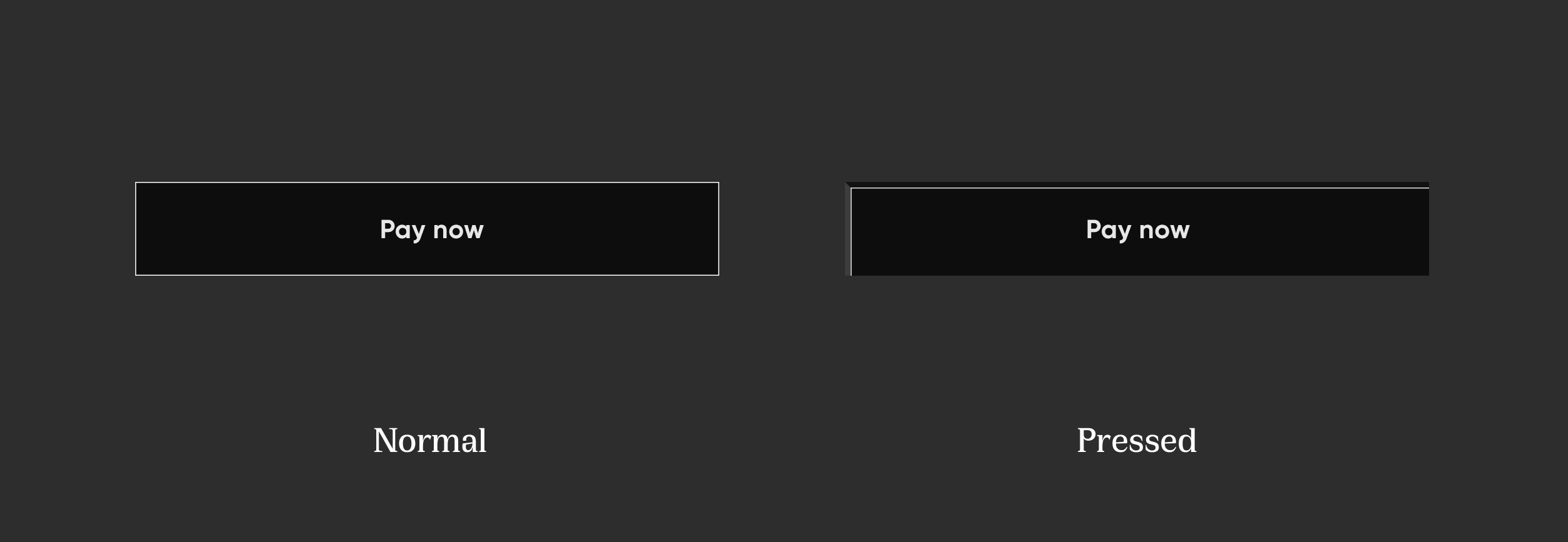
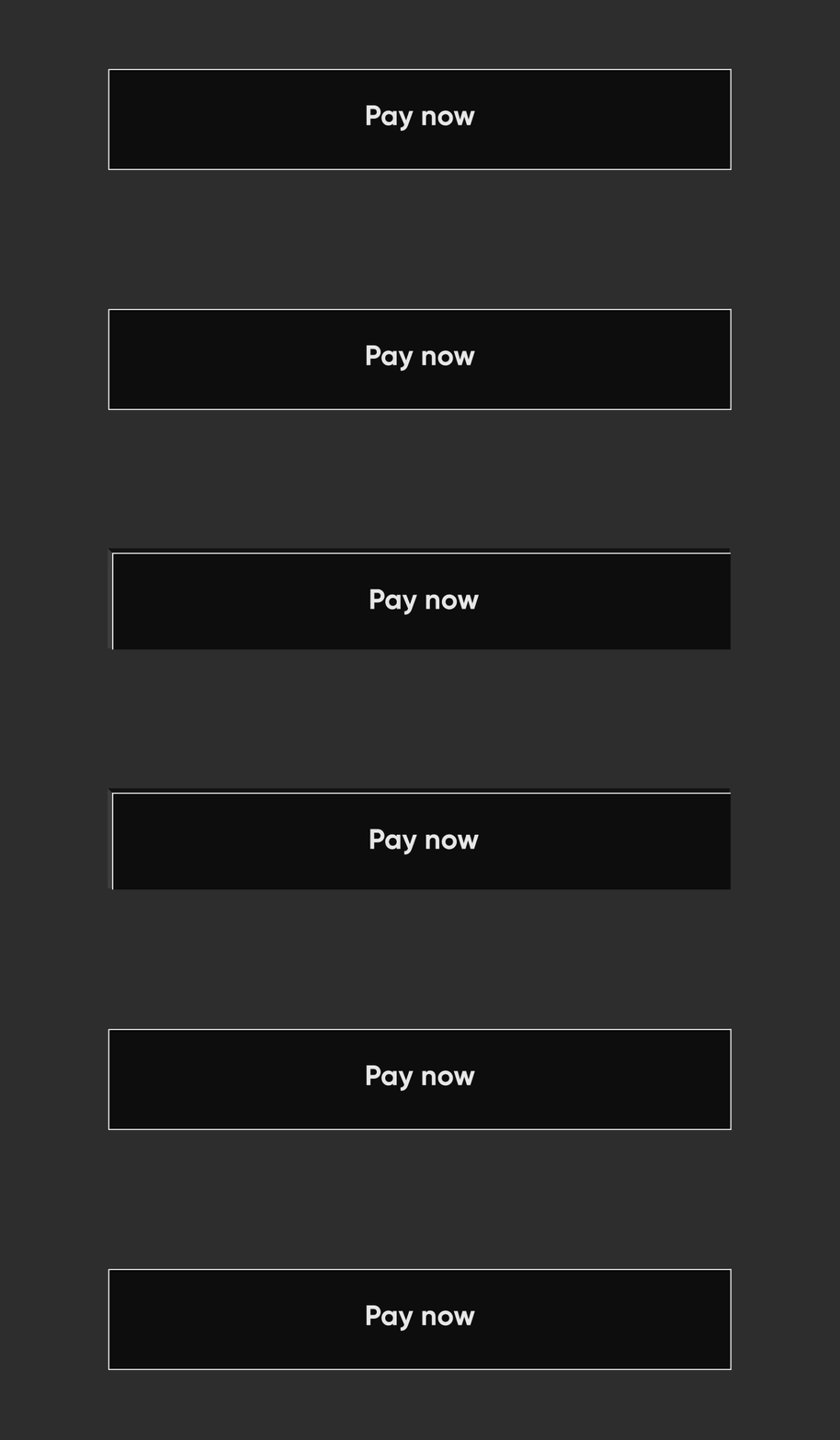
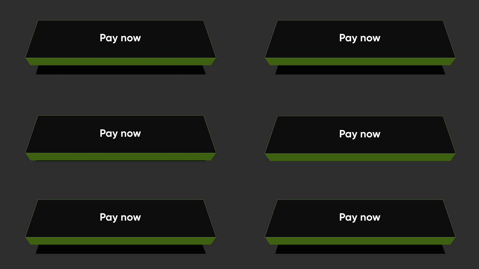
Flat Strokes

Flat Strokes flatStroked

To add border on a flat button, add border

NeoPopButton(
    color: const Color.fromRGBO(0, 0, 0, 1),
    buttonPosition: Position.center,
    onTapUp: () {},
    border: const Border.fromBorderSide(
        BorderSide(color: kBorderColorWhite, width: kButtonBorderWidth),
    ),
    child: Padding(
        padding: const EdgeInsets.symmetric(horizontal: 20, vertical: 15),
        child: Row(
            mainAxisAlignment: MainAxisAlignment.center,
            children: const [
                Text("Pay Now", style: TextStyle(color: Colors.white)),
            ],
        ),
    ),
),

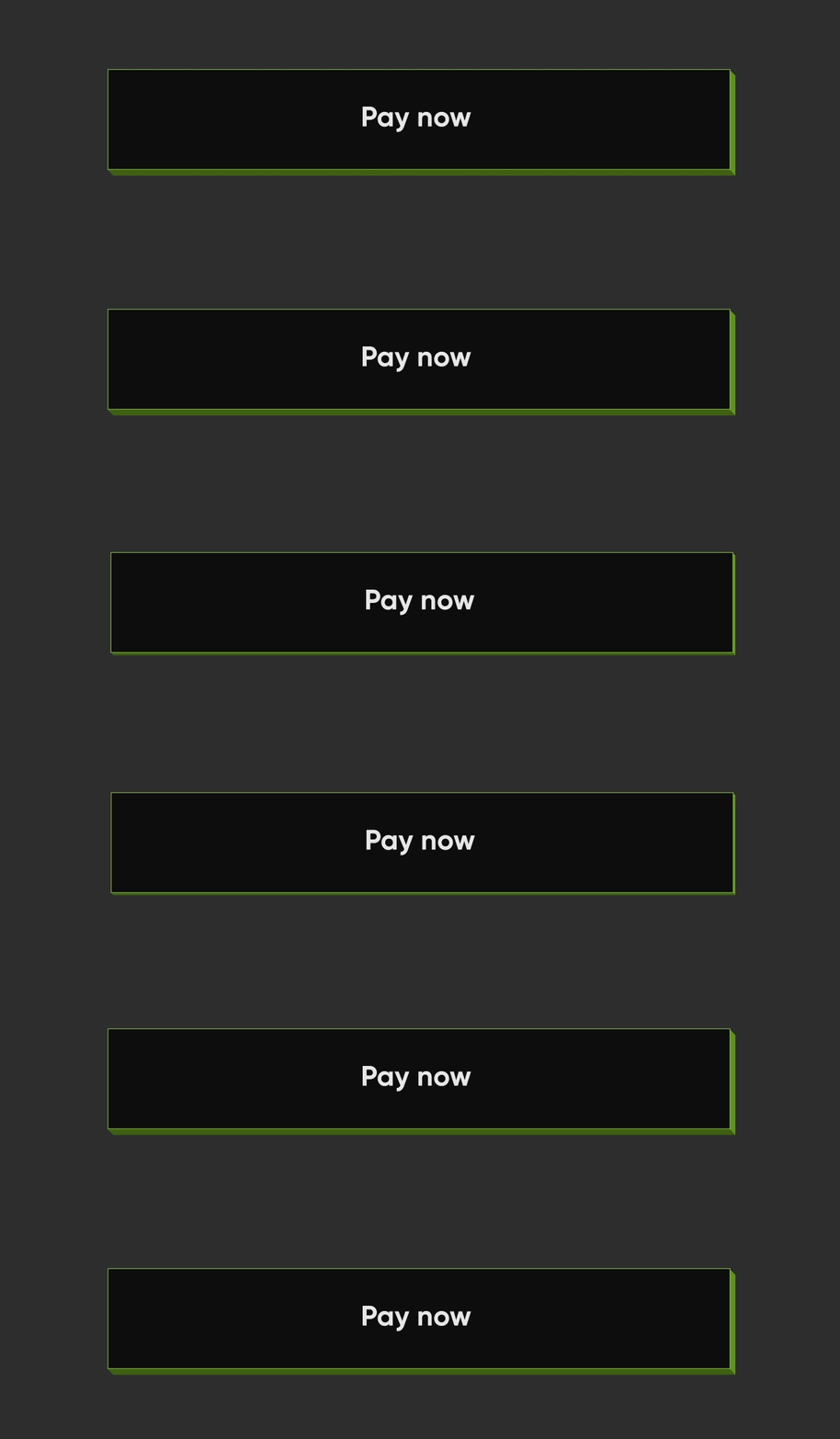
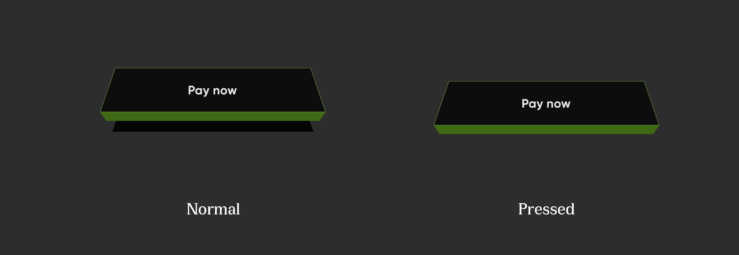
Elevated Strokes

Elevated Strokes elevatedStroked

NeoPopButton(
    color: kSecondaryButtonLightColor,
    bottomShadowColor: ColorUtils.getVerticalShadow(kBorderColorGreen).toColor(),
    rightShadowColor: ColorUtils.getHorizontalShadow(kBorderColorGreen).toColor(),
    animationDuration: kButtonAnimationDuration,
    depth: kButtonDepth,
    onTapUp: () {},
    border: Border.all(
        color: kBorderColorGreen,
        width: kButtonBorderWidth,
    ),
    child: Padding(
        padding: const EdgeInsets.symmetric(horizontal: 20, vertical: 15),
        child: Row(
            mainAxisAlignment: MainAxisAlignment.center,
            children: const [
                Text("Scan & Pay", style: TextStyle(color: Colors.white)),
            ],
        ),
    ),
),

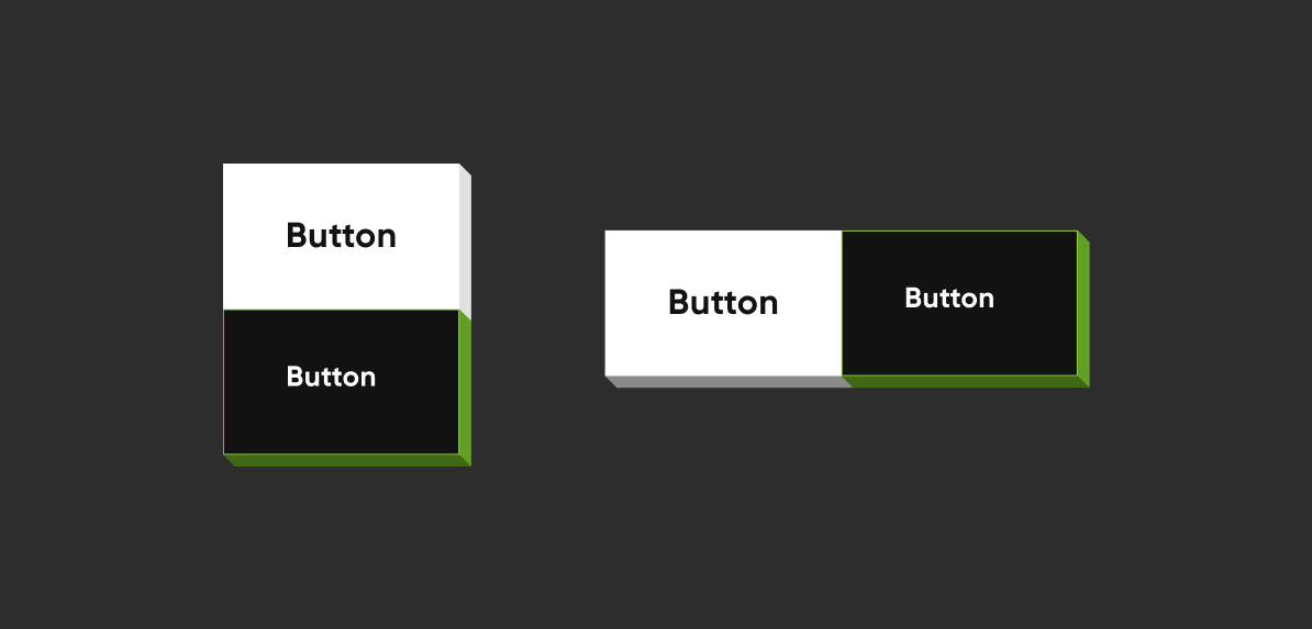
Adjacent Buttons

Adjacent Buttons

Vertically Aligned Buttons
Column(
    mainAxisSize: MainAxisSize.min,
    children: [
        NeoPopButton(
        color: kSecondaryButtonLightColor,
        bottomShadowColor: kShadowColorDarkGreen,
        rightShadowColor: kShadowColorGreen,
        buttonPosition: Position.fullBottom,
        onTapUp: () {},
        border: Border.all(
            color: kBorderColorGreen, width: kButtonBorderWidth,
        ),
        child:  const Padding(
                    padding: EdgeInsets.symmetric(horizontal: 8.0, vertical: 15.0),
                    child: Text(
                    "Button",
                    style: TextStyle(color: Colors.white),
                ),
            ),
        ),
        NeoPopButton(
            color: kPrimaryButtonColor,
            buttonPosition: Position.fullBottom,
            onTapUp: () {},
            child:  const Padding(
                padding: EdgeInsets.symmetric(horizontal: 8.0, vertical: 15.0),
                child: Text("Button"),
            ),
        ),
    ],
),
Horizontally Aligned Buttons
Row(
    mainAxisSize: MainAxisSize.min,
    children: [
        Expanded(
        child: NeoPopButton(
            color: kPrimaryButtonColor,
            buttonPosition: Position.fullBottom,
            depth: kButtonDepth,
            onTapUp: () {},
            child: const Center(
            child:  Padding(
                    padding: EdgeInsets.symmetric(
                        horizontal: 8.0, vertical: 15.0),
                    child: Text("Button"),
                    ),
                ),
            ),
        ),
        Expanded(
            child: NeoPopButton(
                color: kSecondaryButtonLightColor,
                bottomShadowColor: kShadowColorDarkGreen,
                rightShadowColor: kShadowColorGreen,
                buttonPosition: Position.fullBottom,
                depth: kButtonDepth,
                onTapUp: () {},
                border: Border.all(
                    color: kBorderColorGreen, width: kButtonBorderWidth,
                ),
                child: const Center(
                child: Padding(
                    padding: EdgeInsets.symmetric( horizontal: 8.0, vertical: 15.0),
                    child: Text(
                            "Button",
                            style: TextStyle(color: Colors.white),
                        ),
                    ),
                ),
            ),
        ),
    ],
),

NeoPopButton Attributes

Attribute Type Description
child Widget The child of button widget
color Color Color of the button
depth double The depth of the button if it is elevated
onTapUp VoidCallback? Callback triggered when the forward & reverse button animation is finished
onTapDown VoidCallback? Callback triggered as soon as the user clicks the enabled button
onLongPress VoidCallback? Callback triggered when user has long pressed the cta
disabledColor Color Color of the button when it is disabled
parentColor Color Button's immediate ancestor's color
grandparentColor Color Button's second level ancestor's color
buttonPosition Position The position of button in reference to parent view. default - Position.fullBottom
animationDuration Duration Animation duration of the button click. default - const Duration(milliseconds: 50)
forwardDuration Duration? If you want different forward duration for button click, use forwardDuration
reverseDuration Duration? If you want different reverse duration for button click, use reverseDuration
border Border? The border to be painted around the button
enabled bool If set to false, the button will be disabled. default - true
shadowColor Color? The base color of the shadow. The shadow colors will be derived from this
rightShadowColor Color? The color of the right shadow.
leftShadowColor Color? The color of the left shadow.
topShadowColor Color? The color of the top shadow.
bottomShadowColor Color? The color of the bottom shadow.

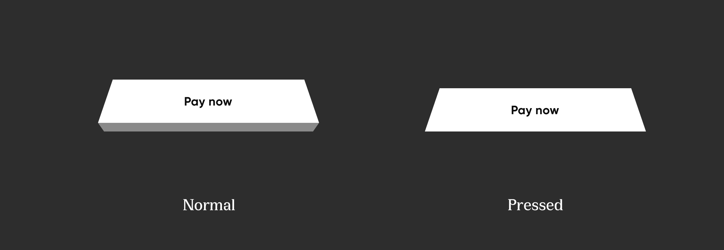
NeoPopTiltedButton

NeoPopTiltedButton

Non Floating

Non Floating tiltNonFloating

 NeoPopTiltedButton(
    color: kPrimaryButtonColor,
    onTapUp: () {},
    child: Padding(
        padding: const EdgeInsets.symmetric(
        horizontal: 80.0,
        vertical: 15,
        ),
        child: SvgPicture.asset('assets/svg/cta_text_view.svg'),
    ),
),

Floating

Floating tiltFloating

NeoPopTiltedButton(
    isFloating: true,
    onTapUp: () => HapticFeedback.vibrate(),
    onTapDown: () => HapticFeedback.vibrate(),
    decoration: const NeoPopTiltedButtonDecoration(
        color: kPopYellowColor,
        plunkColor: kPlunkColorYellow,
        shadowColor: kTiltedButtonShadowColor,
    ),
    child: Padding(
        padding: const EdgeInsets.symmetric(
        horizontal: 70.0,
        vertical: 15,
        ),
        child: SvgPicture.asset('assets/svg/cta_text_play_now.svg'),
    ),
),

Strokes

Strokes TiltStroked

NeoPopTiltedButton(
    isFloating: true,
    onTapUp: () {},
    decoration: const NeoPopTiltedButtonDecoration(
        color: Color(0xFF0D0D0D),
        plunkColor: Color(0xFF3F6915),
        shadowColor: Colors.black,
        border: Border.fromBorderSide(
        BorderSide(color: Color(0xFF8DD04A), width: 1),
        ),
    ),
    child: const Padding(
        padding: EdgeInsets.symmetric(horizontal: 70.0, vertical: 15),
        child: Text('Play Now', style: TextStyle(color: Colors.white)),
    ),
),

Shimmer

shimmer

NeoPopTiltedButton(
    isFloating: true,
    onTapUp: () {},
    decoration: const NeoPopTiltedButtonDecoration(
        color: Color.fromRGBO(255, 235, 52, 1),
        plunkColor: Color.fromRGBO(255, 235, 52, 1),
        shadowColor: Color.fromRGBO(36, 36, 36, 1),
        showShimmer: true,
    ),
    child: const Padding(
        padding: EdgeInsets.symmetric(
        horizontal: 70.0,
        vertical: 15,
        ),
        child: Text('Play Now'),
    ),
),

NeoPopTiltedButton Attributes

Attribute Type Description
child Widget The child of the button
color Color? Color of the button
decoration NeoPopTiltedButtonDecoration? The decoration to paint the button. The color and decoration arguments cannot both be supplied, since it would potentially result in the decoration drawing over the background color. To supply a decoration with a color, use decoration.
buttonDepth double? The depth of the tilted button. default: 8.0
onTapUp VoidCallback? A callback triggered when a pointer that will trigger a tap with button has stopped contacting the screen
onTapDown VoidCallback? A callback triggered when a pointer that might cause a tap with button has contacted the screen
shadowDistance double? The maximum distance from the button at which the shadow is painted. default: 20
yPosFactor double? Factor that defines the floating positions of buttons and shadow along vertical-axis. default: 5
isFloating bool Whether the button is floating. default: false
floatingDuration Duration? The duration of the floating animation. One floating cycle i.e to-and-fro movement of the button and shadow accounts for two floating durations. default: Duration(milliseconds: 1500)
floatingDelay Duration? The delay between two floating cycles. default: Duration(milliseconds: 750)
tapDuration Duration? The duration of the animation when button is pressed or released. default: Duration(milliseconds: 100)
enabled bool Whether the button is enabled. default: true

Contributing

Pull requests are welcome! We'd love help improving this library. Feel free to browse through open issues to look for things that need work. If you have a feature request or bug, please open a new issue so we can track it.

License

Copyright 2022 Dreamplug Technologies Private Limited.  
  
Licensed under the Apache License, Version 2.0 (the "License");  
you may not use this file except in compliance with the License.  
You may obtain a copy of the License at  
  
 http://www.apache.org/licenses/LICENSE-2.0  
Unless required by applicable law or agreed to in writing, software  
distributed under the License is distributed on an "AS IS" BASIS,  
WITHOUT WARRANTIES OR CONDITIONS OF ANY KIND, either express or implied.  
See the License for the specific language governing permissions and  
limitations under the License.  

カテゴリー

ソースリポジトリ

このパッケージを使用しているプロジェクト