nice_buttons
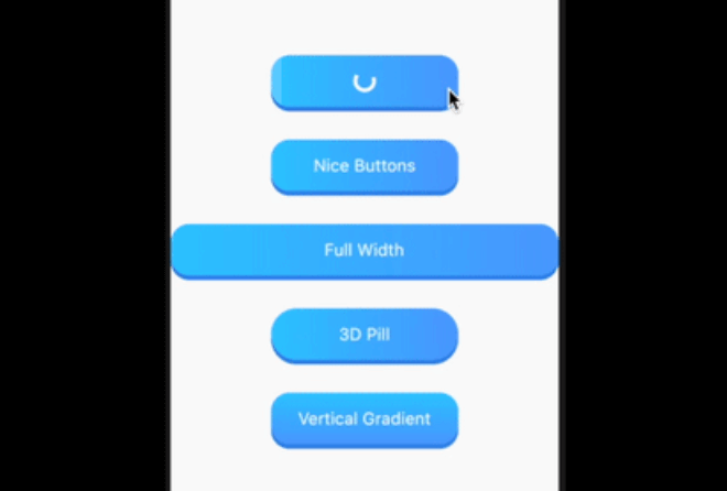
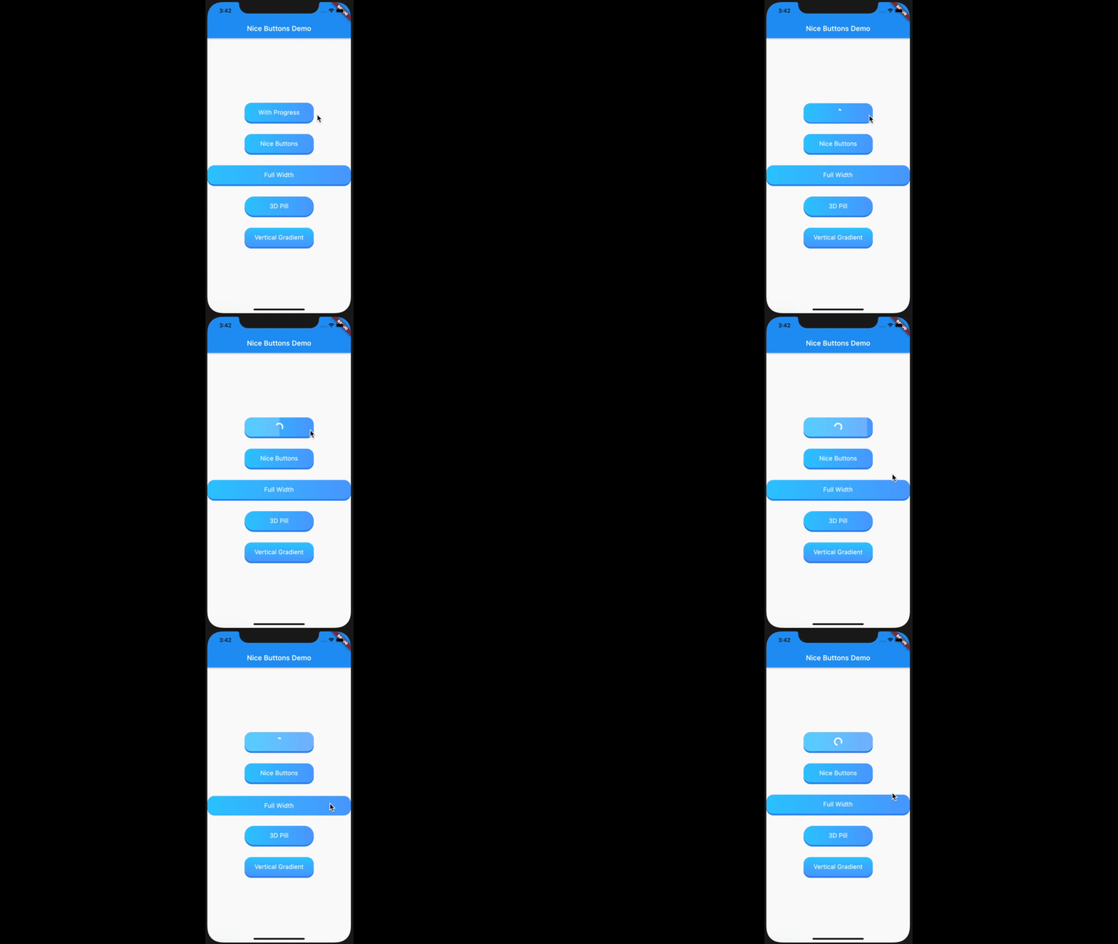
nice_buttons a beautiful, animated, and customizable 3D button for your flutter project.
Platform Support
| Android |
iOS |
Web |
MacOS |
Linux |
Windows |
| ✅ |
✅ |
✅ |
✅ |
✅ |
✅ |
Installation
Add it as a dependency in their pubspec.yaml:
dependencies:
  nice_buttons: ^0.0.3
Customizations
| Attribute |
Type |
Default |
Description |
startColor |
Color |
0xFF2ec8ff |
The gradient start color |
endColor |
Color |
0xFF529fff |
The gradient end color |
borderColor |
Color |
0xFF3489e9 |
The color of the 3D border. |
progressColor |
Color |
white |
The color of circular progress indicator, defaults to white |
progressSize |
Double |
20 |
The size of progress indicator circle, defaults to 20 |
gradientOrientation |
GradientOrientation |
Horizontal |
Orientation of the gradient defaults to Horizontal |
borderThickness |
Double |
5 |
The thickness of the 3D border, defaults to 5 |
height |
Double |
60 |
Height of the button, defaults to 60 |
width |
Double |
200 |
Width of the button defaults to 200, its useless if the stretch property is set to true |
stretch |
bool |
true |
Whether to occupy the full available space in the parent, defaults to true |
borderRadius |
Double |
20 |
The border radius of the button, defaults to 20 |
progress |
bool |
false |
Whether the progress indicator is required or not, defaults to false |
disabled |
bool |
false |
Disables the button, defaults to false |
onTap |
Function(void Function() finish) |
|
Button tap handler with finish callback to reset the state of progress and animation when called, required* |
child |
Widget |
|
Inner content for the button, required* |
Usage
...
import 'package:nice_buttons/nice_buttons.dart';
...
NiceButtons(
  stretch: true,
  gradientOrientation: GradientOrientation.Horizontal,
  onTap: (finish) {
    print('On tap called');
  },
  child: Text(
    'Full Width',
    style: TextStyle(color: Colors.white, fontSize: 18),
  ),
);
Check example folder for more examples.