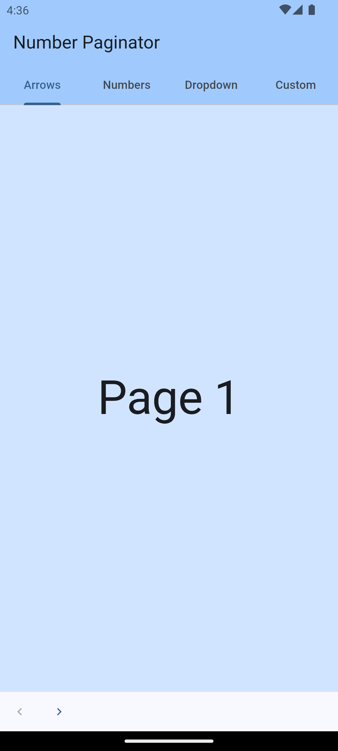
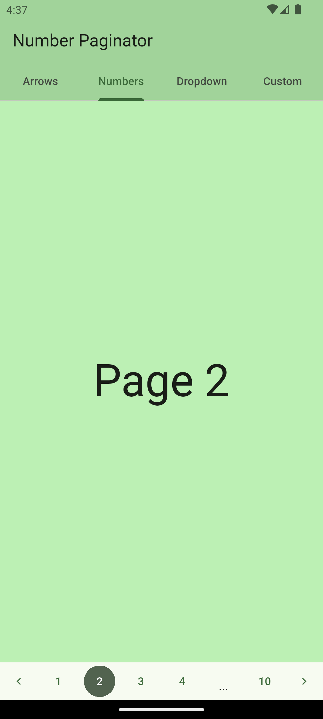
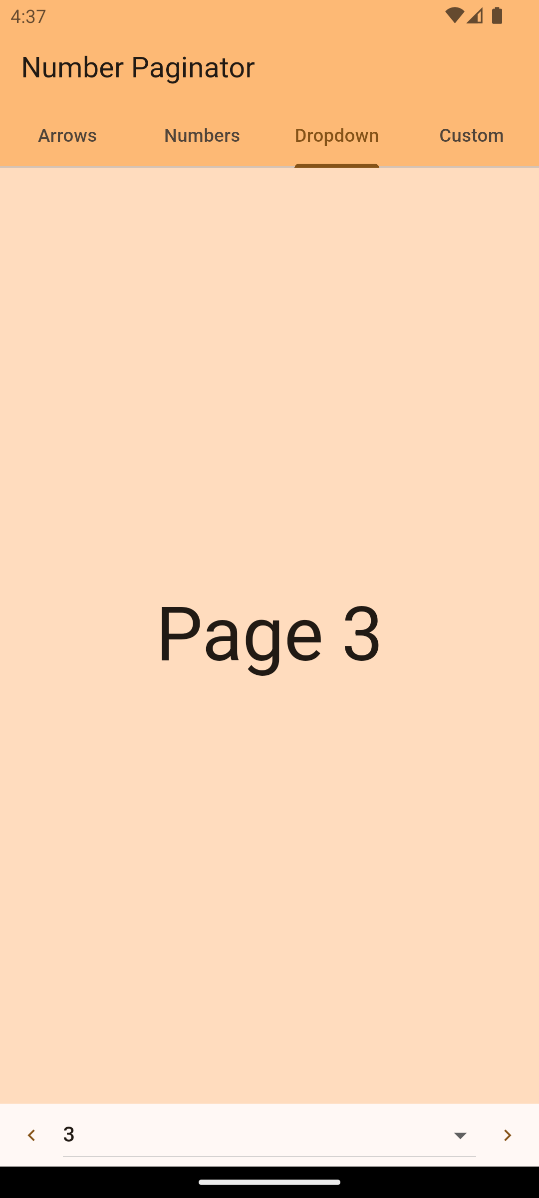
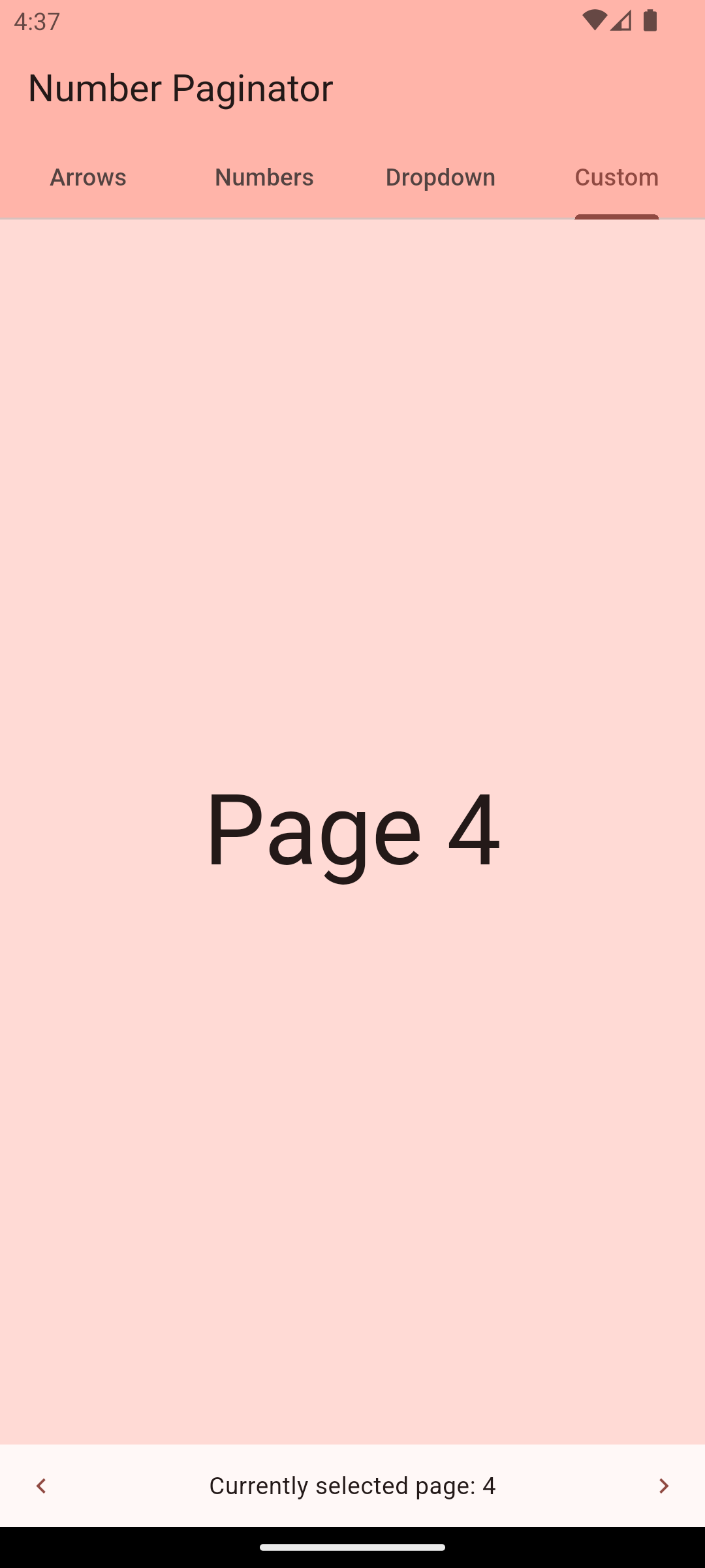
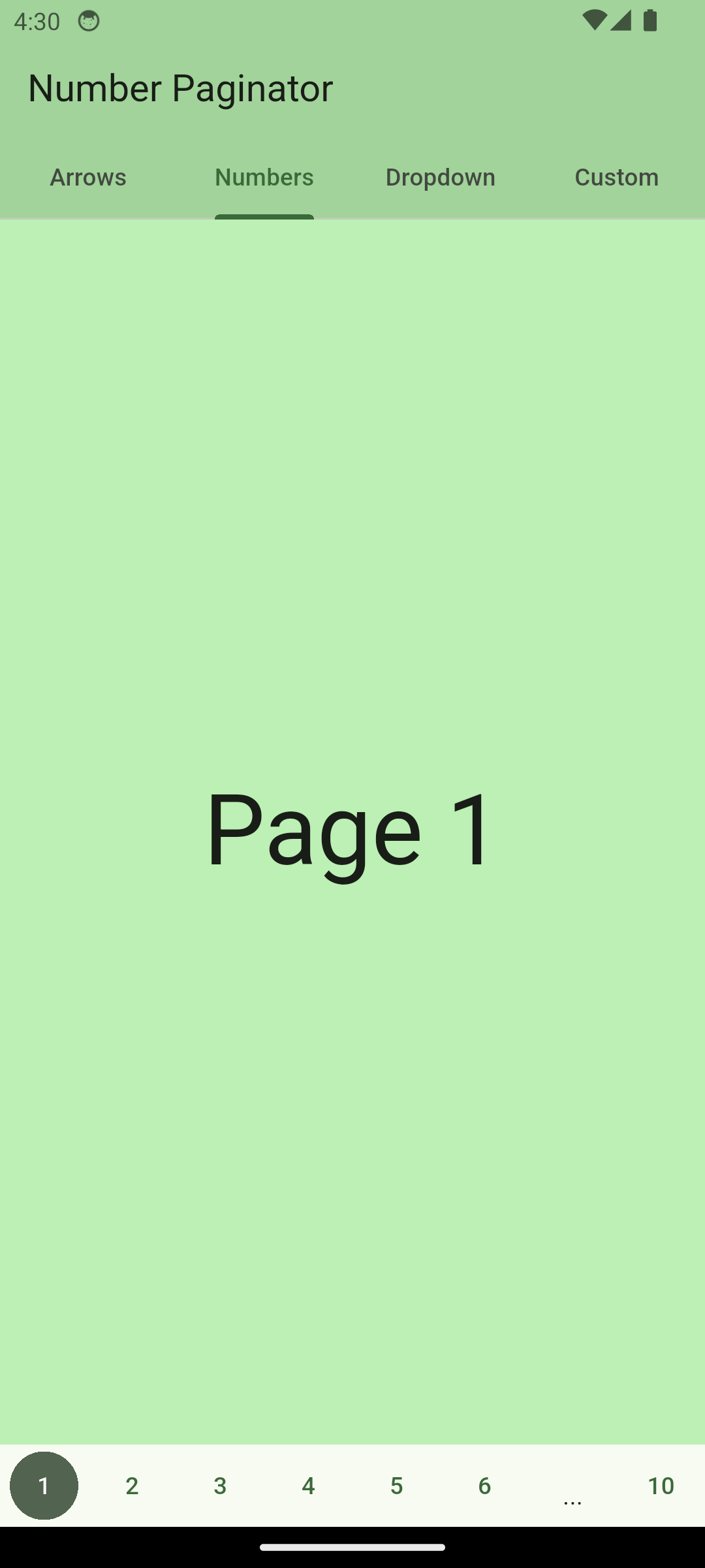
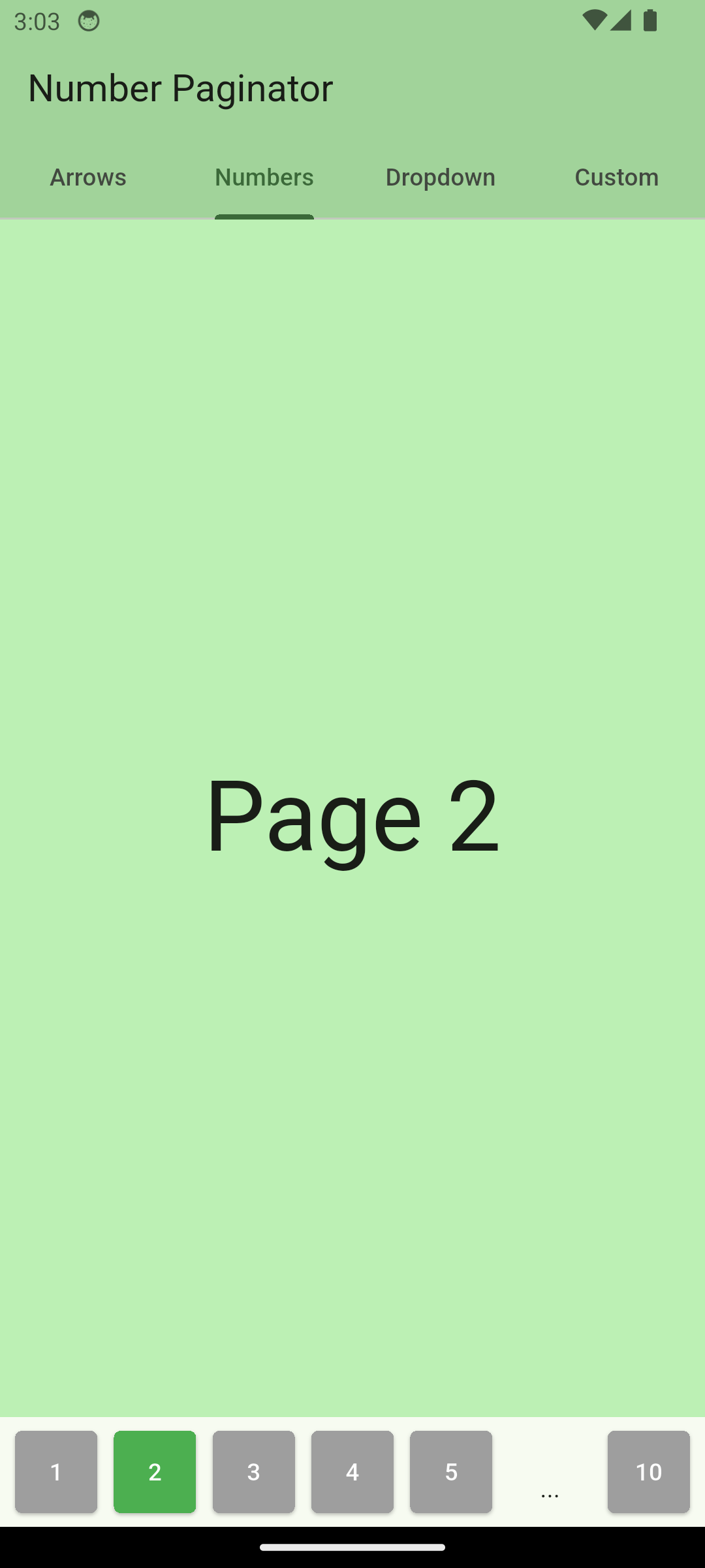
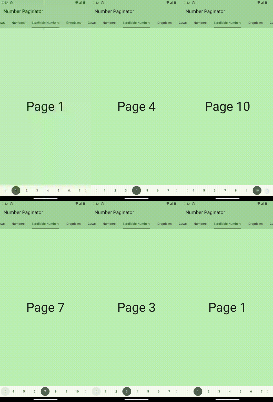
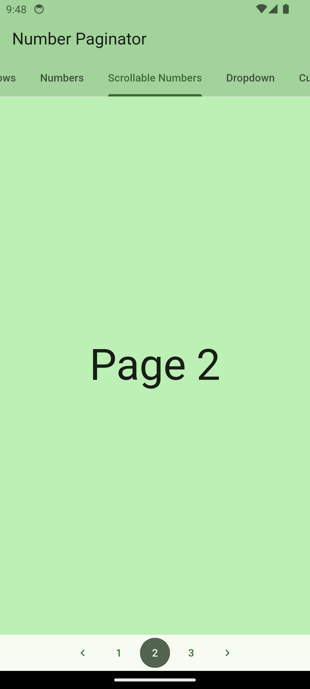
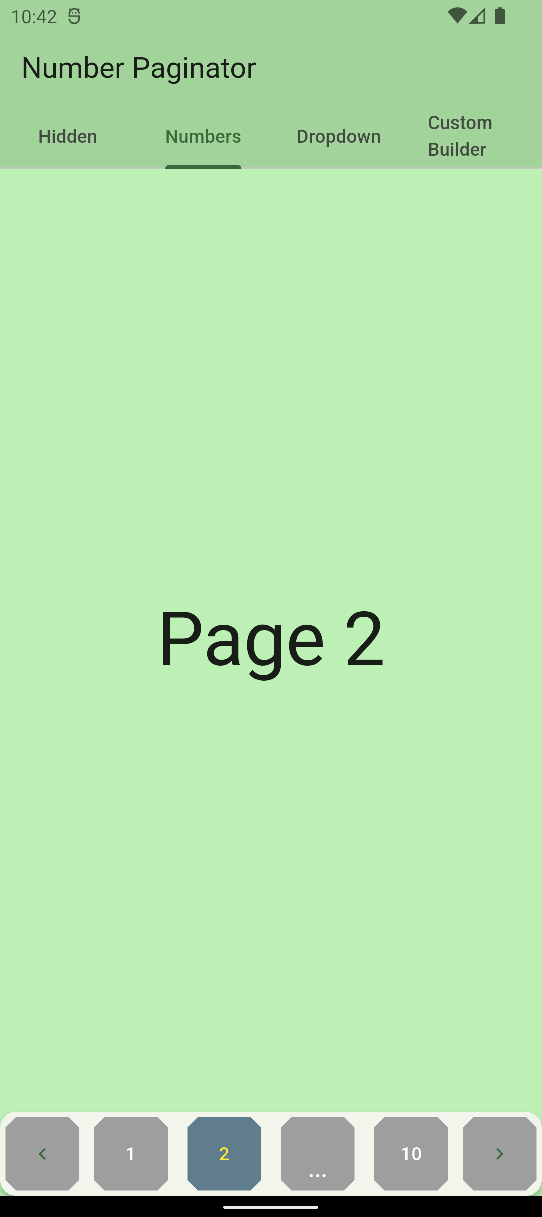
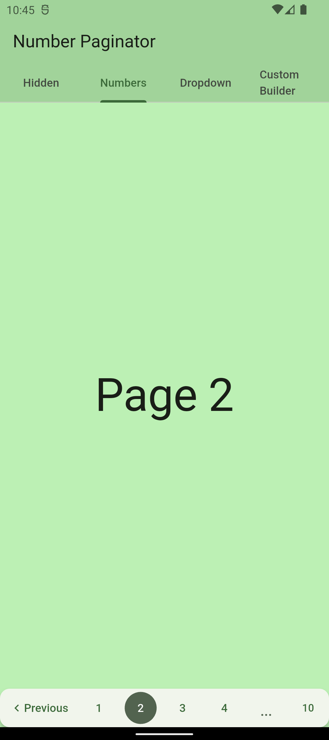
The number_paginator package allows you to implement pagination with page numbers very easily. If you have content that is split up into several pages, number_paginator can be used to let the user switch between these page numbers.
The package automatically handles the case where page numbers don't fit on one screen and replaces some of them with three dots.
Usage - Version 1.0.0 or newer
NumberPaginator only requires the number of pages (numberPages) to be set. All the rest is handled by the widget automatically. Normally, one also wants to react to page changes using the onPageChange callback. By default, NumberPaginator displays just page numbers, without arrow buttons for "previous" or "next" (unlike in the versions previous to 1.0.0).
From version 1.0.0 on, the back/next buttons are not shown by default. You can manually add PrevButton and NextButton widgets, which come included with the package. This gives more freedom compared to the versions before 1.0.0, and lets you customize the layout as you need.
NumerPaginatorController allows you to control the NumberPaginator from the outside, e.g. with an external button anywhere in your app.
// instantiate the controller in your statefinalNumberPaginatorController _controller = NumberPaginatorController();
...
/// use it within NumberPaginatorNumberPaginator(
controller: _controller,
// by default, the paginator shows numbers as center content
numberPages: 10,
onPageChange: (int index) {
// handle page change...
},
)
...
// Use the controller, e.g. within a button, to trigger a page change
floatingActionButton: FloatingActionButton(
onPressed: () => _controller.next(),
child: constIcon(Icons.navigate_next),
)
Be aware that the page indices are zero-based! I.e. using _controller.navigateToPage(0); will navigate to page "1".
Customize
NumberPaginator version 1.0.0 and later provides more flexibility when it comes to customization.
NumberPaginator allows for customization of how a user can navigate between pages. It provides three different modes and an additional possibility of complete customization o the content using a builder.
Numbers (default)
The paginator shows numbers for switching to any page number that is visible. If the pages don't
fit on the screen, some of them are replaced with three dots.
Using the builder property, you can pass any content that you want that should be displayed as a central part of the paginator. For example, you can pass a custom text:
NumberPaginator only requires the number of pages (numberPages) to be set. All the rest is handled by the widget automatically. Normally, one also wants to react to page changes using the onPageChange callback. By default, NumberPaginator displays page numbers as central content of the paginator.
NumerPaginatorController allows you to control the NumberPaginator from the outside, e.g. with an external button anywhere in your app.
// instantiate the controller in your statefinalNumberPaginatorController _controller = NumberPaginatorController();
...
/// use it within NumberPaginatorNumberPaginator(
controller: _controller,
// by default, the paginator shows numbers as center content
numberPages: _numPages,
onPageChange: (int index) {
setState(() {
_currentPage = index;
});
},
)
...
// Use the controller, e.g. within a button, to trigger a page change
floatingActionButton: FloatingActionButton(
onPressed: () => _controller.next(),
child: constIcon(Icons.navigate_next),
)
Customize
NumberPaginator allows for several customizations.
Button look and feel
NumberPaginator(
  // by default, the paginator shows numbers as center content
  numberPages: 10,
  onPageChange: (int index) {
    setState(() {
      _currentPage = index; // _currentPage is a variable within State of StatefulWidget
    });
  },
  // initially selected index
  initialPage: 4,
  config: NumberPaginatorUIConfig(
    // default height is 48
    height: 64,
    buttonShape: BeveledRectangleBorder(
      borderRadius: BorderRadius.circular(8),
    ),
    buttonSelectedForegroundColor: Colors.yellow,
    buttonUnselectedForegroundColor: Colors.white,
    buttonUnselectedBackgroundColor: Colors.grey,
    buttonSelectedBackgroundColor: Colors.blueGrey,
  ),
)
Visibility/customisation of prev/next buttons
NumberPaginator(
// by default, the paginator shows numbers as center content
numberPages: 10,
onPageChange: (int index) {
setState(() {
_currentPage = index; // _currentPage is a variable within State of StatefulWidget
});
},
// show/hide the prev/next buttons
showPrevButton: true,
showNextButton: false, // defaults to true// custom content of the prev/next buttons, maintains their behavior
nextButtonContent: Icon(Icons.arrow_right_alt),
// custom prev/next buttons using builder (ignored if showPrevButton/showNextButton is false)
prevButtonBuilder: (context) => TextButton(
onPressed: _controller.currentPage > 0 ? () => _controller.prev() : null, // _controller must be passed to NumberPaginator
child: constRow(
children: [
Icon(Icons.chevron_left),
Text("Previous"),
],
),
),
)
Content variations
NumberPaginator allows for customization of how a user can navigate between pages. It provides three different modes and an additional possibility of complete customization o the content using a builder.
Hidden (only arrows are visible)
The user only sees arrows to switch to the previous/next page.
NumberPaginator(
numberPages: _numPages,
// shows only default arrows, no center content of paginator
config:
constNumberPaginatorUIConfig(mode: ContentDisplayMode.hidden),
onPageChange: (int index) {
setState(() {
_currentPage = index;
});
},
)
Numbers (default)
The paginator shows numbers for switching to any page number that is visible.
NumberPaginator(
  // by default, the paginator shows numbers as center content
  numberPages: _numPages,
  onPageChange: (int index) {
    setState(() {
      _currentPage = index;
    });
  },
)
Dropdown
The paginator shows a dropdown (material widget) for choosing which page to show, along with the prev/next buttons.
NumberPaginator(
numberPages: _numPages,
// shows a dropdown as the center paginator content
config: constNumberPaginatorUIConfig(
mode: ContentDisplayMode.dropdown),
onPageChange: (int index) {
setState(() {
_currentPage = index;
});
},
)
Builder (for passing any content)
Using the contentBuilder property, you can pass any content that you want that should be displayed as a central part of the paginator. For example, you can pass a custom text: