OnBoarding Animation
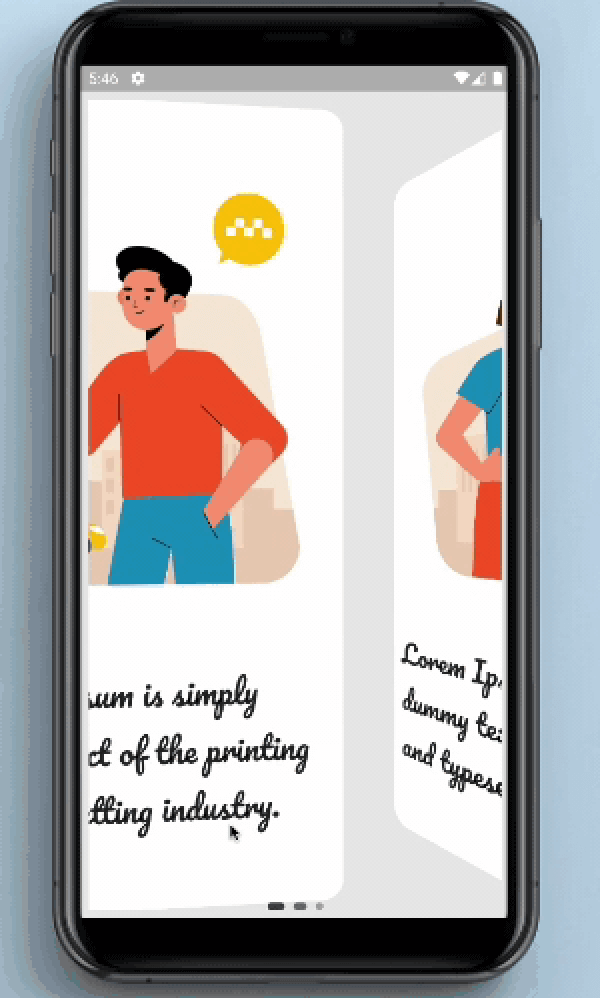
OnBoarding Animation provides page like animation to the onBoarding screens with the page indicator.
Screenshots and Screen recording
Usage
Installation
Add onboarding_animation: any to your pubspec.yaml dependencies. And import it:
import 'package:onboarding_animation/onboarding_animation.dart' ;
Example
OnBoardingAnimation(
          pages: [
           Container(),
           Container(),
           Container(),
          ],
          indicatorDotHeight: 7.0,
          indicatorDotWidth: 7.0,
          indicatorType: IndicatorType.expandingDots,
          indicatorPosition: IndicatorPosition.bottomCenter,
        ),
Parameters
Required Parameters
pages:
Need to pass the List of Widgets for providing the content of onBoarding cards.
Optional Parameters
controller:
This parameter is use to set the page controller.
indicatorOffset:
This parameter is used to set the offset of the indicator.
indicatorDotWidth:
Set the width of the the indicator's dot.
indicatorDotHeight:
Set the height of indicator's dot.
indicatorDotSpacing:
Using this parameter user can define the space between the dots of indicator.
indicatorDotRadius:
This is use to set the radius of the circle shown in the indicator.
indicatorInActiveDotColor:
This is use to set the color of the inactive(unselected) dot color.
indicatorActiveDotColor:
This is use to set the color of the active(selected) dot color.
indicatorStrokeWidth:
indicatorStrokeWidth is use to set the width of the stroke if the PaintStyle is selected to the stroke.
indicatorType:
This is an enum which is use to select the type of an indicator.
indicatorPosition:
This is an enum which is use to select the position of an indicator.
indicatorColorTransitionActiveStrokeWidth:
Need to pass the List of Widgets for the providing the content of the onBoarding cards.
indicatorExpansionFactor:
indicatorExpansionFactor is multiplied by indicatorDotWidth to resolve the width of the expanded dot.
indicatorJumpScale:
The maximum scale the dot will hit while jumping.
indicatorVerticalOffset:
The vertical offset of the jumping dot.
indicatorPaintStyle:
indicatorPaintStyle is use to select between the fill and the stroke style.
indicatorWormType:
indicatorWormType helps to select the form of the WormType between normal and thin.
indicatorSwapType:
indicatorSwapType helps to select the form of the SwapType between normal, yRotation and zRotation.
indicatorActivePaintStyle:
Inactive dots paint style (fill/stroke) defaults to fill.
indicatorActiveStrokeWidth:
This is ignored if indicatorActivePaintStyle is PaintStyle.fill.
indicatorScale:
indicatorScale is multiplied by indicatorDotWidth to resolve active dot scaling.
indicatorActiveDotScale:
indicatorActiveDotScale is multiplied by indicatorDotWidth to resolve active dot scaling.
indicatorMaxVisibleDots:
The max number of dots to display at a time if count is <= maxVisibleDots indicatorMaxVisibleDots = countmust be an odd number that's >= 5.
indicatorFixedCenter:
If True the old center dot style will be used.
indicatorInActiveDotDecoration:
indicatorInActiveDotDecoration is used to set the inactive dot decoration if indicatorType is selected to custom.
indicatorActiveDotDecoration:
indicatorActiveDotDecoration is used to set the active dot decoration if indicatorType is selected to custom.
indicatorActiveColorOverride:
This parameter is use to override the existing active colors.
indicatorInActiveColorOverride:
This parameter is use to override the existing inactive colors.
Guideline for contributors
Contribution towards our repository is always welcome, we request contributors to create a pull request to the development branch only.
Guideline to report an issue/feature request
It would be great for us if the reporter can share the below things to understand the root cause of the issue.
Library version
Code snippet
Logs if applicable
Device specification like (Manufacturer, OS version, etc)
Screenshot/video with steps to reproduce the issue
Library used
LICENSE!
OnBoarding Animation is MIT-licensed .
Let us know!
We’d be really happy if you send us links to your projects where you use our component. Just send an email to sales@mindinventory.com And do let us know if you have any questions or suggestion regarding our work.