パッケージ、リポジトリ、アプリカテゴリを検索

onboarding_overlay のカバー
パッケージ詳細v3.2.3

onboarding_overlay

ターゲット要素を指定するかしないかでオンボーディングオーバーレイを制御可能(onboard_overlay からのフォーク)

AndroidiOSWebmacOSWindowsLinux
30日間ダウンロード
1万
いいね数
375
Pub ポイント
150

パッケージをインストール

flutter pub add onboarding_overlay

パッケージ概要

公開情報に基づく選定ガイドです。参考としてご利用ください。

特定のUI要素をターゲットにするか、ターゲットなしで自由に表示できる、アプリ機能をユーザーに案内するオンボーディングオーバーレイを作成するための柔軟なFlutterパッケージです。onboard_overlayのフォークとして作成されており、オーバーレイの外観と挙動に対するカスタマイズ性と制御性が向上しています。複数のプラットフォームでスムーズでインタラクティブなチュートリアルを通じて、新規ユーザーに主要機能を紹介するのに最適です。

用途

  • アプリの機能について新規ユーザーを案内する
  • オンボーディング中に特定のUI要素を強調表示する
  • カスタマイズ可能なチュートリアルフローの作成
  • マルチプラットフォームのオンボーディング体験をサポートする
  • ステップバイステップのウォークスルーの統合

主な機能

  • ターゲットまたはフリーフロートオーバーレイの位置指定
  • カスタマイズ可能なオーバーレイの外観とアニメーション
  • 複数プラットフォームへのデプロイメント対応
  • ステップ用の柔軟なコールバック処理
  • 既存のFlutterウィジェットとの簡単な統合

適している対象

  • アプリオンボーディング画面
  • ユーザー教育フロー
  • マルチプラットフォームアプリケーション
  • 軽量なオンボーディングソリューションを求める開発者
  • 非対象オーバーレイガイドが必要なプロジェクト

注意事項

  • 重複するコンテンツのための慎重なレイアウト管理が必要です
  • 一貫したクロスプラットフォームの見た目を実現するには、追加のスタイリングが必要になる場合があります
  • 限定された組み込みテーマ;カスタマイズが必要
  • 複雑なナビゲーションワークフローには適していません
  • 明確なユーザー操作のトリガーと併用するのが最適です

元の README

関連するソースリポジトリの README 原文のスナップショットです。最新の内容はリポジトリをご覧ください。

Pub

onboarding_overlay

A flexible onboarding widget that can start and stop with an arbitrary number of steps and arbitrary starting point

Demo

Usage

  1. Create your List<FocusNodes> somewhere accessible
final List<FocusNode> overlayKeys = <FocusNode>[
    FocusNode(),
    FocusNode(),
    FocusNode(),
  ];
  1. Create your List<OnboardingSteps> somewhere accessible
final List<OnboardingSteps> steps = [OnboardingStep(
    focusNode: _focusNodes != null ? _focusNodes[0] : null,
    title: "Hi",
    titleTextStyle: Theme.of(context).textTheme.headline5.copyWith(
        color: Theme.of(context).canvasColor,
        ),
    bodyText:
        '''Check this out''',
    bodyTextStyle: Theme.of(context).textTheme.subtitle1.copyWith(
        color: Theme.of(context).canvasColor,
        ),
    hasLabelBox: false,
    fullscreen: true,
    overlayColor: Theme.of(context).primaryColorDark.withOpacity(0.8),
    hasArrow: false,
    ),]
  1. Provide the FocusNodes to the widgets.
Focus(
    focusNode: focusNode[0]
    Text(
        'You have pushed the button this many times:',
    ),
)
  1. Add Onboarding widget to your widget tree below MaterialWidget and above of everything else
void main() {
  runApp(App());
}

class App extends StatefulWidget {
  final GlobalKey<OnboardingState> onboardingKey = GlobalKey<OnboardingState>();

  @override
  _AppState createState() => _AppState();
}

class _AppState extends State<App> {
  List<FocusNode> focusNodes = <FocusNode>[];

  @override
  void initState() {
    super.initState();

    focusNodes = List<FocusNode>.generate(
      7,
      (int i) => FocusNode(debugLabel: i.toString()),
      growable: false,
    );
  }

  @override
  Widget build(BuildContext context) => MaterialApp(
        home: Onboarding(
          key: widget.onboardingKey,
          steps: steps,
          onChanged: (int index) {
            debugPrint('----index $index');
            if (index == 5) {
              /// interrupt onboarding on specific step
              /// widget.onboardingKey.currentState.hide();
              /// or do something else
            }
          },
          child: Home(
            focusNodes: focusNodes,
          ),
        ),
      );
}
  1. Showing the onboarding
  • On some activity somewhere down the widget tree in another widget with a new BuildContext
final OnboardingState? onboarding = Onboarding.of(context);

if (onboarding != null) {
  onboarding.show();
}
  • Or immediately in initState somewhere down the widget tree in another widget with a new BuildContext
@override
void initState() {
  super.initState();
  WidgetsBinding.instance.addPostFrameCallback((Duration timeStamp) {
    final OnboardingState? onboarding = Onboarding.of(context);
    if (onboarding != null) {
      onboarding.show();
    }
  });
}
  1. The text can be wrapped in a box, than support all kind of decorations and only shape: BoxShape.rectangle For this to happen, you have to set hasLabelBox equal to true, labelBoxDecoration, which supports only BoxDecoration

  2. The Label box also supports having an arrow. This is controlled by hasArrow. The position is not calculated automatically. The default position is top. You will have to specify the position via arrowPosition by using the enum ArrowPosition. The ArrowPosition.top and ArrowPosition.bottom calculates the horizontal position automatically according to the widget of interest (the focused one which is visible through the overlay), the other arrow positions are centered in the label box e.g. ArrowPosition.topCenter, ArrowPosition.bottomCenter. In addition there are 2 new settings from v3.0.0 - ArrowPosition.autoVertical and ArrowPosition.autoVerticalCenter, which will take care of positioning the arrow automatically relative to the label box and widget position.

  3. The onboarding also supports forwarding the onTap event to the widget of interest. You can control the behavior for each step using the overlayBehavior. It accepts the Flutter enum HitTestBehavior. By default, the value used is HitTestBehavior.opaque.

  • HitTestBehavior.opaque ignores the clicks on the focused widget and always will navigate to next step
  • HitTestBehavior.translucent forwards clicks on the focused widget and on the overlay in the same time
  • HitTestBehavior.deferToChild the clicks on the hole are forwarded to the focused widget, clicks on the overlay navigates to next step.
  1. Sometimes the titleText and the bodyText might not fit well in the constrained label box, because of the long texts, longer translations or smaller screens. There are 2 behaviors for this scenario. The default one will limit the title to 2 lines and the bodyText to 5 lines and will overflow both with ellipsis, the second one is to automatically resize the texts. This is controlled by the Onboarding property autoSizeTexts, which default value is false.

  2. The onboarding can show only a portion of the defined steps with a specific start index. Use showWithSteps method. Remember that the steps indexes are 0-based (starting from zero)

@override
void initState() {
  super.initState();
  WidgetsBinding.instance.addPostFrameCallback((Duration timeStamp) {
    final OnboardingState? onboarding = Onboarding.of(context);
    if (onboarding != null) {
      onboarding.showWithSteps(3, <int>[3,4,5,6]);
    }
  });
  }
  1. The onboarding can start from a specific index and play until the end step is reached. Use showFromIndex method. Remember that the steps indexes are 0-based (starting from zero)
@override
void initState() {
  super.initState();
  WidgetsBinding.instance.addPostFrameCallback((Duration timeStamp) {
    final OnboardingState? onboarding = Onboarding.of(context);
    if (onboarding != null) {
      onboarding.showFromIndex(3);
    }
  });
}
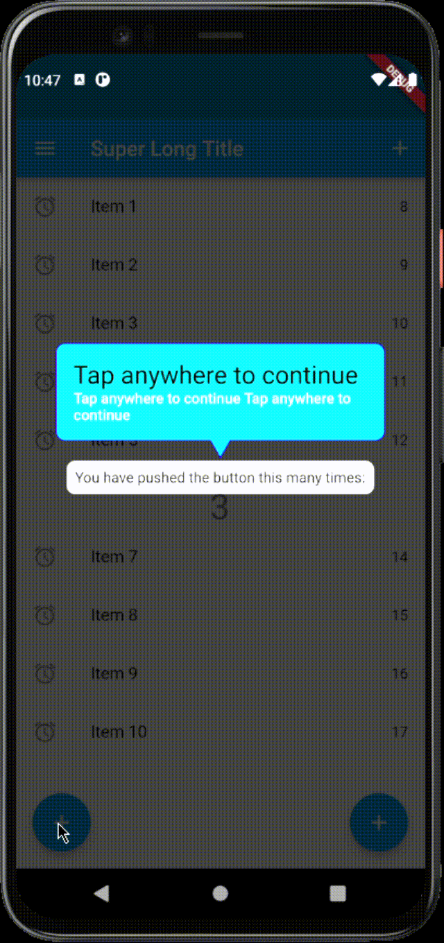
  1. From v.3.0.0 if you want to show something else, different from just title and explanation text, then stepBuilder is for you. With stepBuilder, you can change the layout, add images or something else.

Important: If you want to inherit your App Theme from your app instead of using the style properties. You need to wrap your stepBuilder code with a Scaffold or Material widgets.

Important: Clicks on the overlay are ignored if stepBuilder is set. Clicks on the hole or on the widget depend on the HitTestBehavior.

  • using HitTestBehavior.translucent and HitTestBehavior.deferToChild will forward clicks on the hole to the focused widget
  • using HitTestBehavior.opaque ignores clicks on the hole and on the overlay are ignored. Call callbacks provided by the stepBuilder
OnboardingStep(
  focusNode: focusNodes[0],
  titleText: 'Tap anywhere to continue ',
  titleTextColor: Colors.black,
  bodyText: 'Tap anywhere to continue Tap anywhere to continue',
  labelBoxPadding: const EdgeInsets.all(16.0),
  labelBoxDecoration: BoxDecoration(
    shape: BoxShape.rectangle,
    borderRadius: const BorderRadius.all(Radius.circular(8.0)),
    color: const Color(0xFF00E1FF),
    border: Border.all(
      color: const Color(0xFF1E05FB),
      width: 1.0,
      style: BorderStyle.solid,
    ),
  ),
  arrowPosition: ArrowPosition.autoVertical,
  hasArrow: true,
  hasLabelBox: true,
  fullscreen: true,
  stepBuilder: (
    BuildContext context,
    OnboardingStepRenderInfo renderInfo,
  ) {
    return SingleChildScrollView(
      child: Column(
        children: [
          Text(
            renderInfo.titleText,
            style: renderInfo.titleStyle,
          ),
          Row(
            crossAxisAlignment: CrossAxisAlignment.start,
            children: [
              Image.asset(
                'assets/demo.gif',
                width: 50,
              ),
              const SizedBox(
                width: 10,
              ),
              Flexible(
                child: AutoSizeText(
                  renderInfo.bodyText,
                  style: renderInfo.bodyStyle,
                ),
              ),
            ],
          ),
          Row(
            children: [
              TextButton(
                onPressed: renderInfo.nextStep,
                child: Text('Next'),
              ),
              const SizedBox(
                width: 10,
              ),
              TextButton(
                onPressed: renderInfo.close,
                child: Text('close'),
              ),
            ],
          ),
        ],
      ),
    );
  },
),
  1. From v.3.0.0 Combining onTapCallback with the overlayBehavior gives more control.
  • If you want to capture any clicks and decide what to do depending on the area that was clicked - use HitTestBehavior.opaque
  • if you want to be able to click on the focused widget and control when to go to next step or close - use HitTestBehavior.translucent
  • If you want to capture clicks only on the overlay, the clicks on the hole will not be controlled by the callback - use HitTestBehavior.deferToChild

Using the TapArea you can specify what happens when the user clicked on certain area. The possible options are hole, label and overlay

OnboardingStep(
  focusNode: focusNodes[4],
  titleText: 'Menu',
  bodyText: 'You can open menu from here',
  overlayColor: Colors.green.withOpacity(0.9),
  shape: const CircleBorder(),
  overlayBehavior: HitTestBehavior.translucent,
  onTapCallback:
      (TapArea area, VoidCallback next, VoidCallback close) {
    if (area == TapArea.hole) {
      next();
    }
  },
),
  1. From v.3.0.0 It is possible to combine onTapCallback and stepBuilder. No navigation will be executed except if you call next() method from onTapCallback or the stepBuilder. You can customize the behavior using the TapArea enum to get the area where the user clicked. By using the HitTestBehavior you can again customize if the clicks on the hole are ignored or forwarded to the focused widget. Again if you define the overlayBehavior with HitTestBehavior.deferToChild the click on the hole or the widget in focus will not be controlled by the onTapCallback

  2. From v3.0.0 there is an additional OverlayController (ChangeNotifier) attached to the OverlayState that provides the currentIndex, currentStep and isVisible.

final OnboardingState? onboarding = Onboarding.of(context);
if( onboarding?.controller.isVisible ?? false) {
  // do some logic here
}
  1. From v.3.0.0 you can also add a pulsing animation around the focused widget. Pulse animation will be displayed showPulseAnimation on an OnboardingStep is set to true. In addition you can change the inner and outer colors of the pulse animation. Thanks to the author Gautier of the pal package for the inspiration.
  1. From v.3.0.0 you can show a red border around the label box for debugging purposes by using an Onboarding parameter debugBoundaries which is false by default.
  1. From v.3.1.0 The package can be used with ResponsiveFramework. For this to work as expected you need to perform these changes to your code:

    • move Onboarding widget under the ResponsiveWrapper.builder
    • wrap with a Builder to be able to access the inherited widget for ResponsiveWrapperData
    • manually calculate scale for width and height
    • pass the calculated values to the Onboarding widget.
    • by default these scale values will be 1.0

Example:

return MaterialApp(
      home: ResponsiveWrapper.builder(
        Builder(builder: (context) {
          final ResponsiveWrapperData data = ResponsiveWrapper.of(context);
          final scaleWidth = data.screenWidth / data.scaledWidth;
          final scaleHeight = data.screenHeight / data.scaledHeight;

          return Onboarding(
            key: widget.onboardingKey,
            steps: steps,
            globalOnboarding: true,
            debugBoundaries: true,
            child: const Home(),
            scaleWidth: scaleWidth,
            scaleHeight: scaleHeight,
          );
        }),
        maxWidth: 1200,
        minWidth: 480,
        defaultScale: true,
        breakpoints: [
          const ResponsiveBreakpoint.autoScale(800, name: TABLET),
        ],
      ),
      initialRoute: "/",
    );
  1. From 3.2.1 [stepPainterBuilder] is a callback function that passes the context, the title String, the hole Rect nd if the arrow position isTop bool. By default it is null and it will use the LabelPainter. You can use this to draw custom shapes around the hole. You can use the LabelPainter as a reference

  2. From 3.2.3

  • [animateOverlayHole] is a property that can be set to false to disable the animation of the overlay hole.
  • [labelBoxMargin] property to the OnboardingStep so that the user can control the space around the label box. Especially useful for limiting maximum width of the label box.

Example:

OnboardingStep(
  focusNode: focusNodes[0],
  titleText: 'Tap anywhere to continue ',
  labelBoxMargin: const EdgeInsets.symmetric(horizontal: 16.0), // <--This ensures that there will be always padding around the label box on the left and right sides
  labelBoxDecoration: BoxDecoration(
    shape: BoxShape.rectangle,
    borderRadius: const BorderRadius.all(Radius.circular(8.0)),
    color: const Color(0xFF00E1FF),
  ),
),
  1. From 3.2.4
  • [labelBoxVerticalDistance] property to the OnboardingStep so that the user can customize the space between the label box and the overlay hole.

Example:

OnboardingStep(
  focusNode: focusNodes[0],
  titleText: 'Tap anywhere to continue',
  labelBoxVerticalDistance: 16.0, // default is kSpace = 4.0
),

カテゴリー

依存関係

依存関係一覧 2 件

ソースリポジトリ

このパッケージを使用しているプロジェクト

データはまだありません。