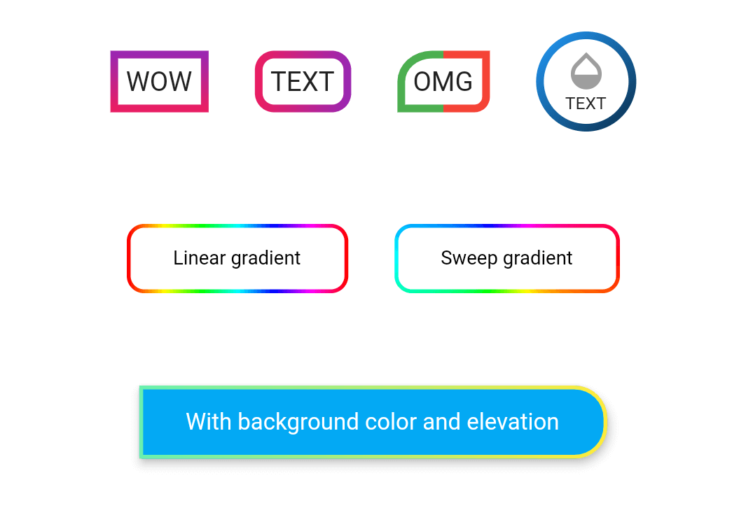
Example
Take a look at the provided example for how to use the OutlineGradientButton.
How to use

OutlineGradientButton(
  child: Text('WOW'),
  gradient: LinearGradient(
    colors: [Colors.purple, Colors.pink],
    begin: Alignment.topCenter,
    end: Alignment.bottomCenter,
  ),
  strokeWidth: 4,
),

OutlineGradientButton(
  child: Text('TEXT'),
  gradient: LinearGradient(colors: [Colors.pink, Colors.purple]),
  strokeWidth: 4,
  radius: Radius.circular(8),
),

OutlineGradientButton(
  child: Text('OMG'),
  gradient: LinearGradient(
    stops: [0, 0.5, 0.5, 1],
    colors: [Colors.green, Colors.green, Colors.red, Colors.red],
  ),
  strokeWidth: 4,
  corners: Corners(topLeft: Radius.elliptical(16, 14), bottomRight: Radius.circular(6)),
),

OutlineGradientButton(
  child: SizedBox(
    width: 52,
    height: 52,
    child: Column(
      mainAxisSize: MainAxisSize.min,
      mainAxisAlignment: MainAxisAlignment.center,
      children: <Widget>[
        Icon(Icons.opacity, color: Colors.grey, size: 24),
        Text('TEXT', style: TextStyle(fontSize: 9)),
      ],
    ),
  ),
  gradient: LinearGradient(
    colors: [Colors.blue, Colors.black],
    begin: Alignment(-1, -1),
    end: Alignment(2, 2),
  ),
  strokeWidth: 4,
  padding: EdgeInsets.zero,
  radius: Radius.circular(26),
),

OutlineGradientButton(
  child: Text('Linear gradient', style: TextStyle(color: Colors.black, fontSize: 10)),
  gradient: LinearGradient(
    colors: List.generate(360, (h) => HSLColor.fromAHSL(1, h.toDouble(), 1, 0.5).toColor()),
  ),
  strokeWidth: 2,
  padding: EdgeInsets.symmetric(horizontal: 24, vertical: 12),
  radius: Radius.circular(8),
),

OutlineGradientButton(
  child: Text('Sweep gradient', style: TextStyle(color: Colors.black, fontSize: 10)),
  gradient: SweepGradient(
    colors: List.generate(360, (h) => HSLColor.fromAHSL(1, h.toDouble(), 1, 0.5).toColor()),
  ),
  strokeWidth: 2,
  padding: EdgeInsets.symmetric(horizontal: 24, vertical: 12),
  radius: Radius.circular(8),
),

OutlineGradientButton(
  child: Text('With background color and elevation', style: TextStyle(color: Colors.white, fontSize: 12)),
  gradient: LinearGradient(colors: [Colors.greenAccent, Colors.yellow]),
  strokeWidth: 2,
  padding: EdgeInsets.symmetric(horizontal: 24, vertical: 12),
  corners: Corners(topRight: Radius.circular(16), bottomRight: Radius.circular(16)),
  backgroundColor: Colors.lightBlue,
  elevation: 4,
  inkWell: true,
  onTap: () => showSnack('onTap'),
  onDoubleTap: () => showSnack('onDoubleTap'),
  onLongPress: () => showSnack('onLongPress'),
),