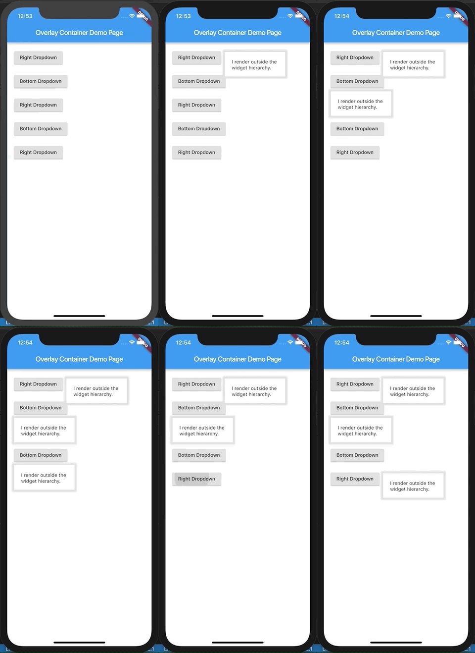
A flutter widget which renders its child outside the original widget hierarchy.
Demo.
This demo is present as an example here. You can also checkout the examples folder.
Description.
The child passed to this widget is rendered outside the widget hierarchy as an overlay to the exisiting widget tree. As a result this widget is highly suitable for building custom dropdown options, autocomplete suggestions, dialogs, etc. Think of it as widget placed absolutely and having a positive z-index over the rest of the widget tree.
It is actually a friendly wrapper over the Flutter's Overlay and OverlayEntry APIs.
If you've ever used react, this tries to do what React Portal does, in a way.
Example.
import'package:flutter/material.dart';
import'package:overlay_container/overlay_container.dart';
classMyAppextendsStatelessWidget{
@overrideWidgetbuild(BuildContext context) {
returnMaterialApp(
title: 'Overlay Container Demo',
theme: ThemeData(
primarySwatch: Colors.blue,
),
home: MyHomePage(),
);
}
}
classMyHomePageextendsStatefulWidget{
_MyHomePageStatecreateState() => _MyHomePageState();
}
class_MyHomePageStateextendsState<MyHomePage> {
// Need to maintain a "show" state either locally or inside// a bloc.bool _dropdownShown = false;
void_toggleDropdown() {
setState(() {
_dropdownShown = !_dropdownShown;
});
}
@overrideWidgetbuild(BuildContext context) {
returnScaffold(
appBar: AppBar(
title: Text('Overlay Container Demo Page'),
),
body: Padding(
padding: constEdgeInsets.all(20),
child: Column(
crossAxisAlignment: CrossAxisAlignment.start,
children: <Widget>[
RaisedButton(
onPressed: _toggleDropdown,
child: Column(
children: <Widget>[
Text("Dropdown button"),
],
),
),
// By default the overlay (since this is a Column) will// be added right below the raised button// but outside the widget tree.// We can change that by supplying a "position".OverlayContainer(
show: _dropdownShown,
// Let's position this overlay to the right of the button.
position: OverlayContainerPosition(
// Left position.150,
// Bottom position.45,
),
// The content inside the overlay.
child: Container(
height: 70,
padding: constEdgeInsets.all(20),
margin: constEdgeInsets.only(top: 5),
decoration: BoxDecoration(
color: Colors.white,
boxShadow: <BoxShadow>[
BoxShadow(
color: Colors.grey[300],
blurRadius: 3,
spreadRadius: 6,
)
],
),
child: Text("I render outside the \nwidget hierarchy."),
),
),
],
),
),
);
}
}