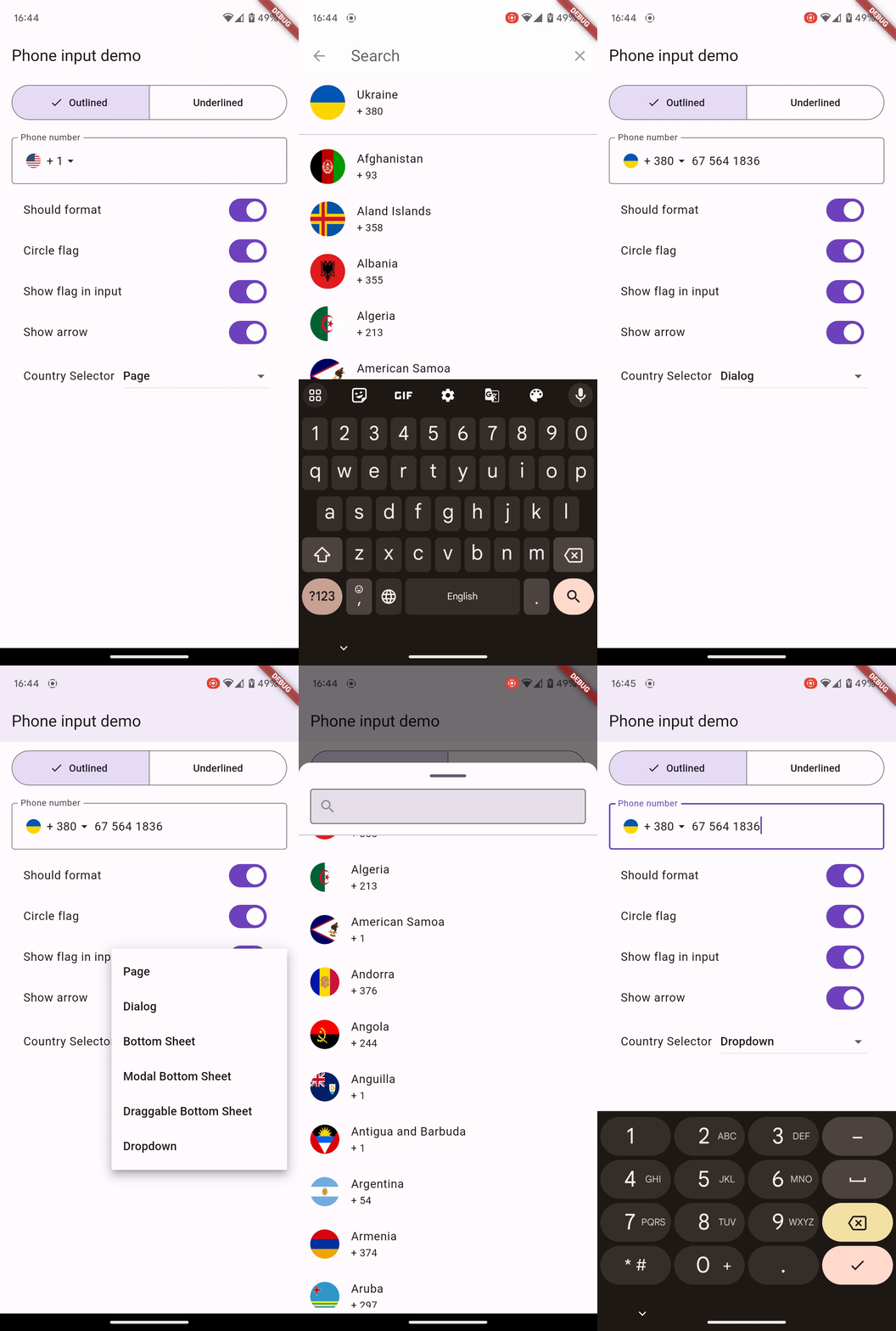
The Phone Input is a versatile package that provides cross-platform support for phone number input fields. This package is designed to simplify the process of capturing phone numbers from users.
It was based on the Phone Form Field package - https://pub.dev/packages/phone_form_field
Features
Cross-Platform Compatibility
Automated phone number formatting
Realm-Time phone number validation
Different methods for selecting countries with flexible customization
Integration with Customs Text Fields
Localization for different regions
Demo
Getting Started
Just create a PhoneInput widget and pass desired country selector that's it, you can already use it.
You can choose from many different selectors to select a country. All of them are flexibly customizable, and the default appearance selectors like dialog and bottom sheets depend on your app's theme settings.
Here is the list of the parameters available for all built-in country selectors:
countries - The list of countries that will be available in the list view widget.
favorites - The list of countries to be displayed at the top of the list.
addFavouriteSeparator - The boolean value determines whether to display divider between favorite and default countries.
showCountryCode - The boolean value determines whether to display the country dial code.
showCountryName - The boolean value determines whether to display the country name.
showCountryFlag - The boolean value determines whether to display the country flag.
noResultMessage - The String value that will display when a search result is empty.
countryCodeStyle - The text style of a country code.
countryNameStyle - The text style of a country name.
flagSize - Flag icon size.
flagShape - The BoxShape that determines if the displayed flags should be circular.
Built-in country selector
Name
Description
Search Delegate
Open a page for choosing the country
Dialog
Open a dialog for choosing the country
Bottom Sheet
Open a bottom sheet that expands to occupy all available space in both the horizontal and vertical axes.
Modal Bottom Sheet
Open a modal bottom sheet that is expanded in the horizontal direction.
Draggable Bottom Sheet
Open a modal bottom sheet that is expanded horizontally and can be dragged from a minimum to a maximum height based on the currently available space.
Dropdown
Open a dropdown menu under text input with customizable height.
Extra parameters
CountrySelectorNavigator.searchDelegate
No extra parameters.
CountrySelectorNavigator.dialog
Extra parameters:
showSearchInput Whether to show the search input
searchInputDecoration The [InputDecoration] of the Search Input
searchInputTextStyle The [TextStyle] of the Search Input
defaultSearchInputIconColor The [Color] of the Search Icon in the Search Input
searchInputHeight The height of the search input field, if specified.
searchInputWidth The width of the search input field, if specified.
CountrySelectorNavigator.bottomSheet
Extra parameters:
bottomSheetDragHandlerColor The [Color] of the divider at the top on the bottom sheet
and other extra params as in the dialog
CountrySelectorNavigator.modalBottomSheet
Extra parameters:
height Provides the capability to define the height of the bottom sheet.
and other extra params as in the bottomSheet
CountrySelectorNavigator.draggableBottomSheet
Extra parameters:
initialChildSize Defines the initial height of the bottom sheet.
minChildSize Defines the minimum height that the bottom sheet can occupy.
maxChildSize Defines the maximum height that the bottom sheet can occupy.
borderRadius Controls the rounded corner radius of the bottom sheet.
and other extra params as in the dialog
CountrySelectorNavigator.dropdown
Since dropdown is implemented using overlay it is necessary to pass Layer Link.
Extra parameters:
required layerLink The LayerLink for overlay positioning
borderRadius The dropdown's border-radius
listHeight The height of the dropdown list
backgroundColor The background color of the dropdown
and other extra params as in the dialog
Integration with Customs Text Fields
You can utilize any country selectors with either a customized or standard text field, allowing you to obtain an instance of the chosen country.
To achieve this, you only need to invoke the requestCountrySelector() function on the desired selector while providing the necessary parameters.
For example:
TextField(
onTap: () async {
final country = awaitCountrySelectorNavigator.dialog().requestCountrySelector(context);
print(country);
},
),
Note that with bottomSheet selector, you need to additionally wrap the TextField in Builder.
Example:
Builder(
builder: (context) {
returnTextField(
onTap: () async {
final country = awaitconstCountrySelectorNavigator.bottomSheet().requestCountrySelector(context);
print(country);
},
);
},
),
Also, note what you need to do with with dropdown selector:
Start by wrapping your TextField with CompositedTransformTarget.
With Phone Input widget you can use a number of build-it and your own custom validators for phone numbers.
You can customize validate behavior through autovalidateMode parameter in Phone Input widget.
Each validator can be customized with an optional errorText property to change the displayed error message.
Most of the validators have an optional allowEmpty property that prevents the field from being flagged as valid if it is empty. This can be useful if you want to display a different error message for empty fields.
Built-in validators
Phone Input has the following built-in validators
Name
Description
required
This validator ensures that a phone number field is required and must be filled in.
valid
This validator checks if the provided phone number is valid
valid country
This validator checks if the provided phone number is valid within the specified country.
valid type
This validator validates the phone number based on its type, such as mobile or fixed-line, ensuring it matches the specified type.
valid mobile number
This validator verifies that the phone number provided is a valid mobile number
valid fixed line number
This validator confirms the validity of the phone number as a fixed-line number
none
Using this validator disables the default validation
Composing validators
You can also create your own custom validators by using the PhoneValidator.compose() method. This method takes a list of built-in or custom validators as input and combines the functionality of all of the input validators.
Note that when composing validators, the sorting is important as the error message displayed is the first validator failing.
PhoneInput(
// ...
validator: PhoneValidator.compose([
// list of validators to usePhoneValidator.required(errorText: "You must enter a value"),
PhoneValidator.validMobile(),
// ..
]),
)
Internationalization
The following code demonstrates the integration of internationalization within your Flutter application using the MaterialApp widget: