PhotoX
An all-in-one solution for displaying interactive images


Features
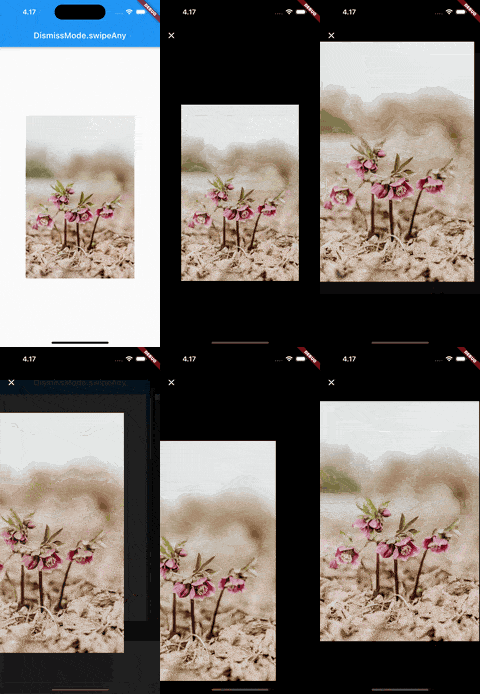
- Smoothly animate images into fullscreen and back
- Swipe to dismiss images
- Pinch to zoom
- Automatically generate swipeable gallery when given multiple images
Getting started
Add photox as a dependency in your pubspec.yaml file
flutter pub add photox
Import PhotoX:
import 'package:photox/photox.dart';
Usage
@override
Widget build(BuildContext context) {
  return Container(
    height: 400,
    width: 400,
    child: PhotoX(
      items: [
        PhotoXItem(
          id: "1", resource: "assets/img1.jpg", isAsset: true),
        PhotoXItem(
          id: "2", resource: "assets/img2.jpeg", isAsset: true),
      ]
    )
  );
}
Additional parameters
dismissMode
DismissMode.swipeAny |
DismissMode.swipeVertical |
 |
 |
⚠️ DismissMode.swipeAny can only be used when provided with a single PhotoXItem
showPageIndicator
Whether to show the page indicator in the thumbnail gallery for multiple PhotoXItems
pageIndicatorAlignment
The alignment of the page indicator relative to the gallery
pageIndicatorActiveColor
The color of the active bubble in the page indicator
pageIndicatorInactiveColor
The color of the inactive bubbles in the page indicator
pageIndicatorBackgroundColor
The background color of the page indicator
pageIndicatorBubbleRadius
The radius of the indicator bubbles in the page indicator
pageIndicatorBubblePadding
The padding between the bubbles in the page indicator
fullscreenGalleryTitleTextStyle
The TextStyle for the AppBar title in the fullscreen gallery
fullscreenGalleryAppBarLeadingWidget
A custom widget to use as the leading widget in the fullscreen gallery AppBar