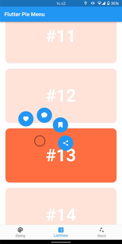
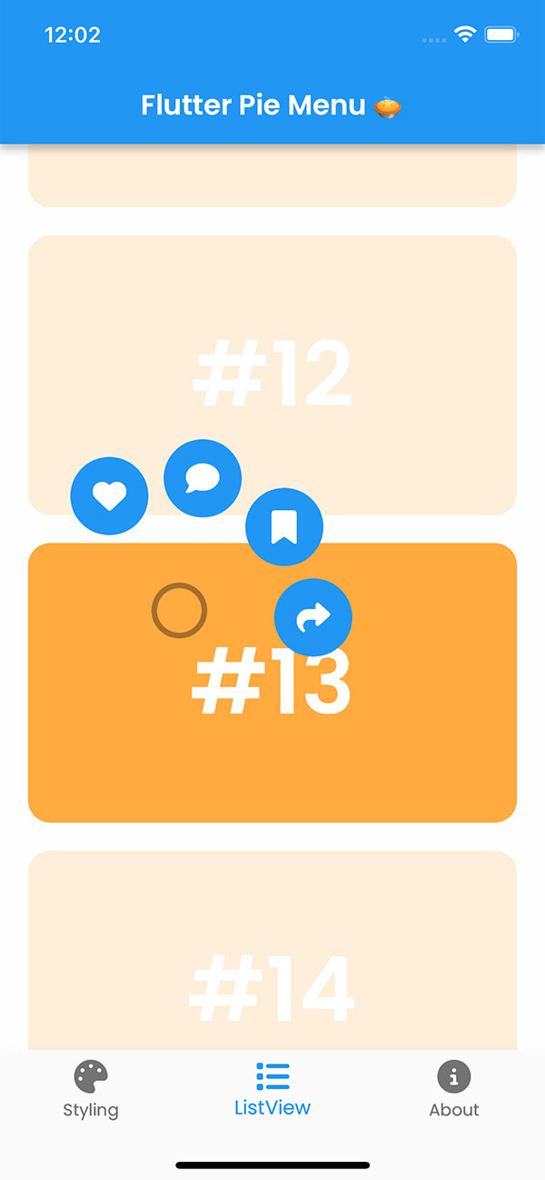
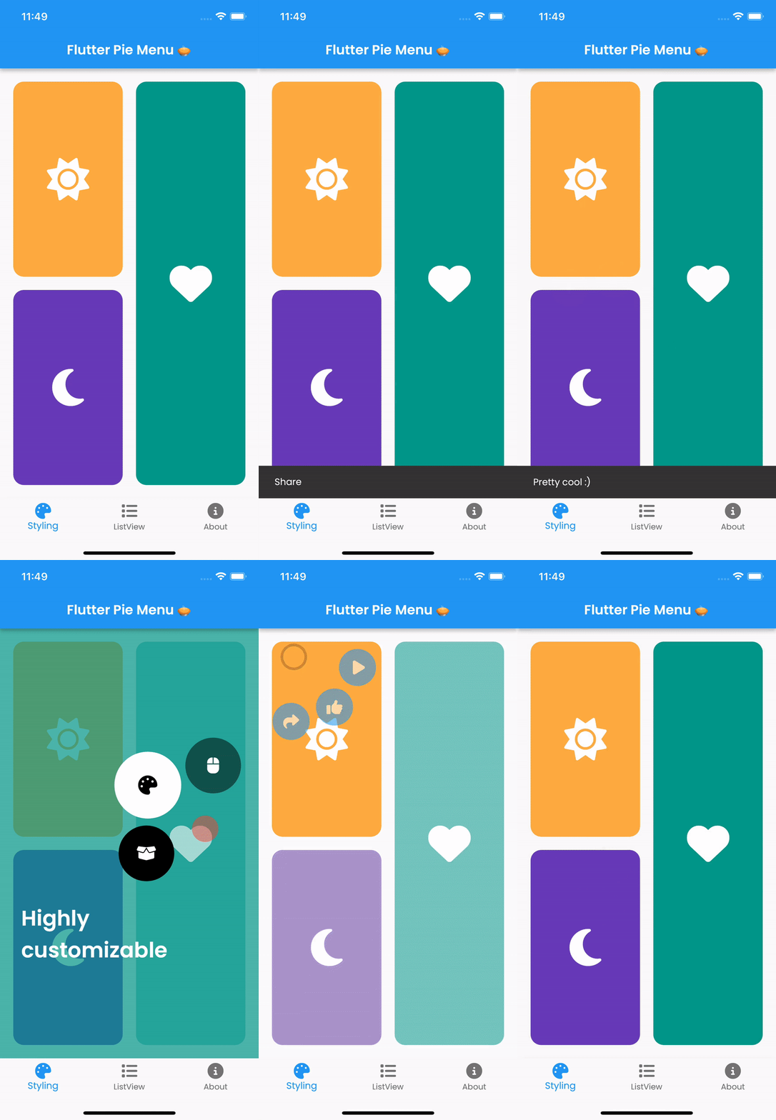
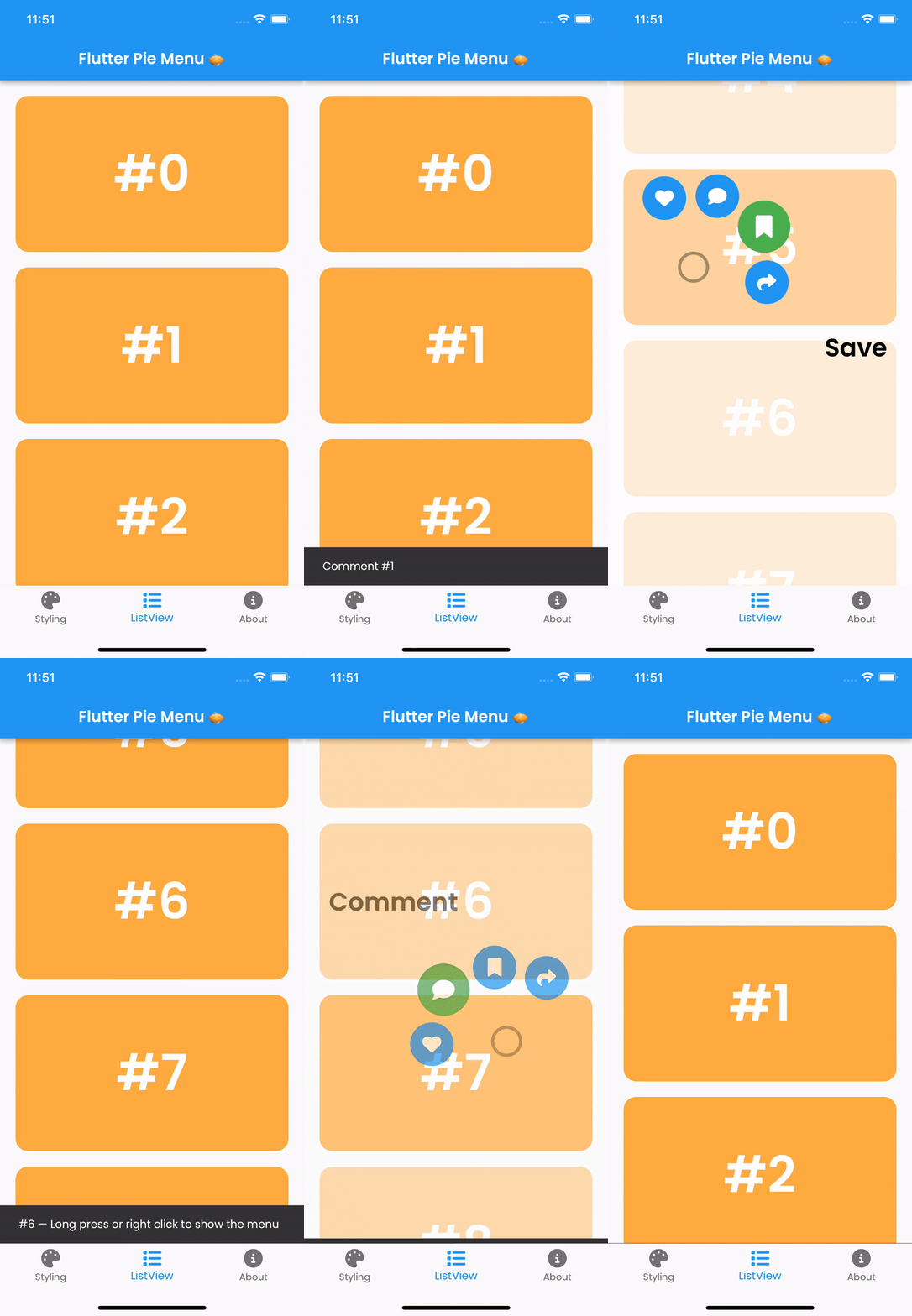
Wrap the widget that should respond to gestures with the PieMenu widget, and provide the menu with a list of PieActions to display as circular buttons.
PieMenu(
onPressed: () => print('pressed'),
actions: [
PieAction(
tooltip: constText('like'),
onSelect: () => print('liked'),
child: constIcon(Icons.favorite), // Can be any widget
),
],
child: ChildWidget(),
),
💡 Note that PieMenu must be a descendant of a PieCanvas widget.
Wrap your page, or any other desired widget for drawing the menu and the background overlay, with the PieCanvas widget.
For instance, if you want the menu to be displayed at the forefront, wrap your Scaffold with a PieCanvas as follows:
Button background and icon colors are defined by the theme's buttonTheme and buttonThemeHovered properties. You can create custom PieButtonTheme instances for your canvas and menu themes.
To disable dynamic angle calculation and have the menu appear at a fixed angle, set the customAngle and customAngleAnchor attributes of PieTheme.
PieTheme(
  customAngle: 90, // In degrees
  customAngleAnchor: PieAnchor.center, // start, center, end
),
You can also use customAngleDiff or spacing to adjust the angle between buttons, and angleOffset to rotate the menu.
Specific menu position
Use the menuAlignment attribute of PieTheme to make the menu appear at a specific position regardless of the press location. Combine it with menuDisplacement to fine-tune the position.
To open, close, or toggle a menu programmatically, assign a PieMenuController to it.
// Create a controller inside a stateful widget.final _pieMenuController = PieMenuController();
// Assign the controller to a PieMenu.PieMenu(
controller: _pieMenuController,
...
),
// Control the menu using the controller.
_pieMenuController.open(
menuAlignment: Alignment.center,
);
If you need to perform actions when the menu is toggled, use the onToggle callback of PieMenu or the onMenuToggle callback of PieCanvas.