profile_photo
Creates a widget that was designed to be used to display a profile photo, but it could also be used in many other ways
Features
- Ability to add a custom badge to the widget, could be used to display premium users for example
- Will automatically figure out a users initals to display if no image is given, but a name is
- ImageProvider as an image source to use either network or asset images
- onTap and onLongPress call backs
- Adjustable size
- Adjustable corner radius
- Adjustable outline width
- Adjustable background and outline colors
Getting started
Add the dependency and add anywhere in widget tree
Usage
Minimum required code for a simple round photo (2nd example)
ProfilePhoto(
    totalWidth: 100,
    cornerRadius: 80,
    color: Colors.blue,
    image: const AssetImage('assets/test_profile_photo.jpg'),
),
More complicated example with initals shown, custom boarder and colors, and badge (3rd example)
ProfilePhoto(
totalWidth: 200,
cornerRadius: 25,
color: Colors.blue,
outlineColor: Colors.red,
outlineWidth: 10,
textPadding: 10,
name: 'Brad Varnum',
fontColor: Colors.white,
nameDisplayOption: NameDisplayOptions.initials,
fontWeight: FontWeight.w100,
showName: true,
image: const AssetImage('assets/test_profile_photo.jpg'),
badgeAlignment: Alignment.bottomLeft,
badgeSize: 60,
badgeImage: const AssetImage('assets/star.png'),
onTap: () {
},
onLongPress: () {
},
),
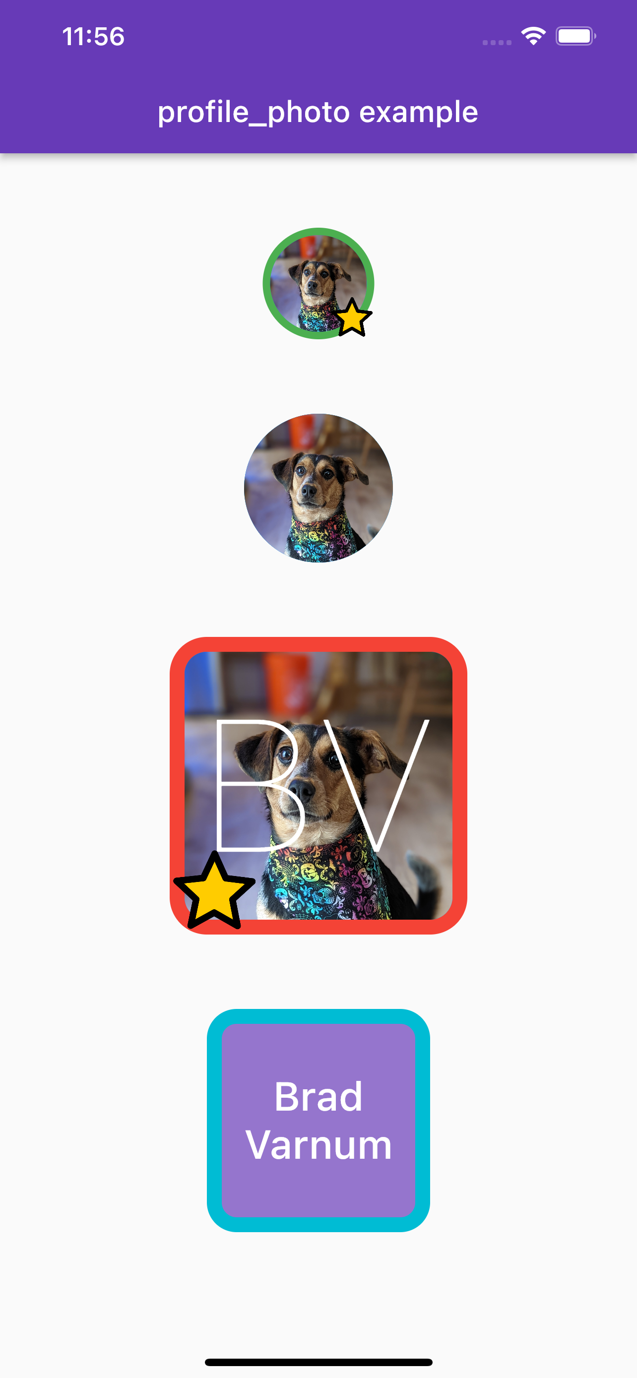
Additional information
- Feel free to use as-is or fork and modify for what you need
- If you find any issues, please create a issue in this repo
- If you have any suggestions or feature requests, please create an issue
- I made this mostly for fun, and explore the package creation process

