パッケージ、リポジトリ、アプリカテゴリを検索

progress_state_button のカバー
パッケージ詳細v1.0.4

progress_state_button

Flutter Android、iOS、Web 向けのカスタマイズ可能なプログレスボタンウィジェット。

AndroidiOSWebmacOSWindowsLinux
30日間ダウンロード
2420
いいね数
373
Pub ポイント
130

パッケージをインストール

flutter pub add progress_state_button

パッケージ概要

公開情報に基づく選定ガイドです。参考としてご利用ください。

Flutter向けのカスタマイズ可能なプログレスボタンウィジェットで、Android、iOS、Web、macOS、Windows、Linuxをサポートしています。ロード中、成功、エラー、アイドルなどの動的な状態を持つボタンを作成でき、フォーム送信やAPI呼び出しなどのアクション中にユーザーのフィードバックを向上させます。このウィジェットは非常にカスタマイズ可能で、色、ラベル、アイコン、アニメーションをカスタマイズできます。既存のFlutterアプリにスムーズに統合され、プラットフォーム間で一貫した体験を提供します。

用途

  • ロード状態付きのフォーム送信
  • 認証フローの進行状況
  • ファイルアップロードインジケーター
  • 決済処理UI
  • オンボーディングウィザードの手順

主な機能

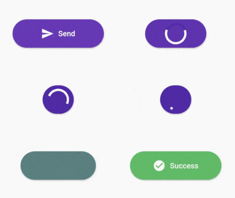
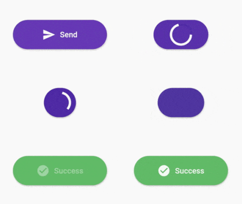
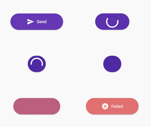
  • 複数の状態をサポート(アイドル、ロード中、成功、エラー)
  • カスタマイズ可能な外観と動作
  • クロスプラットフォーム互換性
  • 状態間のアニメーション遷移
  • カスタマイズ可能なラベルとアイコン
  • 既存のウィジェットとの簡単な統合

適している対象

  • インタラクティブなフォームを構築する開発者
  • UXの一貫性を重視するチーム
  • リアルタイムフィードバックを必要とするアプリ
  • クロスプラットフォームのモバイルおよびWebアプリケーション
  • 複雑なユーザー作業フローを持つプロジェクト

注意事項

  • Flutter のステート管理の理解が必要です
  • 複雑なデザインには追加のスタイルが必要になる場合があります
  • ボタン固有のユースケースに限定
  • インタラクティブでない要素には適していません
  • プラットフォーム固有のレンダリング動作に依存しています

元の README

関連するソースリポジトリの README 原文のスナップショットです。最新の内容はリポジトリをご覧ください。

Progress State Button

A customizable progress button for Flutter

Test with DartPad

Installation

https://pub.dev/packages/progress_state_button

progress_state_button: "^1.0.4"

Usage

Icon

ProgressButton.icon(iconedButtons: {
      ButtonState.idle:
        IconedButton(
            text: "Send",
            icon: Icon(Icons.send,color: Colors.white),
            color: Colors.deepPurple.shade500),
      ButtonState.loading:
        IconedButton(
            text: "Loading",
            color: Colors.deepPurple.shade700),
      ButtonState.fail:
        IconedButton(
            text: "Failed",
            icon: Icon(Icons.cancel,color: Colors.white),
            color: Colors.red.shade300),
      ButtonState.success:
        IconedButton(
            text: "Success",
            icon: Icon(Icons.check_circle,color: Colors.white,),
            color: Colors.green.shade400)
    }, 
    onPressed: onPressed,
    state: ButtonState.idle);
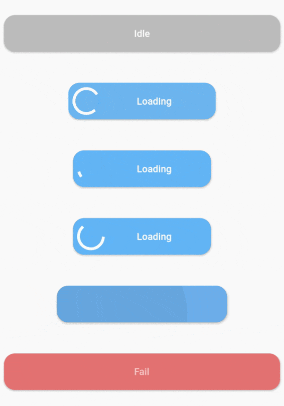
With Custom Widgets

ProgressButton(
      stateWidgets: {
        ButtonState.idle: Text("Idle",style: TextStyle(color: Colors.white, fontWeight: FontWeight.w500),),
        ButtonState.loading: Text("Loading",style: TextStyle(color: Colors.white, fontWeight: FontWeight.w500),),
        ButtonState.fail: Text("Fail",style: TextStyle(color: Colors.white, fontWeight: FontWeight.w500),),
        ButtonState.success: Text("Success",style: TextStyle(color: Colors.white, fontWeight: FontWeight.w500),)
      },
      stateColors: {
        ButtonState.idle: Colors.grey.shade400,
        ButtonState.loading: Colors.blue.shade300,
        ButtonState.fail: Colors.red.shade300,
        ButtonState.success: Colors.green.shade400,
      },
      onPressed: onPressed,
      state: ButtonState.idle,
    );
Constructors
Default constructor of ProgressButton
stateWidgets - Widgets of states
stateColors - Background color oof states
state = ButtonState.idle` - Current state of button
onPressed - onPressed function same like MaterialButton
onAnimationEnd - onAnimatedEnd function calls like that onAnimatedEnd(AnimationStatus animationStatus,ButtonState currentState).
minWidth = 200.0 - Loading state width
maxWidth = 400.0 - failed,success,idle states width
radius = 16.0 - Button radius
height = 53.0 - Button height
circularProgressIndicator - CircularProgressIndicator widget, default is instating with current state color.
progressIndicatorAlignment = MainAxisAlignment.spaceBetween` - ProgressIndicator aligment
progressIndicatorSize = 35.0 - size of progress indicator
padding = EdgeInsets.zero - Padding of button
minWidthStates = List of min width states, loading is the default. If you want to make small only icon states define them on this.
animationDuration = Transition animation duration.
ProgressButton.icon() specific constructors
Map<ButtonState, IconedButton> iconedButtons- State and IconedButton map
double iconPadding: 4.0 - Padding of icon 
TextStyle textStyle - TextStyle of all of states

License

This project is licensed under the MIT License - see the LICENSE.md file for details

カテゴリー

ソースリポジトリ

このパッケージを使用しているプロジェクト

データはまだありません。