パッケージ、リポジトリ、アプリカテゴリを検索

pull_down_button のカバー
パッケージ詳細v0.10.2

pull_down_button

iOS 14 のプルダウンボタンを Flutter で実装するパッケージ。非常にカスタマイズ可能。

AndroidiOSWebmacOSWindowsLinux
30日間ダウンロード
21万
いいね数
480
Pub ポイント
150

パッケージをインストール

flutter pub add pull_down_button

パッケージ概要

公開情報に基づく選定ガイドです。参考としてご利用ください。

iOS 14のプルダウンボタンUIコンポーネントを再現するFlutterパッケージで、アプリインターフェース用にカスタマイズ可能なドロップダウンスタイルのボタンを提供します。ユーザーがボタンから下にスワイプすることでオプションやアクションを表示できるようにし、iOSデザインパターンとのインタラクションの一貫性を高めます。このパッケージは複数のプラットフォームをサポートしており、外観および挙動の広範なカスタマイズが可能です。

用途

  • iOSスタイルのプルダウンメニューの実装
  • Flutterアプリでのカスタムドロップダウンの作成
  • ジェスチャー制御によるユーザーインタラクションの向上
  • クロスプラットフォームアプリにプラットフォーム固有のUI要素を追加する
  • 直感的なアクションセレクタの設計

主な機能

  • iOS 14 をインスパイアしたプルダウンアニメーション
  • 非常にカスタマイズ可能な外観と動作
  • すべての主要なFlutterプラットフォームをサポート
  • ジェスチャー駆動型インタラクション
  • 拡張可能なウィジェット構造

適している対象

  • iOSデザインの一貫性を狙った開発者
  • ジェスチャーによるドロップダウンを必要とするアプリ
  • ネイティブに似たコンポーネントを必要とするクロスプラットフォームアプリ
  • 現代のFlutterウィジェットを探しているUIデザイナー

注意事項

  • ジェスチャー処理の理解が必要です
  • 非iOSプラットフォーム用に追加のスタイリングが必要になる可能性があります
  • プルダウン操作パターンに制限
  • 複雑なメニュー階層には適していません
  • スペースが限られている状況で最も効果的に使用される

元の README

関連するソースリポジトリの README 原文のスナップショットです。最新の内容はリポジトリをご覧ください。

Pull-Down Button from iOS 14-18 for Flutter

Dart SDK Version Pub Version Pub Likes Common Changelog

[!CAUTION] This package is discontinued and will no longer receive any updates. Replacement is available in Flutter since stable version 3.44 - CupertinoMenuAnchor

pull_down_button is an attempt to bring Pop-Up and Pull-Down Buttons from iOS 14-18 to Flutter with some additional customisation options.

This package only tries to visually replicate the native counterpart, some parts might be somewhat different.

[!IMPORTANT] This package is no longer actively maintained and will most likely be deprecated and unlisted some time after Flutter finally supports iOS menus out of the box to give some time for migration. You can follow the progress here - #60298.

One of the core features of this package is an extensive customizability, which, most likely, will not be present in Flutter's pull-down menus. If there won't be any plans to add customizability to Flutter's menus, but there will be a big interest in it, this package might migrate most of the code to use Flutter's more advanced implementation with customisation options present right now. You can post your feedback on this topic here.


Contents:

PullDownButton

PullDownButton example

PullDownButton is a widget used to show the pull-down menu.

While the pull-down menu is opened, the button from where this menu was called will have lower opacity.

PullDownButton(
  itemBuilder: (context) => [
    PullDownMenuItem(
      title: 'Menu item',
      onTap: () {},
    ),
    const PullDownMenuDivider(),
    PullDownMenuItem(
      title: 'Menu item 2',
      onTap: () {},
    ),
  ],
  buttonBuilder: (context, showMenu) => CupertinoButton(
    onPressed: showMenu,
    padding: EdgeInsets.zero,
    child: const Icon(CupertinoIcons.ellipsis_circle),
  ),
);
Properties table
Properties Description
itemBuilder Called when the button is pressed to create the items to show in the menu.
buttonBuilder Builder that provides BuildContext as well as showMenu function to pass to any custom button widget.
onCanceled Called when the user dismisses the pull-down menu.
position Whether the pull-down menu is positioned above, over, or under the pull-down menu button.
itemsOrder Whether the pull-down menu orders its items from itemBuilder in downward or upwards way.
buttonAnchor Whether the pull-down menu is anchored to the center, left, or right side of buttonBuilder.
menuOffset Additional offset for the pull-down menu if the menu's desired position.
scrollController A custom menu scroll controller.
animationBuilder Custom animation for buttonBuilder when the pull-down menu is opening or closing.
routeTheme The theme of the pull-down menu box.
animationAlignmentOverride Custom animation alignment used to override default one.
useRootNavigator Whether to use the root navigator to show the pull-down menu.
routeSettings Optional route settings for the pull-down menu.

PullDownMenuItem

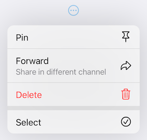
PullDownMenuItem example

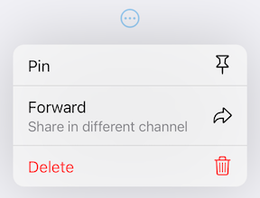
PullDownMenuItem is a widget used to create cupertino-style pull-down menu item.

PullDownMenuItem(
  onTap: () {},
  title: 'Pin',
  icon: CupertinoIcons.pin,
),
PullDownMenuItem(
  title: 'Forward',
  subtitle: 'Share in different channel',
  onTap: () {},
  icon: CupertinoIcons.arrowshape_turn_up_right,
),
PullDownMenuItem(
  onTap: () {},
  title: 'Delete',
  isDestructive: true,
  icon: CupertinoIcons.delete,
),
Properties table
Properties Description
onTap The action this item represents.
tapHandler Handler to resolve how onTap callback is used.
enabled Whether the user is permitted to tap this item.
title Title of this PullDownMenuItem.
subtitle Subtitle of this PullDownMenuItem.
icon Trailing icon of this PullDownMenuItem.
iconColor Trailing icon's color.
iconWidget Custom trailing widget.
isDestructive Whether this item represents destructive action.
itemTheme The theme of the menu item.

PullDownMenuItem.selectable

PullDownMenuItem.selectable example

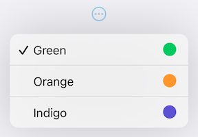
PullDownMenuItem.selectable is a widget used to create cupertino-style pull-down menu item with selection state.

PullDownMenuItem.selectable(
  onTap: () {},
  selected: true,
  title: 'Green',
  icon: CupertinoIcons.circle_fill,
  iconColor: CupertinoColors.systemGreen.resolveFrom(context),
),
PullDownMenuItem.selectable(
  onTap: () {},
  selected: false,
  title: 'Orange',
  icon: CupertinoIcons.circle_fill,
  iconColor: CupertinoColors.systemOrange.resolveFrom(context),
),
PullDownMenuItem.selectable(
  onTap: () {},
  selected: false,
  title: 'Indigo',
  icon: CupertinoIcons.circle_fill,
  iconColor: CupertinoColors.systemIndigo.resolveFrom(context),
),
Properties table

PullDownMenuItem.selectable uses all of PullDownMenuItem properties as well as a boolean value selected, to indicate whether the menu item is selected or not.


PullDownMenuActionsRow

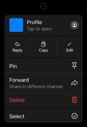
PullDownMenuActionsRow example

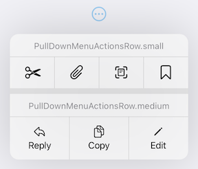
PullDownMenuActionsRow is a widget used to create cupertino-style pull-down menu row of actions (small or medium size).

PullDownMenuActionsRow.medium(
  items: [
    PullDownMenuItem(
      onTap: () {},
      title: 'Reply',
      icon: CupertinoIcons.arrowshape_turn_up_left,
    ),
    PullDownMenuItem(
      onTap: () {},
      title: 'Copy',
      icon: CupertinoIcons.doc_on_doc,
    ),
    PullDownMenuItem(
      onTap: () {},
      title: 'Edit',
      icon: CupertinoIcons.pencil,
    ),
  ],
),

PullDownMenuItem is used to populate PullDownMenuActionsRow.items. Depending on PullDownMenuActionsRows size, PullDownMenuItem might be either icon only or icon and title in a vertical array.

Properties Description
items List of PullDownMenuItem.

PullDownMenuDivider

PullDownMenuDivider example

PullDownMenuDivider.large is a widget used to create cupertino-style pull-down menu large divider.

There is no need in adding PullDownMenuDivider by hand, pull-down menu does it automatically!

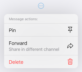
PullDownMenuTitle

PullDownMenuTitle example

PullDownMenuTitle is a widget used to create cupertino-style pull-down menu title (usually at the top of menu).

const PullDownMenuTitle(
  title: Text('Menu title'),
),
Properties Description
title Title widget.
titleStyle Title widget text style.

PullDownMenuHeader

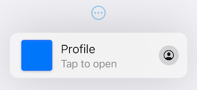
PullDownMenuHeader example

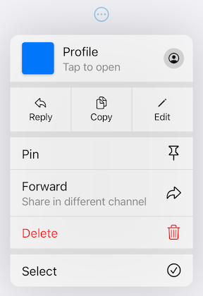
PullDownMenuHeader is a widget used to create cupertino-style pull-down menu document header (usually at the top of menu).

PullDownMenuHeader(
  leading: ColoredBox(
    color: CupertinoColors.systemBlue.resolveFrom(context),
  ),
  title: 'Profile',
  subtitle: 'Tap to open',
  onTap: () {},
  icon: CupertinoIcons.profile_circled,
),
Properties table
Properties Description
onTap The action this header represents.
tapHandler Handler to resolve how onTap callback is used.
leading Leading widget of this PullDownMenuItem.
leadingBuilder Custom leading widget of PullDownMenuHeader.
title Title of this PullDownMenuItem.
subtitle Subtitle of this PullDownMenuItem.
itemTheme The theme of the menu item.
icon Trailing icon of this PullDownMenuItem.
iconWidget Custom trailing widget.

showPullDownMenu

An alternative way of displaying pull-down menu via a function call.

onPressed: () async {
  /* get tap position and / or do something before opening menu */

  await showPullDownMenu(
    context: context,
    items: [...],
    position: position,
  );
}
Properties table
Properties Description
context For looking up Navigator for the menu.
items List of PullDownMenuEntry widgets.
position The Rect is used to align the top of the menu with the top of the position rectangle.
itemsOrder Whether the popup menu orders its items from itemBuilder in a downward or upwards way.
menuOffset Additional offset for the pull-down menu if the menu's desired position.
scrollController A custom menu scroll controller.
onCanceled Called when the user dismisses the pull-down menu.
routeTheme The theme of the pull-down menu box.
useRootNavigator Whether to use the root navigator to show the pull-down menu.
routeSettings Optional route settings for the pull-down menu.
PullDownMenu

Another alternative way of displaying the pull-down menu as a simple widget, with no animations or adding routes to the navigation stack.

PullDownMenu(
  items: [
    PullDownMenuItem(
      title: 'Menu item',
      onTap: () {},
    ),
    const PullDownMenuDivider(),
    PullDownMenuItem(
      title: 'Menu item 2',
      onTap: () {},
    ),
  ]
),
Properties table
Properties Description
items List of PullDownMenuEntry widgets.
scrollController A custom menu scroll controller.
routeTheme The theme of pull-down menu box.

Theming

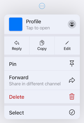
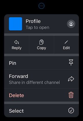
This package also provides additional customization. By default, the iOS 16 theme is used, but it is also possible to override defaults with widget properties (see above) or with PullDownButtonTheme theme extension.

Light Theme Dark Theme
light default theme example dark default theme example
PullDownButtonTheme

To use PullDownButtonTheme define it in your ThemeData as follows:

ThemeData(
  ...,
  extensions: [
    PullDownButtonTheme(
      routeTheme: PullDownMenuRouteTheme(
        backgroundColor: Colors.grey,
      ),
      itemTheme: PullDownMenuItemTheme(
        destructiveColor: Colors.red,
      ),
      dividerTheme: PullDownMenuDividerTheme(
        dividerColor: Colors.black,
      ),
    ),
  ],
),

PullDownButtonTheme uses a set of sub-themes (for items, dividers, the menu itself, etc.) to define the needed theme. See below for every property each sub-theme provides.

PullDownButtonTheme
Properties Description
routeTheme Menu container theme (PullDownMenuRouteTheme).
itemTheme PullDownMenuItem theme (PullDownMenuItemTheme).
dividerTheme PullDownMenuDivider theme (PullDownMenuDividerTheme).
titleTheme PullDownMenuTitle theme (PullDownMenuTitleTheme).
PullDownMenuRouteTheme
Properties Description
backgroundColor The background color of the pull-down menu.
borderRadius The border radius of the pull-down menu.
borderClipper The border radius clipper of the pull-down menu.
shadow The pull-down menu shadow.
width Pull-down menu width.
accessibilityWidth Pull-down menu accessibility width.

backgroundColor usually has opacity in the range of 0.7-0.8 so that menu has a blur effect. If backgroundColor is fully opaque (opacity set to 1), no blur effect will be applied.

PullDownMenuItemTheme
Properties Description
destructiveColor Color for destructive action.
checkmark Checkmark icon.
textStyle PullDownMenuItem text style.
subtitleStyle PullDownMenuItem subtitle text style.
iconActionTextStyle PullDownMenuItem text style inside of PullDownMenuActionsRow.
onHoverBackgroundColor On hover color of PullDownMenuItem.
onPressedBackgroundColor On pressed color of PullDownMenuItem.
onHoverTextColor On hover color of text of PullDownMenuItem.
PullDownMenuDividerTheme
Properties Description
dividerColor Small divider color.
largeDividerColor Large divider color.

largeDividerColor is usually lighter than dividerColor.

PullDownMenuTitleTheme
Properties Description
style PullDownMenuTitle text style.
PullDownButtonInheritedTheme

If defining PullDownButtonTheme in ThemeData is not possible, for example, if you are using CupertinoApp, you can use PullDownButtonInheritedTheme:

CupertinoApp(
  builder: (context, child) => PullDownButtonInheritedTheme(
    data: const PullDownButtonTheme(
      ...
    ),
    child: child!,
  ),
  home: ...,
),

Custom theming example

Here is an example of using PullDownButtonTheme with Material 3 color scheme colors (generated from CupertinoColors.systemBlue with ColorScheme.fromSeed) from Material 3 Menu specs.

Custom Material 3 light theme Custom Material 3 dark theme
light theme example dark theme example

Contributions

Feel free to contribute to this project.

Please file feature requests and bugs at the issue tracker.

If you fixed a bug or implemented a feature by yourself, feel free to send a pull request.

カテゴリー

依存関係

依存関係一覧 1 件

ソースリポジトリ

このパッケージを使用しているプロジェクト