パッケージ、リポジトリ、アプリカテゴリを検索

quickalert のカバー
パッケージ詳細v1.1.0

quickalert

QuickAlertを使用すると、成功、エラー、警告、確認、ロード中、またはカスタムダイアログなど、アニメーション付きのアラートダイアログをすぐに表示できます。

AndroidiOSWebmacOSWindowsLinux
30日間ダウンロード
2万
いいね数
590
Pub ポイント
150

パッケージをインストール

flutter pub add quickalert

パッケージ概要

公開情報に基づく選定ガイドです。参考としてご利用ください。

QuickAlert は、成功、エラー、警告、確認、ロードなど、事前に定義されたタイプを持つアニメーション付きでカスタマイズ可能なアラートダイアログを迅速に表示できるFlutterパッケージです。最小限のコードでユーザーのフィードバックを簡単に表示でき、Android、iOS、Web、macOS、Windows、Linuxなど複数のプラットフォームをサポートしています。スムーズなアニメーションと単一のメソッド呼び出しによる簡単な統合により、即時の視覚的フィードバックが必要なアプリのユーザーエクスペリエンスを向上させるのに最適です。ユニークな用途向けのカスタムダイアログもサポートされています。

用途

  • フォーム送信後に成功メッセージを表示する
  • 無効な入力に対するエラーアラートを表示する
  • はい/いいえのプロンプトで操作を確認する
  • 非同期操作中のロード状態を示す
  • 特定のUI要件に合わせたカスタムアラートデザインの作成

主な機能

  • 事前定義されたアラートタイプ(成功、エラー、警告など)
  • 視覚的魅力のためのアニメーション遷移
  • カスタムダイアログコンテンツのサポート
  • シンプルな1行呼び出し
  • クロスプラットフォーム互換性
  • 軽量で統合が簡単

適している対象

  • 初心者のFlutter開発者
  • 迅速なユーザーのフィードバックが必要なアプリ
  • フォームと認証フロー
  • 頻繁なアラートを持つインタラクティブUI
  • 迅速な実装を重視するプロジェクト

注意事項

  • 基本的なスタイリングを超えるカスタマイズは限定的
  • 複雑なレイアウトには追加のスタイル設定が必要になる場合があります
  • 非常に動的なまたは永続的なダイアログには適していない
  • 一時的な通知に最適
  • 効果のために外部アニメーションライブラリに依存しています

元の README

関連するソースリポジトリの README 原文のスナップショットです。最新の内容はリポジトリをご覧ください。

QuickAlert Banner

An instantly ready, full-featured alerts for development on any platform with flutter. Enabling you to complete projects and deploy quickly. With QuickAlert, you can display animated alert dialogs such as success, error, warning, confirm, loading or even a custom dialog.

Key Features 🔮

Easy To Use

The alerts are very flexible and can be customized very easily. In QuickAlert, the QuickAlert.show() triggers the alert, which informs the user about the situations that need acknowledgment.

Predefined Beautiful Alert Styles

Make use of the predefined alerts are very beautiful and can also be customized very easily. In QuickAlert there are 6 different types of alerts, they are Success, Error, Warning, Info, Confirm & Loading.

Predefined Title & Actions

In QuickAlert all the 6 different types of alerts have predefined title & actions matching the alert type.

Super Customizable

Build your custom alert with power of QuickAlert using the flutter widgets.

Change Animation

Set your favorite animation by choosing from scale, rotate, slideInDown, slideInUp, slideInLeft, slideInRight.

Set Auto close

Auto close the alert by setting auto close duration.

Set Overlay Tap to Dismiss

Control the alert's Barrier Dismissible Property by setting barrierDismissible to true or false.

And Many More...


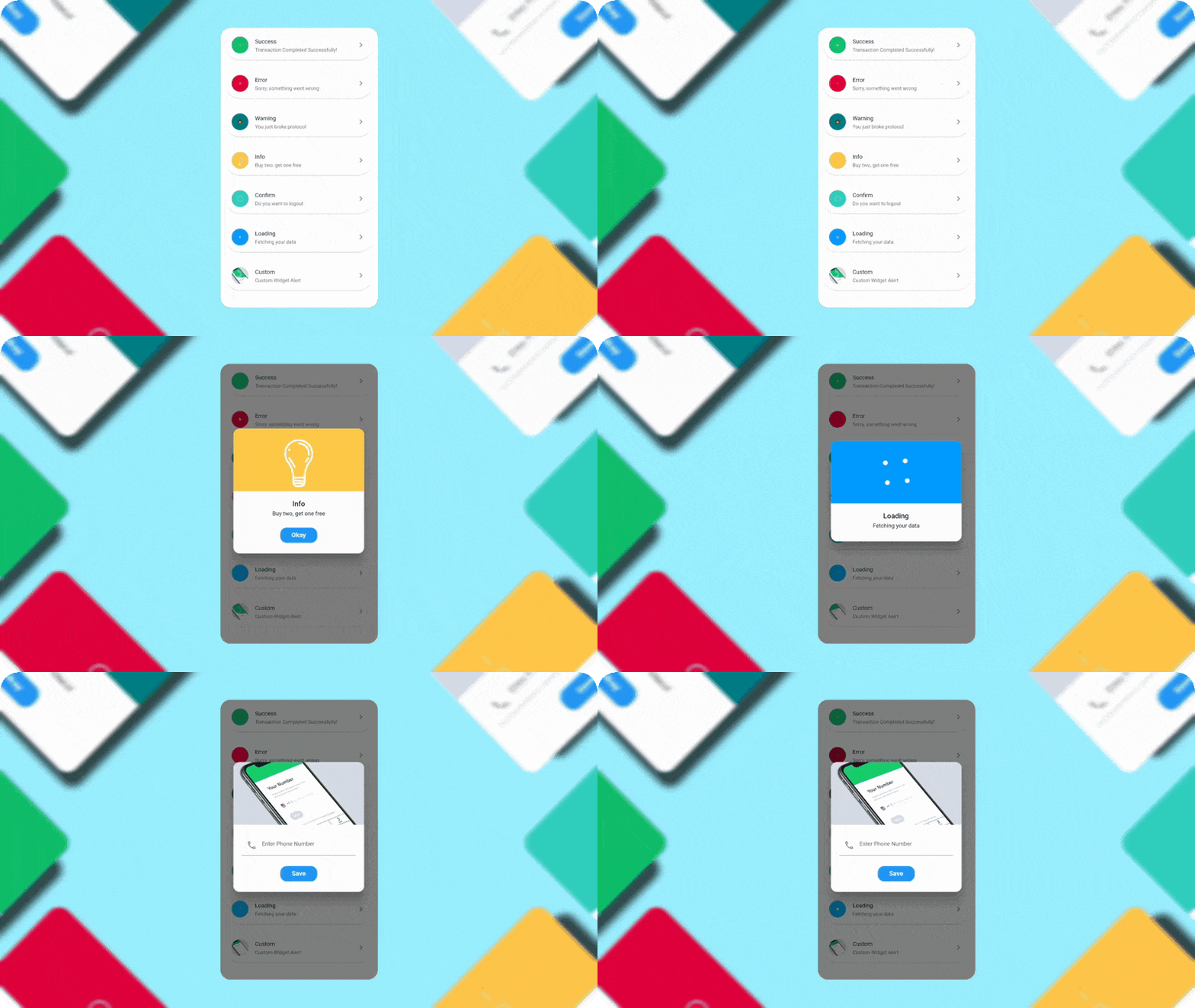
QuickAlert Demo

QuickAlert Demo

Getting Started 🔥

Start by adding the library as a dependency to your project.

dependencies:
  quickalert: <latest version>

Run the command get the dependency

$ flutter pub get

Import it in your dart code, you can use

import 'package:quickalert/quickalert.dart';

To display alert use QuickAlert.show() and define the type of alert.

QuickAlert.show(
  context: context,
  type: QuickAlertType.success,
); // That's it to display an alert, use other properties to customize.

Examples ⚡

There is a detailed example project in the example folder. You can directly run and play on it. There are code snippets from example project below.

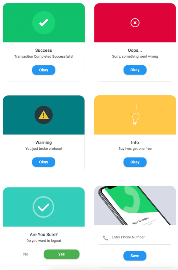
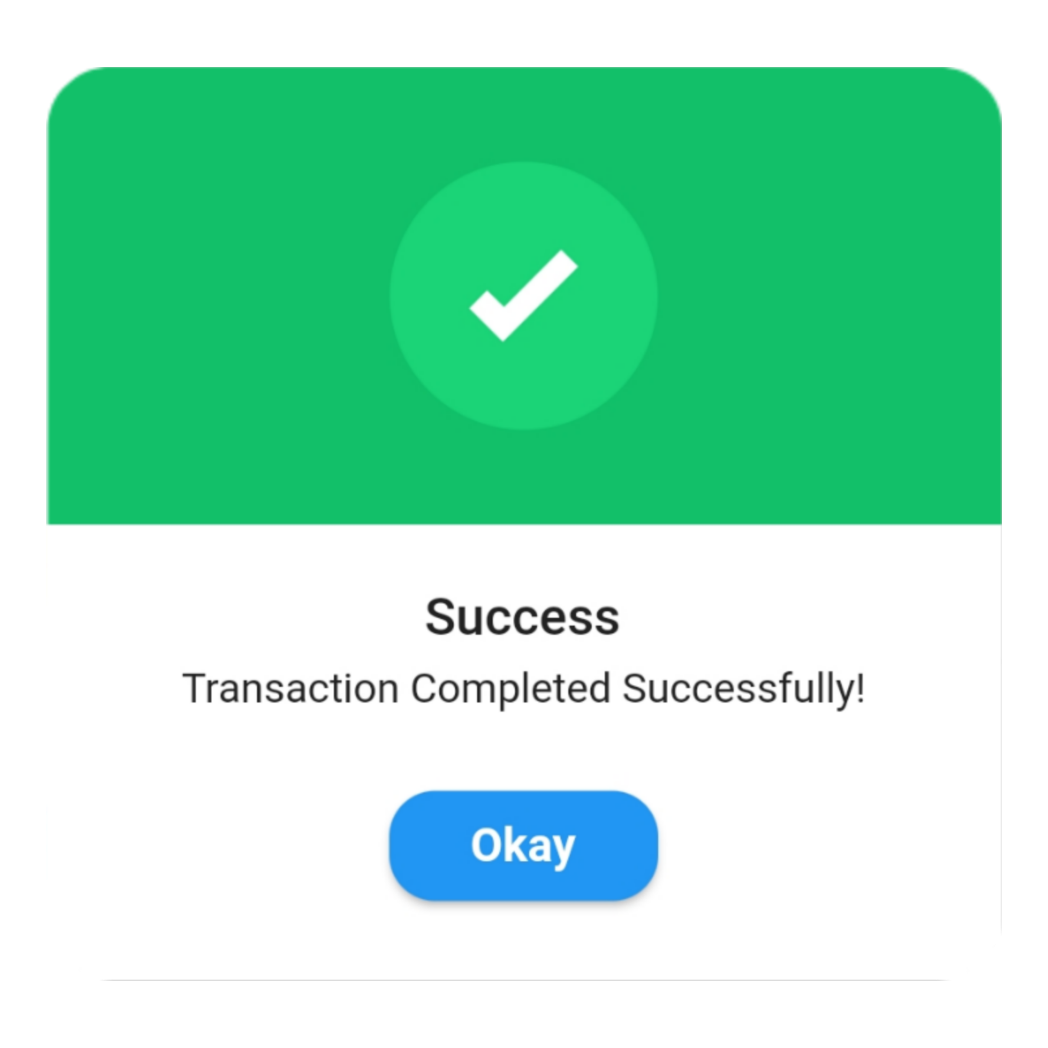
Success
QuickAlert.show(
 context: context,
 type: QuickAlertType.success,
 text: 'Transaction Completed Successfully!',
);

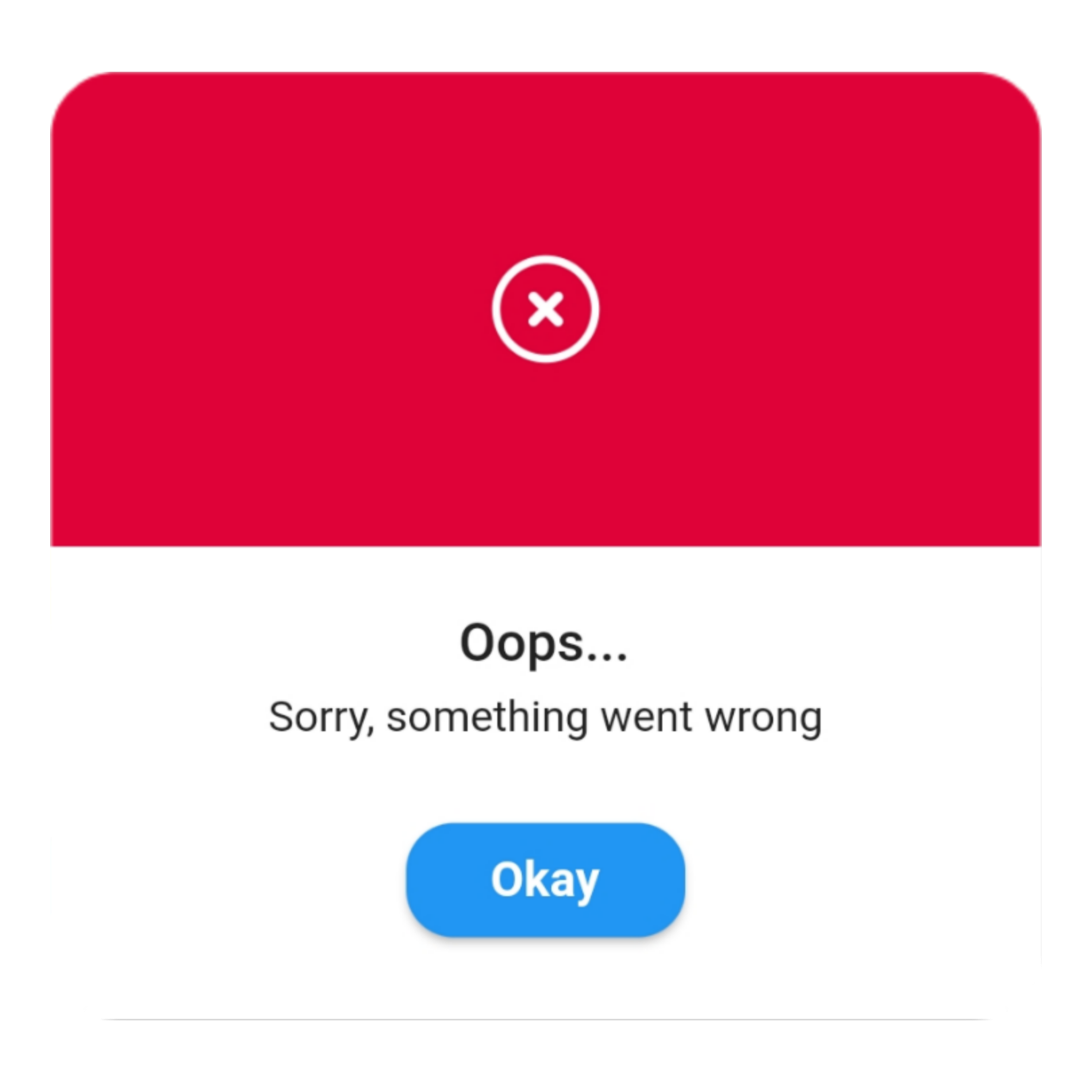
Error
QuickAlert.show(
 context: context,
 type: QuickAlertType.error,
 title: 'Oops...',
 text: 'Sorry, something went wrong',
);

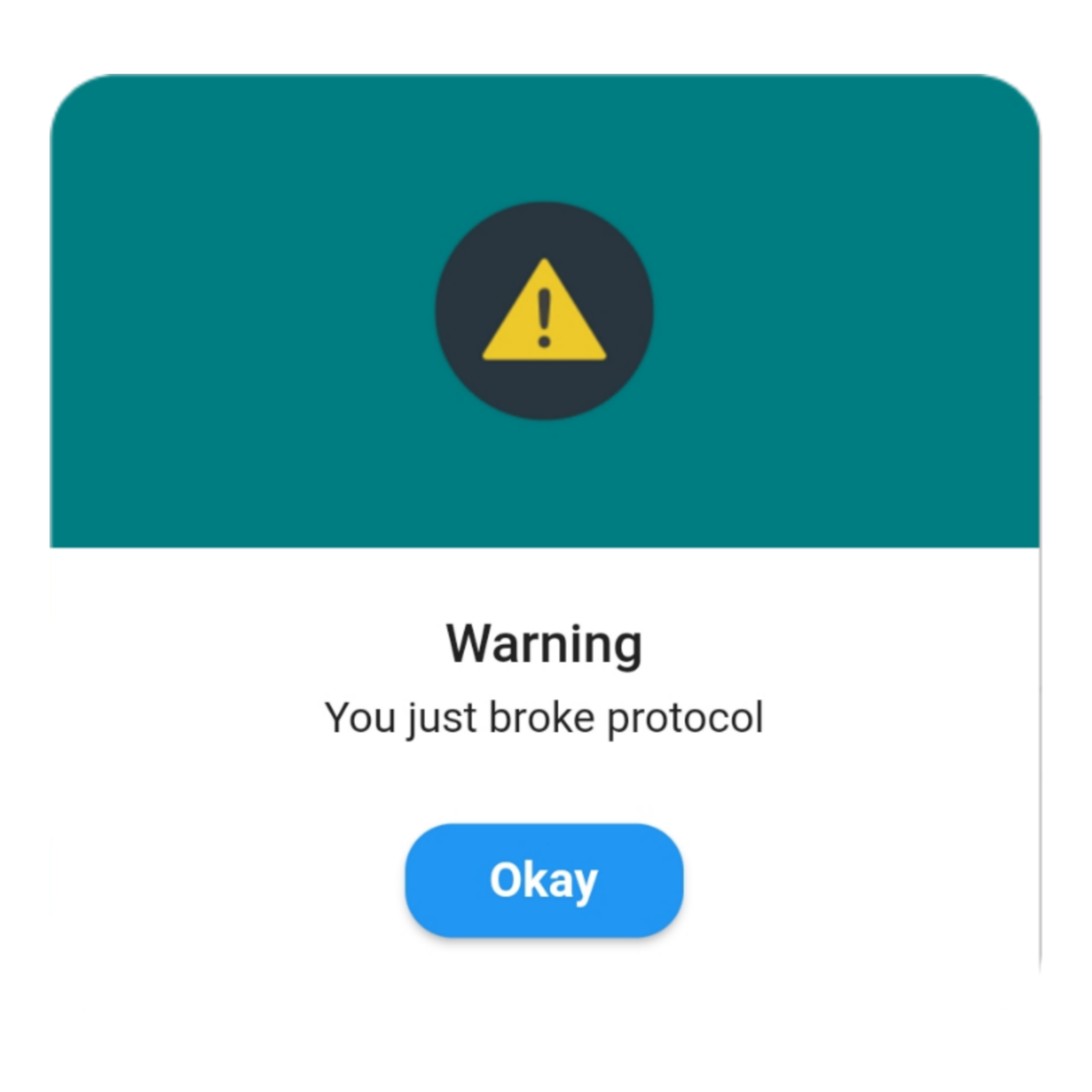
Warning
QuickAlert.show(
 context: context,
 type: QuickAlertType.warning,
 text: 'You just broke protocol',
);

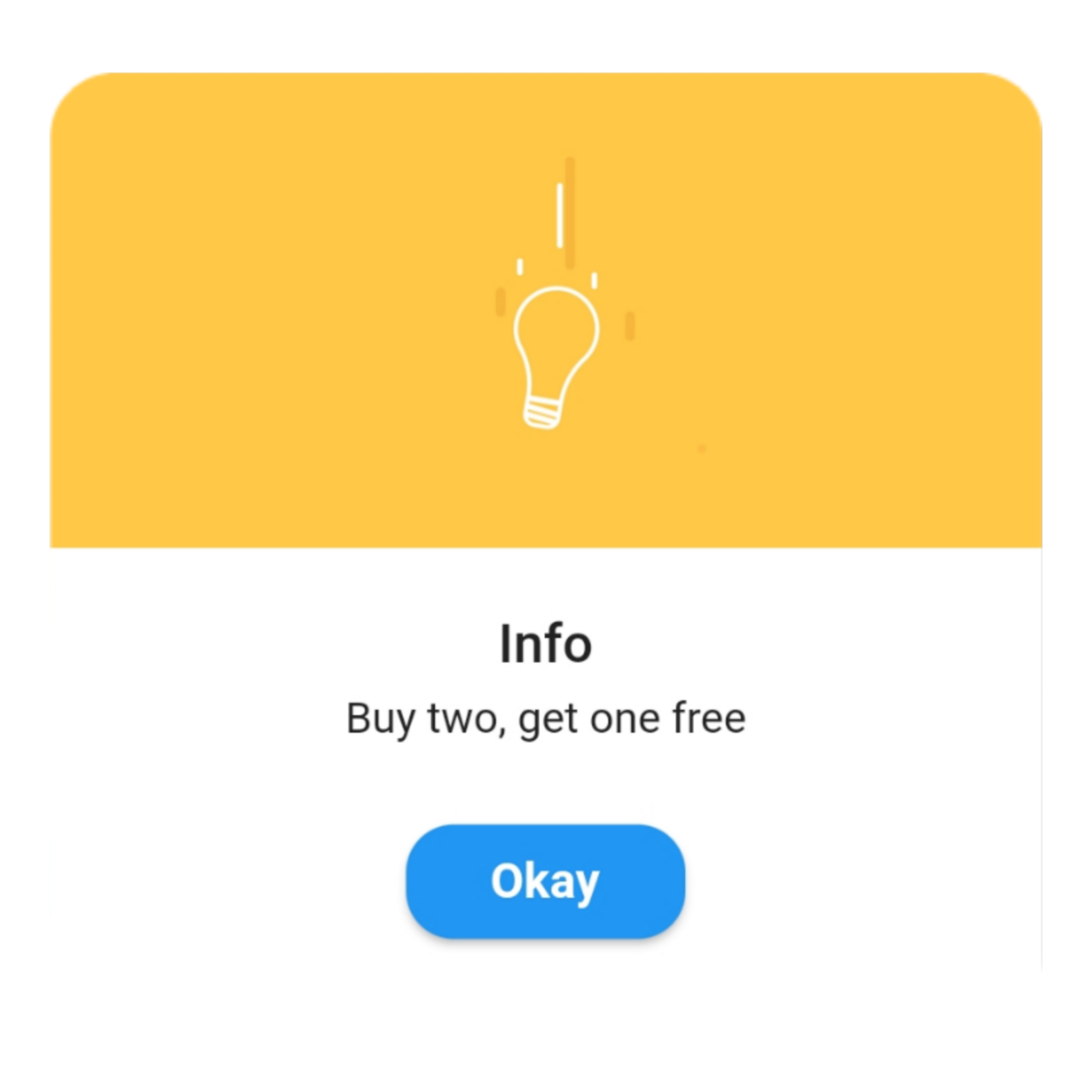
Info
QuickAlert.show(
 context: context,
 type: QuickAlertType.info,
 text: 'Buy two, get one free',
);

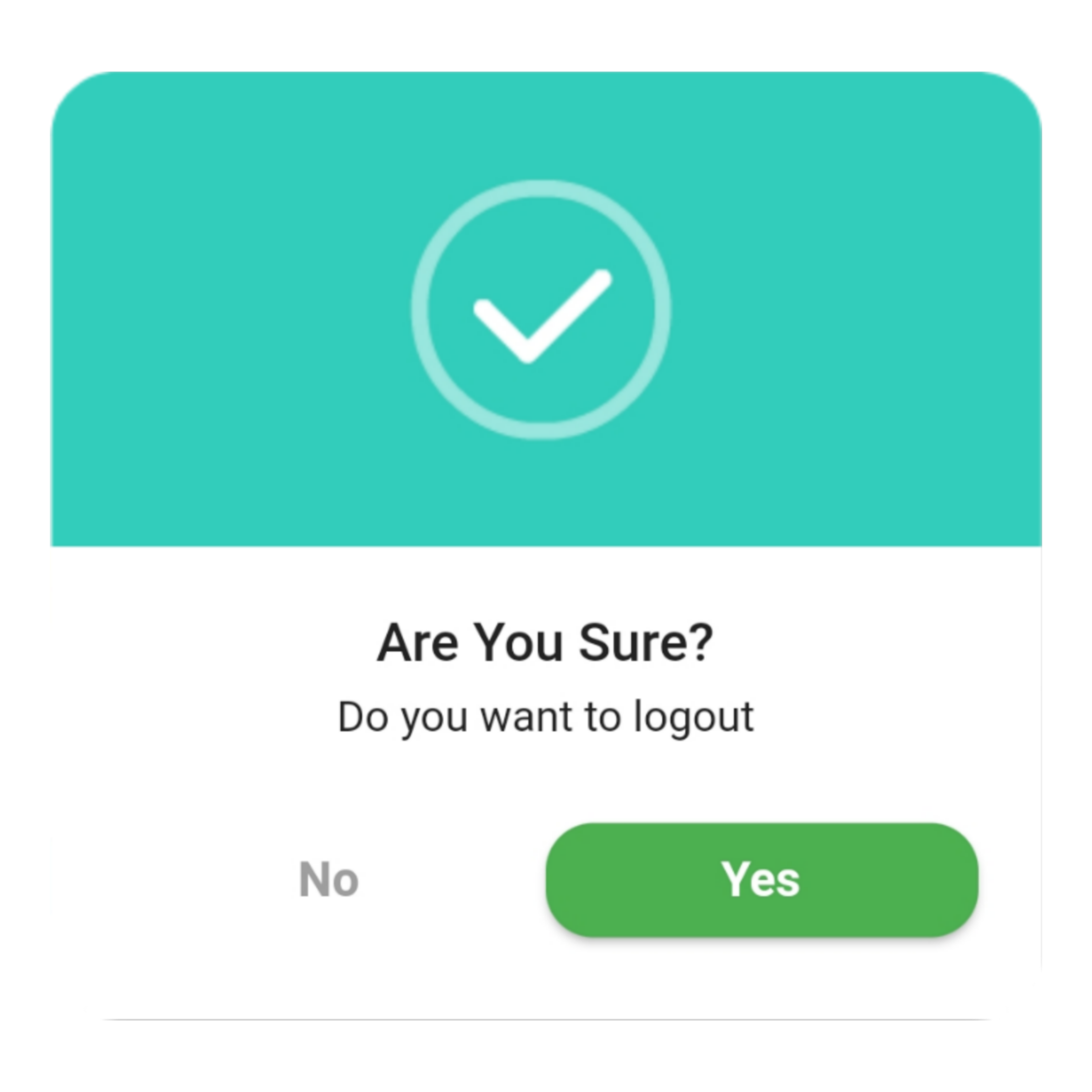
Confirm
QuickAlert.show(
 context: context,
 type: QuickAlertType.confirm,
 text: 'Do you want to logout',
 confirmBtnText: 'Yes',
 cancelBtnText: 'No',
 confirmBtnColor: Colors.green,
);

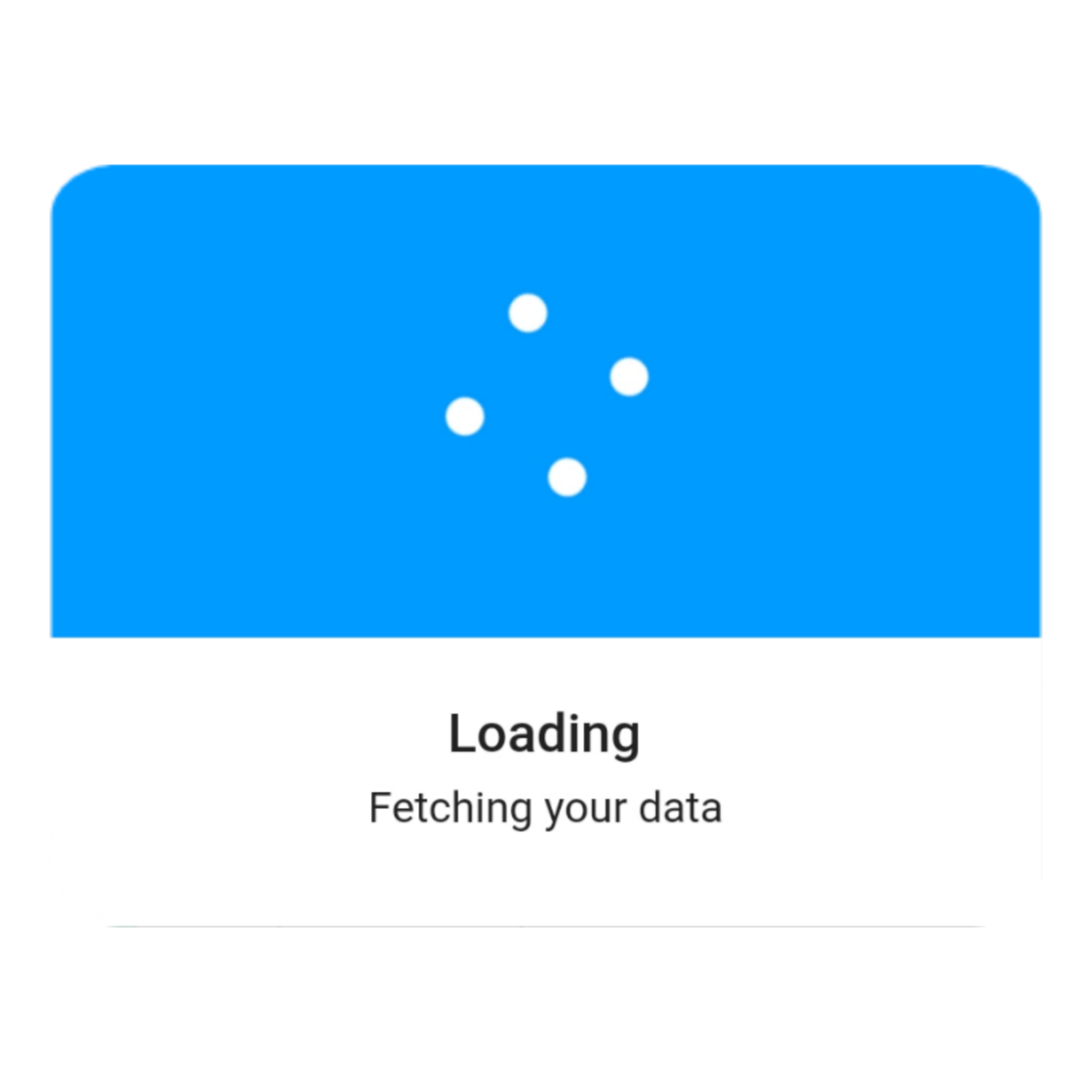
Loading
QuickAlert.show(
 context: context,
 type: QuickAlertType.loading,
 title: 'Loading',
 text: 'Fetching your data',
);

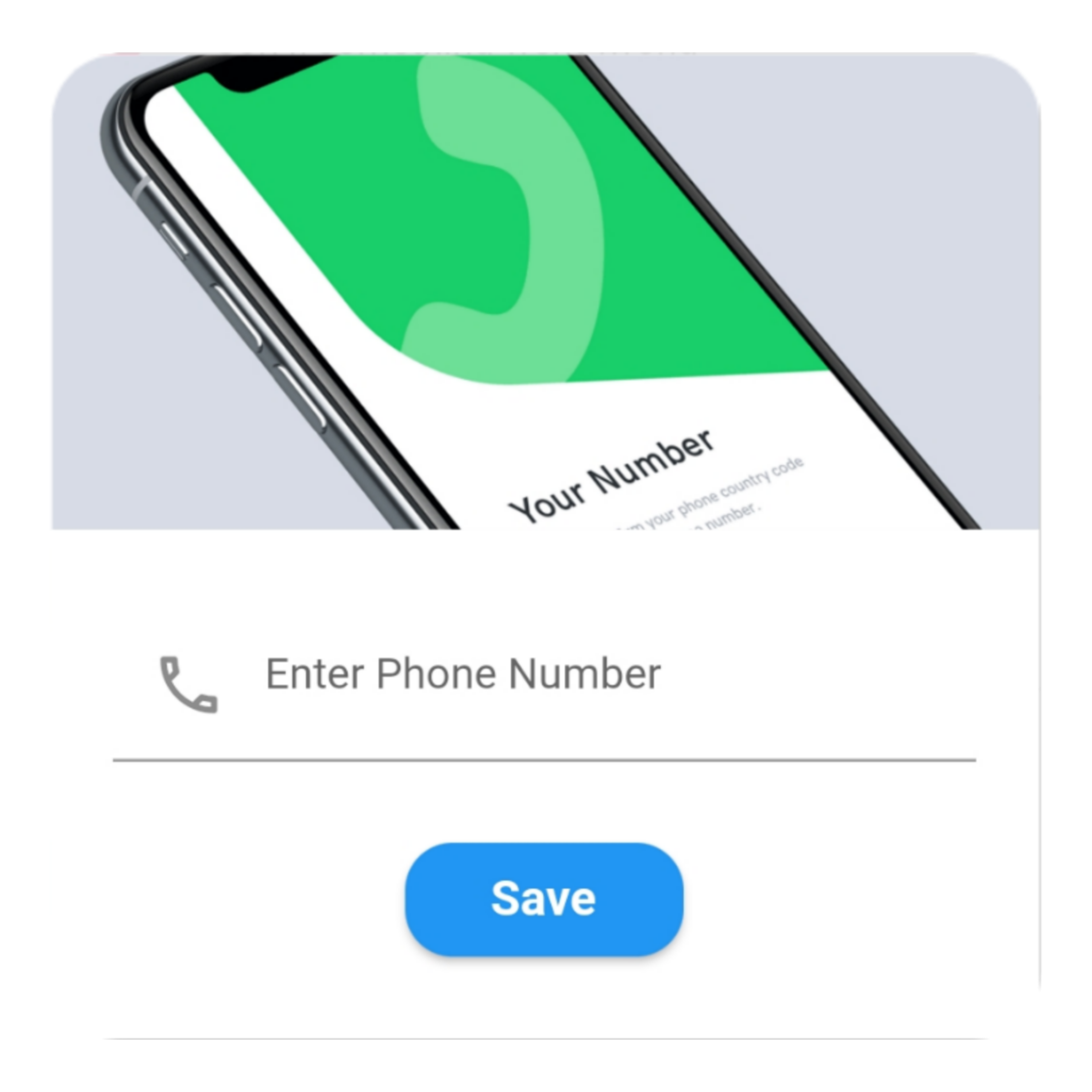
Custom
QuickAlert.show(
  context: context,
  type: QuickAlertType.custom,
  barrierDismissible: true,
  confirmBtnText: 'Save',
  customAsset: 'assets/custom.gif',
  widget: TextFormField(
  decoration: const InputDecoration(
     alignLabelWithHint: true,
     hintText: 'Enter Phone Number',
     prefixIcon: Icon(
     Icons.phone_outlined,
     ),
    ),
    textInputAction: TextInputAction.next,
      keyboardType: TextInputType.phone,
      onChanged: (value) => message = value,
    ),
    onConfirmBtnTap: () async {
     if (message.length < 5) {
      await QuickAlert.show(
       context: context,
       type: QuickAlertType.error,
       text: 'Please input something',
      );
      return;
    }
    Navigator.pop(context);
     await Future.delayed(const Duration(milliseconds: 1000));
     await QuickAlert.show(
      context: context,
      type: QuickAlertType.success,
      text: "Phone number '$message' has been saved!.",
     );
    },
  );
 },
 title: 'Custom',
 text: 'Custom Widget Alert',
 leadingImage: 'assets/custom.gif',
); 

Screenshots ✨

Here are some screenshots of the QuickAlert Dialogs.

QuickAlert Options 📖

These are the options available in QuickAlert Class.

Attribute Data type Description Default Value
context BuildContext @required BuildContext N/A
type QuickAlertType @required - Type of alert dialog, ex: QuickAlertType.success for success dialogs NULL
title String Set a custom title for dialog Based on the QuickAlertType selected
text String Set the description text of the dialog. NULL
widget Widget Set custom widget of the dialog. NULL
confirmBtnText String Text of confirm button 'Okay'
onConfirmBtnTap Function Function that handle click of confirm button () => Navigator.pop(context)
confirmBtnColor Color Color of confirm Button Colors.blue
showCancelBtn bool Determines if cancel button is shown or not false
showConfirmBtn bool Determines if confirm button is shown or not true
cancelBtnText String Text of cancel button 'Cancel'
onCancelBtnTap Function Function that handle click of cancel button () => Navigator.pop(context)
barrierDismissible bool Dismiss dialog on touch overlay true
animType QuickAlertAnimType Type of dialogue enter animation QuickAlertAnimType.scale
confirmBtnTextStyle TextStyle Confirm button text theme TextStyle(color: Colors.white, fontWeight:FontWeight.w600,fontSize: 18.0)
cancelBtnTextStyle TextStyle Cancel button text theme TextStyle(color: Colors.grey, fontWeight:FontWeight.w600,fontSize: 18.0)
backgroundColor Color Color of dialog background Colors.white
headerBackgroundColor Color Background Color of dialog Header Background Colors.white
titleColor Color Color of title Colors.black
textColor Color Color of text Colors.black
barrierColor Color Color of Barrier NULL
customAsset String Asset path of your custom asset NULL
autoCloseDuration Duration Determines how long the dialog stays open for before closing NULL
width double Dialog width MediaQuery.of(context).size.shortestSide
titleAlignment TextAlign Title Alignment of the dialog NULL
textAlignment TextAlign Text Alignment of the dialog NULL
borderRadius double Dialog's border radius 15.0
disableBackBtn bool Determines if the dialog should be closed when back button is pressed false

カテゴリー

依存関係

依存関係一覧 1 件

ソースリポジトリ

このパッケージを使用しているプロジェクト