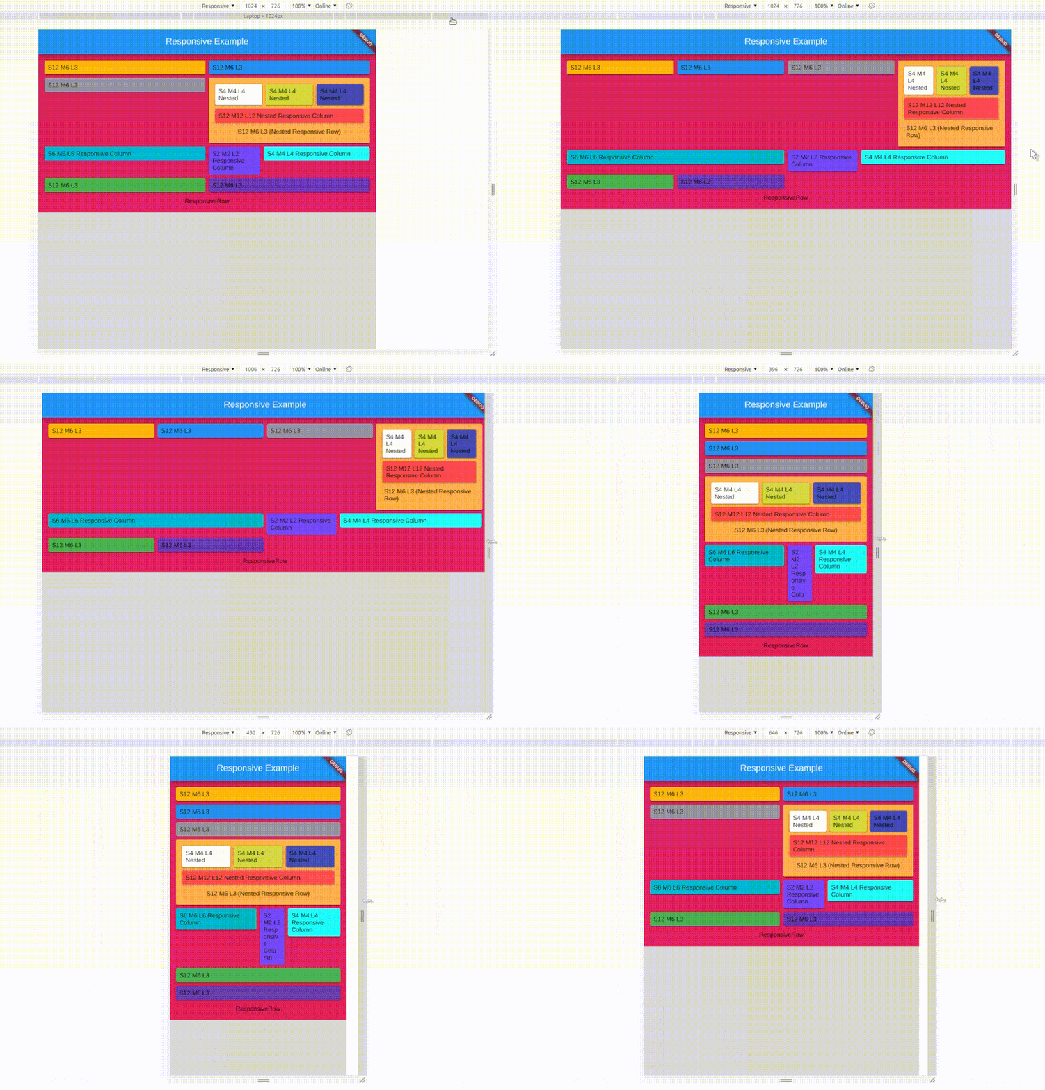
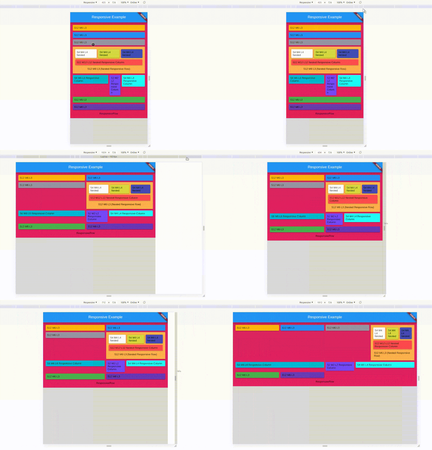
It works as same as Bootstrap / Materialize Row Column method, Splitting screen into 12 columns and placing widget by combining column based on screen size.
The Responsive UI Package contains two simple widgets.
Div()
Responsive()
1. Div()
Arguments
inputs
if null / default to
child
Widget
required
division
Division
if null defaluts to Division()
Divison() intakes column sizes and offSets.
Arguments
inputs
if null / default to
colXS
(int) 0-12
12
colS
(int) 0-12
colXS value
colM
(int) 0-12
ColS value
colL
(int) 0-12
ColM value
colXL
(int) 0-12
ColL value
offsetXS
(int) 0-12
0
offsetS
(int) 0-12
0
offsetM
(int) 0-12
0
offsetL
(int) 0-12
0
offsetXL
(int) 0-12
0
(XS = Extra Small, S = small, M = medium, L = large, XL = Extra Large)
0 - 0.0 width (gone) (replaced with SizedBox.shrink())
12 - full width (provided by parent widget not screen width)
Parent widget should not be a horizontal scroll type widget
To offset, simply add offsetS / offsetM / offsetL to the Div() widget with colS / colM / colL respectively.
Offset works for their respective column sizes.
2. Responsive()
Responsive intakes List<Widget> or List<Div> with default column/screen size for each widget can be declared.
Arguments
inputs
if null / default
children
List / List
not null / required / empty[]
alignment
WrapAlignment
WrapAlignment.start
runAlignment
WrapAlignment
WrapAlignment.start
crossAxisAlignment
WrapCrossAlignment
WrapCrossAlignment.start
runSpacing
double
0.0
Note
Responsive widget is a Wrap widget.
Responsive & Div() widget need Finite width to work.
Div() works with vertical scroll not in horizontal scroll, as it calculations are base on width only.
Div() works as expected when it placed as a direct child of Responsive() widget's children.
Sum of the offset and the respective col should be <= to 12
Nested Responsive
Place a Responsive() widget into a Div().
The nested Responsive() widget takes the width provided by parent Div() widget and not the screen width
sample
Screen Types
Type
Default Size
Xtra small
< 375.0
Small
375.0 - 596.0
Medium
596.0 - 897.0
Large
897.0 - 1232.0
Xtra Large
>1232.0
Override / Set your default size
Yes, now you can set your own breakpoints, that applies to all the Responsive & Div widgets.
voidmain() {
// sample 1Responsive.setGlobalBreakPoints(400.0, 600.0, 997.0, 1380.0);
// Sample 2 Responsive.setGlobalBreakPoints(0, 596.0, 897.0, 1232.0);
// Since the first value is 0 : colXS is always neglectedrunApp(constMyApp());
}
responsive_ui is made simply using Wrap() and LayoutBuilder() with a bits of logics.