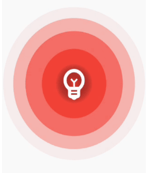
Simple and easy to use ripple animation that can be wrapped in widgets to create beautiful ripple effects.
Features


Installing
Add ripple_wave to your pubspec.yaml file.
dependencies:
  ripple_wave:
Import ripple_wave in files that it will be used.
import 'package:ripple_wave/ripple_wave.dart';
Usage
To use this package, add ripple_wave as a dependency in your pubspec.yaml file.
Then wrap your desired widget with RippleWave widget to get the ripple animation.
Usage without repeated animation:
class MyHomePage extends StatelessWidget {
  const MyHomePage({Key? key}) : super(key: key);
  @override
  Widget build(BuildContext context) {
    return Scaffold(
      body: RippleWave(
        color: Colors.green,
        repeat: false,
        child: const Icon(
          Icons.emoji_emotions,
          size: 100,
          color: Colors.white,
        ),
      ),
    );
  }
}
Usage with tween effect on child widget of the RippleWave:
class MyHomePage extends StatelessWidget {
  const MyHomePage({Key? key}) : super(key: key);

  @override
  Widget build(BuildContext context) {
    return Scaffold(
      body: RippleWave(
        color: Colors.red,
        childTween: Tween(begin: 0.2, end: 1),
        child: const Icon(
          Icons.emoji_emotions,
          size: 100,
          color: Colors.white,
        ),
      ),
    );
  }
}
Usage with animation controller to manually start or stop the animation:
class DemoPage extends StatefulWidget {
  const DemoPage({Key? key}) : super(key: key);

  @override
  State<DemoPage> createState() => _DemoPageState();
}

late AnimationController animationController;

void start() {
  animationController.repeat();
}

void stop() {
  animationController.stop();
}

class _DemoPageState extends State<DemoPage>
    with SingleTickerProviderStateMixin {
  @override
  void initState() {
    animationController = AnimationController(
      duration: const Duration(seconds: 3),
      vsync: this,
    );
    super.initState();
  }

  @override
  Widget build(BuildContext context) {
    return Scaffold(
      appBar: AppBar(
        title: const Text("Ripple Demo"),
      ),
      body: Column(
        mainAxisAlignment: MainAxisAlignment.center,
        children: [
          RippleWave(
            childTween: Tween(begin: 0.1, end: 1.0),
            color: Colors.deepPurpleAccent,
            repeat: false,
            animationController: animationController,
            child: const Icon(
              Icons.emoji_emotions,
              size: 100,
              color: Colors.white,
            ),
          ),
          const SizedBox(
            height: 200,
          ),
          TextButton(
            onPressed: () {
              start();
            },
            child: const Text(
              'Start animation',
            ),
          ),
          const SizedBox(
            height: 40,
          ),
          TextButton(
            onPressed: () {
              stop();
            },
            child: const Text(
              'Stop animation',
            ),
          ),
        ],
      ),
    );
  }
}