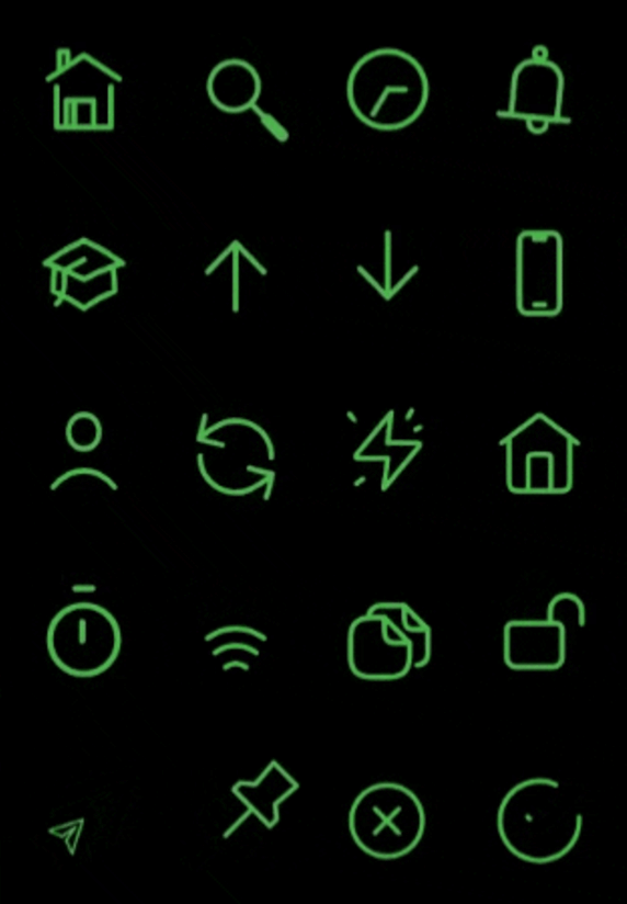
This package provides rive animated icons that can be customized to suit your preference. It includes the riveIcon type, onTap, color and other parameters to give you a level of control.
This parameter is used to define the icon type from the RiveIcon enum
Optional parameters
width:
This parameter is used to set the icon width
height:
This parameter is used to set the icon height
color:
This parameter is used to set icon color
loopAnimation:
When this parameter is set to true the icon's animation will be on loop
onTap:
This callback is set by the user to perform actions onTap
onHover:
This callback is set by the user to perform actions onHover
splashColor:
This parameter is used to set icon splash color
strokeWidth:
This parameter is used to set icon stroke width
splashFactory:
This parameter is used to set icon splashFactory
mouseCursor:
This parameter is used to set icon mouseCursor when hovered
enableAbsorbPointer:
When this parameter is set to true it disables all interactive features of the icon
Animated Icon stroke width sample ⬇️
Best practices 🙌
If a Rive animation is set to loop and is scrolled off-screen, you can disable the loop to stop the animation and conserve resources while it's not visible. Similarly, you can re-enable the loop when the animation comes back into view.