パッケージ、リポジトリ、アプリカテゴリを検索

rounded_expansion_tile のカバー
パッケージ詳細v0.0.13

rounded_expansion_tile

Flutterアプリケーション用のシンプルなExpansionTileで、角丸の境界線付き。

AndroidiOSWebmacOSWindowsLinux
30日間ダウンロード
705
いいね数
28
Pub ポイント
135

パッケージをインストール

flutter pub add rounded_expansion_tile

パッケージ概要

公開情報に基づく選定ガイドです。参考としてご利用ください。

カスタマイズ可能なボーダー半径を備えた拡張されたExpansionTileを提供するFlutterパッケージで、折りたたみ可能なコンテンツセクションにモダンで視覚的に魅力的なデザインを提供します。シンプルさと統合性を重視して作成され、すべてのプラットフォームで標準のExpansionTileに丸いコーナーを追加しています。モバイルおよびWebアプリケーションでクリーンで使いやすいインターフェースを作成するのに最適です。このパッケージは軽量であり、Flutterのコアウィジェットとの互換性を維持しています。

用途

  • フォーム内のスタイル付き折りたたみセクションの作成
  • ダッシュボードでのレスポンシブなアコーディオンのデザイン
  • ラウンドされたインタラクティブ要素によるUIの一貫性の向上
  • アクセシブルなナビゲーションパネルの構築
  • eコマースアプリにおける拡張可能な製品詳細の実装

主な機能

  • カスタマイズ可能なボーダー半径
  • クロスプラットフォーム対応(Android、iOS、Web、macOS、Windows、Linux)
  • 既存のFlutterプロジェクトとの簡単な統合
  • 標準の ExpansionTile を拡張します
  • 軽量で最小限の依存関係

適している対象

  • 洗練されたUIコンポーネントを求める開発者
  • 視覚的一貫性に注力するUIデザイナー
  • 一貫したラウンドカード風の拡張を必要とするプロジェクト
  • 複数のプラットフォームをターゲットにするアプリ
  • Flutterの初心者がウィジェットカスタマイズを探索しています

注意事項

  • ボーダー半径のスタイルのみに制限
  • 標準のExpansionTile以外の追加アニメーションは含まれません
  • 必要に応じて、コンテンツのパディングを手動で処理する必要があります
  • デフォルト以外の組み込みアイコンやタイトルのカスタマイズはできません
  • 複雑なレイアウトが不要なシンプルな拡張ユースケースに最適

元の README

関連するソースリポジトリの README 原文のスナップショットです。最新の内容はリポジトリをご覧ください。

Rounded Expansiontile

A simple combination of widgets to provide an Expansiontile with rounded corners. This widget uses default Flutter widgets only and is available for each platform.

Getting Started

This Widget returns a column with a ListTile and a ListView. It has all properties of the ListTile width a few custom inputfield. Simply load the widget in your pubspec yaml and start using it.

Inputfields

Default ListTile and ExpansionTile inputfields
  • autofocus

  • contentPadding

  • dense

  • enabled

  • enableFeedback

  • focusColor

  • focusNode

  • horizontalTitleGap

  • hoverColor

  • isThreeLine

  • key

  • leading

  • minLeadingWidth

  • minVerticalPadding

  • mouseCursor

  • onLongPress

  • selected

  • selectedTileColor

  • shape

  • subtitle

  • title

  • tileColor

  • trailing

  • visualDensity

  • onTap

  • initiallyExpanded

Extra inputfields and tips
  • shape Shape()

    The shape will be used for the shape of the ListTile, not for the children. This is visible when pressed and will be shown in the ink splash.

    Use the RoundedExpansionTile in a Card-widget with the same shape for the best result.

    Card(
        shape: RoundedRectangleBorder(borderRadius: BorderRadius.circular(16)),
        child: RoundedExpansionTile(
            shape: RoundedRectangleBorder(borderRadius: BorderRadius.circular(16)),
            title: Text('Some title'),
            children: [
                child1,
                child2,
                child3,
                ...
            ],
        ),
    ),
    
  • duration Duration()

    This will be used to show the expansion animation. It is used for the Expansion it self and the rotation / animation of the Icon. By default the duration is 500 milliseconds.

  • children List<Widget>[]

    The children that will be displayd when the ListTile is expanded.

  • childrenPadding EdgeInsets()

    The padding around the children. This is not the same as the contentpadding.

  • curve Curve()

    The curve used for the children animation. By default it uses Curves.fastLinearToSlowEaseIn

  • trailing Widget()

    When provided this will override the default hamburger menu icon (AnimatedIcon). This icon will rotate by default but can be set to false see rotateTrailing.

  • rotateTrailing bool

    Rotate the custom trailing icon when provided. By default this is true. When set to false the icon stays the same. Provide the trailing with an arrow down to make the widget look like the default ExpansionTile.

  • noTrailing bool

    When set to true there will be no trailing at all. Even when provided custom trailing this bool will prevent it from being shown.

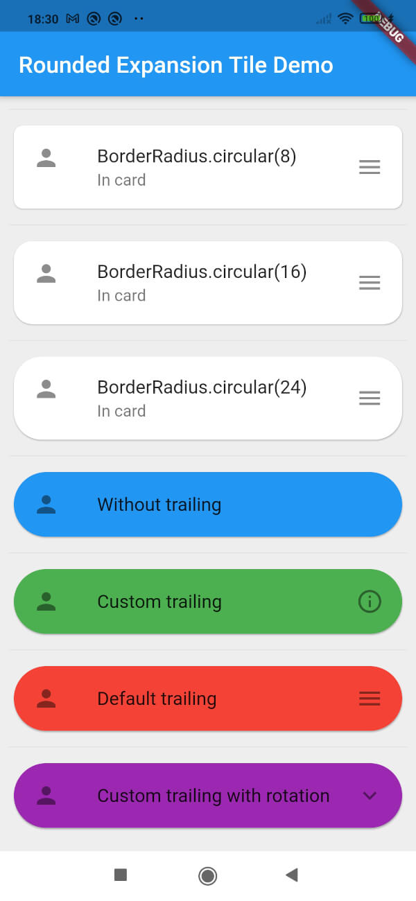
Example

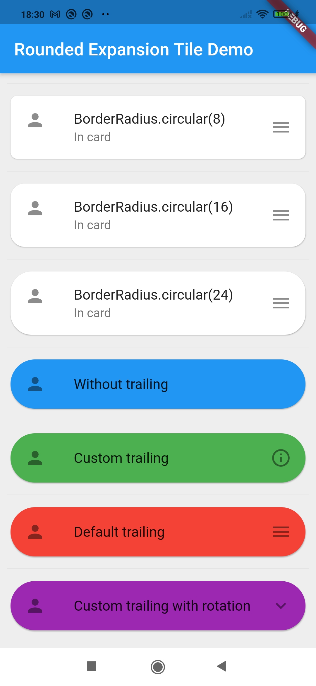
Screenshot of example app

カテゴリー

ソースリポジトリ

このパッケージを使用しているプロジェクト

データはまだありません。