パッケージ、リポジトリ、アプリカテゴリを検索

rounded_loading_button_plus のカバー
パッケージ詳細v3.0.1

rounded_loading_button_plus

Flutter用のシンプルなアニメーションロードボタンウィジェットの実装

AndroidiOSWebmacOSWindowsLinux
30日間ダウンロード
2660
いいね数
79
Pub ポイント
155

パッケージをインストール

flutter pub add rounded_loading_button_plus

パッケージ概要

公開情報に基づく選定ガイドです。参考としてご利用ください。

滑らかな遷移とカスタマイズ可能なスタイルを備えたアニメーションローディングボタンウィジェットを提供するFlutterパッケージです。フォーム送信やAPI呼び出しなどのアクション中にローディング状態を視覚的に示すことで、ユーザー体験を向上させます。円形およびラウンドされた長方形の形状をサポートし、色、サイズ、アニメーション速度をカスタマイズできます。シンプルさとパフォーマンスを重視して作られており、あらゆるFlutterアプリに複数のプラットフォームでシームレスに統合可能です。

用途

  • ロード状態付きのフォーム送信
  • API呼び出しのトリガー
  • ユーザー認証フロー
  • インタラクティブなUI要素
  • モバイルアプリにおける進行状況の表示

主な機能

  • アニメーション付きロード遷移
  • カスタマイズ可能なボタンの形状
  • カスタマイズ可能な色とサイズ
  • クロスプラットフォーム対応
  • onPressed との簡単な統合
  • スムーズなアニメーション効果

適している対象

  • インタラクティブなフォームを構築する開発者
  • 非同期操作中に視覚的なフィードバックを必要とするアプリ
  • UI中心のFlutterプロジェクト
  • 初心者から中級者までのFlutter開発者
  • Android、iOS、Web、macOS、Windows、Linux をターゲットとするプロジェクト

注意事項

  • 基本的な使用には最小限のセットアップが必要です
  • コアプロパティを超えるカスタマイズは限定的
  • 組み込みのエラー処理なし
  • シンプルな読み込みシナリオに最適
  • 複雑な状態管理には適していない

元の README

関連するソースリポジトリの README 原文のスナップショットです。最新の内容はリポジトリをご覧ください。

rounded_loading_button_plus

pub package build codecov style: effective dart License: MIT Awesome Flutter

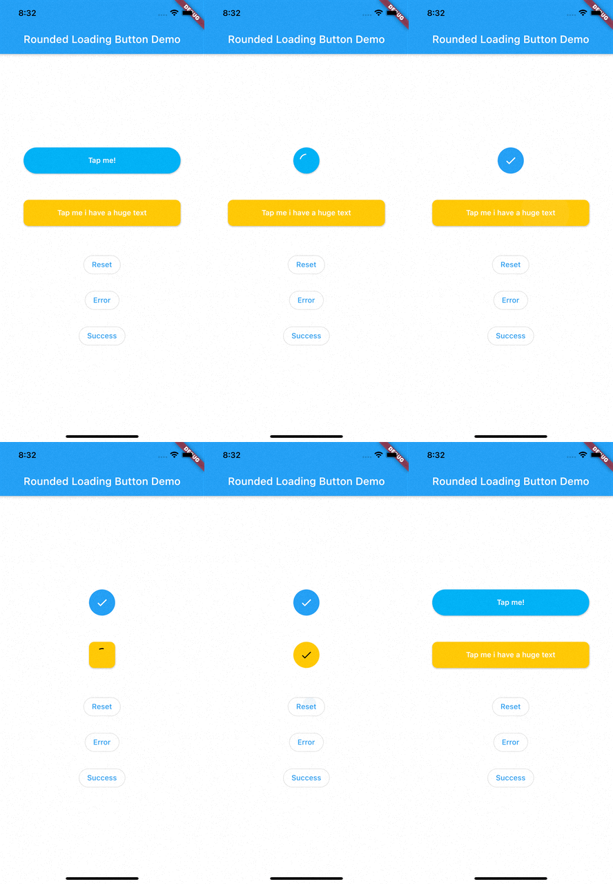
RoundedLoadingButton is a Flutter package with a simple implementation of an animated loading button, complete with success and error animations.

Installation

Add this to your pubspec.yaml:

dependencies:
    rounded_loading_button_plus: ^2.0.8

Usage

Import
import 'package:rounded_loading_button_plus/rounded_loading_button_plus.dart';
Simple Implementation
final RoundedLoadingButtonController _btnController = RoundedLoadingButtonController();

void _doSomething() async {
    Timer(Duration(seconds: 3), () {
        _btnController.success();
    });
}

RoundedLoadingButton(
    child: Text('Tap me!', style: TextStyle(color: Colors.white)),
    controller: _btnController,
    onPressed: _doSomething,
)

The Rounded Loading Button has many configurable properties, including:

  • duration - The duration of the button animation
  • loaderSize - The size of the CircularProgressIndicator
  • animateOnTap - Whether to trigger the loading animation on the tap event
  • resetAfterDuration - Reset the animation after specified duration, defaults to 15 seconds
  • errorColor - The color of the button when it is in the error state
  • successColor - The color of the button when it is in the success state
  • successIcon - The icon for the success state
  • failedIcon - The icon for the failed state

Contributions

All contributions are welcome!

カテゴリー

依存関係

依存関係一覧 1 件

ソースリポジトリ

このパッケージを使用しているプロジェクト