パッケージ、リポジトリ、アプリカテゴリを検索

scroll_snap_list のカバー
パッケージ詳細v0.9.1

scroll_snap_list

ユーザーのスクロール終了時にアイテムに「スナップ」イベントを適用できるFlutterウィジェットです。

AndroidiOSWebmacOSWindowsLinux
30日間ダウンロード
3.5万
いいね数
409
Pub ポイント
150

パッケージをインストール

flutter pub add scroll_snap_list

パッケージ概要

公開情報に基づく選定ガイドです。参考としてご利用ください。

ScrollSnapListは、リスト内のスムーズなアイテムへのスナップスクロールを可能にするように設計されたFlutterウィジェットです。ユーザーがスクロールすると、リストは自動的に最も近いアイテムにスナップし、カルーセル型やページングインターフェースでのナビゲーションを向上させます。Android、iOS、Web、macOS、Windows、Linuxなど、すべての主要プラットフォームをサポートしています。画像スライダー、オンボーディング画面、タブ付きコンテンツなど、リストアイテムへの正確な配置が必要なスクロールベースのインタラクションの実装を簡単にします。パフォーマンスと使いやすさを意識して設計されており、既存のFlutterプロジェクトにシームレスに統合できます。

用途

  • オンボーディング画面
  • 画像カルーセル
  • タブ付きコンテンツナビゲーション
  • 製品スライダー
  • ページネーション付きリスト
  • インタラクティブなチュートリアル

主な機能

  • アイテムへの自動スナップ
  • スムーズなスクロール遷移
  • クロスプラットフォーム対応
  • シンプルな統合
  • カスタマイズ可能なスナップ動作
  • 垂直および水平レイアウトをサポートしています

適している対象

  • インタラクティブなリストインターフェースを構築する開発者
  • スワイプベースのナビゲーションを実装するデザイナー
  • 正確なスクロール位置合わせを必要とするアプリ
  • カルーセルまたはページネーションが必要なプロジェクト
  • Flutterの初心者が直感的なスクロール制御を探している

注意事項

  • カスタムアニメーション用に追加のスタイルが必要になる場合があります
  • 非常に大きなデータセットでのパフォーマンスへの影響
  • 制限された組み込みジェスチャーのカスタマイズ
  • スナップなしで連続スクロールには向かない
  • 一貫したスナップを実現するためには、アイテムサイズの丁寧な取り扱いが必要です

元の README

関連するソースリポジトリの README 原文のスナップショットです。最新の内容はリポジトリをご覧ください。

scroll_snap_list

A wrapper for ListView.builder widget that allows "snaping" event to an item at the end of user-scroll.

This widget allows unrestricted scrolling (unlike other widget that only able to "snap" to left/right neighbor at a time).

  • Support horizontal & vertical list
  • Use ListView.Builder, means no Animation

You can use this widget to achieve:

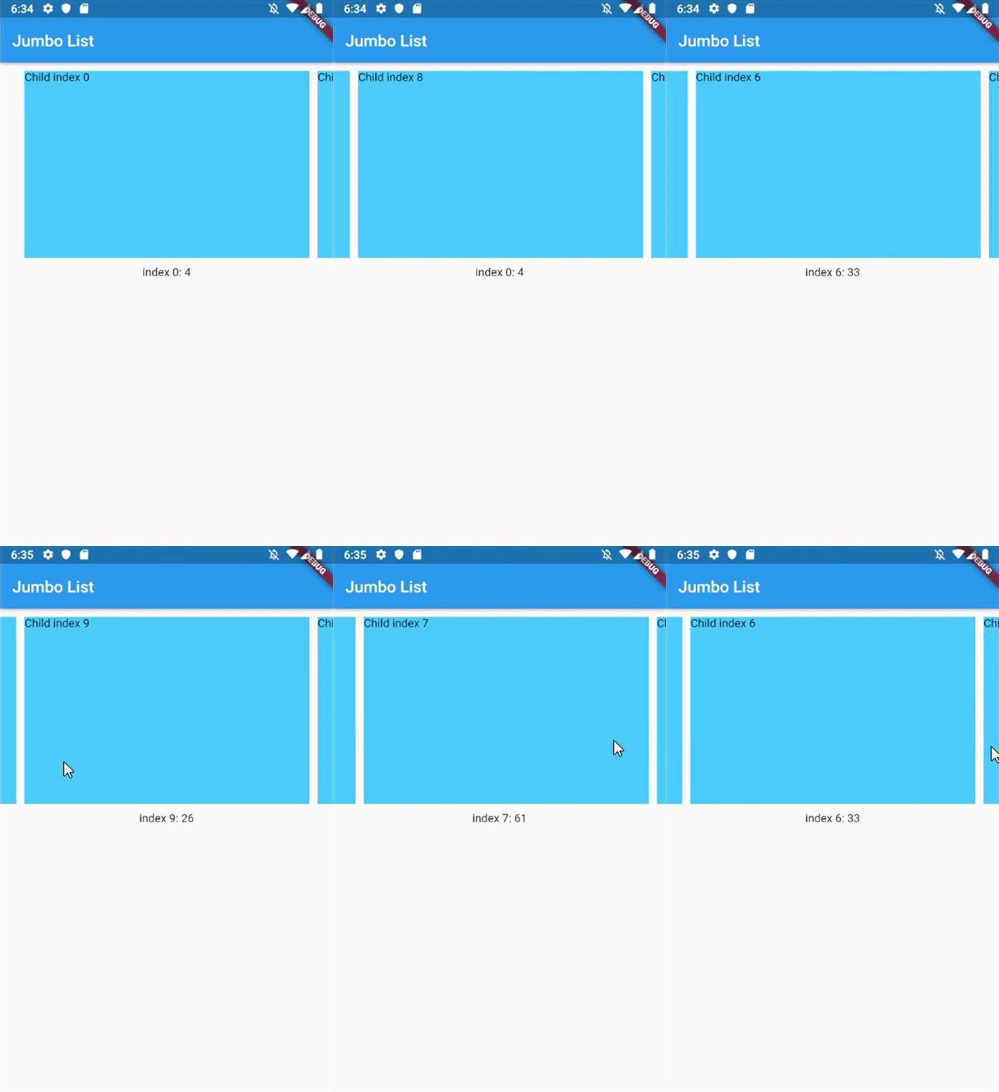
  • Unrestricted scrollable Jumbotron
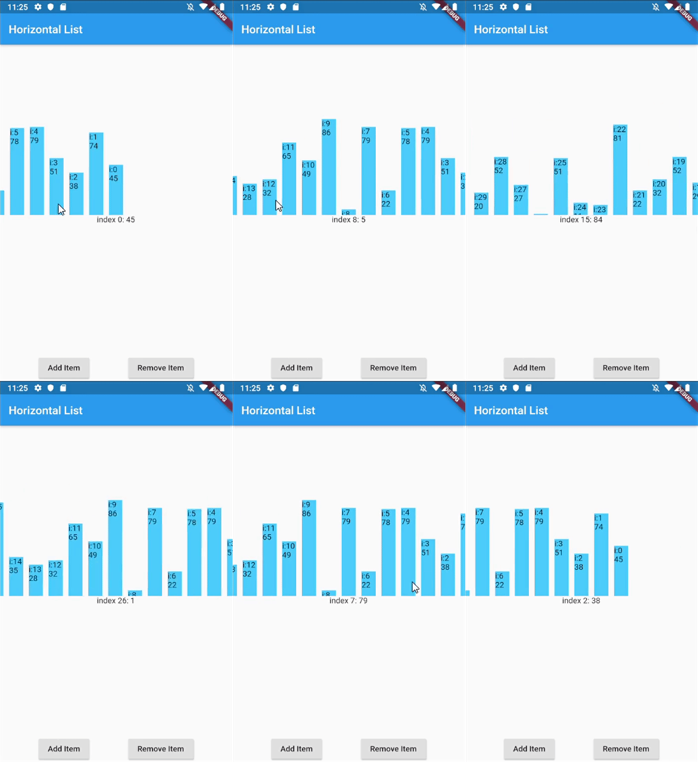
  • Show daily entry for Health App and shows its detail directly below the list (reduce number of click)
  • Scrollable InputSelect, like datetime picker in cupertino
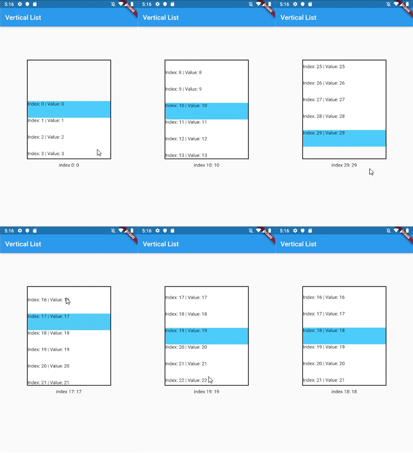
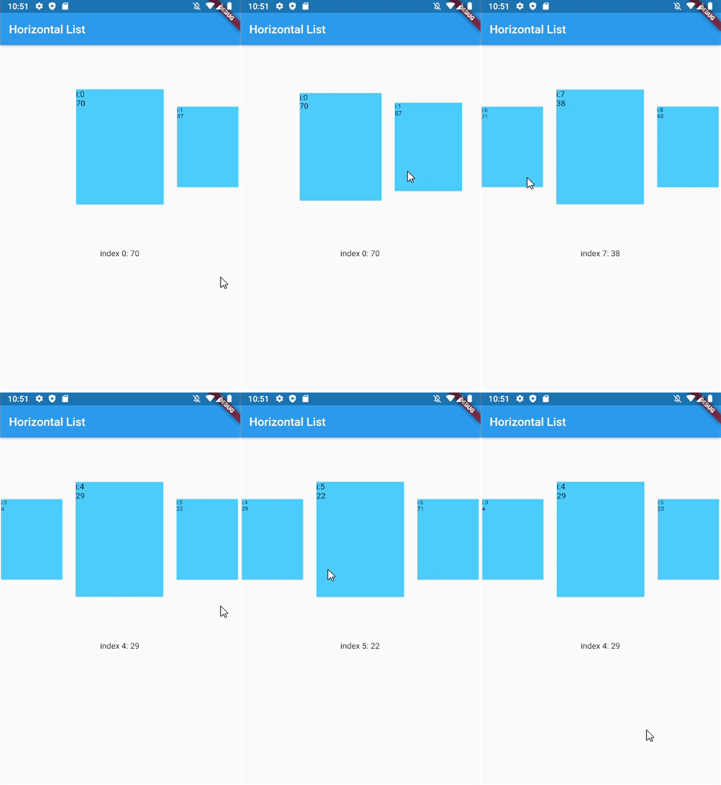
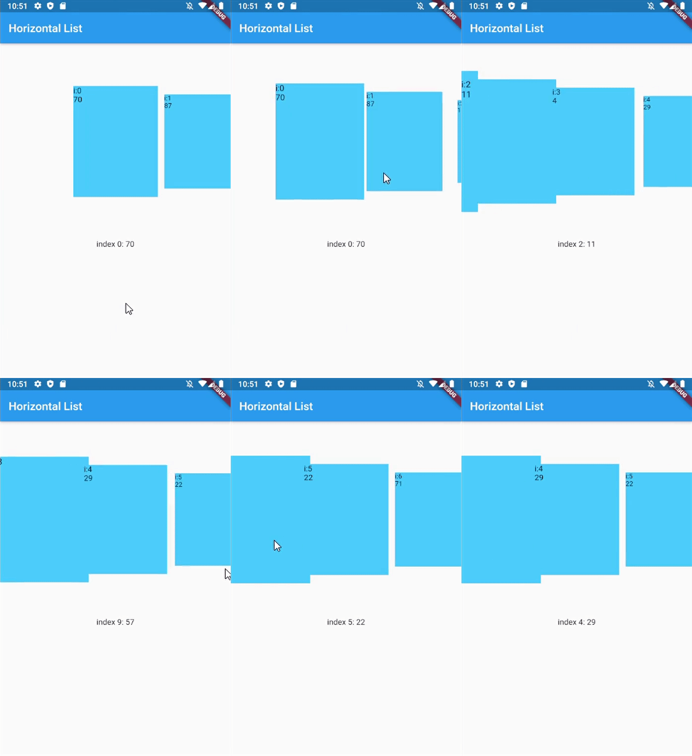
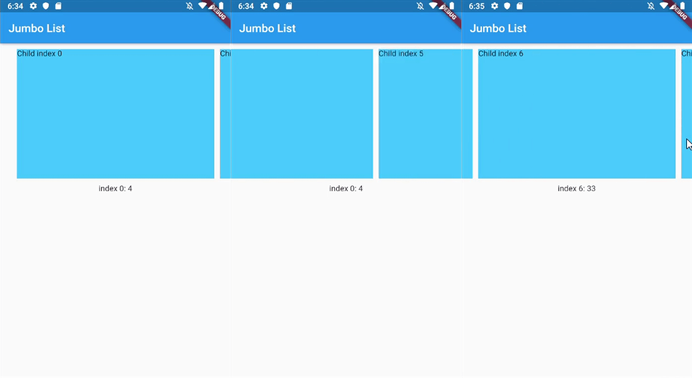
Jumbotron List Horizontal List Vertical List Dynamic Size Custom Dynamic Size
Horizontal Jumbotron List Horizontal List with infinite-loading Vertical list with InkWell ListItems Horizontal with dynamic item size Horizontal with custom dynamic item size

Getting Started

In your flutter project pubspec.yaml add the dependency:

dependencies:
  ...
  scroll_snap_list: ^[version]

Usage example

This library doesn't use other library, so it should work out of the box.

Import scroll_snap_list.dart.

import 'package:scroll_snap_list/scroll_snap_list.dart';

Add ScrollSnapList in your build method. Make sure to enter correct itemSize (helps with "snapping" process).

Expanded(
  child: ScrollSnapList(
    onItemFocus: _onItemFocus,
    itemSize: 35,
    itemBuilder: _buildListItem,
    itemCount: data.length,
    reverse: true,
  ),
),

Full example:

import 'dart:math';

import 'package:flutter/material.dart';
import 'package:scroll_snap_list/scroll_snap_list.dart';

void main() => runApp(HorizontalListDemo());

class HorizontalListDemo extends StatefulWidget {
  @override
  _HorizontalListDemoState createState() => _HorizontalListDemoState();
}

class _HorizontalListDemoState extends State<HorizontalListDemo> {
  List<int> data = [];
  int _focusedIndex = 0;

  @override
  void initState() {
    super.initState();

    for (int i = 0; i < 30; i++) {
      data.add(Random().nextInt(100) + 1);
    }
  }

  void _onItemFocus(int index) {
    setState(() {
      _focusedIndex = index;
    });
  }

  Widget _buildItemDetail() {
    if (data.length > _focusedIndex)
      return Container(
        height: 150,
        child: Text("index $_focusedIndex: ${data[_focusedIndex]}"),
      );

    return Container(
      height: 150,
      child: Text("No Data"),
    );
  }

  Widget _buildListItem(BuildContext context, int index) {
    //horizontal
    return Container(
      width: 35,
      child: Column(
        mainAxisAlignment: MainAxisAlignment.end,
        children: <Widget>[
          Container(
            height: data[index].toDouble()*2,
            width: 25,
            color: Colors.lightBlueAccent,
            child: Text("i:$index\n${data[index]}"),
          )
        ],
      ),
    );
  }

  @override
  Widget build(BuildContext context) {
    return MaterialApp(
      title: 'Horizontal List Demo',
      home: Scaffold(
        appBar: AppBar(
          title: Text("Horizontal List"),
        ),
        body: Container(
          child: Column(
            children: <Widget>[
              Expanded(
                child: ScrollSnapList(
                  onItemFocus: _onItemFocus,
                  itemSize: 35,
                  itemBuilder: _buildListItem,
                  itemCount: data.length,
                  reverse: true,
                ),
              ),
              _buildItemDetail(),
              Row(
                mainAxisAlignment: MainAxisAlignment.spaceEvenly,
                children: <Widget>[
                  RaisedButton(
                    child: Text("Add Item"),
                    onPressed: () {
                      setState(() {
                        data.add(Random().nextInt(100) + 1);
                      });
                    },
                  ),
                  RaisedButton(
                    child: Text("Remove Item"),
                    onPressed: () {
                      int index = data.length > 1
                          ? Random().nextInt(data.length - 1)
                          : 0;
                      setState(() {
                        data.removeAt(index);
                      });
                    },
                  ),
                ],
              )
            ],
          ),
        ),
      ),
    );
  }
}
Usage with dynamic item size

This feature is added since version 0.4.0.

We can customize item size with respect to distance between item and center of ScrollSnapList.

@override
Widget build(BuildContext context) {
  return MaterialApp(
    title: 'Horizontal List Demo',
    home: Scaffold(
      appBar: AppBar(
        title: Text("Horizontal List"),
      ),
      body: Container(
        child: Column(
          children: <Widget>[
            Expanded(
              child: ScrollSnapList(
                onItemFocus: _onItemFocus,
                itemSize: 150,
                itemBuilder: _buildListItem,
                itemCount: data.length,
                dynamicItemSize: true,
                // dynamicSizeEquation: customEquation, //optional
              ),
            ),
            _buildItemDetail(),
          ],
        ),
      ),
    ),
  );
}

Important parameters and explanation

Parameter Explanation
key Key for ScrollSnapList, used to call ScrollSnapListState
listViewKey Key for ListView inside ScrollSnapListState, often used to preserve scroll location
itemBuilder Same as ListView's itemBuilder
curve Animation curve when snapping
duration Animation duration
endOfListTolerance Pixel tolerance to trigger onReachEnd
focusOnItemTap Focus to an item when user tap on it. Inactive if the list-item have its own onTap detector (use state-key to help focusing instead).
focusToItem Method to manually trigger focus to an item. Call with help of GlobalKey<ScrollSnapListState>
margin Container's margin
itemCount Number of item in this list
itemSize Size used is width if scrollDirection is Axis.horizontal, height if Axis.vertical. Composed of the size of each item + its margin/padding.
onItemFocus Callback function when list snaps/focuses to an item
onReachEnd Callback function when user reach end of list. E.g. load more data from db
reverse Same as ListView's reverse to reverse scrollDirection
updateOnScroll Calls onItemFocus (if it exists) when ScrollUpdateNotification fires
initialIndex Optional initial position which will not snap until after the first drag
scrollDirection ListView's scrollDirection
listController External ScrollController
dynamicItemSize Scale item's size depending on distance to center
dynamicSizeEquation Custom equation to determine dynamic item scaling calculation
dynamicItemOpacity Custom opacity for offset item (single value)
selectedItemAnchor Anchor location for selected item in the list (Start, Middle, End)
shrinkWrap ListView's shrinkWrap
scrollPhysics ListView's scrollPhysics
clipBehavior ListView's clipBehavior
keyboardDismissBehavior ListView's keyboardDismissBehavior
allowAnotherDirection Allow List items to be scrolled using other direction
dispatchScrollNotifications Control if ScrollNotifications should be dispatched to further ancestors. Default: false

Other Notice

By default, SnapScrollList set focusOnItemTap as true. Means any tap event on items will trigger snap/focus event to that item.

This behavior use GestureDetector, so if the list's items have their own detector (e.g. InkWell, Button), SnapScrollList unable to trigger snap event on its own. To handle this, we may use GlobalKey<ScrollSnapListState> to trigger the event manually.

Add GlobalKey<ScrollSnapListState> in your widget

GlobalKey<ScrollSnapListState> sslKey = GlobalKey();

Add key parameter to SnapScrollList.

ScrollSnapList(
  onItemFocus: _onItemFocus,
  itemSize: 50,
  itemBuilder: _buildListItem,
  itemCount: data.length,
  key: sslKey,
  scrollDirection: Axis.vertical,
)

In your buildItem method, call focusToItem method.

Widget _buildListItem(BuildContext context, int index) {
  //horizontal
  return Container(
    height: 50,
    child: Material(
      color: _focusedIndex == index ? Colors.lightBlueAccent : Colors.white,
      child: InkWell(
        child: Text("Index: $index | Value: ${data[index]}"),
        onTap: () {
          print("Do anything here");

          //trigger focus manually
          sslKey.currentState.focusToItem(index);
        },
      ),
    ),
  );
}

Full example for this part can be found in example/vertical_list.dart.

About

Created by Vincent (MSVCode) Email: msvcode@gmail.com

カテゴリー

ソースリポジトリ

このパッケージを使用しているプロジェクト