パッケージ、リポジトリ、アプリカテゴリを検索

scrollable_list_tabview のカバー
パッケージ詳細v0.1.6

scrollable_list_tabview

ScrollView とカスタムタブビューを同期するためのFlutterウィジェット。

30日間ダウンロード
49
いいね数
166
Pub ポイント
40

パッケージをインストール

flutter pub add scrollable_list_tabview

パッケージ概要

公開情報に基づく選定ガイドです。参考としてご利用ください。

スクロール可能なリストとカスタムタブビューを同期するFlutterウィジェットで、2つのコンポーネント間のスムーズな整合を保証します。ユーザーはスクロールによりコンテンツを移動しながら、同時に選択されたタブを更新できるほか、逆もまた同様です。リストアイテムとタブが密接に関連している一貫性のあるインタラクティブなインターフェースを作成するのに最適です。このパッケージは軽量であり、既存のFlutterプロジェクトへのシームレスな統合を目的としています。

用途

  • 同期リストおよびタブナビゲーション
  • コンテンツの多いダッシュボードを作成する
  • ガイド付きオンボーディングフローの構築
  • スクロール可能なタブインターフェースの実装

主な機能

  • スクロールとタブ間のリアルタイム同期
  • カスタマイズ可能なタブスタイル
  • 動的コンテンツをサポートします
  • 既存のウィジェットとの簡単な統合
  • デバイス間での応答性のある動作

適している対象

  • タブ付きコンテンツレイアウトを構築している開発者
  • 同期スクロールおよびタブ選択を必要とするアプリ
  • インタラクティブなナビゲーションパターンを探しているUIデザイナー

注意事項

  • タブ項目のデータを手動で処理する必要があります
  • 制限されたプラットフォーム固有の最適化
  • 組み込みのアニメーションなし
  • 非常に複雑なネストされたナビゲーションには適していません

元の README

関連するソースリポジトリの README 原文のスナップショットです。最新の内容はリポジトリをご覧ください。

scrollable_list_tabview

Build Status Codemagic build status Coverage Status

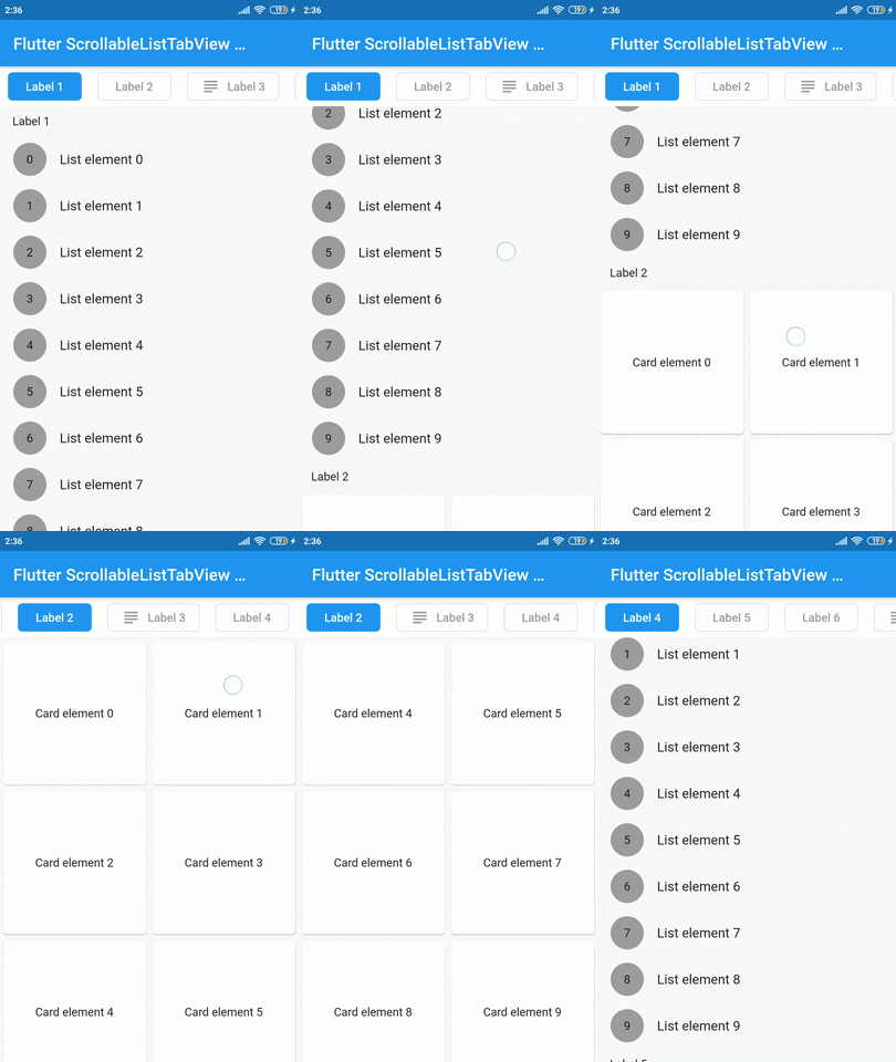
A Flutter widget which synchronize a ScrollView and a custom tab view.

The main idea is to create a custom tab view synchronizing with inner ScrollView. The scroll activity will trigger custom tab view at the top to follow the index of the inner scroll view widget.

Demo

Installation

Add dependency for package on your pubspec.yaml:

dependencies:
    scrollable_list_tabview: <latest>

Usage

To use this widget we must first define how our tabs will look like.

ListTab
Parameter Definition
Widget icon Trailing widget for a tab, typically an Icon.
Widget label Label to be shown in the tab, must be non-null.
BorderRadiusGeometry borderRadius BorderRadius value for a single tab.
Color activeBackgroundColor Color to be used when the tab is selected.
Color inactiveBackgroundColor Color to be used when the tab isn't selected.
bool showIconInList Decide whether show icon widget in the scrollable view.
Color borderColor Color of the border of tab when its not selected

Then we can use LisTab in ScrollableListTab.

ScrollableListTab
Parameter Definition
ListTab tab Data model used for rendering tab widgets.
ScrollView body An individual inner scrollable widget.

Then ScrollableListTabView will take a list of ScrollableListTab as an argument.

ScrollableListTabView
Parameter Definition
List<ScrollableListTab> tabs List of tabs to be built.
double height Height of the tab at the top of the view.
Duration tabAnimationDuration Duration of tab change animation.
Duration bodyAnimationDuration Duration of inner scroll view animation.
Curve tabAnimationCurve Animation curve used when animating tab change.
Curve bodyAnimationCurve Animation curve used when changing index of inner ScrollView(s).

Example

import 'package:flutter/material.dart';
import 'package:scrollable_list_tabview/scrollable_list_tabview.dart';

void main() {
  runApp(MyApp());
}

class MyApp extends StatelessWidget {
  // This widget is the root of your application.
  @override
  Widget build(BuildContext context) {
    return MaterialApp(
      title: 'Flutter Demo',
      debugShowCheckedModeBanner: false,
      theme: ThemeData(
        primarySwatch: Colors.blue,
        visualDensity: VisualDensity.adaptivePlatformDensity,
      ),
      home: MyHomePage(title: 'Flutter ScrollableListTabView Example'),
    );
  }
}

class MyHomePage extends StatefulWidget {
  MyHomePage({Key key, this.title}) : super(key: key);

  final String title;

  @override
  _MyHomePageState createState() => _MyHomePageState();
}

class _MyHomePageState extends State<MyHomePage> {
  @override
  Widget build(BuildContext context) {
    return Scaffold(
      appBar: AppBar(
        title: Text(widget.title),
      ),
      body: ScrollableListTabView(
        tabHeight: 48,
        tabs: [
          ScrollableListTab(
              tab: ListTab(label: Text('Label 1'), icon: Icon(Icons.group)),
              body: ListView.builder(
                shrinkWrap: true,
                physics: NeverScrollableScrollPhysics(),
                itemCount: 10,
                itemBuilder: (_, index) => ListTile(
                  leading: Container(
                    height: 40,
                    width: 40,
                    decoration: BoxDecoration(
                        shape: BoxShape.circle, color: Colors.grey),
                    alignment: Alignment.center,
                    child: Text(index.toString()),
                  ),
                  title: Text('List element $index'),
                ),
              )),
        ],
      ),
    );
  }
}

Limitations & Considerations

There are some limitations on this package. For example we only support ScrollView to be the body. Also, we could have used builder pattern to build the widgets.

I would like to thank Google developers for creating awesome package called ScrollablePositionedList.

Contribution

Contributions are accepted via pull requests. For more information about how to contribute to this package, please check the contribution guide.

License

This project is licensed under the MIT license, additional knowledge about the license can be found here.

カテゴリー

依存関係

依存関係一覧 1 件

ソースリポジトリ

このパッケージを使用しているプロジェクト

データはまだありません。